7 ways to optimize your lead generation using A/B testing

Email marketing is a critical skill for any online business to build a strong and real relationship with their potential clients and eventually make sales.
But before you can build that relationship in your email funnel, you need to get them on your list using an effective lead generation tactics.
And I’m sorry to tell you this, but that little widget that says “Join our Newsletter” just isn’t cutting it anymore.
To effectively build your email list, you are going to need to put on your white lab coat and start thinking like a scientist–constantly testing and iterating your opt-in forms to optimize your conversions.
In this post, I’ll give you 7 different A/B split test ideas you can use to grow your email list more effectively, as well as recommend my favorite tool to make it simple for WordPress users.
Ready? Let’s dive in!
Quick refresher: What is A/B split testing?
Before we get into testing ideas to grow your list, let’s quickly get on the same page here.
A/B split testing is a powerful tool that allows you to test two different ideas against each other to determine which one is more effective.
Let’s do a quick example:
You want to test the headline of your opt-in, so you (smartly!) decide to run an A/B split test for your two best ideas:
Headline A: Get My Free Report To Decluttering Your Home in 30 Minutes!
Headline B: Messy Home? Sign Up Below to Fix It Today!
Both headlines have promise and we could spend hours arguing about which one SHOULD convert to more email subscribers. But instead of arguing and guessing, we will set up a test.
For the next 1,000 visitors to our site, we will randomly show a different headline to new subscribers, and measure how many people saw each headline, and calculate how many sign-ups we got from each.
Some sample results might look like this:
Headline A: 547 views, 22 new subscribers, 4% conversion rate
Headline B: 453 views, 41 new subscribers, 9% conversion rate
Once you review the results and see that Headline B is performing more than twice as effectively as headline A, you can end the test and declare the winner. Now with no guess-work, you have improved the effectiveness of your lead capturing system.
Cool, right?
What’s even better is that your testing should never end there. If lead generation is important to your business (hint: it is!) then as soon as you complete an A/B test, you should be rolling right into a new test.
In this way, you are constantly iterating and improving the efficiency of your online business.
Now that you know what A/B Tests are and see the value in them, let’s give you 8 different ideas on tests you can run to optimize your own results.
And don’t worry - you don’t have to get the calculator out to figure out the winner. If you are using the MailerLite landing page builder, you can A/B test up to 5 versions easily.
And if you are using WordPress to create your forms for your pop-ups and blog posts, you can integrate with Thrive Leads, which is a plugin that can do some amazing analytics and tests to help build your lists extremely quickly!
Test idea #1: A crystal clear headline
Your headline is one of the most important aspects of your email opt-in form. If your headline doesn’t demonstrate clear value immediately, your readers will simply move on to the rest of your content.
It’s also the place I like to start all my A/B tests because it only takes a few seconds to create a new headline and test against the original, yet it can lead to massive improvements in conversion rates.
A good method I like to use to test my headlines is to ask a friend to perform the 1-second test.
The idea is to flash the headline for one second to your friend and then pull it down.
Does your friend know clearly what it is that you are offering? Or does he stumble around trying to remember exactly what the headline was trying to convey?
The best headlines are immediately clear and value-oriented.
It’s important not to run this test on yourself. You likely just spent an hour thinking deeply about your opt-in offer and headlines, so it will be impossible for you to judge the headlines without bias.
Once you have a few powerful and clear headlines that pass the 1-second test, it’s time to let the data speak and run an A/B test on them!
Test idea #2: Captivating imagery
Depending on the reader, their eyes will either be drawn to your Headline or your Imagery first. So it is a good idea to consistently test the imagery you use on your opt-in to capitalize on their limited attention.
When testing out your imagery, I like to test graphics that display the thing being offered against the feelings of your subscriber. Let me explain:
Let’s go back to the previous example of home decluttering. I can think of 3 easy image ideas to test for this offer:
An image focused on the physical report you would get when opting-in
An image that focuses on the feeling of serenity you get when you have fixed your clutter problem
An image that focuses on feeling overwhelmed and anxious when you feel cluttered.
As an example:

This image clearly shows that what you are getting is a report on the topic of decluttering.
What it DOESN’T convey, however, is the feeling you are trying to get away from or the feeling you are trying to achieve like these images might:

These images clearly convey emotions of serenity and overwhelm - which may speak to the visitor if they are dealing with a cluttered world.
Which image would make the best use for optimizing your conversions? Nobody knows - but a quick A/B Test would tell you!
MailerLite allows up to 5 variations and Thrive Leads (the tool I recommend for this testing purpose) allows you to create unlimited variations when running a test. So while A/B sounds like you can only test 2 versions against each other, in this case, I would set up 3 variations where I would test each image to see which comes out on top!
Test idea #3: Opt-in type
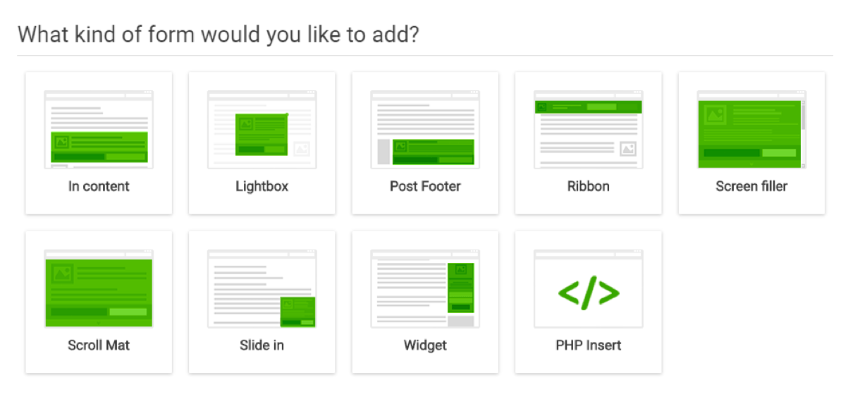
Effective email marketing means switching things up over time. If you have relied on pop-ups exclusively to get people on your list, it might be worth testing out sidebar widgets or a top ribbon that sticks around as your readers browse your post.
But there must be a balance here because you don’t want to annoy your reader by having 7 different advertisements popping up all over the page!
Thrive Leads gives you the advanced feature to A/B test different form types against each other.
As an example, you could test a pop up that shows up after 5 seconds on the page vs a slide-in widget that appears once the reader gets through 25% of the article.
This way you can learn what formats best resonate with your reader without annoying them!
Test idea #4: One-step vs two-step
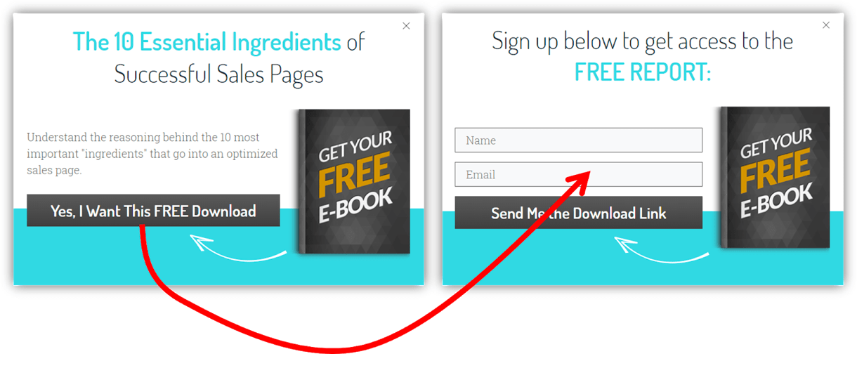
We are getting into the nitty-gritty here, but through testing, you may find that having a 2-step opt-in form provides better results than showing the form immediately.
A 2-step form is where the pop up appears with a simple button that offers the item. Once the button is pushed, instead of delivering the item, you actually reveal the signup form.
Some may think this is frustrating, but there is some psychology to support this method.
By clicking the button, the visitor has already made a micro-commitment to you, that they want the thing.
So when the form fields appear after the button click, your visitor may be more likely to fill it out since they have already made it that far.
Sneaky, but effective.
Test Idea #5: The right number of form fields
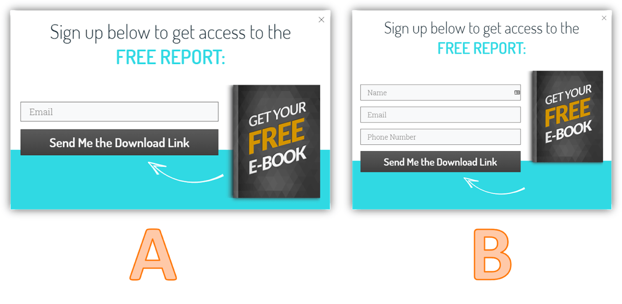
Personalizing your emails and segmenting your list is extremely valuable, but only if you are able to get people on your list in the first place! It’s a good idea to test the impact of additional form fields on your email opt-in rates.
For example, in version A above, we are only collecting email addresses, and in version B we also ask for a name and phone number. Maybe we should throw in their birthday and favorite flavor of ice cream too?
Depending on your business, you may NEED all that information to effectively operate - for example, if you plan to follow up via phone, it makes a lot of sense to capture all the info in version B.
But if you ultimately want to build an email relationship with the user, that information could cost you a large number of subscribers from ever entering your funnel.
Test Idea #6: Color and Design
This idea is towards the bottom of the list because in general I don’t find much benefit in changes to button color or text fonts.
But if you sometimes get stuck between putting a red or green button on your opt-in form, I officially give you permission to stop worrying about it and simply run an A/B test to decide once and for all.
A/B testing is also beneficial even if the results aren’t significant. I have had several strong beliefs and opinions shattered by testing.
For example, many gurus would tell me the exact font size and color of buttons to optimize conversions, and after I ran several iterations of A/B tests with other variations, I learned that… it really didn’t matter what I used.
So if you tend to get into arguments over these little details - feel free to settle them once and for all, and move on!
Test idea #7: Completely different offer

I’ve saved this test for the bottom because it requires the most work of all, but it’s also the most likely one to yield huge results.
Even with the best headline, opt-in type, and colors… if no one wants the thing you are offering, they won’t sign up!
So test out different offers! There are two great ways to do this:
The first way is to create some opt-ins like A above. This offers a single opt-in, so your readers know exactly what they are going to get. You can duplicate this form and change out the offer to something else - maybe an email challenge instead of an ebook.
The second way is to throw the whole kitchen sink at your reader by offering a multiple-choice pop-up. Got 3 different offers? Let them choose and download all from the same form!
This could be nice because your readers can self-identify and segment based on their actions (you can always link the different forms to different Mailerlite Groups).
But this could be overwhelming to your reader, and a confused reader doesn’t opt-in.
What’s a guy to do? By now you know the answer: A/B test them and let the data tell you what works best!
Other Useful Ways to A/B Test
We drilled deep into A/B testing your landing pages and forms in this article, but did you also know that it’s incredibly powerful to test:
Your Product Pricing to get more revenue per customer
Your Blog Post Headlines to get more traffic from Google (learn how to do it easily!)
Your Home Page Call To Action to get more subscribers
And so much more…
The basic way to think about it is:
If it is a valuable business asset that can directly impact your bottom line, you should be optimizing it!
It’s time to get geeky and become a conversion scientist!
Conclusion
Is your head spinning yet with the possibilities of how you can optimize your conversions to get more email subscribers with the same amount of traffic?
Great!
You are now armed with the skills to let your creativity unleash into a series of tests to improve your website conversion rates using the power of data!
Have you already tried A/B testing your landing pages? Tell us about your experience below!

John is a professional digital marketer who blogs at incomemesh.com. His former career as an engineer has helped him specialize in using data-driven methods to improve conversions and efficiencies of bloggers and online entrepreneurs.