Colors in marketing: How to choose the right ones for your brand
 Jonas, CMO, and Migle, product manager.
Colors aren’t just for aesthetics—they shape how people feel, recognize, and interact with your brand. Choose the right ones, and your marketing becomes more powerful. Here are 3 reasons why.
People associate colors with feelings. A brand that uses a natural green and brown palette gives off different vibes to one that uses bright neon.
Using colors consistently helps boost brand recognition. People will recognize your marketing when they see colors associated with your brand.
The colors you use impact how people interact with your messages. The right colors make blogs, ads and emails easy to read and interact with.
Every color choice matters. In this article, you’ll learn how to pick the perfect ones for your marketing and use them to their full potential.
What is the psychology of color?
Color psychology is the study of how colors influence human emotions and behavior. The idea is that certain colors naturally evoke specific emotions—blue is calming, red is energizing, and yellow is cheerful.
These associations come from a combination of cultural and biological factors. On the biological side, red has been found to increase the heart rate of people who see it, while blue has a relaxing effect.
Meanwhile, purple and gold have cultural associations with royalty, green with nature and prosperity, and yellow with excitement and creativity.
These cultural and biological factors impact how people respond to these colors.
Why color matters for your marketing
Since colors have different associations, the colors you use for your brand and marketing impact how people feel about your company and products. You need to choose the ones that fit your identity.
Imagine a high-end jewelry brand using neon pink—it would give off a more playful but less elegant vibe than if it used black or gold. Using pink may be ok if the brand is trying to position itself as fun, but using black or gold would be a safer bet.
Here’s what different colors mean
This section will explore the emotions people commonly associate with different colors. We’ve also highlighted some brands that use the color associations to their benefit.
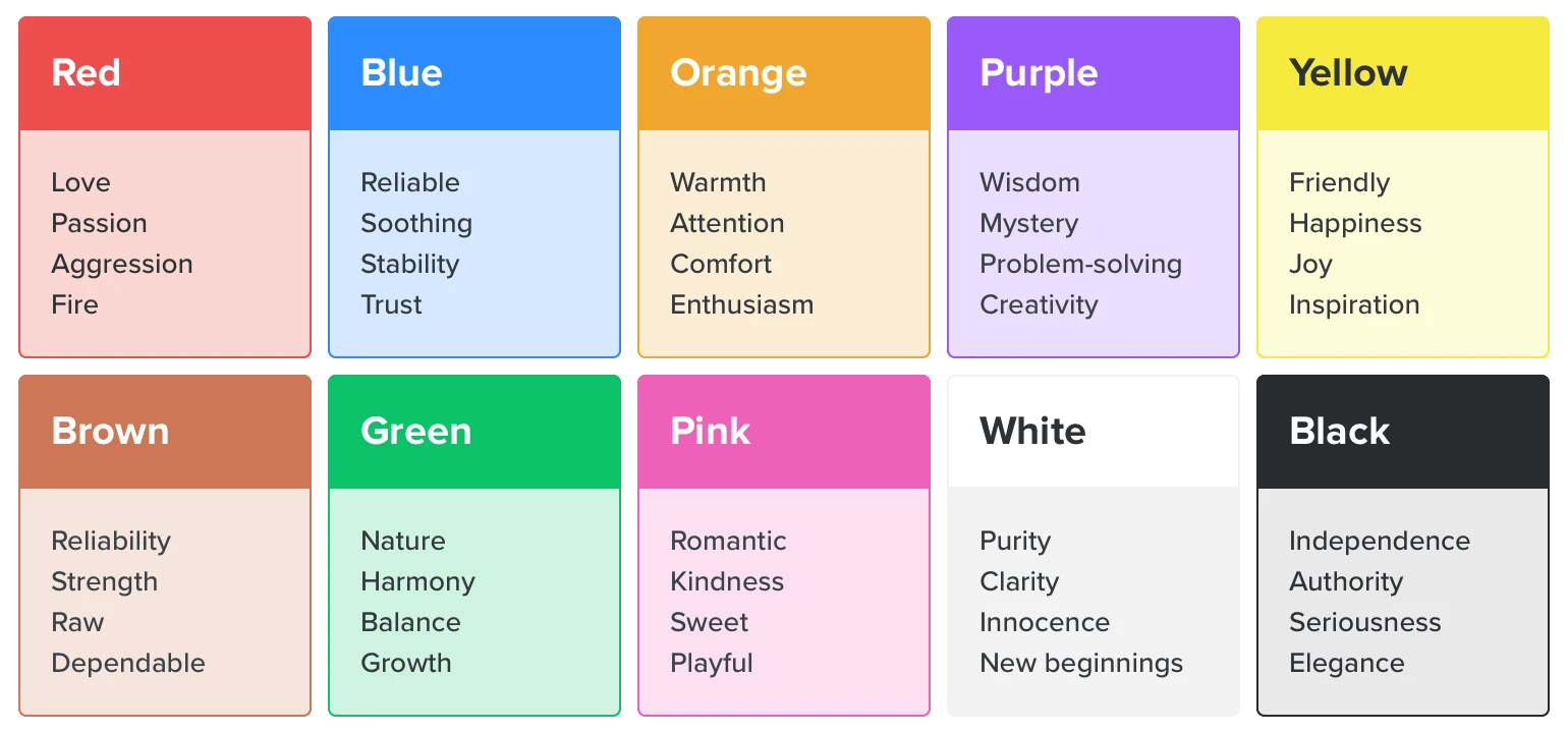
Red is passion and romance
Red is the color of passion, romance, and excitement. It’s a powerful color that studies have shown raises the heart rate of people who see it.
The red of Coca-Cola is arguably the most recognizable color of any brand. The shiny red can stands out on any shelf. Netflix, ESPN and Bugatti are other brands that use red to highlight their dynamic products.
Blue is reliable and soothing
Blue signifies reliability, security, trust and professionalism. It’s also a cool color that evokes a sense of peace and relaxation thanks to its resemblance to the ocean and sky.
Blue is used by many finance, transport and IT companies that want to come across as stable and trustworthy. The Bank of America, Ford, IBM, HP, PayPal and Boeing are all examples.
Orange is warm and energetic
Orange is the color of enthusiasm and energy. It evokes feelings of warmth, excitement and creativity. The color is a blend of red’s intensity and yellow’s cheerfulness, so it radiates confidence and encourages action.
Nickelodeon and Fanta use orange to create playful, energetic brand personalities. Their products feel vibrant, bold, and full of life. Harley Davidson leans on orange’s sense of adventure, while Dunkin’ Donuts appears warm and cheerful thanks to its orange logo.
Purple is luxurious and mystical
Purple evokes feelings of luxury, wisdom and imagination. The color is often associated with royalty and sophistication, but it also has a mystical quality that sparks curiosity and inspiration.
Cadbury and Hallmark use purple to convey elegance, creativity, and a touch of magic, making their products feel special. The Wimbledon tennis tournament hints at royal connections thanks to its purple logo.
Yellow is optimistic and warm
Yellow is the color of happiness and optimism. It evokes feelings of joy, warmth, and positivity. It’s also good at grabbing attention as it stands out against darker backgrounds. Yellow is also a color of creativity and can boost energy and inspire new ideas.
Who doesn’t feel happy and welcomed when they see the yellow of the McDonald’s arches? Meanwhile, the yellow logos of social apps Snapchat and Bumble make their tools feel warm, positive and optimistic.
Brown is reliable and earthy
Brown is the color of warmth and reliability. Its rich and earthy tones evoke feelings of comfort and stability while hinting at a deep connection to nature. Brown is a popular choice for brands that emphasize quality and tradition.
UGG uses brown to reflect the coziness of its boots and the natural materials they use. Hershey’s and Nescafe embrace the color to highlight the richness of coffee and chocolate, hint at the natural ingredients, and evoke the comforting feeling you get when you consume their products.
Green is natural and prosperous
Green is the color of nature and renewal. It evokes feelings of harmony, balance, and growth. The color is found in lush forests and thriving plants so is deeply connected to life and vitality. Green creates a sense of calm while also inspiring fresh starts and progress. It’s often associated with health, sustainability, and prosperity.
Whole Foods and Green Giant use green to emphasize their commitments to nature, health and the environment. Starbucks and accounting software QuickBooks use green to suggest prosperity.
Pink is playful and romantic
Pink is the color of romance and kindness. It evokes feelings of warmth, sweetness, and playfulness. It’s often associated with love and affection and has a soft, nurturing quality that feels inviting and comforting. Pink also has a fun, youthful energy.
Barbie uses pink to create a sense of playfulness, while Victoria’s Secret uses pink to hint at romance.
White is minimal and open
White is the color of purity and clarity. It evokes feelings of simplicity, innocence, and fresh starts. The color is often associated with cleanliness and minimalism, which creates a sense of openness and possibility. In color theory, white also symbolizes new beginnings, offering a blank slate for creativity and transformation.
Apple is well known for its use of white, which it uses to highlight the sense of creativity you get when using its products.
Black is sophisticated and elegant
Black is the color of independence and authority. It evokes feelings of power, seriousness and sophistication. The color is associated with strength and confidence, so it commands attention and control. Black is also a timeless symbol of elegance, making it a go-to choice for luxury brands.
Nike uses black to convey a bold and empowering brand message that enables anyone to feel like an athlete. Chanel and Dior portray the elegance of their brands with their black logos.
4 questions to choose the right colors for your brand
Now that you know what different colors mean, you can choose ones for your brand. Here are 4 questions to answer that will help you choose the right colors for your branding and marketing.
1. What is your brand identity?
Your brand colors should reflect your brand identity. Think about what you stand for and how you want to make people feel and then choose colors from the list above that align with that vision.
If you’re unsure about what your brand stands for, our article on creating a brand identity will help clarify your thoughts.
2. What will appeal to your target audience?
Colors don’t just represent your brand—they also need to connect with your audience.
A tech-savvy Gen Z crowd might respond well to bright, playful hues, while a luxury brand’s customers may expect sleek, muted tones. Understanding your audience ensures your colors resonate.
Remember that colors carry different meanings across cultures. Using the color red in China signifies wealth and luck, but in the Middle East its connotations are danger or evil.
If you plan to reach a global audience, choose colors that will be looked upon positively around the world.
3. What colors do competing brands use?
No brand exists in a vacuum. When choosing your colors, consider the other brands in your industry.
Imagine you want to create a new soda with a bright red can to show off how exciting your drink is. Even though red is associated with excitement, that won’t be the first thing people think of when they see a red can of soda. Instead, they’ll think of Coca-Cola.
This could be a good thing. People love Coca-Cola and you could pitch yourself as an alternative. But, it’s just as likely that people will consider your brand a copycat.
4. What are the buyer and industry expectations?
Choosing similar colors to your competitors can help you fit with industry expectations, giving you built-in brand trust. On the other hand, using different colors can help you stand out.
With this in mind, think of your customers’ expectations. Do people who buy a product like yours want to experiment with a new brand or feeling? Or do they want a reliable product they can trust?
Imagine an accountant pitching a CEO new finance software to use in the business. They’ll have a harder time being taken seriously if the tool uses playful, youthful colors than the dark, muted colors of established brands.
But, the same accountant might have more success getting their toddler to eat a healthy snack if it uses eye-catching colors that stand out from the other healthy foods on the shelf.
Best practices for using colors in your marketing
Now you’ve chosen your colors, it’s time to put them to use. Here is how to start using the colors you chose in your marketing.
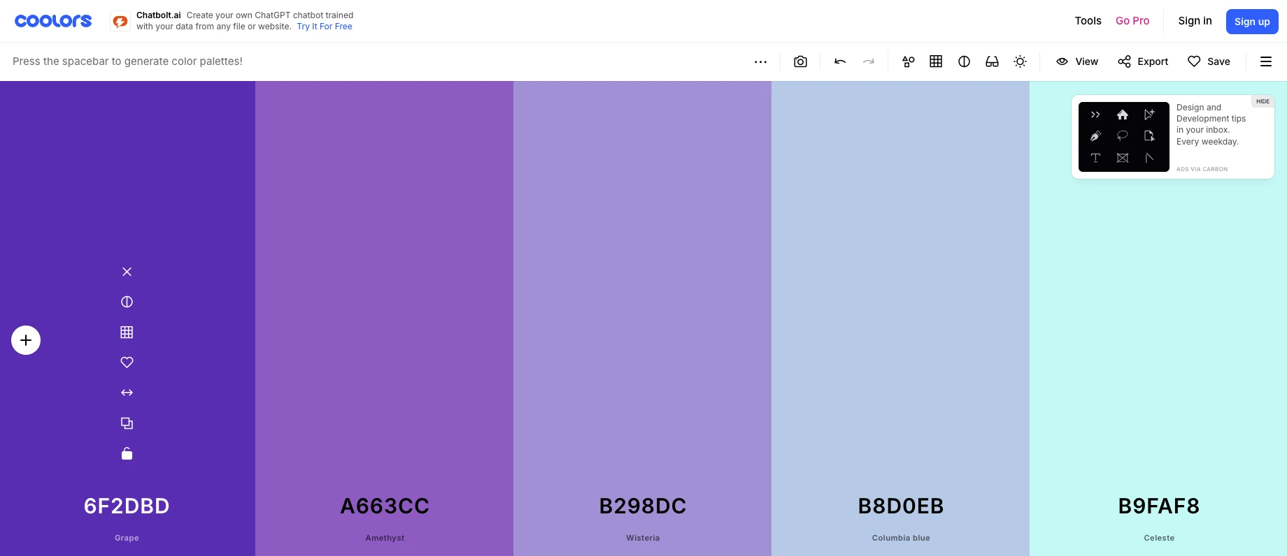
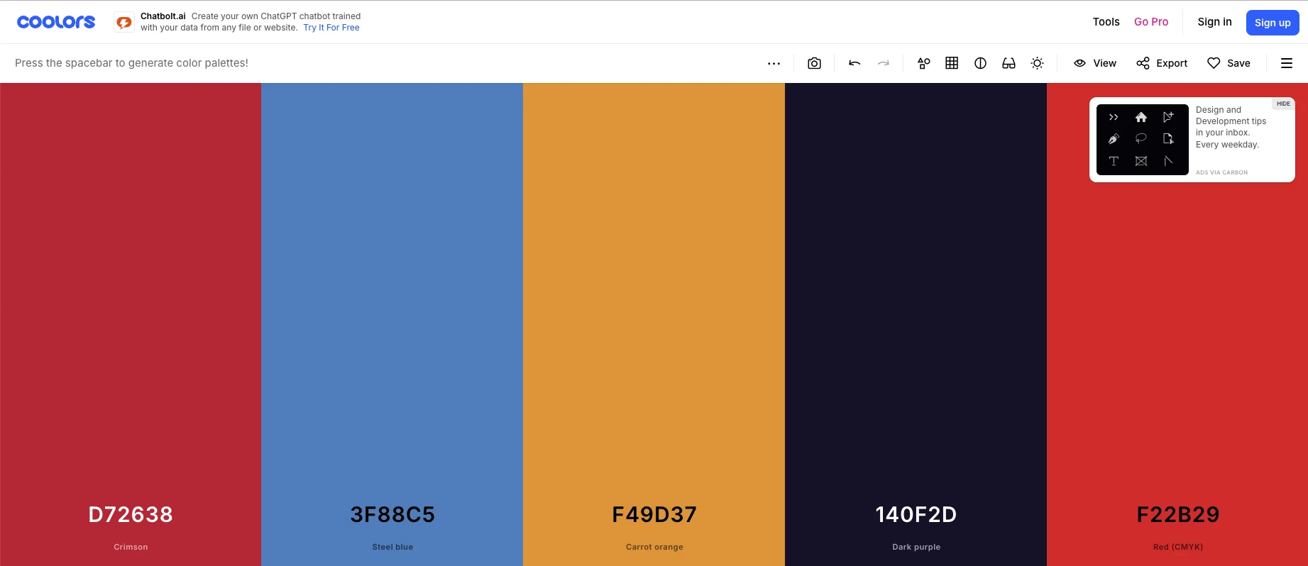
Build a complementary color palette
Once you’ve defined a color or color combination that you want to use, put these together into a color palette.
A color palette is a selection of several colors that work well together. Using these complementary colors makes it more likely that your designs will look professional.
You can use a tool like Coolors to create a color palette that works. You can choose one that uses different shades of similar colors, like in the image below.
Or you can choose a palette that uses different yet complementary colors, like in this image.
Bear in mind that even once you have your palette, you may still need to choose extra colors for web design elements like backgrounds, text and headings.
Decide where you’ll use each color
Now you need to decide where to use each color in your palette. Most brands will choose a primary color, a secondary color, and colors for highlights, text, and headings.
Consider the color you’ll use for elements like:
Your logo
Packaging
Website design
Email marketing
Social media posts
You can also consider the individual elements within each of these assets. For example, accent colors and colors for text, backgrounds and graphics.
Use colors consistently
By sticking to the same color palette in all your marketing and branding, you’ll make it easier for people to recognize your brand.
There may be some places where it helps to be more experimental and forgo safe branding in order to stand out. But, keeping a consistent design language across your assets will help your brand identity shine.
Consider how colors impact usability
While branding is important, you should also use colors to make your brand message clear in all assets.
Here are some factors to consider:
Use dark text on a light background to make text easy to read
Use a high-contrast color for buttons or calls to action you want people to click on
Avoid using too many bright or clashing colors to prevent visual overload and distraction
See the difference in readability between an email that uses colors well and one that doesn’t in the video below.
Following accessibility best practices is also important. Use the Web Accessibility in Mind color contrast checker to ensure that there’s enough contrast in your design elements to make them seen by everyone.
The right brand colors make a big impact, so choose wisely
The colors you choose can help your brand stand out and associate it with different feelings, so use color psychology to choose ones that fit your brand identity. Also, consider your industry and customer expectations.
You should then use these colors consistently across your branding and marketing materials to boost recognition and create a consistent brand image. Just be sure to use colors in a way that makes your marketing materials easy to read and interact with.
Editors note: This article was originally published in August 2019 but has been refreshed with up-to-date information.