How to create a responsive email template from scratch
 MailerLite team member Marta.
These days, it’s rare to come across an email not optimized for mobile. So when we do, it’s a bit of a jarring experience! Sideways scrolling, tiny links, and unreadable text: it’s not magic that prevents these things from happening, it’s responsive email design.
Every year, the number of smartphone users and the time we spend on our mobile devices go up (the average is 4 hours and 2 minutes per day in 2025!). We’re spending more time shopping, browsing and checking our inbox from the palm of our hand than anywhere else. The instinct might be to design newsletters for larger screens, but prioritizing mobile-responsive email templates is a must.
In this guide, we’ll dive deeper into what it means for an email to be responsive, why it’s important, and the steps and best practices you can follow to create stunning, responsive HTML email templates that work on all devices.
What is a responsive HTML email template?
A responsive HTML email template is an email template with an extra superpower that increases usability by making the content easily accessible and readable on all devices.
How does it do this?
With some magic snippets of code that make your template, quite literally, respond to the screen size it's being presented on, adjusting the layout and elements to make the email look good whether on a mobile, tablet, laptop or 32” monitor.
Why you *need* to optimize your emails for mobile
Responsive email development is a must. Here’s why:
Mobile devices are taking over: Research by Adestra found that 81% of emails are now read on mobile devices. So if your emails aren’t adapted to these screen sizes, you’re probably alienating a big chunk of your subscribers.
Unresponsive emails get less engagement: Unsurprisingly, Adestra also found that 52% of people are less likely to engage with an email due to a poor mobile experience.
Unresponsive emails get deleted, fast: Adestra also found that when people view an email on their smartphone that’s not displayed correctly, it takes only 3 seconds for them to decide to delete it. That’s basically an eye-blink or two—and if it happens a lot, they might also unsubscribe.
CTAs (Calls-to-action) and conversion optimization efforts will be lost: When you design an email template, you optimize the layout, content and CTAs to drive subscribers toward an action. That won’t mean much if your layout and CTAs are all mixed up and hard to view.
Step-by-step guide for creating a responsive HTML email template
I worked with MailerLite web developer and designer, Šarūnas, to put together these tips along with a recommended approach for building a responsive newsletter template that displays correctly on all devices. Let’s jump right in.
Step 1: Set up the basic HTML structure
Just like with any web development project, starting with a basic structure will give you a solid foundation to work from.
1.1 Add the HTML skeleton and DOCTYPE
Add the standard <html>, <head>, and <body> tags that you would for any HTML file.
<!DOCTYPE html>
<html lang="en">
	<head>
    	<meta charset="UTF-8">
    	<meta name="viewport" content="width=device-width, initial-scale=1.0">
    	<title>Your Email Title</title>
	</head>
	<body>
  <!-- Your email content will go here -->
	</body>
</html>
Most email clients strip out certain elements from the <head> section, meaning that meta tags are often unsupported. They are sometimes respected by specific email clients, like Apple Mail, and are harmless, so you can go ahead and add them in. Just don’t include any styling in the <head> section that your template relies on without also including a fallback.
1.2 Create a table-based layout
Modern CSS layout methods, like flexbox and grid, aren’t very well supported by email clients. So, to ensure the best compatibility across the most clients, it’s best to stick with tables to structure your email templates.
<table role="presentation" cellpadding="0" cellspacing="0" width="600" align="center" style="border-collapse: collapse; max-width: 600px; width: 100%;">
	<tr>
    	<td align="center" style="padding: 20px;">
            <!-- Email content goes here -->
        </td>
    </tr>
</table>
role="presentation" tells screen readers that the table is being used for layout purposes, and not to display data
Margin is unreliable in email clients, so set padding inside cells instead
border-collapse: collapse gives your email templates a cleaner, tighter layout by collapsing the borders of table cells into a single border
A width of 600-640px is standard
Step 2: Create your email template sections
Before you start with design elements, think about the sections you want your template to have. A basic HTML email template will consist of a header section, the main body content, and a footer, and each of these may contain multiple columns. Let’s add these in.
<table role="presentation" cellpadding="0" cellspacing="0" width="600" align="center" style="border-collapse: collapse; max-width: 600px; width: 100%;">
<tr>
<td align="center" style="padding: 20px;">
<!-- Main Container -->
<table width="600" cellpadding="0" cellspacing="0" border="0" style="background-color:#ffffff; margin: 0 auto; border-collapse: collapse;">
<!-- Header: Small Banner -->
<tr>
<td style="background-color:#222222; padding:10px; text-align:center; color:#ffffff; font-size:12px;">This is a small banner text</td>
</tr>
<!-- Header: Main Header Content -->
<tr>
<td style="padding:20px; text-align:center; font-family:sans-serif; font-size:24px; font-weight:bold; color:#333333;"> Welcome to Our Newsletter </td>
</tr>
<!-- Main Body Section -->
<tr>
<td style="padding:20px; font-family:sans-serif; color:#333333;">
<h1 style="margin:0; font-size:20px;">Main Heading</h1>
<img src="https://via.placeholder.com/560x200" width="100%" style="max-width:560px; height:auto; margin:20px 0;" alt="Main image">
<h2 style="font-size:16px; margin:0 0 10px 0;">Subheading goes here</h2>
<p style="font-size:14px; line-height:1.5; margin-bottom:20px;">This is some engaging copy that tells the reader what this section is about. Keep it short and sweet!</p>
<table cellpadding="0" cellspacing="0" border="0" align="center" style="margin: 0 auto;">
<tr>
<td align="center" bgcolor="#007BFF" style="border-radius:4px;">
<a href="#" style="display:inline-block; padding:10px 20px; font-family:sans-serif; font-size:14px; color:#ffffff; text-decoration:none;">Call to Action</a>
</td>
</tr>
</table>
</td>
</tr>
<!-- Additional Content Section -->
<tr>
<td style="padding:20px; font-family:sans-serif; color:#333333;">
<h2 style="font-size:18px; margin-bottom:10px;">More to Explore</h2>
<ul style="padding-left:20px; font-size:14px;">
<li>
<a href="#" style="color:#007BFF; text-decoration:none;">Link 1</a>
</li>
<li>
<a href="#" style="color:#007BFF; text-decoration:none;">Link 2</a>
</li>
<li>
<a href="#" style="color:#007BFF; text-decoration:none;">Link 3</a>
</li>
</ul>
<img src="https://via.placeholder.com/560x150" width="100%" style="max-width:560px; height:auto; margin:20px 0;" alt="Additional image">
<p style="font-size:14px; line-height:1.5;">Here's some additional information or content that could be helpful or promotional.</p>
</td>
</tr>
<!-- Footer Section -->
<tr>
<td style="padding:20px; background-color:#f0f0f0;">
<table width="100%" cellpadding="0" cellspacing="0" border="0">
<tr>
<!-- Social Icons -->
<td align="left" style="font-family:sans-serif; font-size:12px;">
<a href="#">
<img src="https://via.placeholder.com/24" alt="FB" style="margin-right:10px;">
</a>
<a href="#">
<img src="https://via.placeholder.com/24" alt="TW" style="margin-right:10px;">
</a>
<a href="#">
<img src="https://via.placeholder.com/24" alt="IG">
</a>
</td>
<!-- Unsubscribe -->
<td align="right" style="font-family:sans-serif; font-size:12px;">
<a href="#" style="color:#999999; text-decoration:underline;">Unsubscribe</a>
</td>
</tr>
</table>
</td>
</tr>
</table>
<!-- End Main Container -->
</td>
</tr>
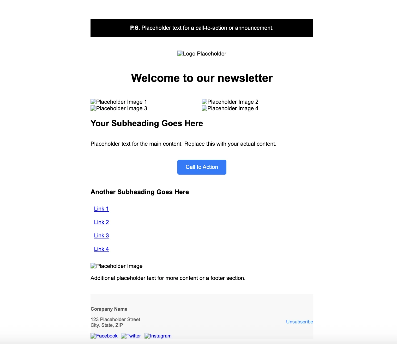
</table>We’ve added more tables, rows, and cells to form the structure of each element section. There’s a header section with two rows: one for a small banner at the top of the email and one for the logo; a main body section for our hero content and CTA; an additional content section; and a footer section containing social links and an unsubscribe link.
We’ve also added some basic inline styling and content to make it easier to see the different sections at this point. This is what we’ve got:
Step 3: Time to style the email template
You’ve probably noticed that, when it comes to email template design, you have to throw some typical web design best practices out the window. How you use CSS is one of them. Since email clients block external stylesheets, you need to use a combination of embedded CSS and inline CSS to style your elements.
Inline CSS is the most reliable and works with even the most picky email clients. Embedded CSS—not so much. But this is where we can apply the media queries that will make our HTML template responsive, since they can’t be added inline.
So let’s add some inline styles to make our template a bit more appealing!
MailerLite's HTML email template editor makes adding inline styles less of a chore by adding them in automatically.
To our <body>, we’ll add the background color and define the margins and padding as 0 so they extend to the edge of the screen.
<body style="margin: 0 !important; padding: 0 !important; background-color:#DFB8B8;">We’ve also added a <div> as a container for our table and set the background color, line height, and font size.
<div style="background-color:#DFB8B8; line-height: 100%; font-size:medium; font-size:max(16px, 1rem);">And we’ve added styles throughout our table to set the width, font, colors, positioning, and other styles. Here’s an example.
<td style="padding: 0 50px;">
	<h2 style="font-family: 'Playfair Display', serif; color: #385A4F; font-size: 42px; line-height: 125%; font-weight: normal; font-style: normal; text-decoration: none; margin-bottom: 0;">See what else we've got...</h2>
</td>
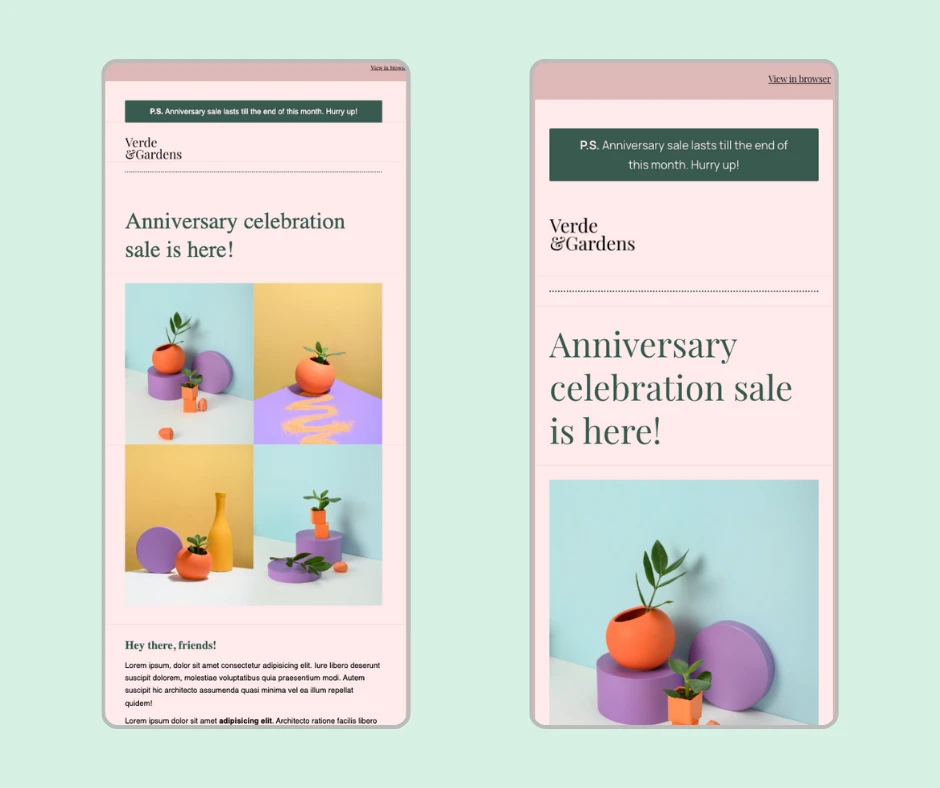
We’ve styled our whole HTML email template with inline CSS and added some content and images. The design is based on one of the templates you can find in MailerLite. This is the result:

It’s looking pretty good! But here’s what happens when you resize it.
-(3).gif)
The width of all content adjusts (up to a point) but this just resizes all of the elements, making them smaller so they fit. This won’t really work for smaller screens, like smartphone screens, because the text and buttons become too small to read or interact with. So let’s make it responsive!
Step 4: Make your email template responsive
To make our HTML email template’s layout responsive, we’re going to add some embedded styles, media queries, and additional meta tags. Let’s start from the top: the additional meta tags.
Meta tags
<meta charset="utf-8">
<meta http-equiv="X-UA-Compatible" content="IE=edge">
<meta name="viewport" content="width=device-width, initial-scale=1, user-scalable=yes">
<meta name="format-detection" content="telephone=no, date=no, address=no, email=no, url=no">
<meta name="x-apple-disable-message-reformatting">
<meta http-equiv="X-UA-Compatible" content="IE=edge">: Makes sure the email layout and styles are rendered properly on legacy Internet Explorer versions and Outlook
<meta name="viewport" content="width=device-width, initial-scale=1, user-scalable=yes">: Controls how the layout scales on mobile devices. We’ve added user-scalable=yes so that users can pinch zoom
<meta name="format-detection" content="telephone=no, date=no, address=no, email=no, url=no">: Helps to keep your design consistent in mobile email clients (particularly iOS mail) by telling them not to auto-link phone numbers, dates, addresses, emails, and URLs
<meta name="x-apple-disable-message-reformatting">: Preserves the original formatting by preventing Apple Mail from automatically adjusting the layout
Conditional comments
<!--[if !mso]>
<meta http-equiv="X-UA-Compatible" content="IE=edge">
	<![endif]-->
<!--[if mso]>
	<style>
        * { font-family: sans-serif !important; }
    </style>
	<noscript>
		<xml>
			<o:OfficeDocumentSettings>
				<o:PixelsPerInch>96</o:PixelsPerInch>
			</o:OfficeDocumentSettings>
		</xml>
	</noscript>
<![endif]-->
Since Microsoft Outlook is the client that most often causes issues with rendering, you can use conditional comments to target or exclude it and address potential issues. Here’s a breakdown of what we’re doing here:
<!--[if !mso]> <meta http-equiv="X-UA-Compatible" content="IE=edge">: Sets Internet Explorer to use the latest rendering engine on non-Outlook clients
<!--[if mso]> <style> * { font-family: sans-serif !important; } </style>: Forces Microsoft Outlook to use the specified font family (Outlook struggles with custom fonts)
<noscript> <xml> <o:OfficeDocumentSettings> <o:PixelsPerInch>96</o:PixelsPerInch> </o:OfficeDocumentSettings> </xml> </noscript>: Sets an Office-specific XML block to ensure that Outlook renders at the standard 96 pixels per inch (PPI). Without this, it might render at 120 PPI, which can distort the layout.
Embedded CSS
Remember when we said you should stick to inline CSS for your emails? Well, that was kind of true. Having the main visual design elements defined inline will ensure a consistent look across all email clients, even when they strip out embedded CSS. But it’s still a good idea to include embedded CSS because it is supported by some clients (like Apple Mail, Gmail for web, and Outlook for Mac). Essentially, it helps ensure your email template is optimized no matter the client it renders in!
<style type="text/css">
      /* RESET STYLES */
      html,
      body {
        margin: 0 !important;
        padding: 0 !important;
        width: 100% !important;
        height: 100% !important;
      }

      body {
        -webkit-font-smoothing: antialiased;
        -moz-osx-font-smoothing: grayscale;
        text-rendering: optimizeLegibility;
      }

      img {
        border: 0;
        outline: none;
        text-decoration: none;
        -ms-interpolation-mode: bicubic;
      }

      table {
        border-collapse: collapse;
      }

      table,
      td {
        mso-table-lspace: 0pt;
        mso-table-rspace: 0pt;
      }

      body,
      table,
      td,
      a {
        -webkit-text-size-adjust: 100%;
        -ms-text-size-adjust: 100%;
      }

      h1,
      h2,
      h3,
      h4,
      h5,
      p {
        margin: 0;
        word-break: break-word;
      }
In this snippet from our embedded CSS, we’re setting the styles for the html, body, img, table, td, heading, and p tags, using !important; where needed to override any conflicting rules. We’ve also included some additional rules to help make our email responsive across devices and clients.
-webkit-font-smoothing: antialiased;: Makes fonts look thinner, smoother and more refined in WebKit browsers by using grayscale antialiasing
-moz-osx-font-smoothing: grayscale;: Does the same thing but for Firefox on macOS
text-rendering: optimizeLegibility;: Improves readability by telling the browser to use advanced font features
-ms-interpolation-mode: bicubic;: Improves the quality of resized images in Internet Explorer by telling it to use bicubic interpolation
mso-table-lspace: 0pt; and mso-table-rspace: 0pt;: Microsoft Office properties that control how tables are rendered in Outlook by removing default left and right spacing
-webkit-text-size-adjust: 100%;: Controls how text scales on mobiles in WebKit browsers by preventing it from automatically resizing
-ms-text-size-adjust: 100%;: Does the same but for Internet Explorer and older Windows Phone browsers
word-break: break-word;: Forces long, unspaced strings of characters to break and wrap onto the next line to help prevent your layout from breaking
Device-specific rules
You can also add some email-specific fixes for iOS Mail and Gmail on Android:
/* iOS BLUE LINKS */
      a[x-apple-data-detectors] {
        color: inherit !important;
        text-decoration: none !important;
        font-size: inherit !important;
        font-family: inherit !important;
        font-weight: inherit !important;
        line-height: inherit !important;
      }

/* ANDROID CENTER FIX */
      div[style*="margin: 16px 0;"] {
        margin: 0 !important;
      }
iOS BLUE LINKS: Like the meta tag <meta name="format-detection" content="telephone=no, date=no, address=no, email=no, url=no"> that we added before, this stops iOS Mail from autostyling certain types of data, like phones numbers and addresses. Instead of automatically turning them blue, x-apple-data-detectors forces them to respect the styles you’ve defined
ANDROID CENTER FIX: Overwrites a default margin that Gmail adds in mobile views to keep the layout and centering consistent
Media queries
Media queries are the main method for making email templates responsive. Just like with other web projects, we’re going to use them to adjust the layout and styling based on the screen size.
/* MEDIA QUERIES */
      @media all and (max-width:639px) {
        .wrapper {
          width: 100% !important;
        }

        .container {
          width: 100% !important;
          min-width: 100% !important;
          padding: 0 !important;
        }

        .row {
          padding-left: 20px !important;
          padding-right: 20px !important;
        }

        .col-mobile {
          width: 20px !important;
        }

        .table-between-col-mobile {
          width: 100% !important;
        }

        .col {
          display: block !important;
          width: 100% !important;
        }

        .col-feature {
          display: block !important;
          width: 100% !important;
        }

        .mobile-center {
          text-align: center !important;
          float: none !important;
        }

        .mobile-mx-auto {
          margin: 0 auto !important;
          float: none !important;
        }

        .mobile-left {
          text-align: center !important;
          float: left !important;
        }

        .mobile-hide {
          display: none !important;
        }

        .img {
          width: 100% !important;
          height: auto !important;
        }

        *[class="mobileOff"] {
          width: 0px !important;
          display: none !important;
        }

        *[class*="mobileOn"] {
          display: block !important;
          max-height: none !important;
        }

      @media screen and (max-width: 600px) {
        .col-feature {
          margin-bottom: 30px;
        }
      }

        /* TARGET OUTLOOK.COM */
        [class="x_non-webkit"] {
          display: block !important;
        }
      }

      @media screen and (-webkit-min-device-pixel-ratio: 0) {
        [class="x_webkit"] {
          display: none !important;
        }
      }
    </style>

    <style type="text/css">
      @import url("https://assets.mlcdn.com/fonts-v2.css?version=1745332");
    </style>
    <style type="text/css">
      @media screen {
        body {
          font-family: 'Inter', sans-serif;
        }
      }
    </style>
@media all and (max-width:639px) and @media screen and (max-width: 600px): Apply to screens with a width of 639px or less and 600px or less. Within these, we’ve defined the classes and rules that should be applied for these screen sizes
width: 100% !important;: Ensures that the width of the content or container takes up the full width of the mobile device, instead of using the 640px width defined in the HTML for larger screens
Using percentages instead of fixed widths allows you to create a fluid layout. It’s a more efficient way to make email templates responsive that requires the use of less media queries for tons of device sizes.
.mobile-hide {display: none !important;}: Hides elements belonging to this class on mobile devices. This can be used to remove non-essential elements so they don’t take up space
[class="mobileOff"] and [class*="mobileOn"]: Hides or forces elements to be visible on mobile. You can use this to show specific content on mobile and alternative content on larger screens, for example, optimized images.
[class="x_non-webkit"] {display: block !important;}”: Forces elements with the x_non-webkit class to display as block elements in non-WebKit clients like Outlook
@media screen and (-webkit-min-device-pixel-ratio: 0) { [class="x_webkit"] { display: none !important; }}: Hides elements with the x_webkit class in WebKit clients, like Apple Mail. You can use these together to show and hide fallback content to different email clients
@media screen {body {font-family: 'Inter', sans-serif;}}: We’re importing fonts from a URL but since some email clients might not support custom fonts, we’ve also set a fallback for screen devices that sets the font as well
Here’s a before and after of our email template:
And here's the full code example:
<!doctype html>
<html lang dir="ltr" xmlns:v="urn:schemas-microsoft-com:vml" xmlns:o="urn:schemas-microsoft-com:office:office">
<head>
<meta charset="utf-8">
<meta http-equiv="X-UA-Compatible" content="IE=edge">
<meta name="viewport" content="width=device-width, initial-scale=1, user-scalable=yes">
<meta name="format-detection" content="telephone=no, date=no, address=no, email=no, url=no">
<meta name="x-apple-disable-message-reformatting">
<!--[if !mso]>
<meta http-equiv="X-UA-Compatible" content="IE=edge">
<![endif]-->
<!--[if mso]>
<style>
* { font-family: sans-serif !important; }
</style>
<noscript>
<xml>
<o:OfficeDocumentSettings>
<o:PixelsPerInch>96</o:PixelsPerInch>
</o:OfficeDocumentSettings>
</xml>
</noscript>
<![endif]-->
<style type="text/css">
/* Outlines the grids, remove when sending */
/*table td { border: 1px solid cyan; }*/
/* RESET STYLES */
html,
body {
margin: 0 !important;
padding: 0 !important;
width: 100% !important;
height: 100% !important;
}
body {
-webkit-font-smoothing: antialiased;
-moz-osx-font-smoothing: grayscale;
text-rendering: optimizeLegibility;
}
.document {
margin: 0 !important;
padding: 0 !important;
width: 100% !important;
}
img {
border: 0;
outline: none;
text-decoration: none;
-ms-interpolation-mode: bicubic;
}
table {
border-collapse: collapse;
}
table,
td {
mso-table-lspace: 0pt;
mso-table-rspace: 0pt;
}
body,
table,
td,
a {
-webkit-text-size-adjust: 100%;
-ms-text-size-adjust: 100%;
}
h1,
h2,
h3,
h4,
h5,
p {
margin: 0;
word-break: break-word;
}
/* iOS BLUE LINKS */
a[x-apple-data-detectors] {
color: inherit !important;
text-decoration: none !important;
font-size: inherit !important;
font-family: inherit !important;
font-weight: inherit !important;
line-height: inherit !important;
}
/* ANDROID CENTER FIX */
div[style*="margin: 16px 0;"] {
margin: 0 !important;
}
/* MEDIA QUERIES */
@media all and (max-width:639px) {
.wrapper {
width: 100% !important;
}
.container {
width: 100% !important;
min-width: 100% !important;
padding: 0 !important;
}
.row {
padding-left: 20px !important;
padding-right: 20px !important;
}
.col-mobile {
width: 20px !important;
}
.table-between-col-mobile {
width: 100% !important;
}
.col {
display: block !important;
width: 100% !important;
}
.col-feature {
display: block !important;
width: 100% !important;
}
.mobile-center {
text-align: center !important;
float: none !important;
}
.mobile-mx-auto {
margin: 0 auto !important;
float: none !important;
}
.mobile-left {
text-align: center !important;
float: left !important;
}
.mobile-hide {
display: none !important;
}
.img {
width: 100% !important;
height: auto !important;
}
.ml-btn {
width: 100% !important;
max-width: 100% !important;
}
.ml-btn-container {
width: 100% !important;
max-width: 100% !important;
}
*[class="mobileOff"] {
width: 0px !important;
display: none !important;
}
*[class*="mobileOn"] {
display: block !important;
max-height: none !important;
}
.mlContentTable {
width: 100% !important;
min-width: 10% !important;
margin: 0 !important;
float: none !important;
}
.mlContentButton a {
display: block !important;
width: auto !important;
}
.mlContentOuter {
padding-bottom: 0px !important;
padding-left: 15px !important;
padding-right: 15px !important;
padding-top: 0px !important;
}
.mlContentSurvey {
float: none !important;
margin-bottom: 10px !important;
width: 100% !important;
}
.multiple-choice-item-table {
width: 100% !important;
min-width: 10% !important;
float: none !important;
}
.ml-default,
.ml-card,
.ml-fullwidth {
width: 100%;
min-width: 100%;
}
}
@media screen and (max-width: 600px) {
.col-feature {
margin-bottom: 30px;
}
}
/* Carousel style */
@media screen and (-webkit-min-device-pixel-ratio: 0) {
.webkit {
display: block !important;
}
}
@media screen and (-webkit-min-device-pixel-ratio: 0) {
.non-webkit {
display: none !important;
}
}
@media screen and (-webkit-min-device-pixel-ratio: 0) {
/* TARGET OUTLOOK.COM */
[class="x_non-webkit"] {
display: block !important;
}
}
@media screen and (-webkit-min-device-pixel-ratio: 0) {
[class="x_webkit"] {
display: none !important;
}
}
</style>
<style type="text/css">
@import url("https://assets.mlcdn.com/fonts-v2.css?version=1745332");
</style>
<style type="text/css">
@media screen {
body {
font-family: 'Inter', sans-serif;
}
}
</style>
<meta name="robots" content="noindex, nofollow">
<title>test</title>
<meta name="image" content="https://storage.mlcdn.com/account_image/189/lwW94yzkabrt23BSl99bQDfL6uEJiLpJFikf2ZJD.png" property="og:image">
</head>
<body style="margin: 0 !important; padding: 0 !important; background-color:#DFB8B8;">
<div class="document" role="article" aria-roledescription="email" aria-label lang dir="ltr" style="background-color:#DFB8B8; line-height: 100%; font-size:medium; font-size:max(16px, 1rem);">
<!--[if gte mso 9]>
<v:background
xmlns:v="urn:schemas-microsoft-com:vml" fill="t" if="variable.bodyBackgroundImage.value">
<v:fill type="tile" src="" color="#DFB8B8"/>
</v:background>
<![endif]-->
<table width="100%" align="center" cellspacing="0" cellpadding="0" border="0">
<tr>
<td class background bgcolor="#DFB8B8" align="center" valign="top" style="padding: 0 8px;">
<table class="container" align="center" width="640" cellpadding="0" cellspacing="0" border="0" style="max-width: 640px;">
<tr>
<td align="center">
<table align="center" width="100%" cellpadding="0" cellspacing="0" border="0">
<tr>
<td colspan="2" height="20" style="line-height: 20px"></td>
</tr>
<tr>
<td style="font-family: 'Playfair Display', serif; font-size:0px;color:#DFB8B8;line-height:0px;max-height:0px;max-width:0px;opacity:0;overflow:hidden;mso-hide:all;">
<div style="display:none;font-size:0px;color:#DFB8B8;line-height:0px;max-height:0px;max-width:0px;opacity:0;overflow:hidden;mso-hide:all;"> test </div>
</td>
<td align="right" style="font-family: 'Playfair Display', serif; color: #111111; font-size: 12px; line-height: 18px;">
<a style="color: #111111; font-weight: normal; font-style: normal; text-decoration: underline;" href>View in browser</a>
</td>
</tr>
<tr>
<td colspan="2" height="20" style="line-height: 20px;"></td>
</tr>
</table>
</td>
</tr>
</table>
<table width="640" class="wrapper" align="center" border="0" cellpadding="0" cellspacing="0" style="
max-width: 640px;
border-radius:2px; border-collapse: separate!important; overflow: hidden;
">
<tr>
<td align="center">
<!-- -->
<table class="ml-default" width="100%" bgcolor border="0" cellspacing="0" cellpadding="0">
<tr>
<td style>
<table class="container ml-4 ml-default-border" width="640" bgcolor="#FFEBEB" align="center" border="0" cellspacing="0" cellpadding="0" style="color: #FFEBEB; width: 640px; min-width: 640px;">
<tr>
<td class="ml-default-border container" height="40" style="line-height: 40px; min-width: 640px;"></td>
</tr>
<tr>
<td class="row" style="padding: 0 50px;">
<table width="100%" border="0" cellspacing="0" cellpadding="0" style="border-collapse: separate!important; border-radius: 2px;">
<tr>
<td class="row" valign="middle" bgcolor="#385A4F" style="padding: 10px 30px; border: 0px solid #dceded; border-radius: 2px;">
<p style="font-family: 'Manrope', sans-serif; color: #FFEBEB; font-size: 16px; line-height: 165%; margin-top: 0; margin-bottom: 0; text-align: center;">
<strong>P.S.</strong> Lorem ipsum, dolor sit amet consectetur adipisicing elit!
</p>
</td>
</tr>
</table>
</td>
</tr>
<tr>
<td height="20" style="line-height: 20px;"></td>
</tr>
</table>
</td>
</tr>
</table>
<!-- -->
<!-- -->
<table class="ml-default" width="100%" bgcolor border="0" cellspacing="0" cellpadding="0">
<tr>
<td style>
<table class="container ml-6 ml-default-border" width="640" bgcolor="#FFEBEB" align="center" border="0" cellspacing="0" cellpadding="0" style="
width: 640px; min-width: 640px;
;
">
<tr>
<td class="ml-default-border container" height="30" style="line-height: 30px; min-width: 640px;"></td>
</tr>
<tr>
<td>
<table align="center" width="100%" border="0" cellspacing="0" cellpadding="0">
<tr>
<td class="row" align="left" style="padding: 0 50px;">
<img src="https://storage.mlcdn.com/account_image/189/lwW94yzkabrt23BSl99bQDfL6uEJiLpJFikf2ZJD.png" border="0" alt width="119.60000000000001" class="logo" style="max-width: 119.60000000000001px; display: inline-block;">
</td>
</tr>
</table>
</td>
</tr>
<tr>
<td height="30" style="line-height: 30px;"></td>
</tr>
</table>
</td>
</tr>
</table>
<!-- -->
<!-- -->
<table class="ml-default" width="100%" bgcolor border="0" cellspacing="0" cellpadding="0">
<tr>
<td style>
<table class="container ml-8 ml-default-border" width="640" bgcolor="#FFEBEB" align="center" border="0" cellspacing="0" cellpadding="0" style="
width: 640px; min-width: 640px;
;
">
<tr>
<td class="ml-default-border container" height="20" style="line-height: 20px; min-width: 640px;"></td>
</tr>
<tr>
<td>
<table width="100%" border="0" cellspacing="0" cellpadding="0">
<tr>
<td class="row" style="padding: 0 50px;" align="center">
<table role="presentation" cellpadding="0" cellspacing="0" border="0" align="center" width="100%">
<tr>
<td style="border-top: 2px dotted #385A4F;"></td>
</tr>
</table>
</td>
</tr>
</table>
</td>
</tr>
<tr>
<td height="20" style="line-height: 20px;"></td>
</tr>
</table>
</td>
</tr>
</table>
<!-- -->
<!-- -->
<table class="ml-default" width="100%" bgcolor border="0" cellspacing="0" cellpadding="0">
<tr>
<td style>
<table class="container ml-10 ml-default-border" width="640" bgcolor="#FFEBEB" align="center" border="0" cellspacing="0" cellpadding="0" style="color: #000000; width: 640px; min-width: 640px;">
<tr>
<td class="ml-default-border container" height="20" style="line-height: 20px; min-width: 640px;"></td>
</tr>
<tr>
<td class="row" style="padding: 0 50px;">
<h1 style="font-family: 'Playfair Display', serif; color: #385A4F; font-size: 48px; line-height: 125%; font-weight: normal; font-style: normal; text-decoration: none; ;margin-bottom: 10px; margin-bottom: 0;">Lorem ipsum dolor sit amet!</h1>
</td>
</tr>
<tr>
<td height="20" style="line-height: 20px;"></td>
</tr>
</table>
</td>
</tr>
</table>
<!-- -->
<!-- -->
<table class="ml-default" width="100%" bgcolor border="0" cellspacing="0" cellpadding="0">
<tr>
<td style>
<table class="container ml-12 ml-default-border" width="640" bgcolor="#FFEBEB" align="center" border="0" cellspacing="0" cellpadding="0" style="
width: 640px; min-width: 640px;
;
">
<tr>
<td class="ml-default-border container" height="20" style="line-height: 20px; min-width: 640px;"></td>
</tr>
<tr>
<td>
<table width="100%" border="0" cellspacing="0" cellpadding="0">
<tr>
<td class="row" align="center" valign="top" style="padding: 0 50px;">
<table width="100%" border="0" cellspacing="0" cellpadding="0">
<tr>
<td class="col" align="center" valign="top" style="line-height: 0;" width="270">
<a href target="_self" style="text-decoration: none;">
<img src="https://placeholder.pics/svg/270" class="img" width="270" style="display: block;" border="0">
</a>
</td>
<td class="col" width="0" height="0" style="line-height: 0px;"></td>
<td class="col" align="center" valign="top" style="line-height: 0;" width="270">
<a href target="_self" style="text-decoration: none;">
<img src="https://placeholder.pics/svg/270" class="img" width="270" style="display: block;" border="0">
</a>
</td>
</tr>
</table>
</td>
</tr>
</table>
</td>
</tr>
</table>
</td>
</tr>
</table>
<!-- -->
<!-- -->
<table class="ml-default" width="100%" bgcolor border="0" cellspacing="0" cellpadding="0">
<tr>
<td style>
<table class="container ml-14 ml-default-border" width="640" bgcolor="#FFEBEB" align="center" border="0" cellspacing="0" cellpadding="0" style="
width: 640px; min-width: 640px;
;
">
<tr>
<td>
<table width="100%" border="0" cellspacing="0" cellpadding="0">
<tr>
<td class="row" align="center" valign="top" style="padding: 0 50px;">
<table width="100%" border="0" cellspacing="0" cellpadding="0">
<tr>
<td class="col" align="center" valign="top" style="line-height: 0;" width="270">
<a href target="_self" style="text-decoration: none;">
<img src="https://placeholder.pics/svg/270" class="img" width="270" style="display: block;" border="0">
</a>
</td>
<td class="col" width="0" height="0" style="line-height: 0px;"></td>
<td class="col" align="center" valign="top" style="line-height: 0;" width="270">
<a href target="_self" style="text-decoration: none;">
<img src="https://placeholder.pics/svg/270" class="img" width="270" style="display: block;" border="0">
</a>
</td>
</tr>
</table>
</td>
</tr>
</table>
</td>
</tr>
<tr>
<td height="40" style="line-height: 40px;"></td>
</tr>
</table>
</td>
</tr>
</table>
<!-- -->
<!-- -->
<table class="ml-default" width="100%" bgcolor border="0" cellspacing="0" cellpadding="0">
<tr>
<td style>
<table class="container ml-16 ml-default-border" width="640" bgcolor="#FFEBEB" align="center" border="0" cellspacing="0" cellpadding="0" style="color: #000000; width: 640px; min-width: 640px;">
<tr>
<td class="row" style="padding: 0 50px;">
<h3 style="font-family: 'Playfair Display', serif; color: #385A4F; font-size: 24px; line-height: 165%; font-weight: bold; font-style: normal; text-decoration: none; ;margin-bottom: 8px;">Nihil culpa error ipsam! <br>
</h3>
<p style="font-family: 'Manrope', sans-serif; color: #000000; font-size: 16px; line-height: 165%; margin-top: 0; margin-bottom: 10px;">Lorem ipsum dolor sit amet consectetur, adipisicing elit. A ratione exercitationem dolor magnam, id nulla aliquid ipsam minima harum, veritatis blanditiis illo temporibus impedit? Animi quaerat minus cum sapiente eligendi.</p>
<p style="font-family: 'Manrope', sans-serif; color: #000000; font-size: 16px; line-height: 165%; margin-top: 0; margin-bottom: 0;">Lorem, ipsum dolor sit amet consectetur adipisicing elit. Eum eaque nemo, omnis repellendus quae, soluta sunt, molestiae distinctio facere eveniet necessitatibus neque cum! Cupiditate rem magni hic rerum esse nobis.</p>
</td>
</tr>
<tr>
<td height="10" style="line-height: 10px;"></td>
</tr>
</table>
</td>
</tr>
</table>
<!-- -->
<!-- -->
<table class="ml-default" width="100%" bgcolor border="0" cellspacing="0" cellpadding="0">
<tr>
<td style>
<table class="container ml-18 ml-default-border" width="640" bgcolor="#FFEBEB" align="center" border="0" cellspacing="0" cellpadding="0" style="
width: 640px; min-width: 640px;
;
">
<tr>
<td class="ml-default-border container" height="20" style="line-height: 20px; min-width: 640px;"></td>
</tr>
<tr>
<td class="row" style="padding: 0 50px;">
<table width="100%" border="0" cellspacing="0" cellpadding="0">
<tr>
<td class="col" width="250" valign="top">
<div class="ml-19" style="text-align:full;"></div>
</td>
<td class="col" width="40" height="20" style="line-height: 20px;"></td>
<td class="col" width="250" valign="top">
<div class="ml-20" style="text-align:full;"></div>
</td>
</tr>
</table>
</td>
</tr>
<tr>
<td height="20" style="line-height: 20px;"></td>
</tr>
</table>
</td>
</tr>
</table>
<!-- -->
<!-- -->
<table class="ml-default" width="100%" bgcolor border="0" cellspacing="0" cellpadding="0">
<tr>
<td style>
<table class="container ml-22 ml-default-border" width="640" bgcolor="#FFEBEB" align="center" border="0" cellspacing="0" cellpadding="0" style="
width: 640px; min-width: 640px;
;
">
<tr>
<td class="ml-default-border container" height="40" style="line-height: 40px; min-width: 640px;"></td>
</tr>
<tr>
<td>
<table width="100%" border="0" cellspacing="0" cellpadding="0">
<tr>
<td class="row" style="padding: 0 50px;" align="center">
<table role="presentation" cellpadding="0" cellspacing="0" border="0" align="center" width="100%">
<tr>
<td style="border-top: 2px dotted #385A4F;"></td>
</tr>
</table>
</td>
</tr>
</table>
</td>
</tr>
<tr>
<td height="40" style="line-height: 40px;"></td>
</tr>
</table>
</td>
</tr>
</table>
<!-- -->
<!-- -->
<table class="ml-default" width="100%" bgcolor border="0" cellspacing="0" cellpadding="0">
<tr>
<td style>
<table class="container ml-24 ml-default-border" width="640" bgcolor="#FFEBEB" align="center" border="0" cellspacing="0" cellpadding="0" style="color: #000000; width: 640px; min-width: 640px;">
<tr>
<td class="ml-default-border container" height="10" style="line-height: 10px; min-width: 640px;"></td>
</tr>
<tr>
<td class="row" style="padding: 0 50px;">
<h2 style="font-family: 'Playfair Display', serif; color: #385A4F; font-size: 42px; line-height: 125%; font-weight: normal; font-style: normal; text-decoration: none; ;margin-bottom: 10px; margin-bottom: 0;">See what else we got...</h2>
</td>
</tr>
<tr>
<td height="20" style="line-height: 20px;"></td>
</tr>
</table>
</td>
</tr>
</table>
<!-- -->
<!-- -->
<table class="ml-default" width="100%" bgcolor border="0" cellspacing="0" cellpadding="0">
<tr>
<td style>
<table class="container ml-26 ml-default-border" width="640" bgcolor="#FFEBEB" align="center" border="0" cellspacing="0" cellpadding="0" style="
width: 640px; min-width: 640px;
;
">
<tr>
<td class="ml-default-border container" height="30" style="line-height: 30px; min-width: 640px;"></td>
</tr>
<tr>
<td class="row" style="padding: 0 50px;">
<table width="100%" role="presentation" cellpadding="0" cellspacing="0" border="0" class="ml-link-26">
<tr>
<td align="left">
<a href target="blank" style="display: block; font-family: Helvetica, sans-serif; font-size: 16px; line-height: 125%; color: #385A4F; text-align: left; font-weight: normal; font-style: normal; text-decoration: underline;">
<span style="color: #385A4F;">BOOK A WORKSHOP</span>
</a>
<table cellpadding="0" cellspacing="0" border="0" align="left" width="100%" if="!$last">
<tr>
<td height="20" style="line-height: 20px;"></td>
</tr>
<tr>
<td height="20" style="line-height: 20px; border-top: 2px solid #385A4F;"></td>
</tr>
</table>
</td>
</tr>
<tr>
<td align="left">
<a href target="blank" style="display: block; font-family: Helvetica, sans-serif; font-size: 16px; line-height: 125%; color: #385A4F; text-align: left; font-weight: normal; font-style: normal; text-decoration: underline;">
<span style="color: #385A4F;">PLANT TIPS</span>
</a>
<table cellpadding="0" cellspacing="0" border="0" align="left" width="100%" if="!$last">
<tr>
<td height="20" style="line-height: 20px;"></td>
</tr>
<tr>
<td height="20" style="line-height: 20px; border-top: 2px solid #385A4F;"></td>
</tr>
</table>
</td>
</tr>
<tr>
<td align="left">
<a href target="blank" style="display: block; font-family: Helvetica, sans-serif; font-size: 16px; line-height: 125%; color: #385A4F; text-align: left; font-weight: normal; font-style: normal; text-decoration: underline;">
<span style="color: #385A4F;">SHOP PLANTS</span>
</a>
<table cellpadding="0" cellspacing="0" border="0" align="left" width="100%" if="!$last">
<tr>
<td height="20" style="line-height: 20px;"></td>
</tr>
<tr>
<td height="20" style="line-height: 20px; border-top: 2px solid #385A4F;"></td>
</tr>
</table>
</td>
</tr>
<tr>
<td align="left">
<a href target="blank" style="display: block; font-family: Helvetica, sans-serif; font-size: 16px; line-height: 125%; color: #385A4F; text-align: left; font-weight: normal; font-style: normal; text-decoration: underline;">
<span style="color: #385A4F;">STORE LOCATIONS</span>
</a>
<table cellpadding="0" cellspacing="0" border="0" align="left" width="100%" if="!$last">
<tr>
<td height="20" style="line-height: 20px;"></td>
</tr>
<tr>
<td height="20" style="line-height: 20px; border-top: 2px solid #385A4F;"></td>
</tr>
</table>
</td>
</tr>
</table>
</td>
</tr>
<tr>
<td height="40" style="line-height: 40px;"></td>
</tr>
</table>
</td>
</tr>
</table>
<!-- -->
<!-- -->
<table class="ml-default" width="100%" bgcolor border="0" cellspacing="0" cellpadding="0">
<tr>
<td style>
<table class="container ml-32 ml-default-border" width="640" bgcolor="#FFEBEB" align="center" border="0" cellspacing="0" cellpadding="0" style="
width: 640px; min-width: 640px;
;
">
<tr>
<td class="ml-default-border container" height="20" style="line-height: 20px; min-width: 640px;"></td>
</tr>
<tr>
<td>
<table border="0" cellpadding="0" cellspacing="0" width="100%">
<tr>
<td class="row" style="padding: 0 50px; line-height: 1;" align="center">
<img src="https://placeholder.pics/svg/540" border="0" alt width="540" class="img" style="display: block;">
</td>
</tr>
</table>
</td>
</tr>
<tr>
<td height="20" style="line-height: 20px;"></td>
</tr>
</table>
</td>
</tr>
</table>
<!-- -->
<!-- -->
<table class="ml-default" width="100%" bgcolor border="0" cellspacing="0" cellpadding="0">
<tr>
<td style>
<table class="container ml-34 ml-default-border" width="640" bgcolor="#FFEBEB" align="center" border="0" cellspacing="0" cellpadding="0" style="color: #000000; width: 640px; min-width: 640px;">
<tr>
<td class="ml-default-border container" height="20" style="line-height: 20px; min-width: 640px;"></td>
</tr>
<tr>
<td class="row mobile-center" align="left" style="padding: 0 50px;">
<table class="ml-34 wrapper" width="100%" border="0" cellspacing="0" cellpadding="0" style="color: #000000; text-align: left;">
<tr>
<td class="mobile-center">
<p style="font-family: 'Manrope', sans-serif; color: #000000; font-size: 16px; line-height: 165%; margin-top: 0; margin-bottom: 10px;">Lorem ipsum dolor sit amet consectetur adipisicing elit. Provident ducimus necessitatibus consectetur libero. Officia voluptates ipsam harum minus. Rerum, dolorem impedit minima mollitia quos praesentium autem quo rem quasi possimus! </p>
<p style="font-family: 'Manrope', sans-serif; color: #000000; font-size: 16px; line-height: 165%; margin-top: 0; margin-bottom: 10px;">Lorem ipsum dolor sit amet consectetur adipisicing elit. Magnam saepe obcaecati quam deleniti quia! Illo deserunt dolorum voluptates eligendi. Eaque assumenda enim nobis quia illum nostrum nisi doloribus magnam ex.</p>
<p style="font-family: 'Manrope', sans-serif; color: #000000; font-size: 16px; line-height: 165%; margin-top: 0; margin-bottom: 0;"> Founder, <br>
<strong>Emily Davis</strong>
</p>
</td>
</tr>
<tr>
<td height="10" style="line-height: 10px;"></td>
</tr>
<tr>
<td class="mobile-center" style="line-height: 0;">
<img src="https://storage.mlcdn.com/account_image/511131/90XGQFvpV05j7sVX_signature.png" ng-src="https://storage.mlcdn.com/account_image/511131/90XGQFvpV05j7sVX_signature.png" border="0" alt width="110" class="signature" style="display: inline-block; max-width: 110px;">
</td>
</tr>
</table>
</td>
</tr>
<tr>
<td height="40" style="line-height: 40px;"></td>
</tr>
</table>
</td>
</tr>
</table>
<!-- -->
<!-- -->
<table class="ml-default" width="100%" bgcolor border="0" cellspacing="0" cellpadding="0">
<tr>
<td style>
<table class="container ml-36 ml-default-border" width="640" bgcolor="#FFEBEB" align="center" border="0" cellspacing="0" cellpadding="0" style="
width: 640px; min-width: 640px;
;
">
<tr>
<td class="ml-default-border container" height="10" style="line-height: 10px; min-width: 640px;"></td>
</tr>
<tr>
<td>
<table width="100%" border="0" cellspacing="0" cellpadding="0">
<tr>
<td class="row" style="padding: 0 50px;" align="center">
<table role="presentation" cellpadding="0" cellspacing="0" border="0" align="center" width="100%">
<tr>
<td style="border-top: 2px dotted #385A4F;"></td>
</tr>
</table>
</td>
</tr>
</table>
</td>
</tr>
<tr>
<td height="20" style="line-height: 20px;"></td>
</tr>
</table>
</td>
</tr>
</table>
<!-- -->
<!-- -->
<table class="ml-default" width="100%" bgcolor border="0" cellspacing="0" cellpadding="0">
<tr>
<td style>
<table class="container ml-38 ml-default-border" width="640" bgcolor="#FFEBEB" align="center" border="0" cellspacing="0" cellpadding="0" style="
width: 640px; min-width: 640px;
;
">
<tr>
<td class="ml-default-border container" height="30" style="line-height: 30px; min-width: 640px;"></td>
</tr>
<tr>
<td class="row" style="padding: 0 50px;">
<table align="center" width="100%" cellpadding="0" cellspacing="0" border="0">
<tr>
<td class="col" align="left" width="250" valign="top" style="text-align: left!important;">
<h5 style="font-family: 'Playfair Display', serif; color: #000000; font-size: 15px; line-height: 125%; font-weight: bold; font-style: normal; text-decoration: none; margin-bottom: 6px;">Verde & Gardens</h5>
<p style="font-family: 'Playfair Display', serif; color: #515856; font-size: 14px; line-height: 150%; margin-bottom: 6px;">Company address</p>
<table width="100%" cellpadding="0" cellspacing="0" border="0">
<tr>
<td height="16" style="line-height: 16px;"></td>
</tr>
<tr>
<td>
<table class="**$class**" role="presentation" cellpadding="0" cellspacing="0" border="0">
<tr>
<td align="center" valign="middle" width="18" ng-show="slink.link != ''" style="padding: 0 5px 0 0;">
<a href="https://" target="blank" style="text-decoration: none;">
<img src="https://assets.mlcdn.com/ml/images/icons/default/rounded_corners/black/facebook.png" width="18" alt="facebook">
</a>
</td>
<td align="center" valign="middle" width="18" ng-show="slink.link != ''" style="padding: 0 5px;">
<a href="https://" target="blank" style="text-decoration: none;">
<img src="https://assets.mlcdn.com/ml/images/icons/default/rounded_corners/black/x.png" width="18" alt="x">
</a>
</td>
<td align="center" valign="middle" width="18" ng-show="slink.link != ''" style="padding: 0 0 0 5px;">
<a href="https://" target="blank" style="text-decoration: none;">
<img src="https://assets.mlcdn.com/ml/images/icons/default/rounded_corners/black/instagram.png" width="18" alt="instagram">
</a>
</td>
</tr>
</table>
</td>
</tr>
</table>
</td>
<td class="col" width="40" height="30" style="line-height: 30px;"></td>
<td class="col" align="left" width="250" valign="top" style="text-align: left!important;">
<p style="font-family: 'Playfair Display', serif; color: #515856; font-size: 14px; line-height: 150%; margin-bottom: 6px;">You received this email because you signed up on our website or made a purchase from us.</p>
<table width="100%" cellpadding="0" cellspacing="0" border="0">
<tr>
<td height="8" style="line-height: 8px;"></td>
</tr>
<tr>
<td align="left">
<p style="font-family: 'Playfair Display', serif; color: #515856; font-size: 14px; line-height: 150%; margin-bottom: 0;">
<a href style="color: #515856; font-weight: normal; font-style: normal; text-decoration: underline;">Unsubscribe</a>
</p>
</td>
</tr>
</table>
</td>
</tr>
</table>
</td>
</tr>
<tr>
<td height="40" style="line-height: 40px;"></td>
</tr>
</table>
</td>
</tr>
</table>
<!-- -->
</td>
</tr>
</table>
<table cellpadding="0" cellspacing="0" border="0" align="center" width="640" style="max-width: 640px; width: 100%;"></table>
</td>
</tr>
</table>
</div>
</body>
</html>Additional tips and techniques for mobile email design
Sometimes, no matter how responsive your email templates are, there’s just a lot of content for a small screen or perhaps a visual element, like an image, doesn’t really work. Here are a few tips from Šarūnas that can help.
1. Shorten content and make it expandable
Kind of like on an FAQ page, where you click an FAQ to expand the contents and see the answer. You can use the same technique in emails, and it’s called progressive disclosure.
For a responsive HTML email template, we can make the content fully visible on larger screens, but show a shortened snippet that readers can interact with by clicking on it to view the rest. It involves hiding and showing content on different types of devices; we already used this lightly in our example above. You can use this template on Github to implement progressive disclosure.
Did you know? MailerLite's Drag and drop editor has a pre-built accordion block that lets you quickly and easily implement progressive disclosure into your emails—no coding needed!
2. Optimize your images for mobile
Making sure your images are optimized for the mobile experience can help prevent issues with load time, compatibility, and even deliverability.
Use media queries to display mobile-only images
Highly detailed images (like panoramic photos) can look awesome on larger screens. But when they adapt for smaller screen sizes, it can be hard to see the details that make them so appealing, and they can look odd and out of place. Instead, you could display an entirely different image for mobile devices that looks better for the smaller screen size.
To do this, you can set a media query that hides the main header image on mobile and instead displays an alternative optimized for the smaller screen.
<style type="text/css">
  /* Hide the main header image on mobile */
  @media only screen and (max-width: 639px) {
    .main-header-image {
      display: none !important;
    }

    .mobile-header-image {
      display: block !important;
    }
  }

  /* Hide mobile image on larger screens */
  @media only screen and (min-width: 640px) {
    .mobile-header-image {
      display: none !important;
    }

    .main-header-image {
      display: block !important;
    }
  }
</style>

<!-- Main header image (visible on desktop) -->
<img src="main-header-image.jpg" class="main-header-image" alt="Main Header Image" style="width: 100%;">

<!-- Alternative mobile header image (visible on mobile) -->
<img src="mobile-header-image.jpg" class="mobile-header-image" alt="Mobile Header Image" style="width: 100%; display: none;">
This example includes both images in the HTML, but you can also set the alternative as a background image in CSS.
Use background images and live text
Instead of loading 2 images in your HTML, a more efficient way to show a different image on mobile is to set the background image in CSS. Another benefit of using background images is that you can place live text on top of them. Not only does this make your templates more accessible (assistive technology can’t read text on images), but it’s also more flexible and can adapt to different screen sizes, helping with the responsiveness of your templates.
And a pro tip from Šarūnas? You can make your templates really stand out by using personalization in the live text to look like the header image was designed with the subscriber in mind.
<head>
  <style type="text/css">
    /* Default (desktop) header image */
    @media only screen and (max-width: 639px) {
      /* Mobile view: set mobile header image */
      .mobile-header {
        background-image: url('mobile-header-image.jpg') !important;
      }
    }
  </style>
</head>

<body>
  <!-- Table structure for header with background image -->
  <table role="presentation" width="100%" cellspacing="0" cellpadding="0" style="background-image: url('main-header-image.jpg'); background-size: cover; background-position: center; height: 300px; text-align: center;">
    <tr>
      <td class="mobile-header" style="background-image: url('main-header-image.jpg'); background-size: cover; background-position: center; height: 300px; text-align: center;">
        <h1 style="color: white; font-size: 36px; margin: 0; padding: 0;">Hey, {$name}!</h1>
      </td>
    </tr>
  </table>
</body>
If you haven’t already guessed, Microsoft Outlook unfortunately won’t recognize background images set in this way. But we can make a few tweaks so that it will.
Background images on Outlook
For Outlook to allow background images, we need to use VML (Vector Markup Language). We can add these declarations to our HTML tag:
<html xmlns="https://www.w3.org/1999/xhtml" lang="en" xml:lang="en"
xmlns:v="urn:schemas-microsoft-com:vml"
xmlns:o="urn:schemas-microsoft-com:office:office">
And then we can set the background image using a conditional comment and VML:
<table width="100%" border="0" cellspacing="0" cellpadding="0">
  <tr>
    <td align="center">
      <!--[if gte mso 9]>
      <v:rect xmlns:v="urn:schemas-microsoft-com:vml" fill="true" stroke="false" style="width:600px;height:300px;">
        <v:fill type="frame" src="https://example.com/background.jpg" color="#cccccc" />
        <v:textbox inset="0,0,0,0">
      <![endif]-->
      <div style="background-image: url('https://example.com/background.jpg'); background-size: cover; background-position: center; width: 100%; max-width: 600px; height: 300px;">
        <table width="100%" height="300" cellpadding="0" cellspacing="0" border="0">
          <tr>
            <td align="center" valign="middle">
              <h1 style="color: white; font-size: 36px; margin: 0;">Hey, Jane!</h1>
            </td>
          </tr>
        </table>
      </div>
      <!--[if gte mso 9]>
        </v:textbox>
      </v:rect>
      <![endif]-->
    </td>
  </tr>
</table>
With this added, background images should work across most clients.
Use high-resolution images for Retina displays
A lot of modern smartphones and tablets have higher pixel density displays, so using high-resolution images is important if you want your images to look crisp and professional. You can do this by creating images at 2 times the resolution that you need and then simply scaling them down in your CSS.
But since large image sizes can cause loading issues for emails, make sure that they are compressed and optimized for the smallest file size possible. The goal is to keep individual image sizes under 200 KB.
Test your responsive email templates
Chrome DevTools
DevTools is a free and easy way to simulate various screen sizes so you can see how your email template responds. It’s the tool I used to test the responsiveness of our example template (shown in the GIF up above).
To use it, open your template in Chrome, right-click anywhere and select Inspect. Then, toggle the device toolbar on.
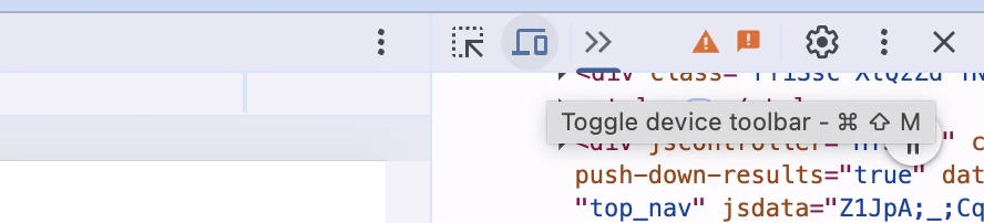
At the top, you’ll be able to choose from various preset device options, or choose responsive and manually adjust the size. If you prefer Firefox, you can use Firefox Responsive Design.
PutsMail
A free email tester from Litmus that lets you send HTML emails and see how they render in real inboxes.
Mailosaur
A paid testing solution that lets you send and test emails across multiple clients and devices.
And of course, you can send your own test emails. The majority of the most popular email clients can be easily downloaded, so set up your own accounts and use them for testing. To narrow it down, try and get data on the email clients your subscribers are using, so you know which to put more focus on.
90+ responsive email templates to get you started
Creating a responsive HTML email template that looks great and renders properly on all devices and clients is quite the challenge. And if you’re looking for an easier way to design awesome-looking, responsive templates, then MailerLite has just the thing.
Our pre-built template gallery has over 90 professionally designed responsive templates that you can choose from. And there’s no need to worry about adding your own creative flair—each template is fully customizable, so you can make it all yours.
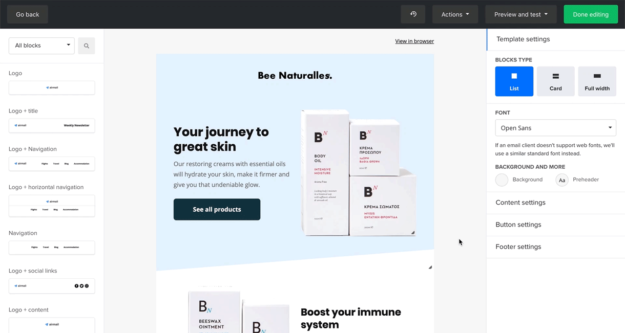
How to create responsive emails in MailerLite
Easy! If you're starting a new campaign, first head to your dashboard and click Create campaign. Then pick a newsletter template from the gallery or start building from scratch. Each design block that you drag and drop into your email template will automatically be made responsive—no media queries, inline CSS or Outlook rules in sight.
You can customize the colors, fonts, images and more so the template perfectly fits your brand design. Once you’re ready, click the Preview and test button on the upper right to see what your newsletter will look like when displayed on smaller screens in a mobile client.
P.S. You can also create mobile pop-ups with MailerLite to accommodate smaller screen sizes.
Responsive email design best practices
1. Use a single-column email design
Multiple columns can be aesthetically pleasing, but it’s best to keep things simple when styling emails with mobile users in mind. A single-column layout is easy to digest, as each column is dedicated to one topic. When these columns are stacked underneath each other, it’s easy to read through the content.
Start with your most important content and work your way down. In mobile emails, it’s the hierarchy that counts. If your email gets too long, delete the columns that aren’t really necessary.
2. Be mindful of font sizes
Before you deliver your email campaign to your subscribers, be sure to send yourself a test email to see what fonts look like on mobile. For example, you might find that the font is small and hard to read.
To make sure you’re covered, use web-safe fonts and fallbacks for cases where a font might not be rendered properly by an email client.
Opt for an easy-to-read font style type that is available on all devices, like Arial, Times New Roman, Georgia or Verdana. We recommend a minimum of 14 pixels for the normal text size and 20 pixels for headers. For mobile, 16 pixels is the best minimum font size for normal text.
3. Use images optimized for different screen sizes
When it comes to using images in email newsletters, make sure they show what you want to convey on every screen size. For example, if you’re selling bags, check whether the bag details are clearly visible on mobile too. An image that looks great and showcases what you want it to on a large screen might not have the same impact on smaller screener. Some close-up shots or different angles might work better, and you can display these for mobile-only use media queries.
4. Set your widths correctly
Setting a max width of 600-640px will ensure your email content hits the sweet spot. But remember, to make your email layouts fluid, setting the width at 100% for containers and other elements like images will make your templates responsive and easily adaptable to all screen sizes.
5. Use inline CSS
It’s not the cleanest way to build something but using inline CSS to style your template will ensure it looks good even if the email client strips out all of your style tags. MailerLite’s HTML email template builder makes it easier to create HTML templates from scratch with code snippets you can insert into your code and an automatic CSS inliner that does the work for you.
6. Structure your email with tables
For now, tables are still the most reliable way to build a layout and structure for email templates. While it might feel restrictive, you can nest tables to create highly complex designs and utilize rows and cells to control spacing.
That's all, for now
Congratulations, you’re now a responsive email designer! Your emails will be readable on all screen sizes and clients, giving your readers a pleasant user experience.
Building responsive HTML email templates from scratch can be… a lot, but once you wrap your head around using inline styles and media queries, you’ll be knocking out templates in no time.
And if you prefer a quicker, easier way to build truly responsive emails, you can always use MailerLite!
Ready to give it a try?
MailerLite lets you craft professional campaigns in minutes, and it automatically adapts them for different screen sizes.
Have you made your newsletter content adaptive to different screen sizes? Share your responsive email design tips with us in the comments below!
Editor's note: This article was originally published in September 2020. It has now been updated with new insights and examples.