9 tips to design UX-friendly mobile pop-ups that convert

Not all pop-ups are created equal—when it comes to mobile, the experience is completely different. It’s important to tap into the mobile mindset to design pop-ups that convert.
Mobile pop-ups are a little different from desktop. Their design and behavior need a particular approach to fit seamlessly into the mobile experience—which is fundamentally different from when browsing on a larger screen size.
Acing your mobile pop-up design will result in more visitors joining your email list and will ensure that your website remains SEO friendly (because Google cares a lot about mobile!).
This article will take a look at why mobile pop-ups are important, and how following some basic best practices can increase your conversion rates and make Google happy.
Why mobile pop-ups are great for email marketing
Ever been to a restaurant and the table next to you is full of people fixed on their phones? You might have even been one of those people! We’re a generation of digital addicts, and there’s no better device to consume it all on than our phones.
That means mobile has huge potential when it comes to reaching your target audience. Take this food for thought: in 2020, US adults spent 4 hours per day on their mobile phones. In 2021, mobile phones are generating 54.25% of web traffic compared with desktops at 42.9%. That’s pretty significant if you ask me.
This is why marketers are focused more than ever on delivering an optimized mobile experience for their visitors. And it extends to pop-ups.
Pop-ups on mobile are great for building your subscriber list when done right. Browsing on our mobiles has become the quick, go-to hobby in all kinds of life’s scenarios, so you need to make it easy for visitors to sign up!
9 mobile pop-up best practices and examples
When using mobile pop-ups, creating a user-friendly experience and optimizing your website for conversions seems like a true balancing act. How can you get your pop-ups in front of visitors without being a turn-off, and also follow the rules of the web?
Well actually, the two are very much intertwined. It all comes down to creating a great mobile user experience. And by following some best practices, you can create high-converting, mobile-friendly pop-ups!
1. Always be compliant
Google can penalize websites for a myriad of reasons, which are increasingly becoming centered around user experience. More than ever, Google takes into account how valuable the content is and whether it satisfies the searcher intent.
One of these areas of penalization is intrusive interstitial content on mobile devices—a policy which aims to make content more accessible for mobile users. It’s not as scary as it sounds! These are actually good guidelines to follow to make sure that you are providing a pleasant experience for your website visitors.
Most importantly, you should avoid using pop-ups for extended periods of time and just stick to using them on a temporary basis. To add to that, you should only use pop-ups sparingly for each visitor. Avoid bombarding them with a pop-up on every page, every time they visit.
Google says you should:
Use pop-ups that allow users to continue viewing the main content of the landing page straight after arriving from the search engine results.
An exception to this would be displaying a cookie disclaimer, location selector or age verification pop-up, as these are in the best interests of the user.
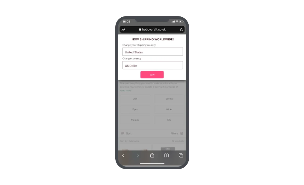
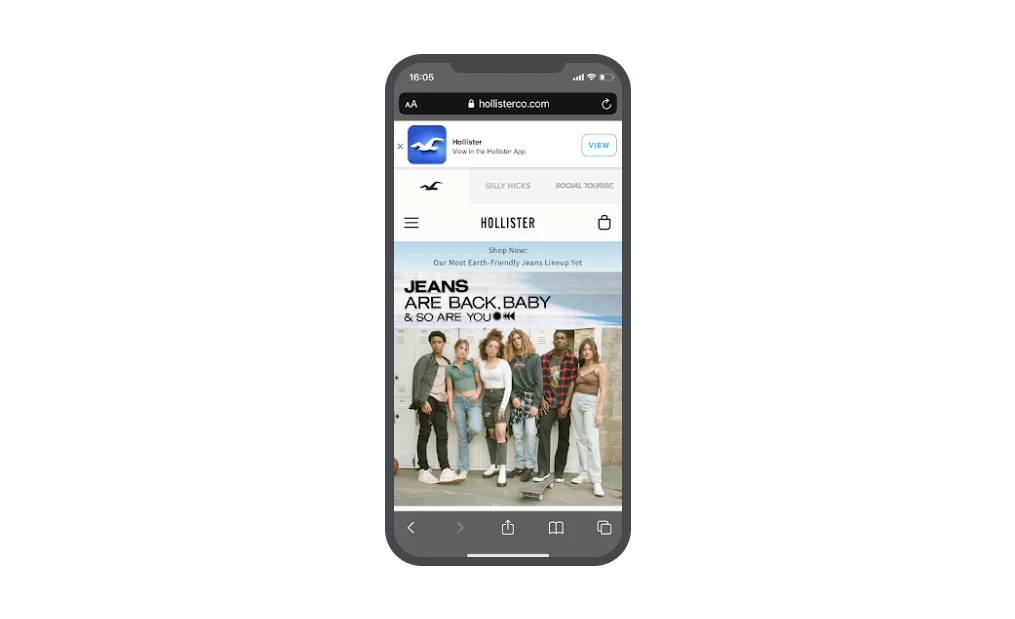
In the examples below, Hobbycraft uses a typical mobile pop-up for country location. This type of pop-up will help to tailor the experience for the individual. Hollister uses a simple floating pop-up to promote their app, leaving the main content of the page easily accessible.
Avoid pop-ups that cover the whole screen and require the user to dismiss them before accessing the main content.
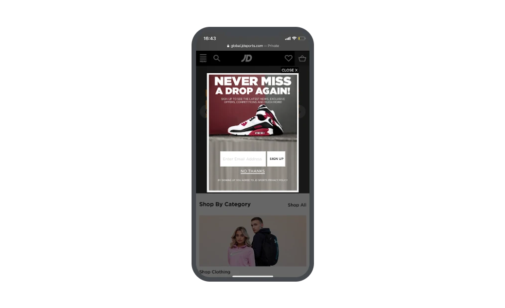
In this pop-up example from JD sports, the main content is still visible, and the style of the pop-up matches that of the website and brand. Although they are using an image, it’s simple and all text is easily readable. Most importantly, they have provided two clear ways for users to exit the pop-up.
2. Use the best types of pop-ups for mobile
There are many types of pop-ups you can use on your website, but only some of them work best for mobile. To optimize your pop-ups for mobile, stick to these.
Floating pop-up: These appear at the top or bottom of the page as a simple bar, and are great to promote discounts, offers, free shipping or other perks.
You can also make them clickable to display signup forms or additional information if the user is interested. If you want to be as least intrusive as possible, floating pop-ups are the way to go.
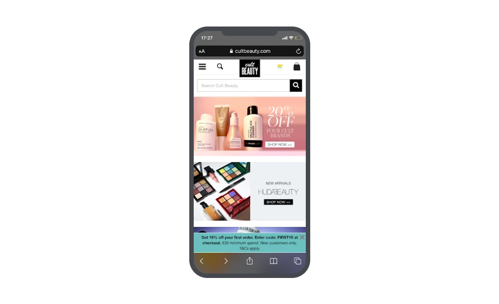
Cult Beauty uses a simple floating pop-up at the bottom of the screen to promote an offer for new customers. They’ve made use of bold and italicized text, as well as a bright eye-catching color to bring the reader’s attention to the pop-up without being intrusive.
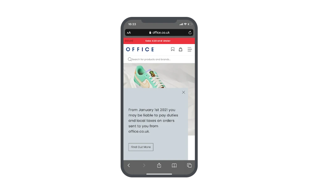
Slidebox pop-up: Slidebox pop-ups for mobile appear in the corner of the screen, larger than floating pop-ups but leaving space for the main content to be visible.
These are better for when the website visitor has displayed an interest in your website, by visiting multiple pages or spending a certain amount of time on your page.
Office uses this incredibly simple pop-up to deliver important information to customers. By keeping the pop-up text only, they are able to deliver the message in a clear way.
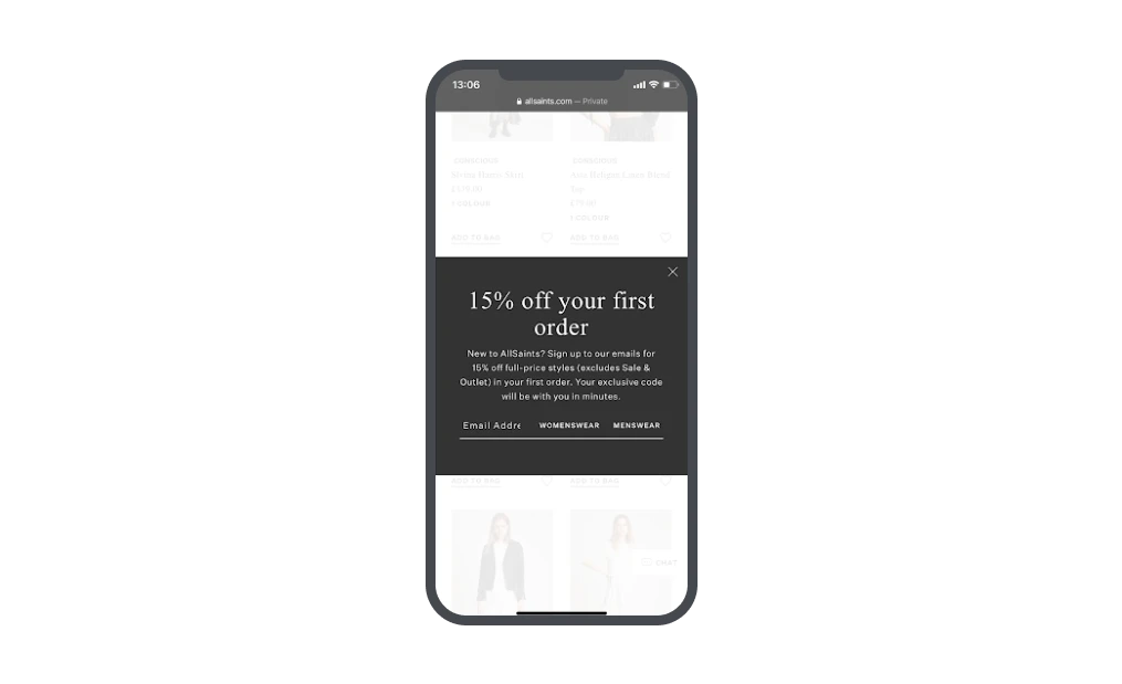
Featured pop-up: These pop-ups are displayed in the middle of the screen above the main content. Although they are not full-screen pop-ups, they should appear after the user has shown an interest by navigating away from the landing page.
AllSaints uses the featured pop-up type to promote a new customer discount. Although the main content is faded out, it’s still visible. What’s more, the pop-up appeared after a few clicks on the website, not on the landing page.
3. Remember GDPR
The GDPR requires you to gain consent from individuals residing in the EU to process their data and use it for specific purposes.
As long as you are clear about what you are doing with visitors' data, you can keep your pop-up relatively simple, but you must get active consent. In other words, you can’t ask someone to complete an action to opt out, only to opt in.
This example from The Hustle is simple and contains no checkboxes, as it clearly states that by signing up, the user consents to receiving the newsletter. They tell the visitor exactly what they are getting if they sign up.
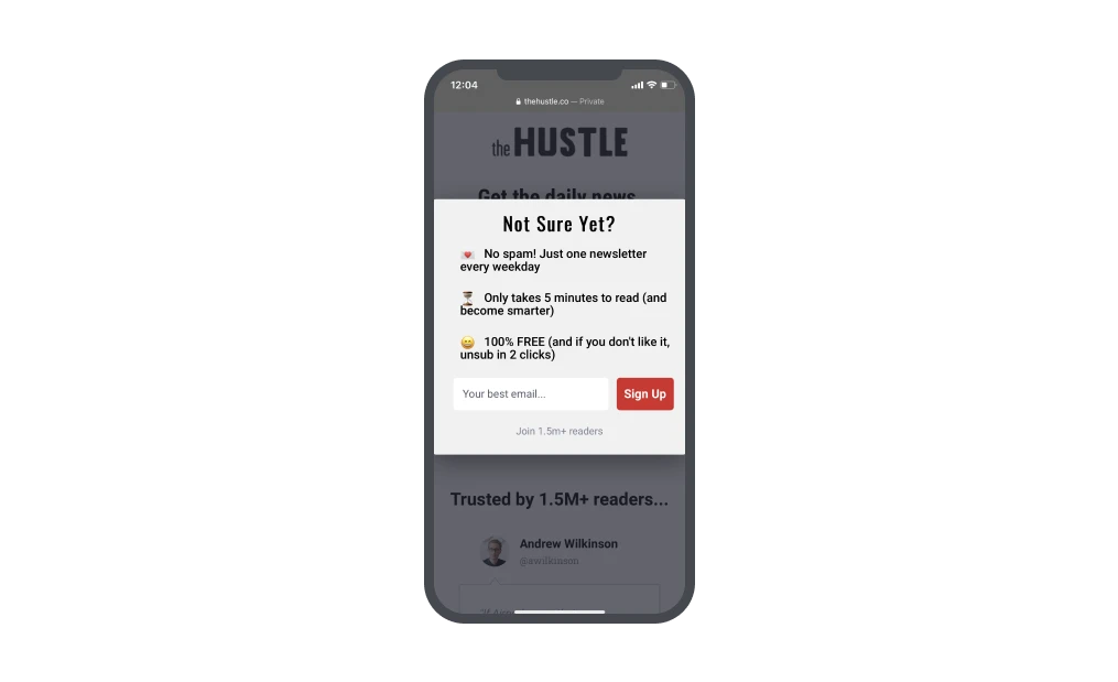
If you only plan to use the subscriber’s email address to send newsletters and promotional content, there is no need for a checkbox. Checkboxes are required for additional processing of data for marketing or analytical purposes. Learn all about creating opt-in forms under GDPR in our guide.
4. Avoid being intrusive
If you really want to get your message across, featured pop-ups, half page pop-ups and even full page pop-ups can be used. Just as long as you wait to display them after your visitor has had time to engage with the web content.
To avoid being intrusive, either stick to mobile-friendly pop-ups that don’t interfere with the users’ actions at all (floating pop-up). Or integrate them into the mobile experience as seamlessly as possible:
Use colors and styles that match the webpage and branding
Make the pop-ups text-light
Most importantly, make it easy for the user to close the pop-up
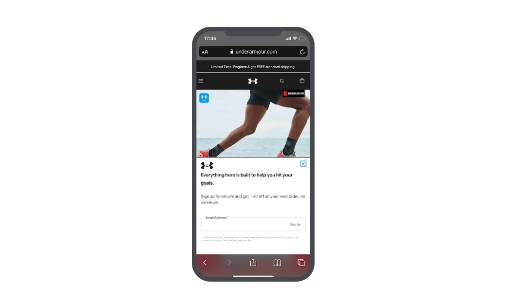
Ever encountered a pop-up that you just couldn’t find a way to close? Annoying, right? 🙄 In this example from Under Armour, they’ve used a simple black and white pop-up that’s easy to read and matches the brand style. They have also made the exit icon easy to find by highlighting it.
5. Use clear CTAs
Now that you’ve created a non-invasive mobile pop-up, it’s time to think about optimization for conversions. Your calls-to-action should be clear and should inspire an action from the reader with the little space you have.
Your CTA button should stand out from the rest of the pop-up with a bright, contrasting color that grabs viewers’ attention. It should also be big enough for mobile and easy to tap.
The CTA text needs to double-down on the action they are about to take by being descriptive of what they are going to do or achieve.
To create CTAs that your visitors have a hard time resisting:
Use second-person pronouns for a touch of personalization that makes visitors feel the offer is just for them
Use more approachable and conversational verbs to make CTA text more friendly
Create a sense of urgency by using time sensitive phrasing
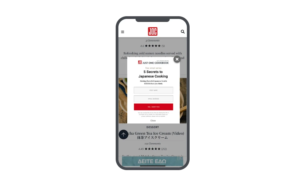
In this example from Just One Cookbook, they’ve used bright red for the CTA button. This matches the color scheme of the website, and also stands out against the white background.
6. Avoid images or videos
You want to create a mobile experience that’s inclusive for everyone. That means accounting for those that don’t have unlimited data.
Keep your mobile pop-ups light and avoid the use of images and videos! If you must use an image, try to keep it less than 100kb and make sure that it isn’t too busy and fits in with the page.
With mobile pop-ups, the real-estate they take up on an average device screen is tiny. Images tend to take up a lot of screen space or make pop-ups look too crowded. Instead, try creating hard-hitting messaging that grabs attention without images.
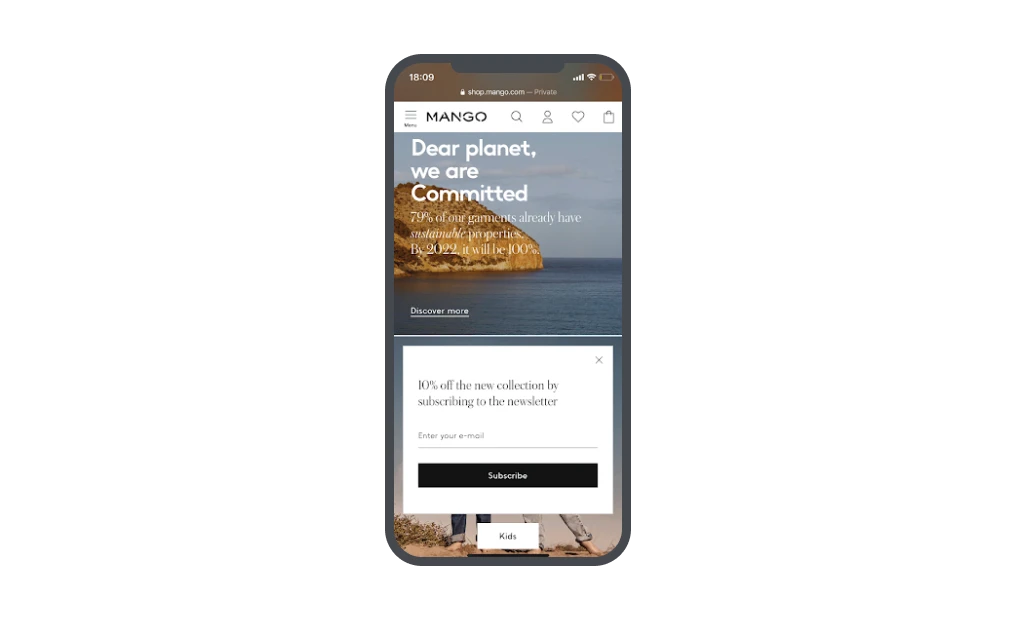
Mango goes minimal to contrast with the highly visual content of the page. Although the pop-up is black and white with just a few words, it’s hard to miss.
7. Personalize pop-ups with behavioral targeting
We all want to feel special, and to feel like the brands we care about, care right back.
Studies have shown that 72% of consumers will only engage with personalized messaging. And with mobile pop-ups, it’s easy to personalize the content that specific visitors are served.
No, it doesn’t entail any creepy behavior! We’ll leave that to certain, ahem, media giants of the social kind. We’re talking about taking into consideration website behavior to serve up relevant pop-ups.
With MailerLite, this kind of personalization is easy to get started with, and it enables you to display mobile pop-ups with content and incentives that are relevant to your visitors’ interests and behavior.
You can display pop-ups based on certain behaviors, for instance, when a visitor goes to a specific page or category, when they have viewed 50% of the page, or spent a certain amount of time on it.
By displaying pop-ups in this way, you can personalize the language you use based on what they’ve shown an interest in on your website. And use specific messages as they’re about to exit.
8. Keep form fields to a minimum
In almost all cases, signup forms should be kept short ‘n sweet—this is especially true of mobile pop-up forms. No one wants to spend more than a few seconds filling out a form on their mobile, especially when their only intention was to browse donut flavors.
Think about the information you really need to be able to communicate with people, and consider how you can make it easy to select further options.
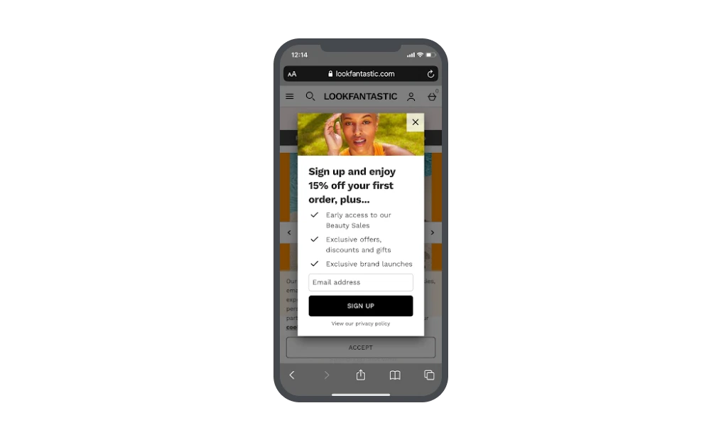
The best option is to ask for an email address only—the rest can come later!
Look fantastic clearly outlines the benefits of joining their email list, and encourages the user to do so by only asking for an email address.
9. Test, test, and oh yeah, test!
Did we mention test? A/B testing elements of your online marketing campaigns is a great way to gain insights into what your audiences like—and mobile pop-ups are no different!
You can test the type of pop-up positioning you use, such as floating, featured or slidebox, and see which type gains the most conversions.
You can then test the design and content of the winning type of pop-up, to really finetune your efforts.
How to create a mobile pop-up using MailerLite
Creating professional, compliant mobile pop-ups has never been easier! With MailerLite, you can choose one of the preset templates and customize the pop-up to suit your branding, website and goals.
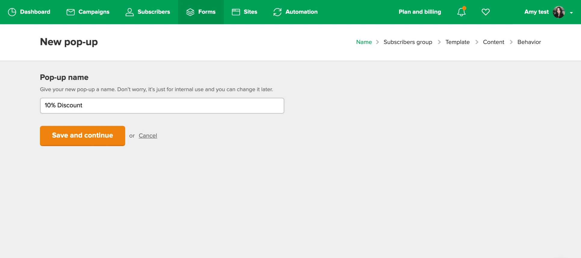
1. To get started, in the MailerLite app, go to Forms then Pop-ups and Create pop-up.
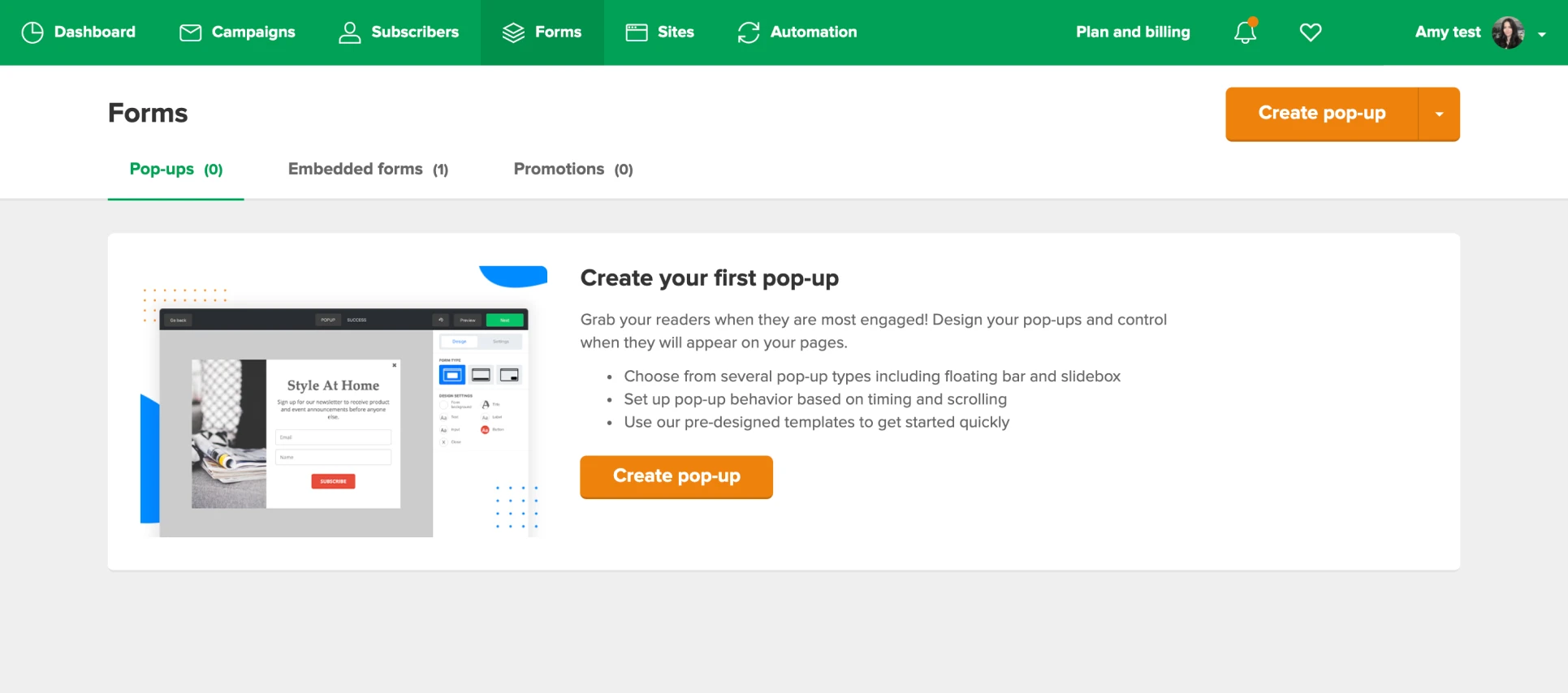
2. Choose a name for your pop-up then click Save and continue.
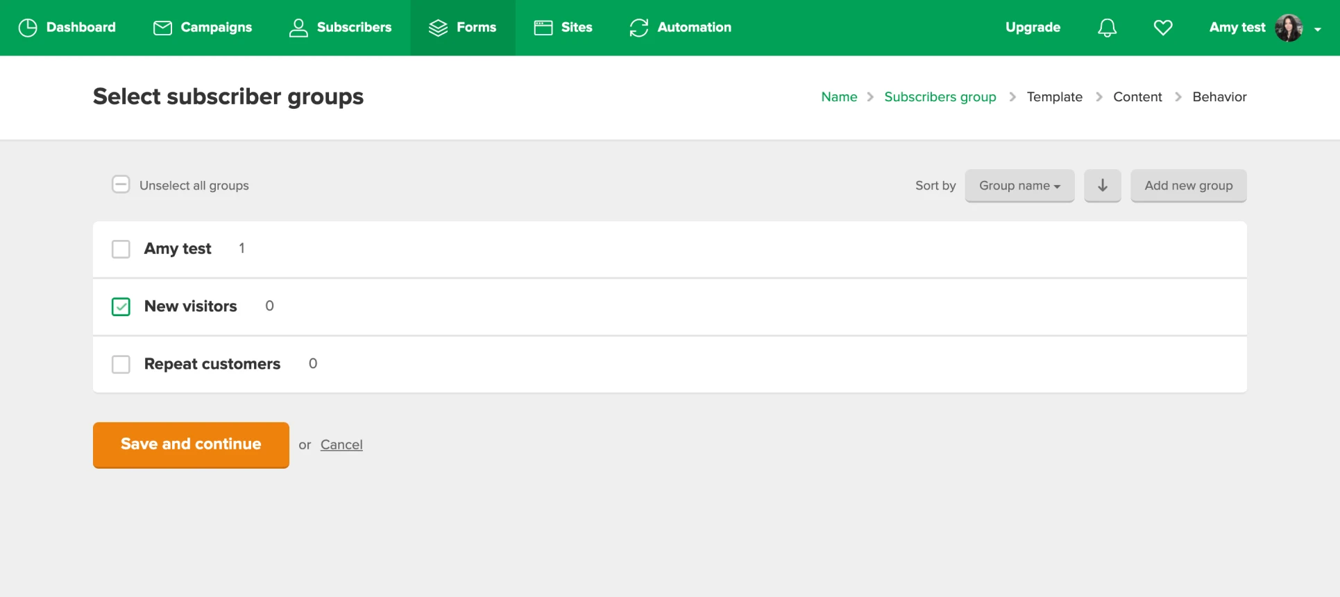
3. Select the group(s) you would like subscribers to be added to when they fill in your form, then click Save and continue.
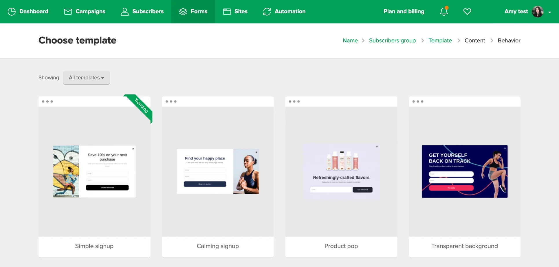
4. Hover over the pop-up template you want to use for your mobile pop-up and click Select. Remember that you can customize everything in the builder.
5. Now to the fun part! Customize the colors, text, fields, CTA, layout, and positioning of your pop-up with the intuitive options of the builder.
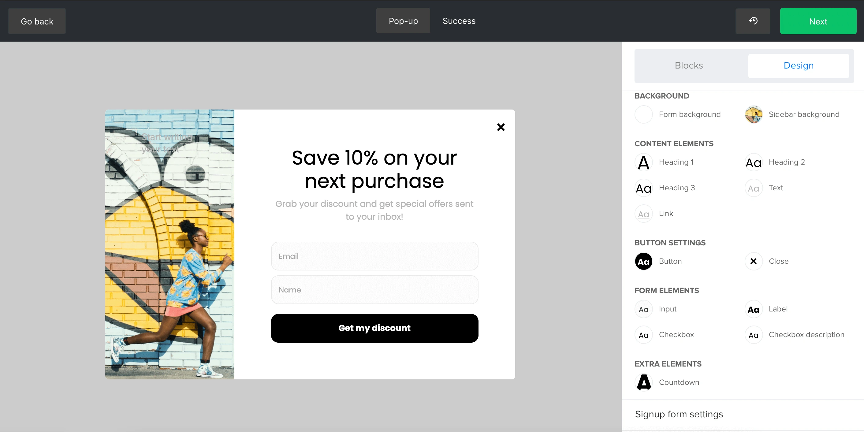
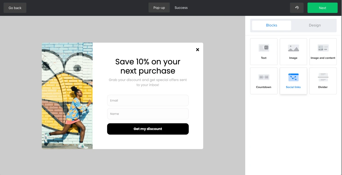
You can add additional blocks to the pop-up by drag and drop. Simply click on Blocks and drag and drop to add text, image, countdown, social media links or a divider.
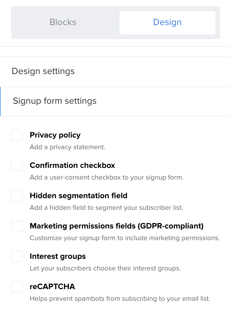
To add additional options such as privacy policy, confirmation checkbox, hidden segmentation fields, marketing permission fields, interest groups or reCAPTCHA, go to Design then Signup form settings.
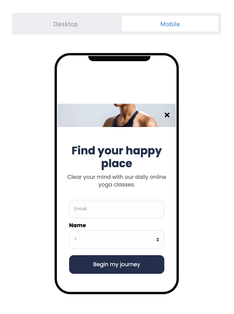
6. To preview your pop-up as it would appear on mobile, click Preview then select Mobile.
7. When you’re finished designing your pop-up, click Next. It’s time to set your mobile pop-up behavior.
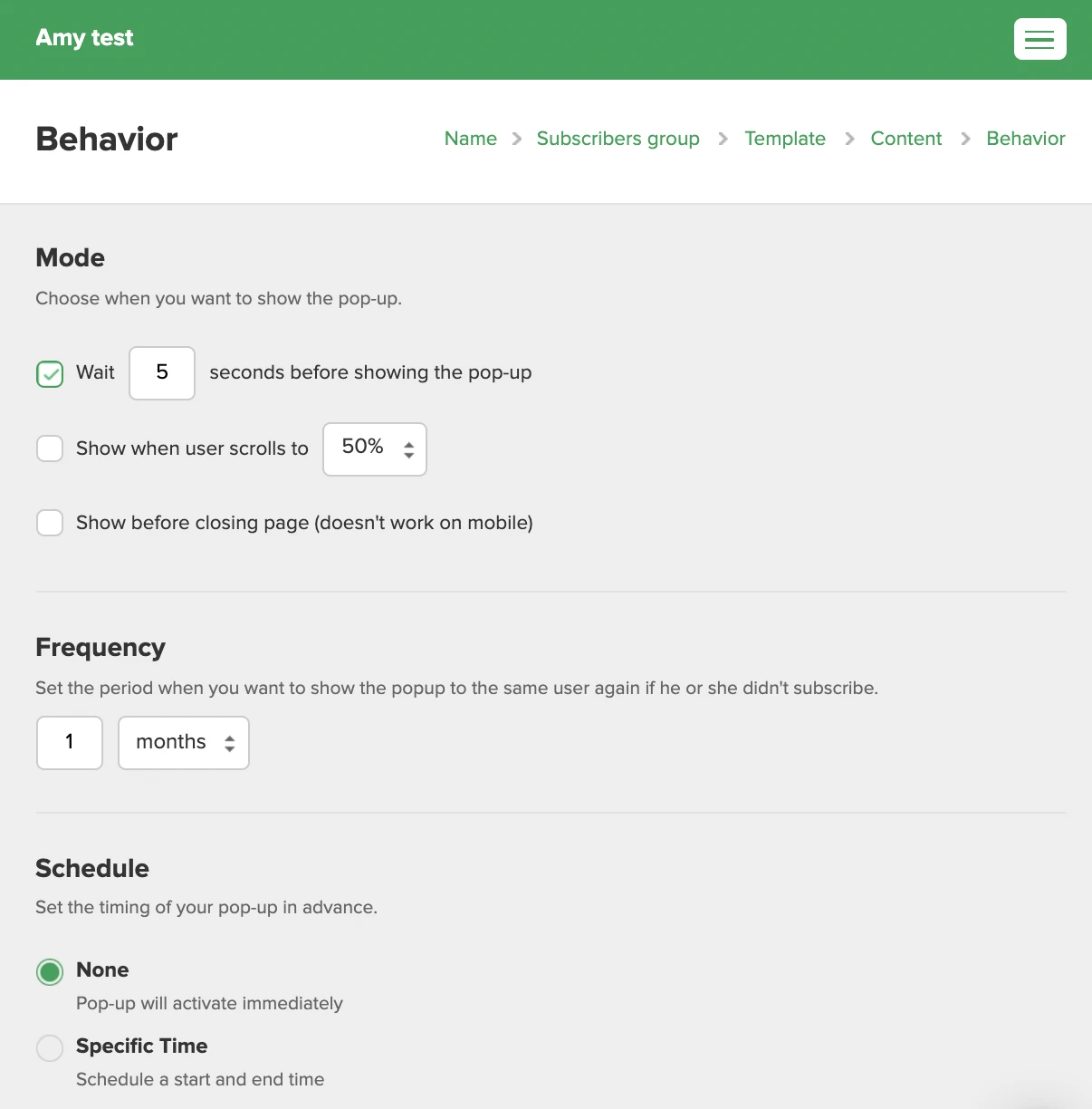
Under Mode you can select when you want the pop-up to appear.
The Frequency section allows you to choose how often the pop-up should appear to returning visitors.
Under Schedule, you can opt to set a start and end date for your pop-up.
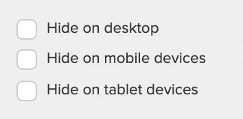
The Visibility section allows you to select which web pages and devices your pop-up will appear.
Hiding your pop-ups on certain devices is a great option for optimizing pop-ups for mobile campaigns. Rather than relying on the responsiveness of a desktop pop-up for all, you can hide your desktop pop-up on mobile devices, and create a purpose built mobile pop-up that you hide on desktop devices.
8. Click Save and continue.
9. Copy and paste the Javascript tracking snippet into your website’s HTML, just before the closing </head> tag. You only need to add the tracking snippet to your website once, even if you plan on having multiple pop-up forms.
Check out our video tutorial on how to create pop-ups with MailerLite.
And that’s it. You’re now ready to start using amazing mobile pop-ups on your website!
Mobile pop-ups can work for you too!
We’re already in the midst of a mobile-first era, so it’s important that every aspect of your website is optimized for the best mobile user experience!
As an online marketer, your ultimate goal is to provide a pleasant experience for users so that they’ll want to convert. And your mobile pop-ups needn’t be any different. They need to blend in with the user’s journey through your website and take into account the differences between how we use mobile and how we use desktop.
If you keep user experience in mind, avoid being intrusive, and think about how you can best design pop-ups with this in mind, you’ll be on the fast track to more conversions and happy subscribers.
Join MailerLite today!
Start creating your own mobile pop-ups and grow your subscriber list.