19 pop-up examples that generate conversions
 Jen, People and Culture
Pop-ups are one of the most effective ways to get your offer in front of as many website visitors as possible. And the more people who see your offer, the more opportunities you have to convert them into leads and customers.
This article will explain pop-up best practices to help you make the most of this powerful tool. Plus, we’ll highlight 19 eye-catching pop-up examples, show 3 real-life success stories of MailerLite customers, and look at some of our favorite pop-up templates.
Use this information to inspire your own designs, grow your email list, and boost your business.
What are website pop-ups?
Website pop-ups are windows that appear in the foreground of a webpage while a user is browsing. They are an effective marketing tool because they are designed to grab a visitor's attention.
By intentionally overlaying the content, pop-ups ensure your message is seen, making them an excellent way to promote special offers or convert visitors into email subscribers and customers.
You can easily add pop-ups to your website with MailerLite by creating one with our brand-new pop-up builder. It comes with tons of features to help you create on-brand, engaging pop-ups that drive real results.
These include:
A more intuitive interface
Tons of customization options
Conversion-boosting spin-the-wheel pop-ups
Expandable pop-up teasers
Plenty of templates to get you started
Once you've designed your pop-up, adjust when and where you will show it in your MailerLite dashboard. Add the pop-ups to your site by either pasting the generated code into your website header or connecting your site via our WordPress or e-commerce plugins.
9 ways pop-ups benefit your online business
From growing your email list and promoting products to upselling and building customer loyalty, pop-ups are a powerful tool to achieve a host of business goals.
Read on to see how each use case can benefit your business.
1. Grow your email list
Pop-ups are an effective way to convert website and blog visitors into email subscribers. Because they appear over the content the visitor is reading, pop-ups are hard to miss—and more people seeing your offer means more people are likely to convert.
To grow your email list with website pop-ups, create one that explains the benefits of joining your list and add an email signup form.
2. Promote offers on your website and landing pages
Pop-ups are an effective way to increase the exposure of promotions on your website and landing pages. Promotion pop-ups show your latest offers or new products to anyone who visits your site. This can lead to more sales, downloads, and conversions.
To dive deeper into promotion pop-ups, read our article on using promotion pop-ups to enhance your customer experience—it covers all the details you need to know.
3. Test different offers
Nothing will improve your website's performance faster than continuous testing. The way your offers are worded, designed, and presented affects how your target audience receives them.
A/B testing pop-ups allows you to quickly test how your audience reacts to your special offers by showing them to all your website visitors. Roll the best-converting promotions out across your website and remove the ones that underperform.
Learn more about how to set up pop-up A/B testing with MailerLite here.
4. Announce important news
Pop-ups are a great way to alert website visitors to business announcements. Use them alongside social media posts, emails and blogs to maximize the number of people who see important news like new features, product updates, your latest collection, or opening hours changes.
5. Recover abandoned carts
"Exit-intent" pop-ups that appear when a user is about to leave a page, are highly effective for reducing cart abandonment. They can remind customers about the items in their cart and offer an incentive to complete the purchase, such as a discount code, free shipping, or a free gift.
6. Up-sell and cross-sell products
Suggest complementary or upgraded products to a customer as they are browsing or adding items to their cart with the help of strategically placed pop-ups. This can increase the average order value and enhance the shopping experience by showing them products they may not have otherwise seen.
7. Guide the customer journey
Use pop-ups to guide visitors to the next step you want them to take. For example, a pop-up can be triggered after a user has scrolled a certain percentage of a page or spent a certain amount of time on a blog post.
8. Enhance customer engagement and loyalty
Pop-ups can be used to gather feedback, conduct quick surveys, or showcase social proof like customer reviews or testimonials. This helps you better understand your audience and builds trust and credibility.
Furthermore, these can be used to create a sense of exclusivity, for example, by inviting visitors to "join a VIP club" or offering a special deal that is only available through the pop-up.
9. Announce time-sensitive deals
Pop-ups are excellent for highlighting limited-time offers, flash sales, or seasonal promotions. By adding a countdown timer or a limited stock warning, you can create a fear of missing out (FOMO) and motivate immediate action.
Create your first pop-up in minutes!
Our free plan includes access to the features you need to create pop-ups, publish them on your website, and deliver follow-up campaigns and automations via email. Hit the button below to start today!
19 pop-up examples and why they work
Now you understand how pop-ups can help your business, here is a look at 19 effective website pop-up examples. Plus, we’ve broken down what makes each one so great.
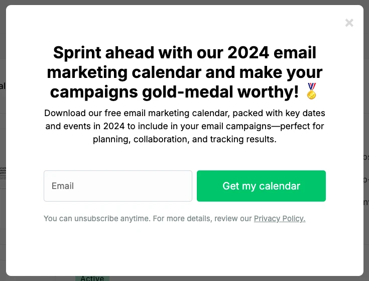
1. MailerLite: Time-based pop-up
Time-based pop-ups appear after a user has been on your website for a specified number of seconds.
These are the most popular kind of pop-ups—you can display them on a specific landing page or across your entire site. Just choose where to show them and how long to wait in the pop-up settings in MailerLite.
We show time-based pop-ups on the MailerLite blog after 7 seconds so people can take in the page's content before they see the offer.
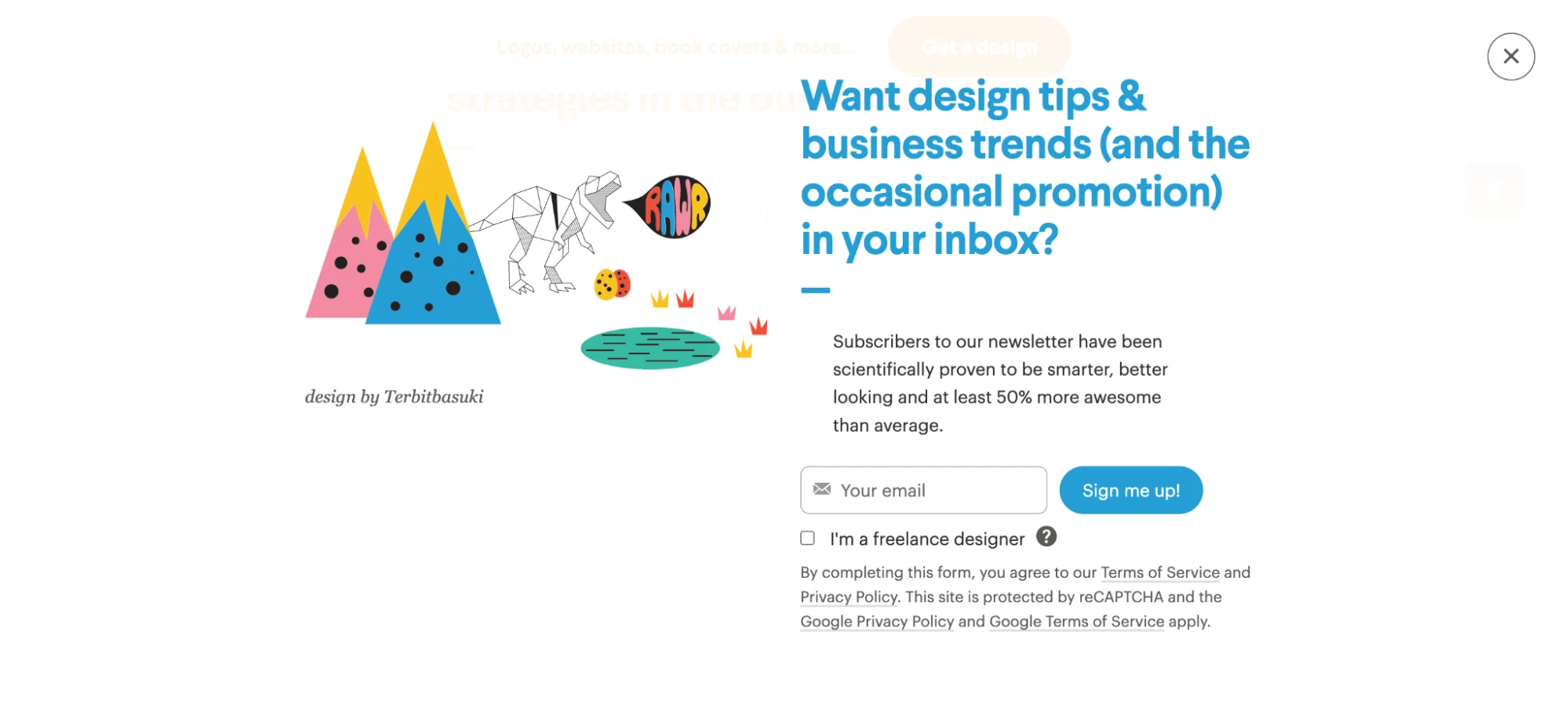
2. 99 designs: Welcome mat pop-up
Welcome mat pop-ups cover the entire browser window, ensuring your offer fully captures the visitor's attention.
These full-screen pop-ups can be intrusive and hurt your user experience. Save them for special occasions and check your analytics to see how they impact engagement.
99Designs uses a welcome mat pop-up that's impossible to miss but has a clear close button so people can easily get back to the content.
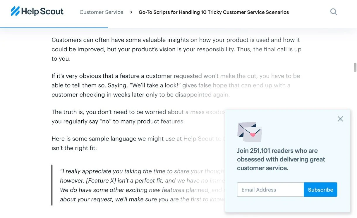
3. Help Scout: Scroll-triggered pop-up
Scroll-triggered pop-ups display when a user reaches a certain depth on your page. Since the people who see a scroll-triggered pop-up have already tasted the value you provide, they're more likely to interact with your offer.
Here's a great example of a scroll-triggered pop-up on the Help Scout blog. It uses a simple newsletter signup CTA, which may work since readers who have scrolled to this point have shown they enjoy the brand’s content.
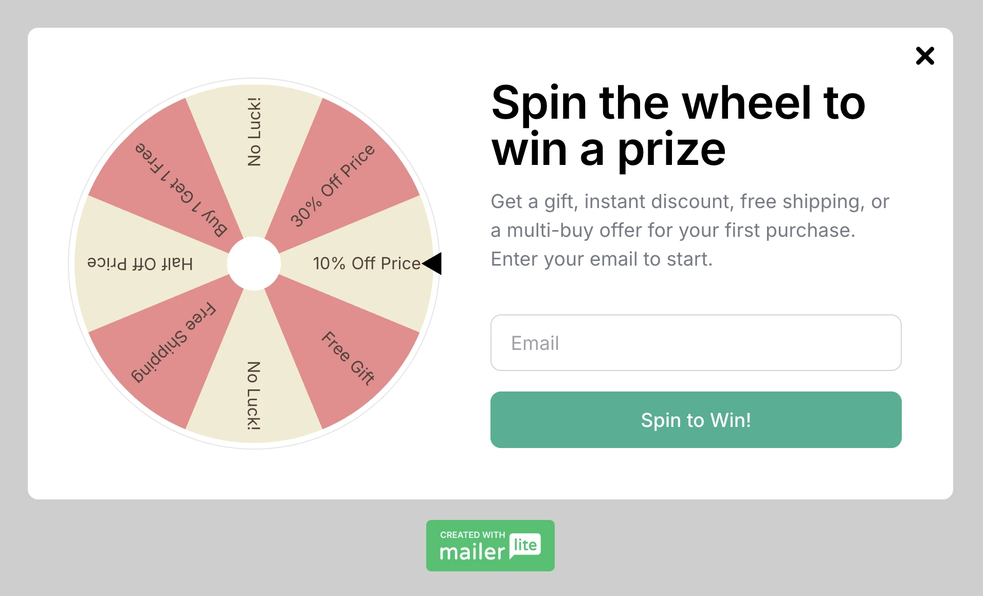
4. MailerLite: Spin-the-wheel pop-ups
Spin-the-wheel pop-ups help you gamify list growth by letting website visitors hand over their email addresses to win a prize. It's an effective way to grow your list and generate sales through special offers.
You can customize all the game settings; add up to 8 slices, give each one a percentage chance of winning, and decide whether to let people have multiple spins. After a spin, prize distribution is taken care of automatically by displaying the coupon code in the success message. You can also configure the settings to send a personalized email with the relevant coupon code to all winners.
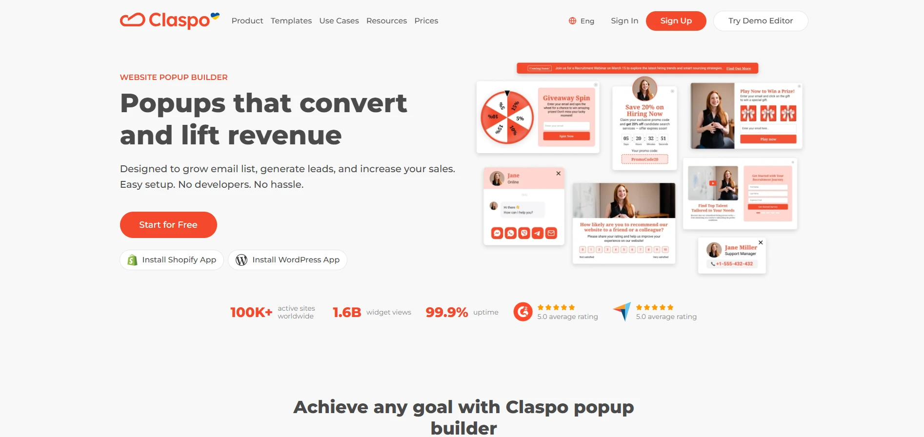
5. Claspo: Pre-order pop-up
A Claspo pre-order pop-up helps brands generate early demand by presenting upcoming products in a compelling and timely way. With a strong message, clean layout, and well-timed appearance, it effectively drives sign-ups and pre-launch conversions.
6. Elegant themes: Hello bar pop-up
Hello bar pop-ups appear at the top or bottom of your webpage. They're the least interruptive type of pop-up because they don’t cover the content the visitor is reading. These pop-ups work well for site-wide announcements and email subscription forms.
Elegant Themes uses its hello bar pop-up to drive attention to its offer. People who click are taken to the signup page. You can also add an email signup form to these pop-ups to grow your list.

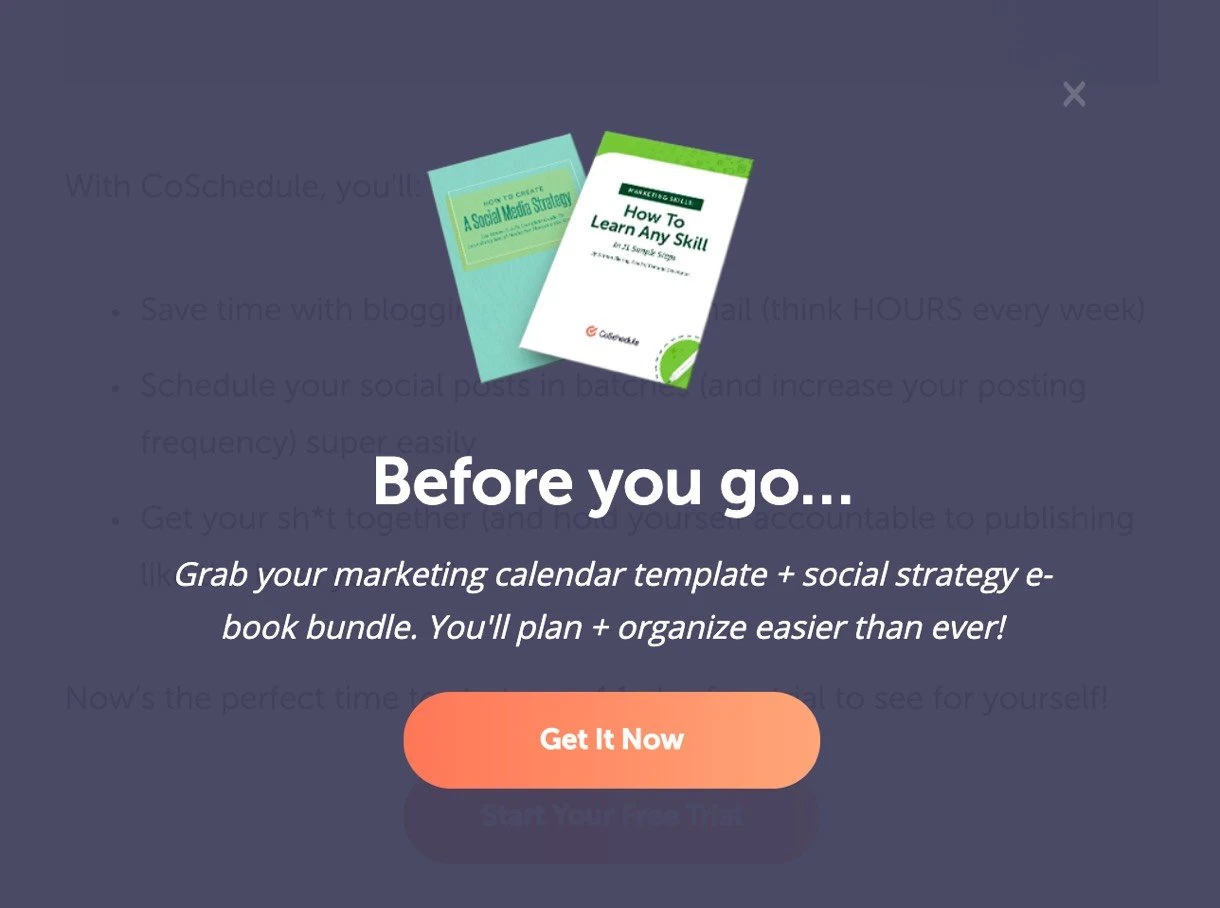
7. Coschedule: Exit-intent pop-up
Exit-intent pop-ups appear when a visitor is about to exit your page. They detect when a visitor's cursor reaches the top of the browser, indicating that they're about to leave.
The team at Coschedule uses exit intent pop-ups to reach out to visitors one last time before they leave. The freebie offer may be all the website visitors need to keep engaging with the brand.
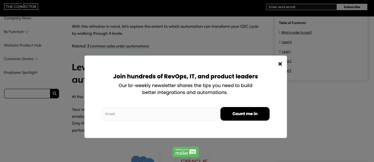
8. Workato: Benefits-focused pop-up
Your pop-up should clearly explain the benefit of your offer so people know why they should sign up.
When promoting an email newsletter, your benefits could be as simple as the information the new visitor will learn when they sign up and how it will help them.
Below is an example from the integration platform Workato. The pop-up message highlights that people who subscribe to the biweekly newsletter will learn all they need to build better integrations and automation.
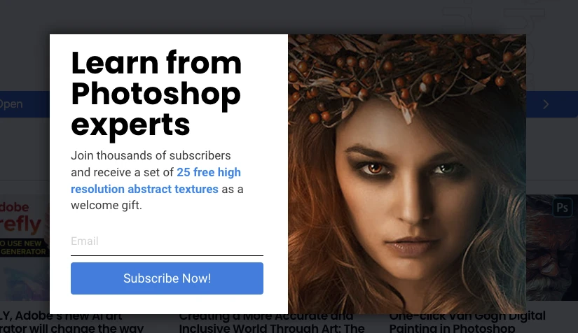
9. Photoshop Mosaic: Lead magnet pop-up
Give people an extra incentive to sign up for your list by promoting a lead magnet they receive when they join.
Photoshop Mosaic does this by promising to send anyone who subscribes a set of free high-resolution abstract textures for Photoshop.
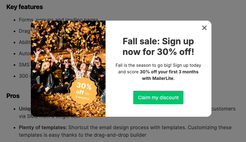
10. MailerLite: Sale promotion pop-up
Consider using your pop-up to send people straight to a page on your website rather than using it to generate email signups. You can easily do this in MailerLite by creating a promotion pop-up.
When we ran our fall sale, we used pop-ups to promote the offer and send people to the sign-up page. This pop-up was clicked on hundreds of times, meaning hundreds more opportunities to make sales than we would have otherwise had.
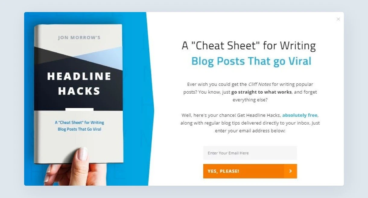
11. SmartBlogger: Cheat sheet pop-up
Cheat sheet pop-ups promote a resource that can help readers achieve a specific goal. Here's an example from SmartBlogger. The offer of a guide to help your content go viral is sure to appeal to the brand’s readers who are typically looking for strategies to grow their blog traffic.
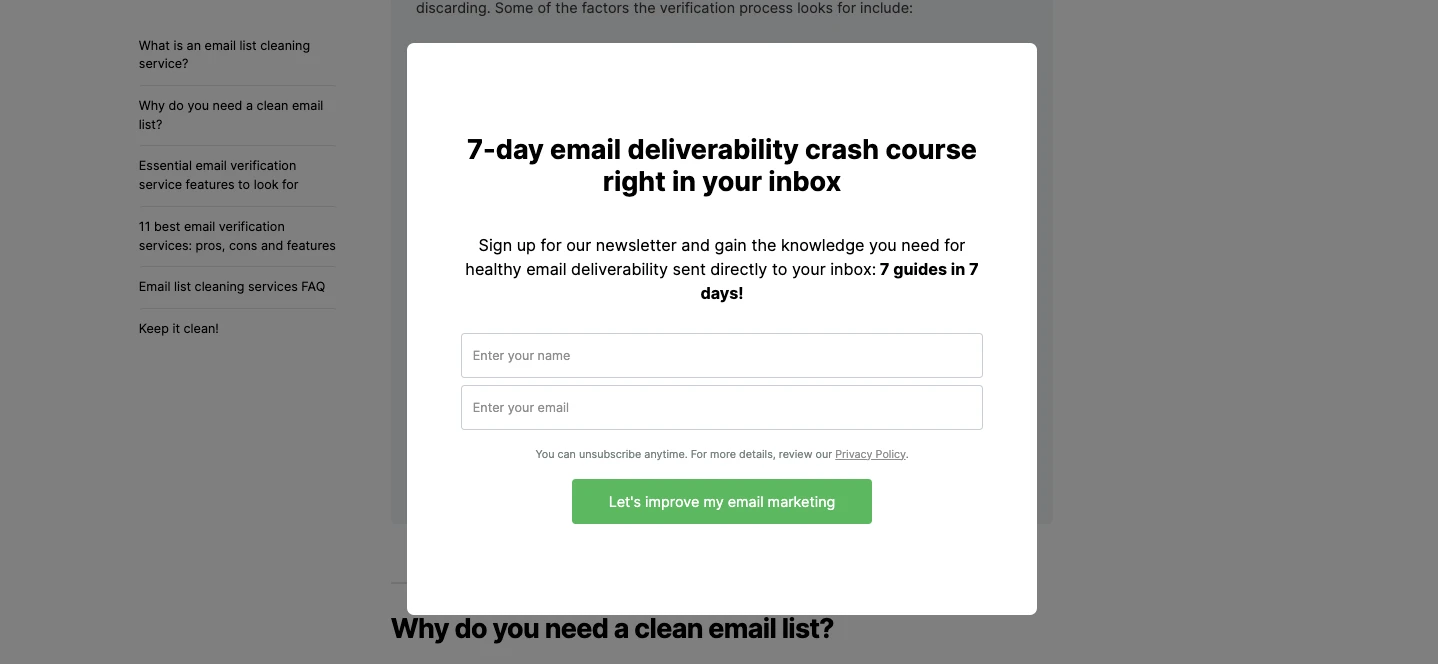
12. MailerLite: Added value pop-up
Pop-ups are more likely to convert when the offer closely relates to the content on the page. To get more sign-ups, consider the challenges people who visit your website have and then create related offers.
At MailerLite, we promote our downloadable email deliverability crash course with a timed pop-up on our blog post about the best email list cleaning services.
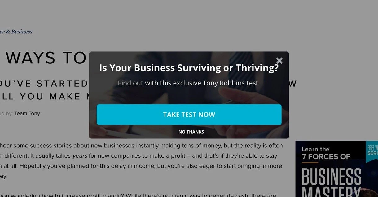
13. Tony Robbins: Quiz pop-up
Quiz and survey pop-ups ask the reader to answer questions to discover information about themselves. The business collects signups by sending the quiz results to the visitor in an email.
This can be an effective way to generate email subscribers as people who have spent time interacting with the test will want to know the results. The below pop-up from Tony Robbins is a good example that links to an online quiz. What business owner wouldn’t want to know if they were surviving or thriving?
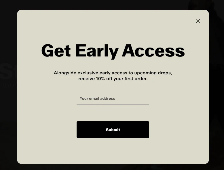
14. Satisfy Running: Early access pop-up
This pop-up from Satisfy Running promises subscribers early access to new drops and a discount. The clear call-to-action (CTA) is prominent and the value is clear. Plus the simple color scheme with lots of contrast is super easy to read.
The double benefit makes this an effective pop-up for any e-commerce store that wants to encourage people to join its list.
15. MailerLite: Teaser pop-up
Teaser pop-ups let you highlight your offer without disrupting visitors' browsing. The teaser appears on the edge or corner of the web page. When someone clicks the message, the full pop-up appears. When they close it, it goes back to the corner.
While teaser pop-ups aren’t intrusive, they make a big impact since they stay on the screen for longer. Website visitors have unlimited chances to click the button and convert.
16. Tim Ferris: E-book promotion pop-up
This pop-up example from Tim Ferris promotes his latest ebook. It links to a form that readers can use to sign up for the content.
Calling the resource an ebook makes it seem more valuable than if he called it a downloadable PDF. This could potentially boost downloads. Since Tim Ferris is a best-selling author, people trust he’ll follow up with the promised extra value.

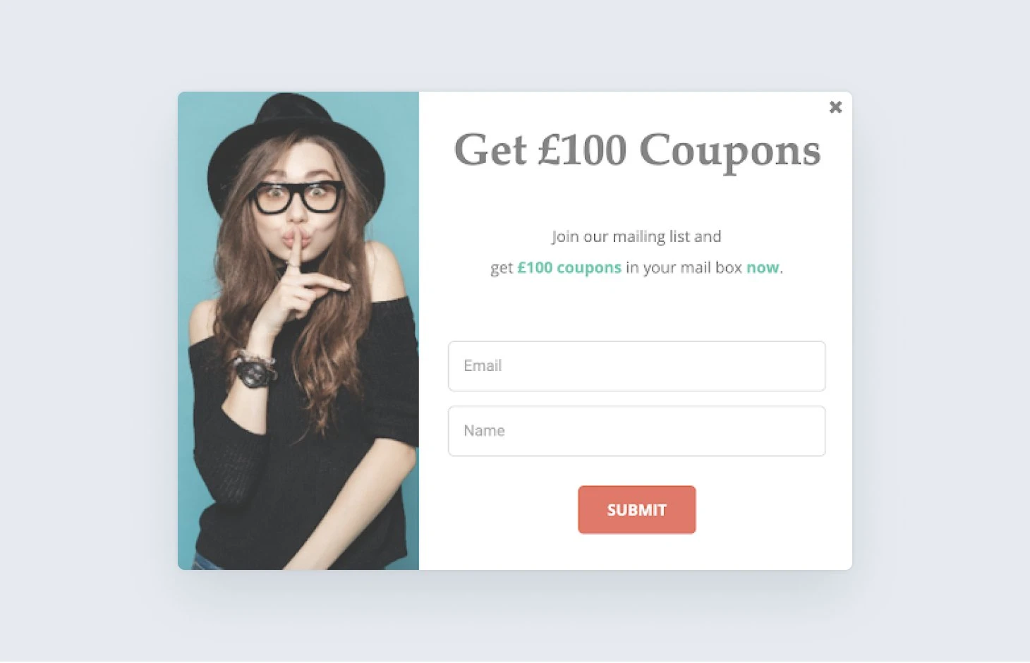
17. Perfect Glasses: Coupon pop-up
Coupons and discounts are one of the most effective ways for e-commerce stores to generate email sign-ups. Use a pop-up to increase the visibility of the offer and maximize the number of people who sign up and buy.
This pop-up from Perfect Glasses works because the £100 offer is generous and it highlights that people can access it immediately.
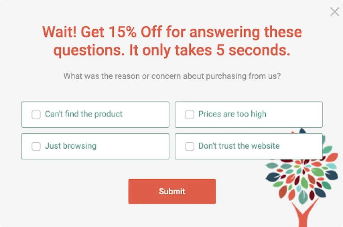
18. Healthy Essentials: Survey pop-up
Adding a survey to a pop-up helps you collect essential insights about your customers. In the below pop-up example, Perfect Glasses embeds a survey to discover more about the challenges people have when buying from the brand.
Since people can answer the question without leaving the webpage, they’re more likely to reply. Plus, the brand offers an extra 15% off to anyone who completes the survey.
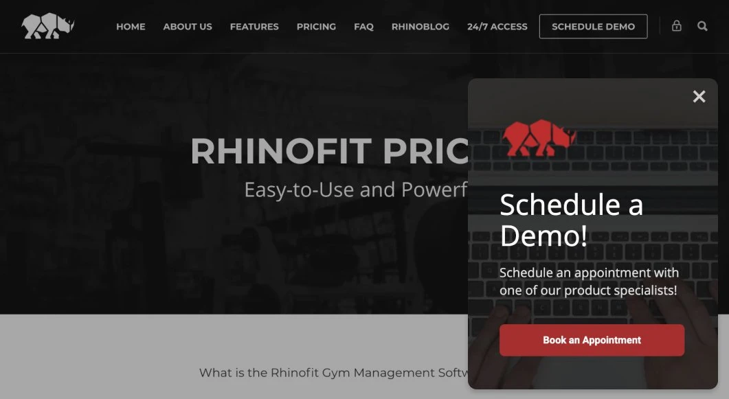
19. Rhinofit: Appointment schedule pop-up
Consider using different pop-ups to target people at different stages of the customer journey based on the page they are visiting.
In this email pop-up example, Rhinofit uses a promotion pop-up form on its pricing page that invites site visitors to schedule a demo. This works because a meeting can help people overcome challenges they may have when buying such a high-ticket item.
Successful pop-ups in action: Stories from MailerLite customers
Let’s check out some successful pop-ups that have worked in favor of our very own MailerLite customers.
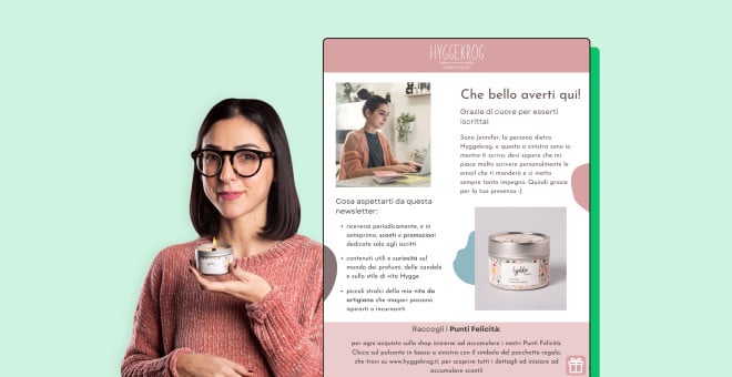
Case study 1: Hyggekrog
Jennifer Peddio of Hyggekrog uses a site-wide pop-up giving a 10% discount for people who join her email list.
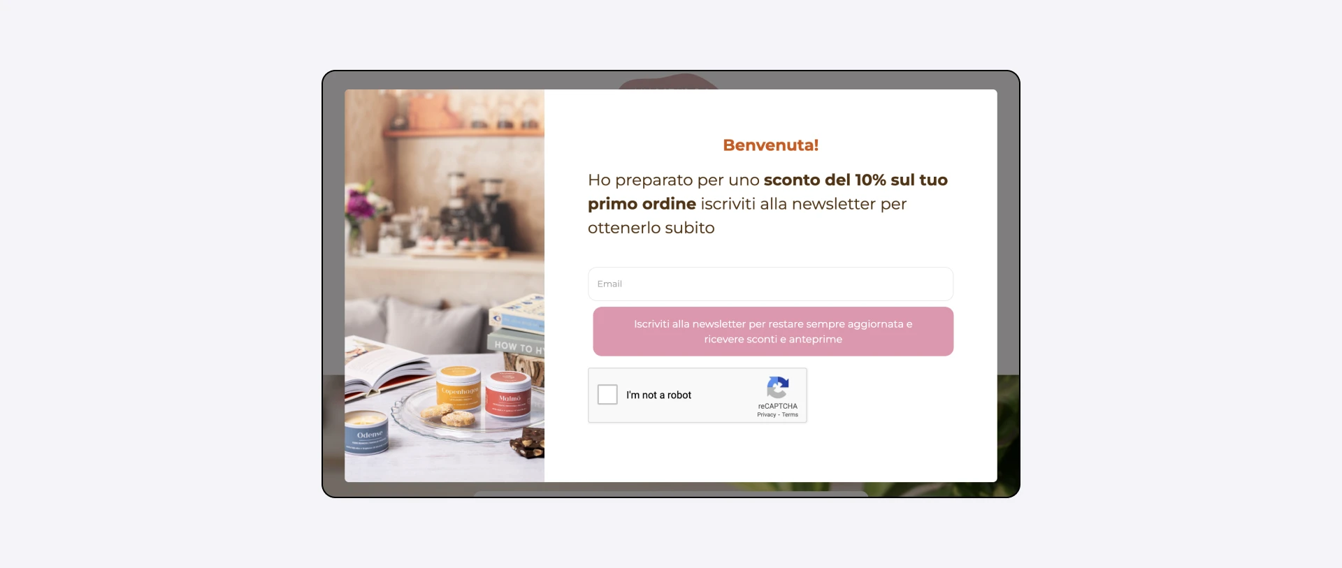
This simple yet powerful strategy encourages immediate purchases and helps build a direct connection with potential customers, increasing the likelihood of both initial and repeat sales.
Read Jennifer’s success story here:
Case study 2: Artist Remon De Jong
Using pop-ups, forms, and offline marketing, artist Remon de Jong has successfully grown his email list to over 4,500 subscribers. He converts website visitors to email subscribers through well-timed pop-ups on his website.
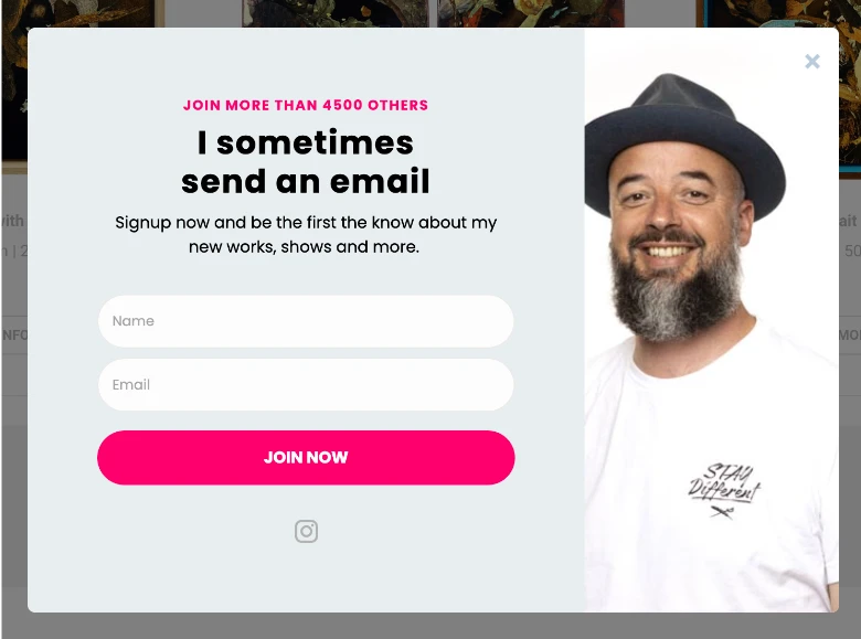
Read Remon’s case study here:

8 more pop-up best practices to boost performance
1. Make pop-ups easy to close
Pop-ups can be intrusive. Minimize the negative impact by making it obvious how people can close your pop-up so they can get back to your content. MailerLite pop-ups automatically have a visible close button. Plus, visitors can close the pop-up by clicking on the page away from the pop-up.
2. Use a gentle, non-aggressive design
While a pop-up is meant to grab attention, it doesn't have to be visually overwhelming. Avoid flashing colors, loud animations, or disruptive sounds. A clean, simple, and well-designed pop-up that complements your brand will be more effective and less likely to annoy visitors.
3. Use consistent brand styles
Align the design of your pop-ups with your website and brand. Do this by matching your pop-ups' primary color, typography, and wording with that of your website. MailerLite’s pop-up builder lets you easily customize the design of each pop-up so they have a consistent look that website visitors recognize as yours.
4. Offer a clear and compelling value proposition
Why should someone give you their email address? The pop-up needs to clearly communicate the benefit of signing up. Instead of a generic message, you could use a more specific and enticing offer like:
Get 10% off your first order
Download our free e-book on [topic]
Join our community and get exclusive content and updates
5. Create responsive pop-ups
Your pop-ups need to be responsive so they look good on all screen sizes, from mobile to tablet and desktop. All buttons and forms should also be accessible, no matter what type of screen the visitor is using. MailerLite’s pop-ups are automatically responsive, no extra work required.
6. Set an appropriate pop-up frequency
If someone closes a pop-up, they don't want to keep seeing it. Respect their decision by not showing those people any more pop-ups during their visit.
You can easily choose how often to show a pop-up to the same visitor in the MailerLite pop-up builder settings.
7. Only ask for the necessary information
People are more likely to join your email list when the process is simple. Reduce friction by only asking for an email address. You can always use email surveys to collect more subscriber information once they have signed up.
If collecting customer information is essential to the effectiveness of your business’s lead generation, you can still add more fields to your forms. Just be aware that you may receive fewer signups.
8. Target your pop-ups based on user behavior
Use triggers to show specific pop-ups to users who have demonstrated interest. For example, with MailerLite pop-ups, you can use pop-ups according to:
Time on page: Show a pop-up after a user has spent a certain amount of time on a page, indicating they're engaged with your content
Scroll depth: Trigger a pop-up when a user has scrolled a certain percentage down the page, showing they're reading the full article
Exit intent: Display a final offer or a call to action just as a user is about to close the page
Pop-up templates to get started in a flash
Speed up the pop-up creation process with one of our pop-up templates. Choose a pop-up design you like and then customize it to your needs with our builder. Browse some of our favorite designs in the library below.
If you like a design, make it your own by heading to the create a new form section in your MailerLite dashboard, choosing to create a pop-up, and then starting from a template.
Final thoughts on pop-ups
When pop-ups provide value to your visitors without hurting their browsing experience, you’ve achieved pop-up nirvana.
If you want to start growing your list and business using pop-ups, our pop-up editor makes creating them simple. Click here to sign up for free and start creating your first pop-up today.