Skyrocket conversion rates with the perfect email call-to-action (CTA)

The final piece of the email conversion puzzle is to give your readers a compelling reason to click.
If you've read the previous chapters of the Ultimate Guide to Email Marketing, you know how to write effective subject lines and content that clearly communicates your message. There's just one last step to complete your email masterpiece.
You need a call-to-action (CTA) that works!
In this chapter, we'll share everything you need to know about CTAs in emails—from the placement to button text and design. But first, let’s get a clear understanding of what a CTA is.
What is a CTA in email marketing?
A CTA (Call-to-Action) is a button or link in your email that prompts the reader to take a specific action, such as "Buy now", "Learn more", or "Sign up". Think of it as a guide that directs your audience towards a desired outcome, whether that’s making a purchase, reading a blog post, or joining a newsletter.
Where to put your call-to-action
The placement of your CTA is crucial and depends on your email's goal and content. A one-size-fits-all approach won't work. The best placement strategy is based on your reader's motivation and the complexity of your offer.
Here are a few fundamental rules you can follow when building your newsletters:
For simple, low-commitment actions, place the CTA above the fold. If your offer is simple and easy to understand (like a quick download or a single product sale), put a prominent CTA at the top of your email. This ensures that even readers who only glance at your email will see it and can take action immediately.
For complex offers, place the CTA below the fold. If you need to tell a story or provide more context to convince your reader to act, build that narrative first. Place the primary CTA after you've made your case, at the "climax" of your email. This allows readers to become fully engaged before you make your final ask.
Use secondary CTAs to support your primary one. You can place secondary CTAs within your body copy to link to related content, product mentions, or a more detailed landing page. These can also be used to provide an alternative, less-committed option for readers who aren't ready for the primary action.
Put CTAs in places readers naturally pause. Use visual breaks, like headers, the ends of sections, and image captions, as strategic spots for secondary CTAs. This can help guide the reader's eye and maintain a logical flow.
Make sure the CTA defines a clear action and links to a complementary landing page. The CTA text and the page it leads to should feel like a cohesive experience. The CTA should always set a clear expectation for what will happen next.
For email campaigns with a singular focus, the CTA placement should follow the logical progression of your message. People typically read from top-left to bottom-right, so placing the button at the end of your content makes the most sense. This also lets you build a compelling narrative before asking for the click.
If you have a newsletter with multiple CTAs, ensure each button is clearly aligned with its corresponding content section.
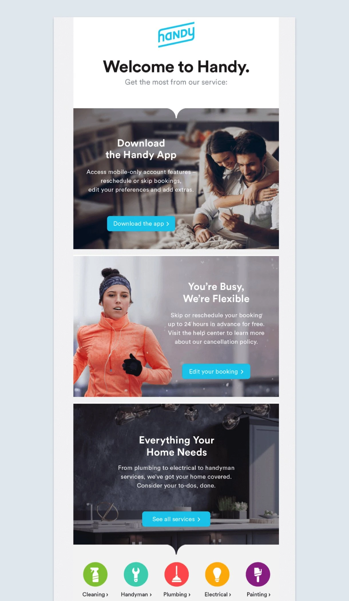
Here is an example from Handy. Its welcome email contains multiple calls-to-action that are organized really well. Your eyes start at the top and follow the flow of the CTA buttons down.
Don’t assume the reader only clicks on the CTA button. Curious people often try to click on different elements in the email like the logo, headlines, and images. Consider adding the same link to those elements if you think it will help the reader.
How to write call-to-action text
Imagine you're reading an email and see these two options:
A. Shop now
B. Find my perfect backpack
Which button would you be more motivated to click?
If you picked B, you're not alone. While buttons with generic text like "Shop now", "Learn more", and "Sign up" are common, they’re not as compelling or descriptive. They tell you what to do but not what you'll get in return.
When you use generic text, you are missing an opportunity to get more clicks.
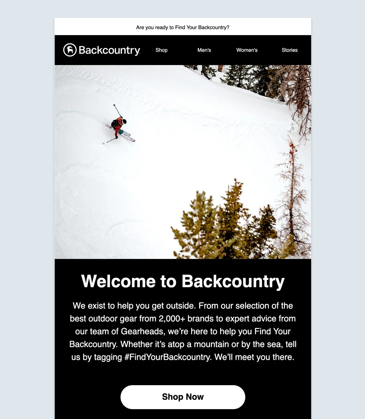
Backcountry, an e-commerce outdoor gear and clothing store, starts by asking if you’re ready to “find your backcountry” and builds upon the story throughout the email.
But, just at the precipice, it ends with a “Shop now” button that links to the homepage. Don’t you think you’d be more motivated to click ahead with a “Find my gear” CTA?
People already know that you want them to click something. The trick is to let them know what is in it for them by highlighting benefits, setting expectations and making it personal. End the story with a satisfying finish!
So, what CTA words should you use? Here are five ways to write the text in your CTA buttons with smart copywriting:
1. Speak directly to your subscriber
Email is personal. Try speaking directly to your subscriber like you would a friend or colleague. A report published in late 2024 revealed over 50% of customers worldwide preferred to buy from companies that offer them personalized experiences.
For example, MyGiftCardSupply uses a second-person pronoun to “Snag Your 10% Off”. What if it had used “Get My 10% Off” instead?
This small change in words can make a huge difference. As a subscriber, you feel that this discount is just for you.
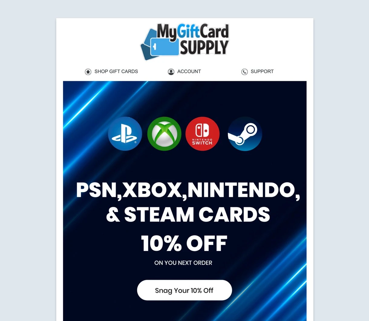
Also, its email’s value proposition is stated clearly in the button text: a 20% discount. Not just any discount but a specific one. So you’re tempted to click and enjoy that benefit. Would you have acted if it simply said, “Get your discount”?
2. Use approachable action verbs
Not all action words work. Some verbs make the reader uncomfortable or even stressed. Try experimenting with CTAs that are similar to how you talk to people in real-life.
Also, use words that let the reader know they are getting something in return. Approachable action verbs like get, find and try tell the reader there is a benefit waiting for them. For best results, combine these action words with an actual benefit to seal the deal.
3. Create urgency
If you have a limited-time offer or your email is time-sensitive, use it to your advantage with an effective CTA that raises the sense of urgency. People hate to miss out, especially with limited e-commerce deals! Use button text that lets your reader know that they must act now to enjoy the benefits.
While it's easy to add the word "now" at the end of your button text, try experimenting with phrases that raise the stakes. For example, "Experience it before your friends" or “Offer ends 6:00 PM”.
For something a little different, MailerLite has a countdown timer that you can insert into your email to heighten the urgency. Simply drag the countdown block into your newsletter and set the date and time. The countdown time is then automatically set based on the timezone of the sender.

4. Focus on the benefit
Instead of just stating a feature or fact, tell your subscribers what's in it for them. In the context of CTAs, emphasizing benefits helps to attract and motivate the audience. Highlight the positive outcomes or advantages your subscribers will get from taking a certain action.
For instance, rather than just saying "Buy now", you might say "Get 50% off". Or instead of "Start today", you could use "See your personalized plan".
By focusing on the direct benefits the reader will receive, you make the offer more appealing and increase the likelihood that they'll take the desired action.
5. Be concise and clear
Your CTA text should be short and to the point. A concise CTA is easier to read and understand at a glance, which is crucial for a reader quickly scanning an email. The ideal length for a CTA is typically 2-5 words. This forces you to be direct and clear about the value you're offering.
For instance, instead of saying, "Click here to see how you can get a discount", a better option is "Get 20% off". The second option is more direct and focuses on the immediate benefit. A clear CTA removes any guesswork and tells the reader exactly what they're getting and what to do next.
Email CTA copy examples
Below, we’ve provided you with 70+ CTA copy examples for the most common categories like purchase, event promotion, engagement, and more.
CTAs for purchase
Get 40% off
Lock in early bird price
Complete your look
Add to cart
Shop the collection
Claim my free gift
Unlock your savings
Get my free shipping
Browse the sale
Find my size
Buy now, pay later
See the deals
Upgrade your gear
Find your next adventure
CTAs for event promotion
Register for the webinar
Reserve your spot
Save your seat
See the agenda
Join the event
RSVP now
Secure your pass
Get event details
Watch the recording
Set a reminder
Hear from our speakers
View the schedule
CTAs for social media following
Follow us on Instagram
Join the conversation
Connect on LinkedIn
Subscribe to our channel
Find us on social
Tag us in your photos
Share your story
Join the community
See what’s trending
CTAs for engagement (works for content-related emails)
Download exclusive content
Download free wedding checklist
Read the full story
Discover 5 new exercises 💪
Explore our blog
Continue reading
Get the guide
Read the case study
Learn the secret
Unlock your potential
Expand your skills
Get the free template
CTAs for services
Start your fitness journey
Improve my writing skills
Grow my audience
Improve my flexibility
Master time management ⏳
Start my free trial
See your personalized plan
Request a demo
Get my custom quote
Book a consultation
See how it works
Let’s get started
CTAs for surveys and reviews
Access VIP perks 🤩
Share your feedback
Take the survey
Leave a review
Rate your experience
What did you think?
Tell us what you think
Help us improve
Claim your reward
CTAs for sign-ups and downloads
Join the waitlist
Sign me up!
Subscribe to our newsletter
Get my free ebook
Download the report
Join for free
More call-to-action email examples
So far, you’ve learned about the most important CTA tips, seen them used in real-life email newsletter examples, and got a list of CTA copy you can use in your email newsletters.
Now, let’s look at a few more email CTA examples that showcase different approaches to CTAs. Remember, one approach doesn’t fit all; use the right CTA to provide a conclusive and ultimately satisfying finish to your compelling story.
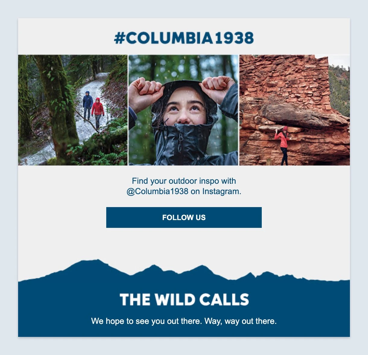
Columbia, an outdoor sports brand, sprinkles the usual e-commerce CTA buttons in its newsletter. However, nestled inside is a social media CTA. Some customers aren’t looking to buy anything at the moment. So allowing them to follow your brand is a great way to keep and nurture them.
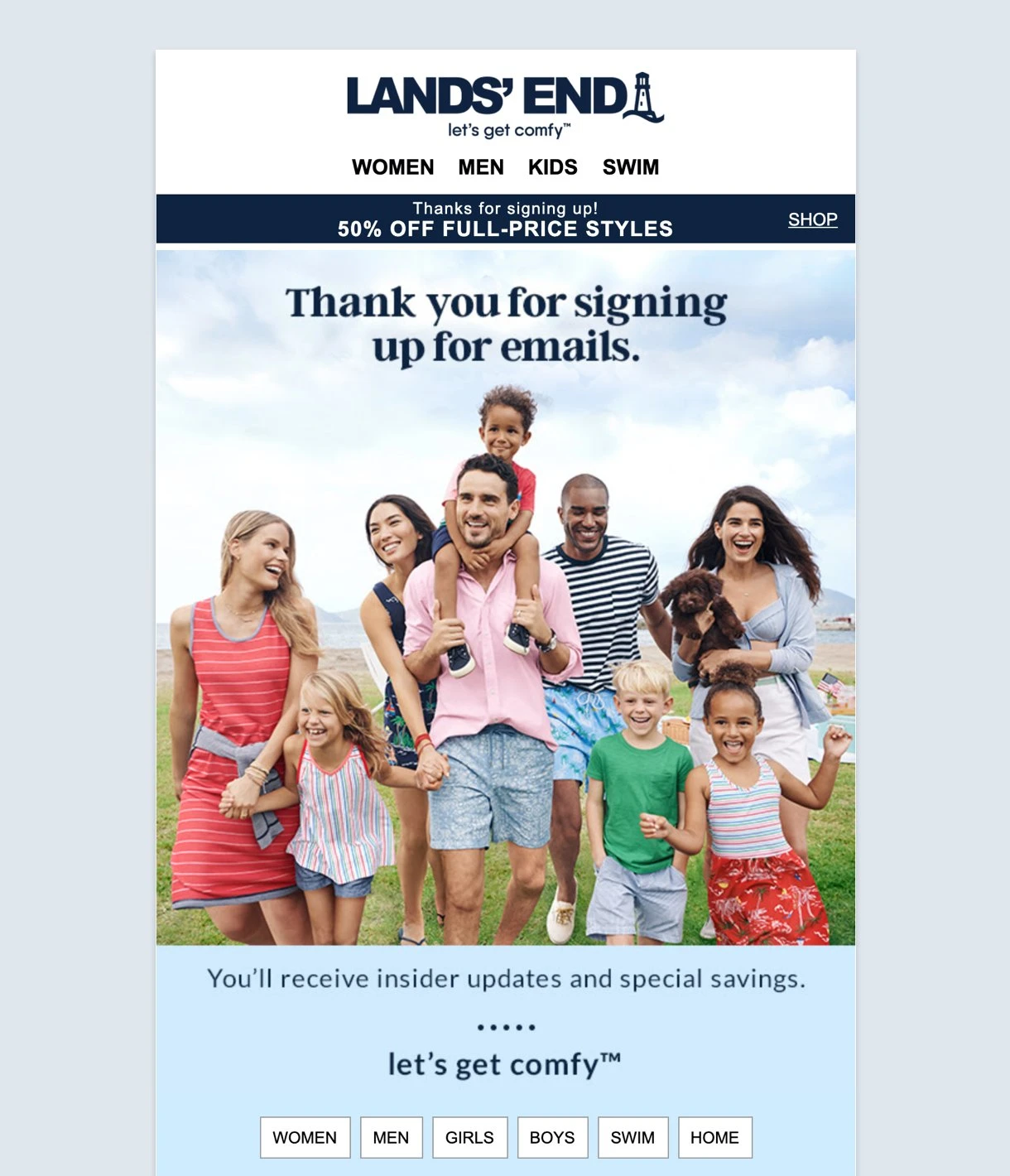
Land’s End is a classic lifestyle brand that transitioned from catalogues to e-commerce. In its welcome email, it doesn't waste time with generic buttons asking you to “Shop now” or “Buy now”.
Instead, it cuts to the chase using different product web pages as its CTA buttons. The brand is boosting its potential conversion rates by putting its landing pages right before you.
For Another Escape, a printed journal for outdoor lovers, it’s not immediately apparent where its email CTAs are. In keeping with its exploration theme, its email encourages you to search, click, and read on at your own pace.
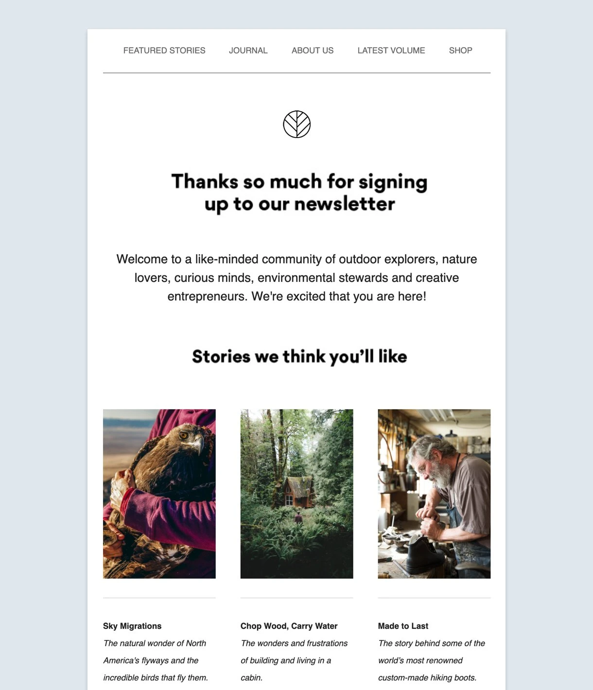
Another Escape thoughtfully refrained from plastering its newsletter with distracting “Read more” links or buttons. Instead, its photos serve as CTA buttons to jump to an article that interests you. It's tastefully done and complements its overall story.
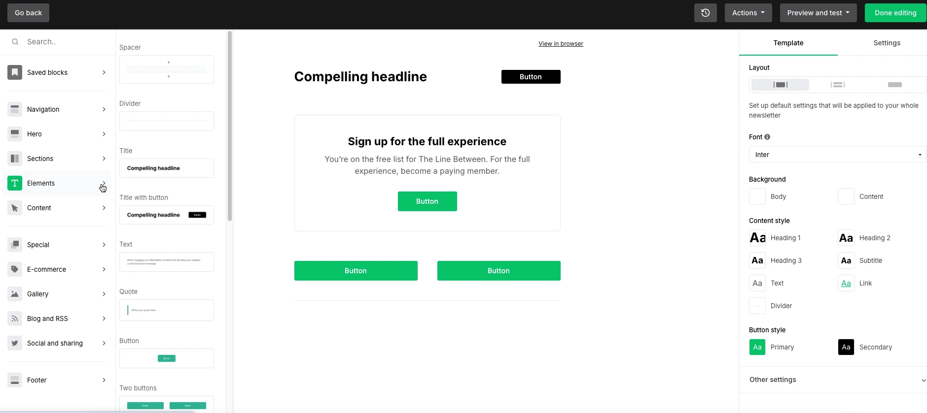
If you like visual CTAs, MailerLite's Drag & drop editor helps you arrange, visualize, and preview your email newsletter before you send it out. Simply drag blocks around your newsletter design and drop them to experiment with different layouts and CTAs.
Email CTA best practices
The best way to get more clicks is to include a call-to-action button.
While some people prefer links or images as their email CTA, buttons make it 100% clear that you want the reader to click.
They are also much easier to find and tap on mobile devices with touchscreens. MailerLite offers a library of customizable button options to help you get started.
Here are some button options on MailerLite’s design interface. You can choose them from the Elements section of our Drag & drop editor. We’ve dragged a few of the buttons to the body of the email to show you how it looks. You can customize them to fit your brand design:
Here’s how to make your CTA button stand out:
1. Use contrasting colors for the CTA button
Take a look at your email design and choose a button color that will stand out. Make sure the button color pops without clashing with the background and text colors. The goal is to make it cohesive while still ensuring the CTA button is the loudest color on the screen.
The North Face uses a contrasting color to good effect with its welcome email. Notice how the orange CTA button pops out from the email together with the backpack as well? Plus, its button text rocks!
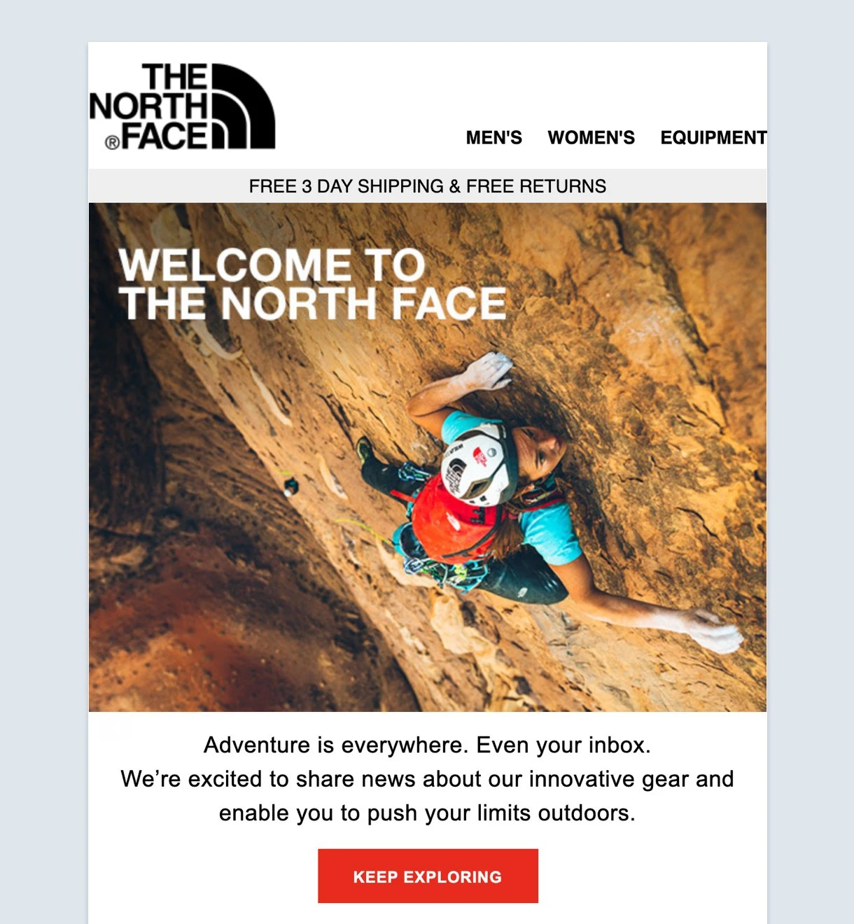
Also, while this mailer is for their e-commerce homepage, it’s not just about discount coupons and specials. The email speaks to you about outfitting yourself for your next outdoor adventure.
2. Make your CTA button interactive
You can use shading to create an illusion that the button lives on a different plane. Or, you can change the color and depth of the button when the mouse hovers over it.
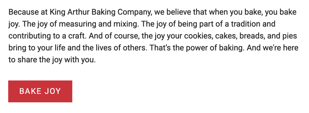
King Arthur Baking Company’s CTA button changes to an outline as you click it. These little tricks enhance interactivity.
3. Experiment with whitespace
If you have too much clutter in your email, the CTA will be hard to find, no matter how bright or big. Think about the negative space in the email. Make sure there is enough white space around your button to avoid any visual noise.
Google’s minimalist design is put to good use in its regular email newsletters. In the signature material design style, the monotone graphic and white space don’t fight for the reader’s attention with the sole CTA button. It may be plain for some, but it works here.

4. Try adding directional cues to the CTA button
Many people have found success by adding arrows that point to their buttons. While this is a good way to draw your readers to the button, it might also be a distraction from the content.
Another more subtle technique is to use imagery that points to the CTA. For example, instead of a person looking directly at the camera, they can be looking in the direction of the button. Coursera nails this in its welcome email—just look at the gaze of the smiling student!
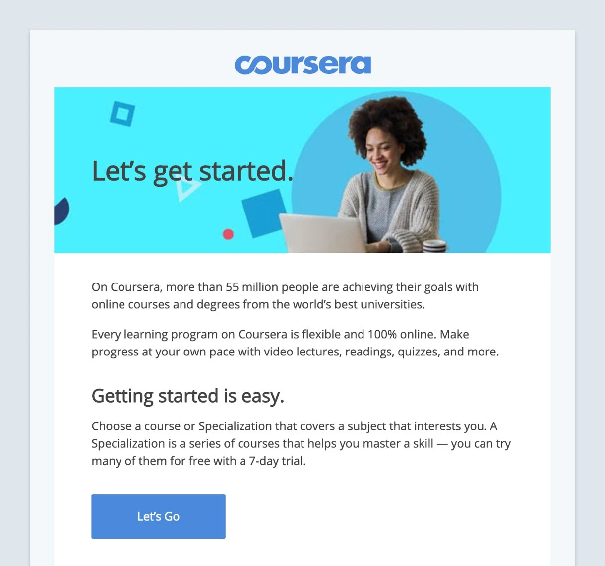
And Coursera pairs it nicely with its CTA button text. Which would you rather be told to do: “Let’s Go”, “Study now”, or "Learn more"?
5. Make the CTA button big enough
OK, this is not permission to make your CTA button humongous. You don’t want it to be obnoxious. But at the same time, it must be large enough to be found quickly.
Use your judgment and do an eye test. Can you find the button?
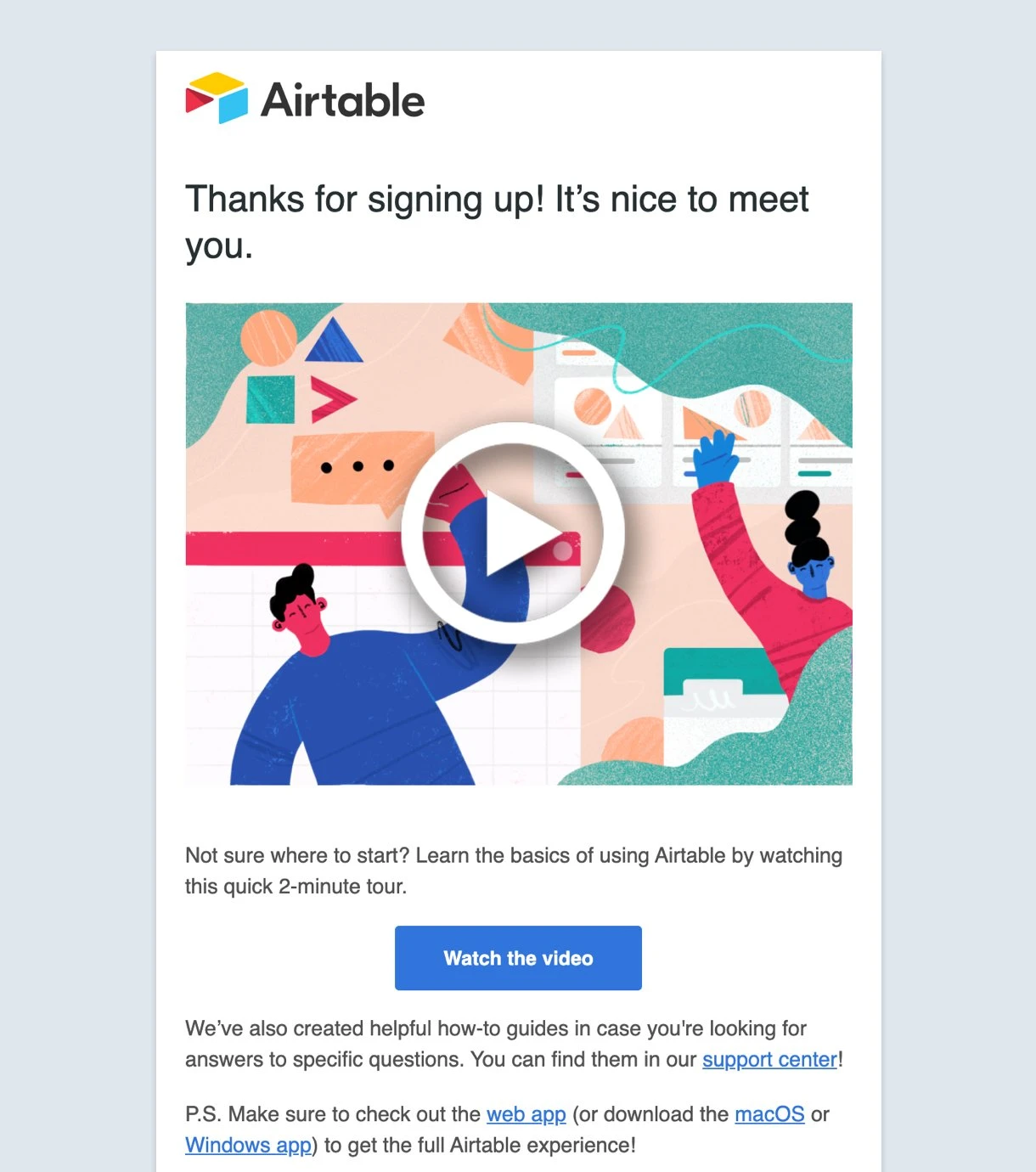
Airtable uses a subtle way to lead your eyes to its call-to-action button. The hourglass layout draws your eyes to the sole CTA button. Thankfully, both the graphic and the CTA button jump to the same video link.
6. Test, track and analyze
Your CTA is only as good as the results it delivers. You might think your button is perfect, but the data will tell you the real story. By regularly testing your CTAs and tracking their performance, you can move beyond guesswork and make data-driven decisions that lead to real results.
Here’s how to set up a system for continuous improvement.
A/B test your CTAs
A/B testing, also known as split testing, is a method of comparing two versions of your email to see which one performs better. It's a simple, yet powerful, way to optimize your CTAs. The key is to test one variable at a time. This allows you to pinpoint exactly what caused a change in performance.
When it comes to your CTA, you can A/B test a variety of elements including button design, CTA text, placement, imagery, and spacing.
To run a test, you create two versions of your email: one with your original CTA (the control) and one with a single change (the variation). Send each version to a small, random segment of your audience, then send the winning version to the rest of your list.

Monitor dashboard metrics
Once your email is sent, the real work begins. Your email marketing platform's dashboard is a treasure trove of information. The most important metrics to watch are:
Open rate: How many people opened your email. While it doesn't directly measure CTA performance, a low open rate suggests you need to work on your subject lines, not your CTAs.
Click-through rate (CTR): The percentage of people who clicked on your CTA. This is your primary indicator for how well your CTA is performing. A high CTR means your content is compelling and your button is attractive.
Conversion rate: The percentage of people who clicked the CTA and then completed the desired action on your landing page—whether that's making a purchase, signing up for a newsletter, or downloading a resource.
By monitoring these metrics, you can identify which CTAs are working and which need to be improved.
Set up goal tracking in GA4
To get a full picture of your CTA's effectiveness, you need to see what happens after the click. Google Analytics 4 (GA4) can help with that. By setting up goal tracking in GA4, you can measure conversions that happen on your website after a user clicks your email's CTA.
The most effective way to do this is by using UTM parameters. These are small snippets of code you add to the end of your CTA link.
For example, instead of www.yourwebsite.com/product, your link might be www.yourwebsite.com/product?utm_source=email&utm_medium=newsletter&utm_campaign=winter_sale.
GA4 automatically reads these parameters and shows you how many visitors, sales, and conversions came directly from your email campaign. This lets you compare the performance of your email CTAs side-by-side with other marketing channels like social media and paid ads.
7. Make your CTA accessible
Making your email CTAs accessible is the right thing to do, plus, it's also a smart business decision. An accessible email reaches a wider audience, including those with visual, motor, or cognitive impairments. Here’s how you can make your CTAs inclusive and effective for all subscribers.
Accessible design and text: The design tips we've already covered, like using contrasting colors and ample whitespace, are key to accessibility. But there are a few more things to keep in mind, especially for users who rely on screen readers or have low vision.
Descriptive button text: Avoid generic text like "Click here" or "Learn more". Screen readers compile a list of all the links on a page, and if a user hears a long list of "Click here", it's completely unhelpful. Instead, use button text that is descriptive and tells the user exactly what will happen when they click, such as "Download the guide" or "Shop the new collection".
Color contrast: For your CTA text to be legible, it must have a high contrast ratio with the button's background. The Web Content Accessibility Guidelines (WCAG) recommend a minimum contrast ratio of 4.5:1 for regular text and 3:1 for large text. You can use free online tools to check if your colors meet these standards.
Text over images: Avoid using images of text for your CTA buttons. Screen readers can’t read the text inside an image. If the image fails to load, the user is left with a broken image and no CTA. Always use live HTML text for your buttons.
Technical accessibility: Beyond the visual design, there are technical details you can implement in the email's code to ensure a great experience for all users.
Semantic HTML: Use proper HTML tags to build your CTA button. A real <button> element or an <a> tag with appropriate styling is much better than a styled <span> or other non-semantic elements. This ensures that assistive technologies, like screen readers, correctly identify the element as a button or link.
ARIA attributes: For a button created with an <a> tag, you can add a role="button" attribute to your code to help screen readers announce the link as a button. This provides a better experience for users navigating your email with a keyboard. For example: <a href="#" role="button">Read More</a>. (Keep in mind though, that native HTML buttons are always better unless you have a strong reason to use non-semantic elements).
Sufficient clickable area: Ensure that your button has a large enough clickable area to be easily tapped on a mobile device or by someone with motor impairments. A good rule of thumb is to aim for a minimum size of 44x44 to 48x48 pixels. This includes the padding around the text and the button itself.
8. Personalize with dynamic content and segmentation
Your readers' inboxes are crowded, with the average person receiving over 120 emails every day.
To connect with your audience and make them take action, your CTAs should feel personal and relevant. This is where audience segmentation and dynamic content can become your best friends.
Audience segmentation: Before you can personalize, you need to understand who you're talking to. Segmentation is the process of dividing your email list into smaller, more specific groups based on shared characteristics. This lets you tailor your message and, importantly, your CTA, to each group's unique interests and behaviors.
For example, instead of sending a generic "Shop now" email to your entire list, you could:
Segment by purchase history: Send a "Shop men's outerwear" CTA to subscribers who have previously bought men's jackets and a "Shop women's outerwear" CTA to others.
Segment by engagement: Send a more direct "Unlock your discount" CTA to highly engaged users, while a less engaged group might receive a softer "See What's new" CTA.
Segment by location: Promote a local event with a "Find an event near me" CTA to subscribers in a specific city.
Dynamic content: Dynamic content takes segmentation a step further. It allows you to automatically change the content of an email—including the CTA—based on the recipient's data. This means you can design a single email template that serves up a completely personalized experience for every subscriber.
Here are a few ways to use dynamic content for your CTAs:
Personalized product recommendations: A customer just bought a new coffee maker. Your follow-up email features coffee beans and filters with a CTA like "Complete your coffee station" or "Shop fresh coffee beans".
Personalized offers: For a new subscriber, the email's CTA button might say "Claim your 10% off" to encourage a first purchase. The same email template might show a more exclusive offer for a loyal customer with a CTA that reads "Unlock your VIP 25% off" to reward their loyalty.
Context-based updates: For a webinar, the CTA could be "Register now" before the event, and then dynamically change to "Watch the recording" for anyone who didn't sign up.
These tips are meant to guide your design, but ultimately, your choices should work together to make your CTA impossible to ignore.
A button that is easy to find and read is a button that gets clicked.
Common mistakes to avoid
One surefire way to increase the effectiveness of your CTAs is to avoid the common pitfalls that lead to decreased engagement. Here are some common mistakes you should avoid while crafting your CTAs:
Generic CTA copy: Don’t rely on overused terms like "Click here" or "Learn more" that don't resonate with or engage your audience
Lack of context: Avoid asking readers to "submit" or "register" without providing a clear understanding of what they're signing up for or why
Design flaws: Small, low-contrast CTAs that easily blend into the overall design are difficult for readers to spot
CTA overload: Don’t add multiple competing CTAs in a single email. This can confuse and overwhelm readers, leading to no clicks at all
Missing value proposition: Explain the benefits of taking action. Without a clear value proposition, readers will be left questioning the purpose of your ask
Too much jargon: Avoid using technical or industry-specific terms that might be unclear to the average reader, hindering engagement
Your email CTA best practices checklist
It may seem like a lot of information to take in, but everything you've learned in this guide can be broken down into a simple checklist. Here's how to create a CTA that converts:
Craft a compelling narrative that guides the reader to a climactic point and a single, clear CTA
Place your primary CTA strategically, either above the fold for simple offers or at the end of a longer story
Write CTA text that is personal and uses approachable action words to create a sense of urgency
Focus on the benefits; tell your readers exactly what's in it for them
Ensure your CTA is concise and clear so readers can understand the value at a glance
Make your button stand out with contrasting colors, interactivity, ample whitespace, directional cues, or a larger size
Design for accessibility by using descriptive text, strong color contrast, and proper HTML
Use audience segmentation and dynamic content to make your CTA feel personal and relevant
Always A/B test your emails and CTAs to find the best-performing combination
Avoid common mistakes like using generic copy, adding too many CTAs, or lacking a clear value proposition