Ultimate guide to email design (+19 easy to use tips)

Design not your thing? Don't worry, anyone can create emails that wow their audience with the right tools. Read on for secrets, shortcuts and strategies to take your email design skills from preschool to Picasso. 🎨
This article includes 19 steps to level up your email design. We’ll cover how to create effective email layouts that generate conversions, design branded messages that are instantly recognizable, and optimize your design with tools and testing. Read on for more!
What is email design?
Email design is the process of creating emails with a look and feel that resonates with your target audience, reflects your brand, and pushes toward your business goals.
Many factors influence the design, including the layout, colors, spacing, consistency, and images.
Email design matters because how your messages look has a direct impact on how people perceive them. The right design can lead to more sales, conversions, trust and brand recognition.
On the other hand, emails without a cohesive look risk being ineffective. They won’t resonate as much and people will have to work harder to understand them.
There are 2 types of emails: HTML emails and plain text emails.
Plain text emails are the ones you send to your mum or boss. They include text and maybe the occasional image. Brands typically avoid this type of email, although they can use them to send messages that appear personal. These emails typically don’t require much design thought beyond basics like spacing.
HTML emails, built with code or a drag-and-drop editor, offer more design flexibility. You can add colors, backgrounds, fonts, buttons, content sections and more. These are the types of emails that brands typically send out, and it’s the type of email this article will discuss.
How to create an effective newsletter layout
Choosing the right layout is a key part of email design. A good one ensures your email is easily readable while highlighting the points you want to focus on.
Here are 6 tips to help you create a layout that works.
1. Consider essential email elements
Most emails have similar elements: Using them in your messages helps you create a layout people can easily navigate.
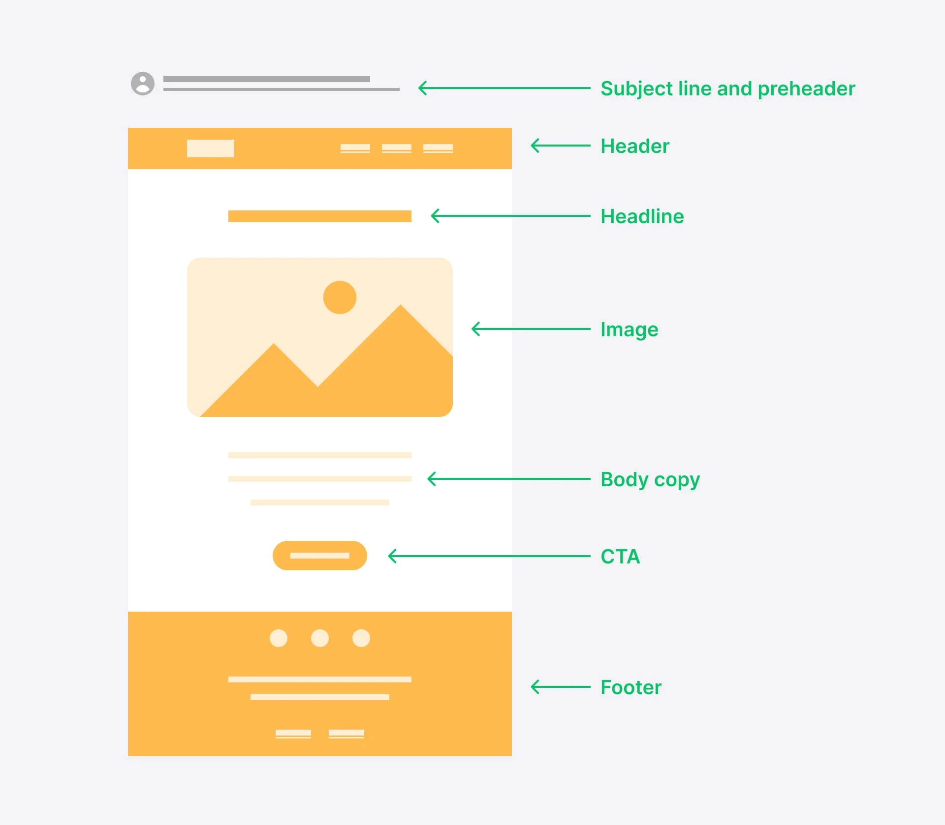
Here are some important elements you’ll see in most emails.
Subject line and preheader: While not part of your email body, your subject line and preheader attract attention and contribute to a cohesive experience
Header: Your email header is one of the first things people see. It may include your logo and links to essential website pages
Headline: A headline’s large font size draws the reader's eyes, making it a great place to highlight the main message of your campaign
Body copy: Go into further detail with your body copy. Use headings and lists to make the content easily scannable
Images: Use images to illustrate parts of your message, whether that’s product photos, helpful graphics, or promotional banners
CTA buttons: Buttons stand out from the rest of your email. Use them to send people to relevant website pages or offers
Footer: Your footer contains essential information about your brand such as contact details and social links. You also have to include an unsubscribe link
You don’t have to design all these elements from scratch. MailerLite has prebuilt blocks that you can choose from and customize to your needs. You can then drag and drop them into an email design that makes sense for your brand.
See a sample of an optimized email layout in the graphic below.
2. Start with a template
Templates are prebuilt HTML emails offered by email service providers that you can customize with your own content and branding.
Starting with a template gives you a professionally designed base to build from, making it much easier to create emails that look great.
Templates also come with many of the essential layout elements mentioned in the point above, such as email headers and footers. You just have to edit the included sections or add new elements to design emails that fit your needs.
Get started by browsing available templates, we’ve linked to some of our favorites below. Remember that all the content in the template can be edited, so choose a design that resonates, even if the template isn’t for your required use case.
3. Put the important information above the fold
Above the fold refers to the portion of an email visible without scrolling. The term comes from the world of printed newspapers, which were often folded in half and displayed so people could only see the information on the top half of the page.
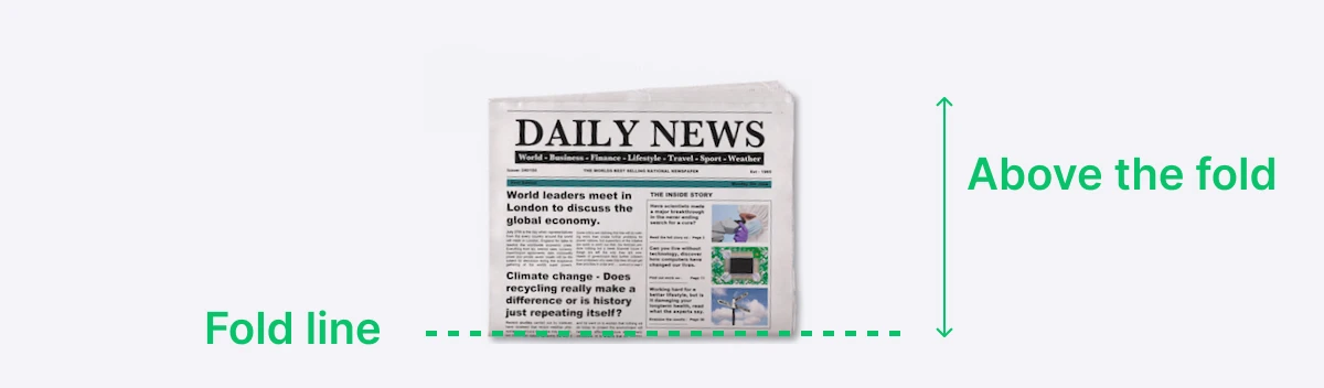
When used to refer to digital content, above the fold is the content that people can see when they open the webpage or email before starting to scroll.
Placing key information here ensures it is seen immediately, making it the key factor in capturing the recipient’s attention.
Since many recipients won’t scroll through the entire email, position your main message, primary call-to-action, and essential details at the top. Use a compelling headline and a concise summary to ensure the most critical content is visible as soon as the email is opened.
Use your email tool’s preview mode or send test messages to check which content shows up above the fold.
4. Keep your content narrow
Keep your email or newsletter within 600 pixels wide. If your emails are too wide, the reader will have to scroll from side to side which can be annoying. Subscribers are likely to skip the content if they can’t immediately see the entire width of the email campaign.
If you use MailerLite’s Drag & drop editor to design your emails, your messages will automatically be the optimal width.
5. Consider email content hierarchy
Email content hierarchy organizes information so that the most important elements catch the reader’s attention first. This structure guides readers through the email, making it easier to understand and more engaging.
Key to this is deciding on the most important part of your message. Assess the content you plan to include and decide what will benefit readers and your business. For many brands, this will be conversion-related content such as offers or product promotions.
Here are some ways to draw the reader’s attention to the most important points of your email
Place important content at the top of the newsletter.
Use color, contrast, position, and size to put more weight on important points.
Use large typography to highlight important content and go smaller with less important info.
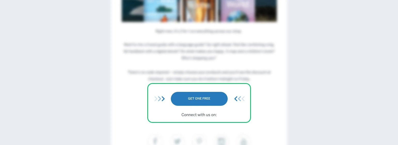
Below is a really clear example from one of our email templates. The 20% discount is highlighted in big text at the top of the email and has a background that contrasts the rest of the message. The CTA button also stands out thanks to the high contrast.
Meanwhile, the offer details are in smaller text so the reader can get extra information once they’ve had their attention drawn to the sale.
6. Use a responsive design
Responsive email design ensures your messages look great on all devices by adapting to different screen sizes. This approach provides an optimal user experience whether recipients are using mobile devices, tablets, or desktops.
If you are designing emails with MailerLite’s Drag & drop builder, all your emails are responsive by default. You can use the email builder’s preview settings to see how your message looks on each device. Or send a test email and view it from within different email clients.
13 more newsletter design tips
Now you’ve got your layout down, we’ll get into the nitty-gritty with 13 more design tips to make your messages stand out.
1. Choose a color palette
Choose a color palette and stick to this for all your emails. This helps you create messages that are easily identifiable as yours.
If your brand already has a defined color palette, use the same one for your emails so people associate the messages with your brand. If your brand doesn’t have a color palette, now is a good time to choose one.
The key to choosing a palette is to pick around 5 colors that complement each other. Tools like Coolors make it easy by generating complementary colors at the click of a button. Just keep going until you get a combination that you like.
Consider the theory of colors when choosing your palette to ensure you convey the emotions and moods that are appropriate for your brand. The chart below highlights some common color associations. Learn more in our article on choosing the best colors for your emails.

2. Choose fonts
Fonts are another essential design element. If your brand already has set fonts, keep using them in your emails.
If you don’t, now’s the time to choose them. Select fonts that reflect your brand's personality and values. Use a primary font for logos and headings and a secondary font for body text. Ensure readability and versatility across different mediums.
Align the style with your brand's image: modern fonts for a sleek look, serif fonts for a traditional feel.
You can use online tools to help discover font pairings that work. Fontjoy is a good one, just hit generate to see different pairings.
3. Use colors consistently
Once you have decided on a color palette, assign them to each element in your email.
Here are some guidelines:
Text: Use dark colors like black or grey. Light colors can work if your email has a dark background
Headings: These can be the same as your body text. Or choose another color to make headings stand out
Backgrounds: Choose colors that contrast with the text colors you plan to use. Use a light background for dark text, or dark colors for light text
Text highlights: Choose bright colors that contrast with the regular text color. You may need different highlight colors depending on the background color
Buttons: Choose eye-catching high-contrast colors that stand out
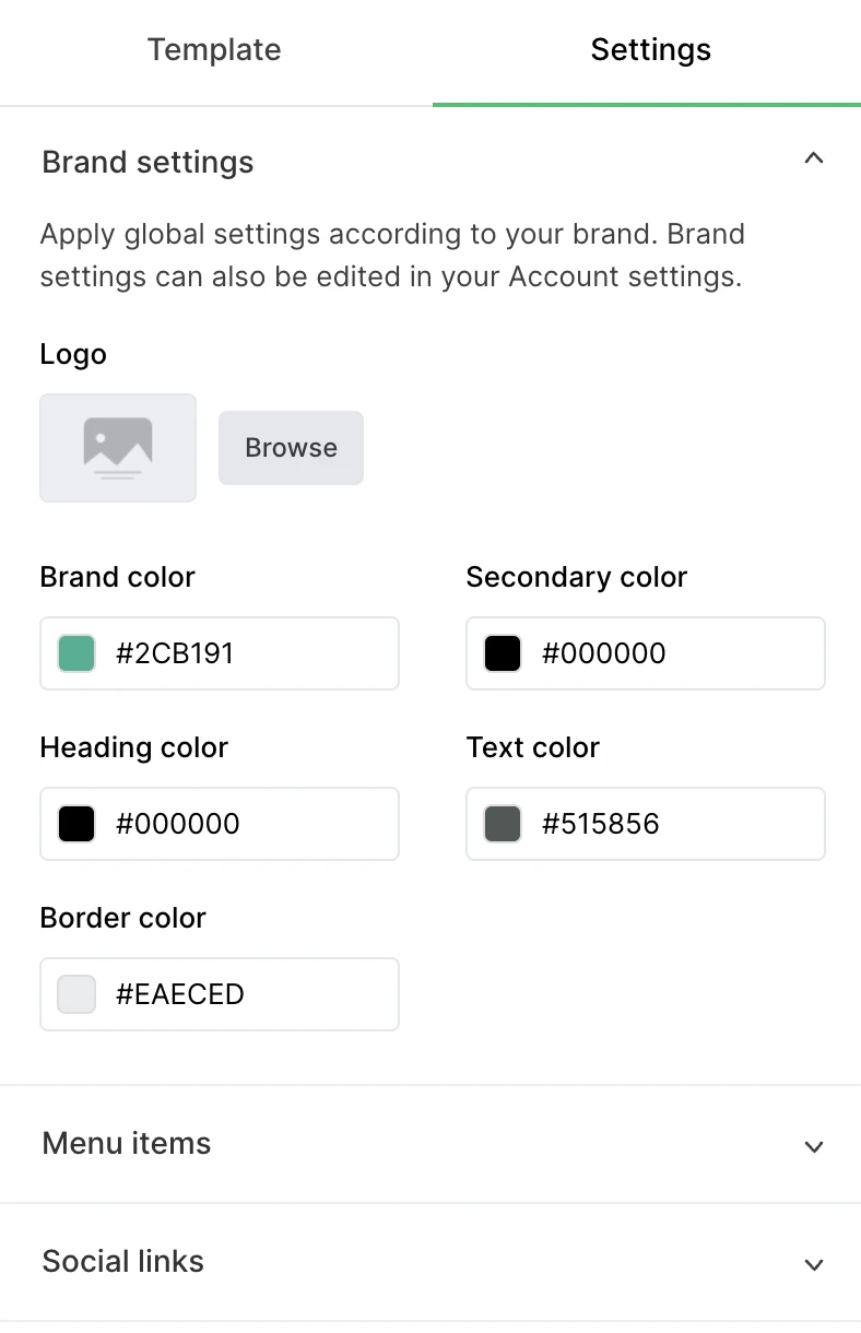
Using colors consistently will reinforce your brand identity and create a cohesive visual experience. Make it easy by assigning global colors to different elements in the MailerLite email editor.
This is easy to do within the brand settings part of your dashboard. Once you’ve updated the colors, they will be automatically reflected whenever you add an element to your email.
4. Use template blocks
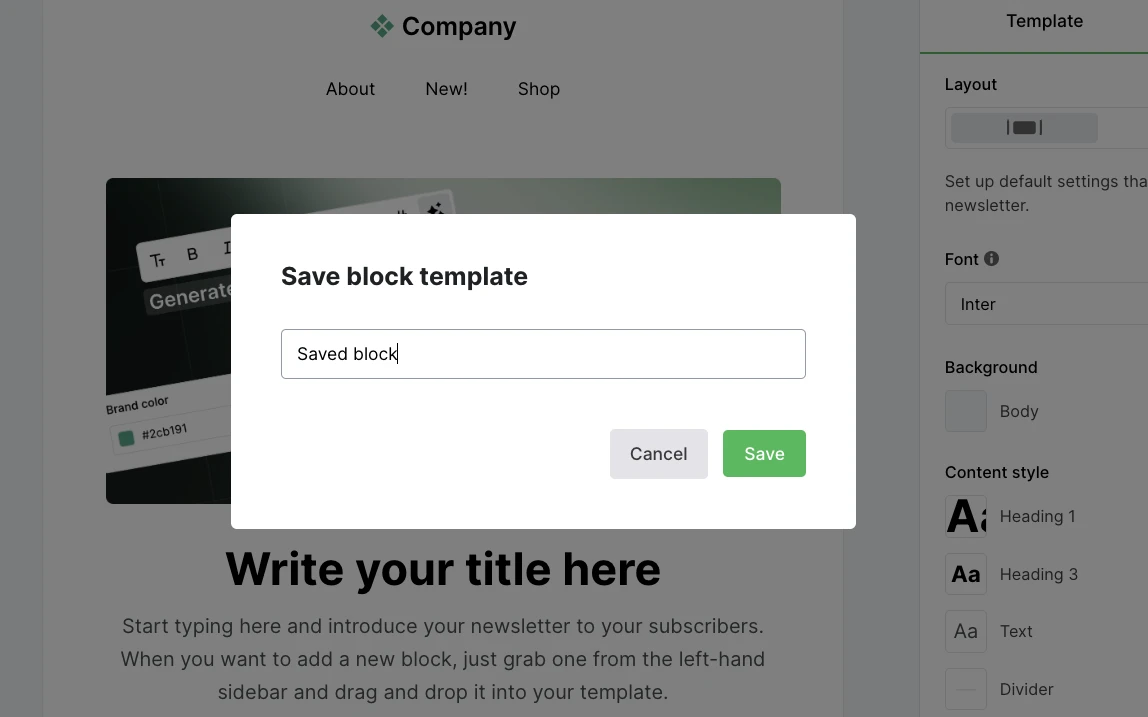
Another way to stay consistent is to save frequently used blocks and then reuse them in each email you send. This ensures a consistent on-brand design while speeding up the email design process.
With MailerLite, you can save blocks by hitting the bookmark icon. Each saved block will then be available in your Saved blocks section in the email builder.
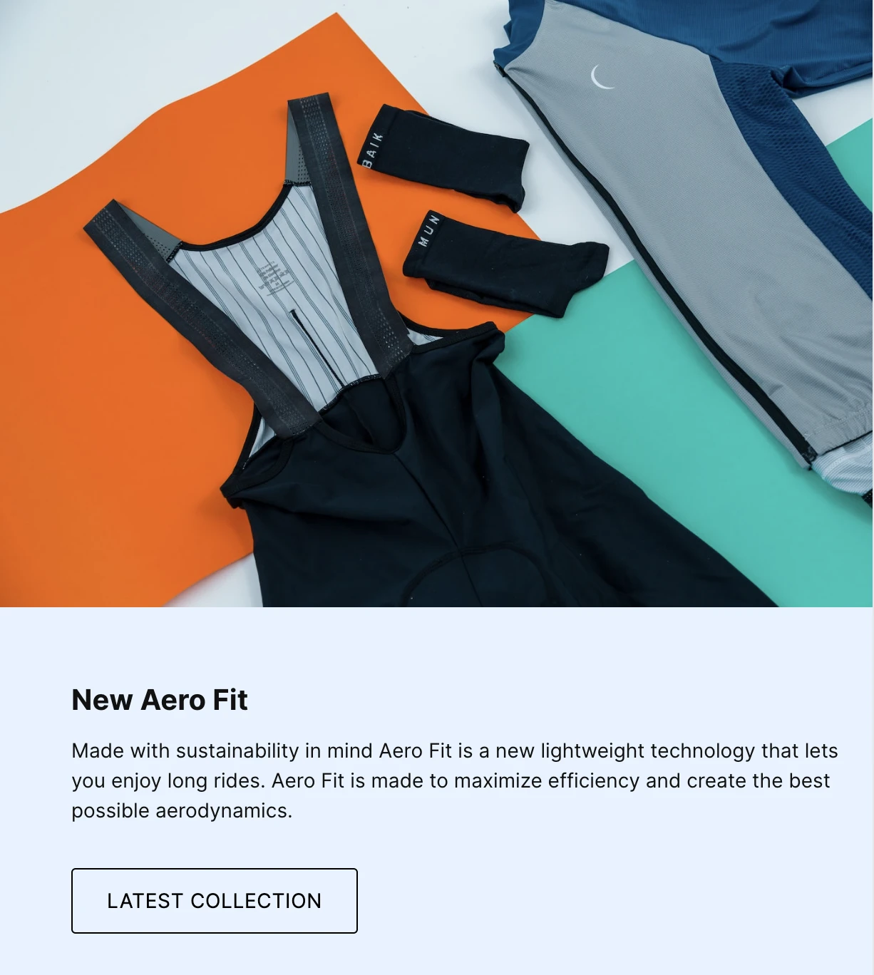
5. Choose the right images
Though using text and the right typography can get your message across, pictures can communicate an idea or a story within seconds. Your images hold a lot of influence.
Select images that complement or even enhance your text. The reader is expecting to learn something specific based on the image so make sure the messaging delivers.
When creating email graphics, be sure to consider the color palette you chose in the step above. And if you use Canva, Adobe Express, or Figma to build your images, it’s easy to add them to your MailerLite file manager with one of our integrations.
You can also add other types of media such as videos, gifs, animation, and social media content.

6. Make your email scannable
Scannable emails allow recipients to quickly grasp the key points without reading the entire content in detail. Many users skim emails rather than read them thoroughly, so making your email scannable ensures that important information is conveyed swiftly, increasing the likelihood of engagement.
Use clear headings and subheadings, bullet points, and short paragraphs. Highlight key information with bold text or different colors, and include plenty of white space to make the content easy to navigate. This approach helps readers find and understand the main messages quickly.
7. Use directional cues
A directional cue is a graphic that points the reader in a specific direction. This can be an effective way to highlight a promotional deal, call-to-action button, or other important email element.
Directional cues can be obvious visuals like arrows, lines or a pointing finger. But they can also be more subtle, such as someone in an image gazing towards your CTA.
8. Switch up your background to break up content
Changing the background of one of your content elements is an easy way to break up a long email and draw attention to specific sections. Use contrasting colors or subtle patterns to help the content pop.
When choosing a background, be sure to choose designs that complement your brand and the design of your emails. You should also make sure that it’s still easy to read the email content.
In MailerLite’s newsletter, we use a light green background to highlight offers or calls to action. This brings attention to the content while being easy to read and staying on brand with a color people associate with our product.
9. Optimize the copy
The copy is the heart and soul of your newsletter! This is what will deliver your message, engage subscribers, build relationships, and reinforce your brand image.
Maximize its impact by using a copy design that is clear and highlights the most important parts of your message.
Keeping the text well-spaced will help make your message easy to read. As will highlighting the most important parts of your message, such as headlines or offers, by using large text or colors.
You can also use the power of 3 to ensure that your headline, body copy, and CTA work together in a compelling structure.
The headline sums up the main message. The body copy delivers the support points. The call-to-action seals the deal. Make sure these 3 elements are super easy to find.
10. Add image alt text
Alt text is displayed when an image file cannot be loaded or when people use screen readers to read your email newsletter. It ensures that your message can still be understood, even without the images.
11. Consider using interactive content
An easy way to drive engagement with your newsletter is to add interactive content like surveys, quizzes or social media posts.
You can embed this into your email marketing campaign with the relevant blocks in the MailerLite Drag & drop builder and then edit each element so it fits your needs.
12. Nail your email footer
Designing your email footer is slightly different from designing the rest of your email, as there are essential elements that you must include to stay compliant with laws relating to email marketing.
You must include an unsubscribe link, your contact details, and your address. You can also consider adding elements like social media links, contact information, and a link to your email preference center.
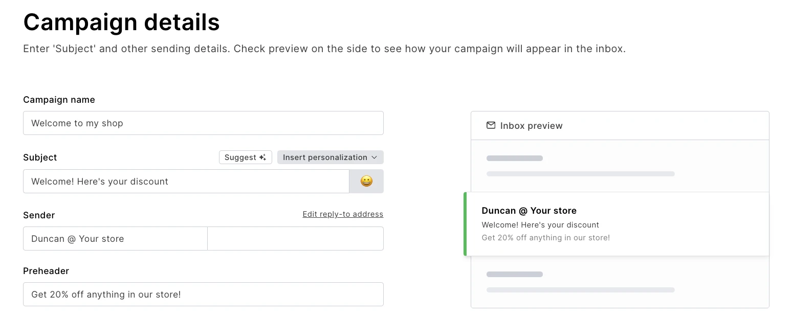
13. Don’t forget the subject line, preheader text, and sender name
While not part of your email body content, your subject line, preheader text, and sender name are the first things that recipients see. Spend some time ensuring it looks good in the inbox.
You can make your subject line stand out by including the most important information in the first 40 characters, as this is what is typically shown in mobile inboxes. Additionally, you can add emojis for a splash of color and stand out further.
Optimize the sender name by choosing something recognizable. You could also add a personal touch by using a real person’s name alongside the name of your business, such as Duncan @ MailerLite.
You can then use the preheader text to build on the information in the subject line.
The best tools to design an email newsletter
Marketing tools are your friend when it comes to email design. Here are 3 that are user-friendly, affordable, and have plenty of features to help you create beautiful emails.
MailerLite
“MailerLite’s no-code builder is the best I’ve tried. It makes it straightforward to create beautiful HTML emails. I think it’s in a class of its own.”
MailerLite is email marketing software with the best email designer around. A large template library and over 70 high-quality prebuilt blocks make it possible to design professional emails in no time, even if you’re not a graphic design pro. Drag-and-drop blocks and easy customization settings help you make them your own.
Beyond design features, MailerLite has all the tools you need to roll out effective marketing campaigns that grow sales, including automation, personalization, and e-commerce integrations. Plus, it offers landing page and email sign-up form builders with the same easy-to-use design functionality as our email builder.
Easily design beautiful emails
Try all of MailerLite’s powerful, yet easy-to-use email design tools for free with a 14-day trial. Hit the button below to start.
Canva
Canva is perhaps the easiest way to create graphics for your emails. Promote sales banners, featured images for blog posts, instructional graphics, and more with easy-to-use drag-and-drop tools.
Once you’ve finished the design, export it to MailerLite with a click by using the integration between MailerLite and Canva. What’s more, the tool has a very generous free plan with more than enough functionality to create beautiful images.
Adobe Express
Adobe Express is a user-friendly web design tool with many similar features to Canva including image templates, drag-and-drop features, and the ability to export images straight to MailerLite via an integration.
Adobe Express also has a free plan and, crucially, you can access the entire tool for free if you (or your organization) has access to Adobe Creative Cloud.
How to optimize your newsletter design
You’ve spent all this time creating your design, but how do you know if it works as intended? There are two main ways to find out!
1. Analyze click maps
Click maps are a super easy way to see exactly what content your email subscribers interact with. This shows you if your design and content hierarchy is actually pushing people towards what you want them to go to. If it isn’t, take steps to put more focus on key elements.
2. A/B testing
A/B testing lets you pit 2 versions of a particular email against each other to see which performs best. Use this to optimize your email design by changing one element of your email and seeing which version generates the best results.
For example, you could test the appearance of your CTA and see which leads to the highest click-through rate, or article blocks to see which people interact with.
The key is to only change a single element with each email send. This allows you to identify the exact changes that make a difference.
And while it can be frustrating to only change a single element at a time, if you test one design change each time you send an email, it won’t be long before you have an email design that is entirely optimized.
Even more email design ideas
Now you know email design basics, let's see these ideas in action. Check out these templates and real email design examples.
Email newsletter templates
Getting started with email design is easy when you use a prebuilt HTML email template. Browse some of our favorites in the section below or view the full library of over 70 email templates built with email design best practices in mind.
Inspiring email design examples
Here are 3 of our favorite email newsletter designs. These showcase the tips mentioned above, making them great inspiration for your own campaigns.
eBay
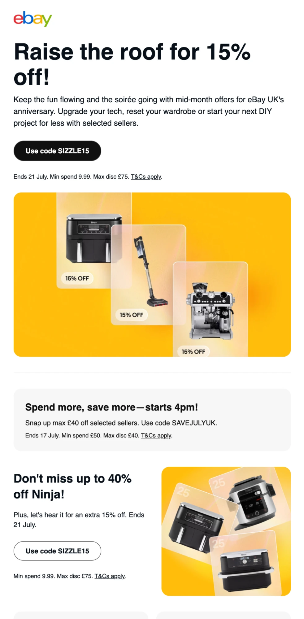
This newsletter from eBay uses many of the points we’ve discussed in the article. The main offer is the first thing you see in the newsletter since maximum visibility means more chances of people taking it up. The email also uses consistent colors and fonts throughout.
The Economist
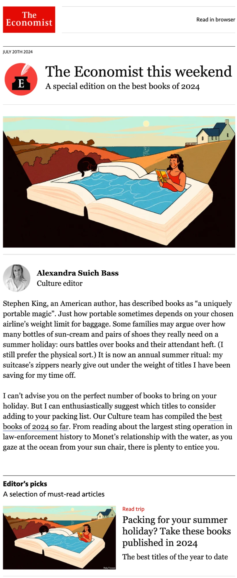
This newsletter from The Economist has several cool design features. It uses consistent colors and fonts throughout. It also has graphics with a unique style that readers will instantly recognize as being that of the publication.
The main content, which is promoted in the subject line, is prioritized at the start of the newsletter to ensure a frictionless user experience.
Uber
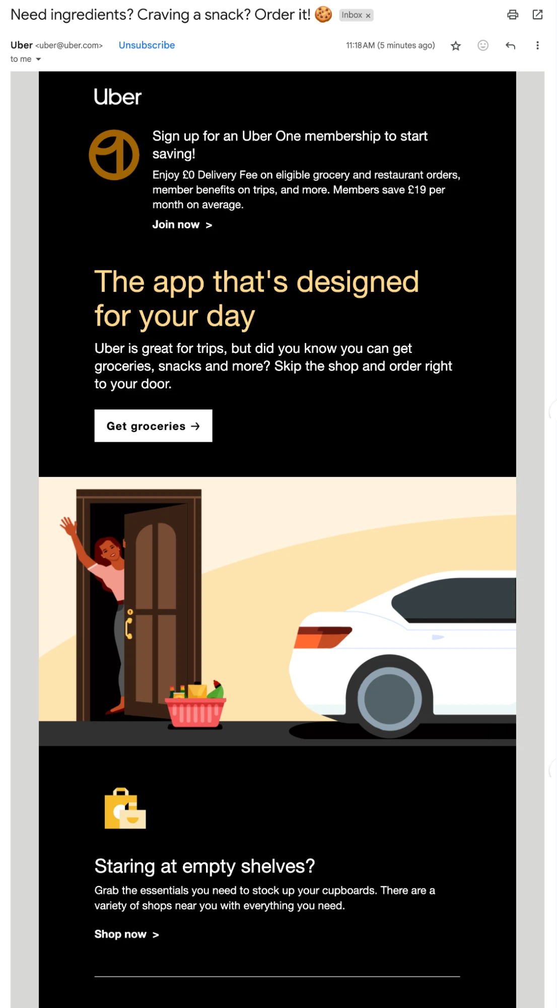
This email from Uber has a distinctive black background with light text that is still easy to read. It breaks up the dark color with a light-colored graphic. Also, check out the subject line. Using an emoji is sure to help the email stand out in crowded inboxes.
Start designing your newsletters today
Now you’ve finished our guide, you should have a good idea of what makes a good email design.
Visual email builders like MailerLite’s do most of the hard work for you. Thanks to predesigned blocks with best practices built-in, you just have to focus on choosing the elements that work for you and then add a complementary color scheme and fonts.
Remember you can always begin with a template to get a head start and then just customize it to your needs by editing the text or adding new blocks.
Design beautiful emails today
MailerLite’s intuitive email builder, customizable templates, global brand settings, pre-built blocks, and granular customization options are all you need to create beautiful emails that wow your audience. Try it out for free with a 14-day trial.