How to use background images in email campaigns the right way
 Nikola, CTO at MailerLite.
The right background image can transform your newsletter design and instantly give it a modern and eye-catching “Vogue cover” allure.
Yet many marketers shy away from using a background image in emails for fear of it looking more like a 2007 MySpace page than a page out of a magazine.
While email background images can be tricky, they're also highly underrated!
Join us as we show you exactly how to do newsletter backgrounds the right way. See examples of simple yet stunning email designs that use a background image, and learn best practices as you go.
What are email background images?
Background images in emails are placed in the “background” element within the email’s HTML code. Pretty self-explanatory, right?
What makes email backgrounds so exciting is that they can totally revamp your email design.
Because the image is in the background, you can build out content by layering new blocks on top (such as text, video, buttons, etc).
Email marketing tools, like MailerLite, can add background images automatically. All you need to do is upload the JPG, PNG, or GIF background image you’d like to use—no coding involved!
(Psst… for those of you who prefer to code yourselves, we’ll briefly talk about coding a background image later on).
Why should I use a newsletter background?
Oftentimes you’ll see emails that are made up using one big image. This can be problematic. If that image doesn’t load in the email client, your newsletter will be empty. You can avoid this by using a background image instead.
Background images have the power to increase conversions, and they also:
Give your emails a polished look
Transform an email into a beautiful small website
Make your newsletter stand out from competitors
Influence subscribers to keep reading
Pick your background: Layout vs. element
There are lots of different ways to use backgrounds (more great newsletter examples coming below). A rule of thumb is to pick an image that complements the other design elements and best fits your newsletter design concept.
In MailerLite, you can add a background image for the entire layout and background images for separate elements, like text blocks.
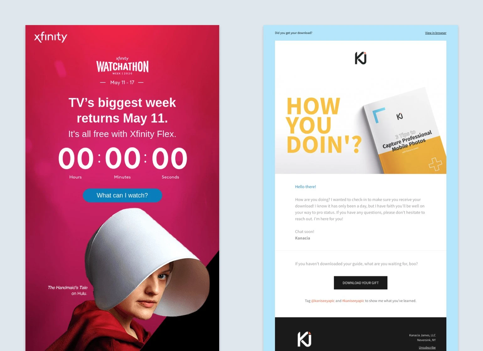
You can see the difference below. Comcast (left) uses a background image that spans across the entire email layout, while photographer Kanacia James (right) uses a text block with a background image and text layered on top.
Whatever you do, don’t make your newsletter one big image file.
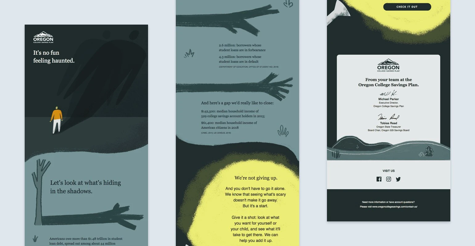
In the example below, the text is layered on top of a background image that makes the design look like an illustrated book page. Even without the background, people will understand what the newsletter is about.
It’s hard to guarantee that every single email client will display your images. If they don’t, the entire email won’t be displayed and your message is gone. If it’s just an email background image that fails to load, any text elements you’ve layered on top will still be visible.
Furthermore, large, image-heavy emails are more likely to be flagged as spam by your subscribers’ email clients. Tools like MailerCheck allow you to test email deliverability and predict inbox placement before sending.
Read about the 10 best ways to use images in newsletters to learn what to pay attention to when picking your imagery.
Best practices for bulletproof background images
Background images add a fresh coat of paint to your newsletter. But before you reach for the roller brush, you need to make sure your walls are primed. Here are four best practices to keep in mind when adding a newsletter background.
1. Know which email clients support backgrounds
As with images in general, some email clients make it technically impossible to show them correctly (due to CSS property issues). When we ran our Litmus background email check, we saw the following results:
Outlook 2016, 2019 and Outlook Office 365 (all Win 10) show no overall background image but do show backgrounds in image blocks
Windows 10 Mail shows no background image and no backgrounds in image blocks
All other desktop clients show the images correctly (including Apple Mail and Outlook for Mac)
Only Android 6.0 and Gmail App IMAP show no background image and no backgrounds in image blocks
All other mobile clients show images correctly (including all iPhones)
Only Freenet.de and T-online.de show no overall background image but do show backgrounds in image blocks
In all other clients, the emails are displayed perfectly (including AOL Mail and Yahoo! Mail). If you’re not catering to the German market, you’ve got nothing to worry about.
Verdict: Check your email reports to see what clients your subscribers use. There are only a handful of email clients that aren’t capable of showing pictures, the majority have no issues at all.
2. Background image size
An important thing to take into account when adding background images is the file size. The larger your email, the more data it takes from the reader, and the bigger the chance your email won’t be fully displayed.
We recommend keeping each image at a maximum file size of 1 MB.
As for width, we advise 640 pixels when used for elements and 1200 pixels for full-width.
As screen sizes vary a lot, it's difficult to guarantee the correct display across all screens, therefore it's best to choose a design that looks nice when tiled as well. You can use the in-built image editor to resize your images within MailerLite.
3. Have a backup ready (ALT text and color)
Make sure to use a background color and insert an ALT text as a backup in case your email background image isn’t displayed in the inbox. The background color can be whatever fits your design (pick a neutral color like light-grey when in doubt).
Tip: Read more about how to use colors in your marketing emails.
The ALT text is a descriptive sentence, like “background image of clouds”. It’s displayed in the place of an image that hasn’t been loaded, or read out by dictation software, and helps people understand what the image is about when they can’t see it.
4. Highlight your text and CTA
Your text and CTA should steal the limelight, not the background. Avoid suffocating your message with a busy pattern.
In MailerLite, you can add a background color to individual content blocks (like text blocks and buttons) so that important information stands out from the rest of the imagery.
Examples of newsletter backgrounds done well
The key to background images is to use them so they emphasize other email content elements and make your newsletter look even better.
In practice, this often means your background is simple but with a twist, like a pattern, gradient or animated GIF. Unless, of course, you want to go all-in!
Below we’ll show you different ways to use email backgrounds to give your design a unique look.
Our free email templates are a good foundation to start building from. Some versions already have a background, like our “Best selling” newsletter template.
Look 1: Transformative
This webinar invitation by Mintel perfectly shows how a background image can totally transform the look of your newsletter. Imagine the same invitation without the background. Kind of boring, right?

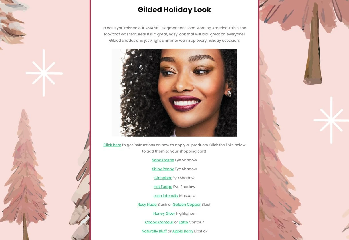
Another example comes from the photography collective and marketplace Moment. They added a background to a text block, which is also possible in MailerLite using the block called: "Article with image background".
When you use an image as the background, be sure to make the font contrasting and large enough so the text is easy to read. Moment kept the word count short and made the font huge.
Look 2: Seasonal flair
MailerLite customer Lisa Prescott switches up her newsletters depending on the season. For this one, she used a grey fallback background color and uploaded a background painting of pine trees. The pastel pink portrays warmth and fits perfectly with her brand.
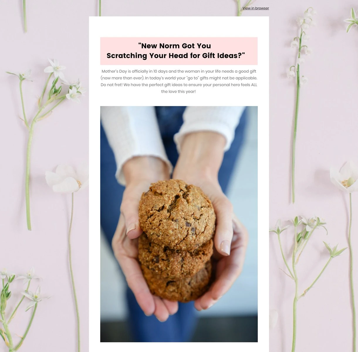
The same can be seen in this newsletter by Clean Creations. This Mother’s Day newsletter radiates spring vibes due to the flower imagery chosen for the newsletter background.
Look 3: Audacious
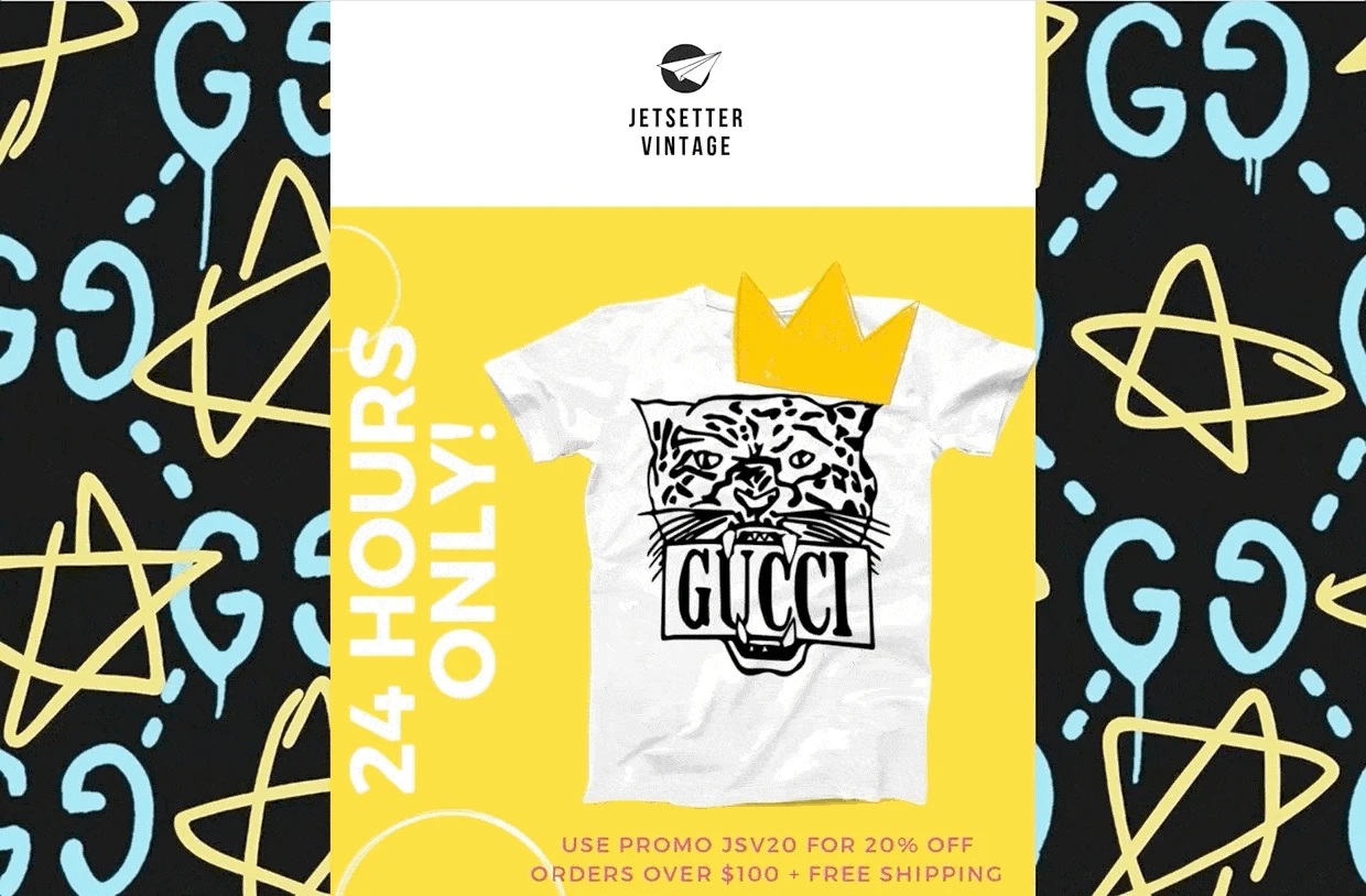
Jetsetter Vintage makes a big, bold statement with this newsletter. The artsy background and the GIF header image work surprisingly well together, as they share the same color palette.
Look 4: Elegant
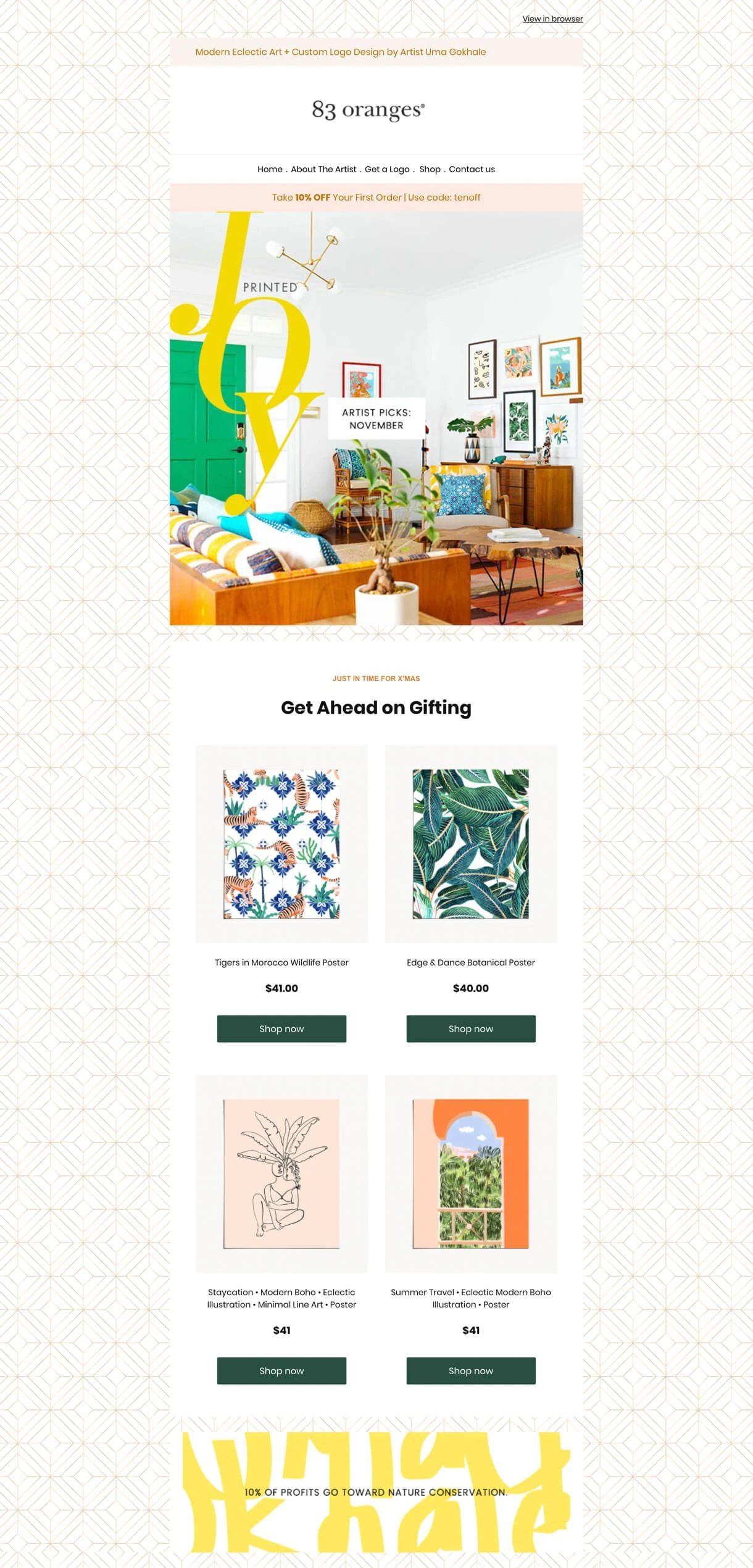
An art shop and design studio named 83 oranges opted for a tile pattern that instantly makes the newsletter look like a page out of a decoration magazine. The background makes the overall newsletter more elegant and interesting.
Do you want to design newsletters like the one above? Our ultimate guide to newsletter design teaches the skills you need.

Look 5: Color-blocking
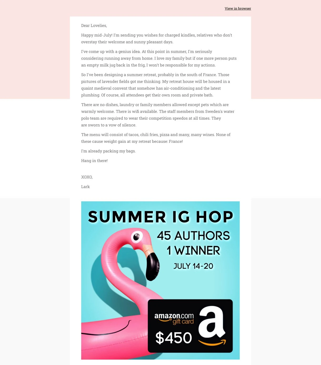
This newsletter romance author Lark Avery shows you how to use color blocking in your newsletter design. The 3 different colors make a simple text-based newsletter a lot more aesthetically interesting.
Look 6: Animated GIFs
When your design is mainly white or another neutral color, an animated GIF in your email can help add excitement.
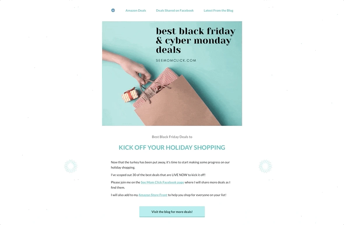
Our customer, See Mom Click, used an animated GIF of fireworks as an email background. Because the fireworks come and go, the otherwise neutral layout feels more alive.
Look 7: Gradient
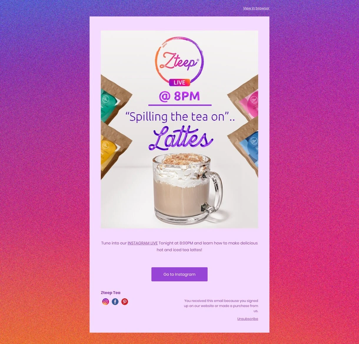
One glance and you already know what social channel this newsletter is about.
You’re right, Instagram! MailerLite user, Zteep Tea, used a gradient background with the same color scheme. Colors that gradually change keep the reader engaged as they scroll down.
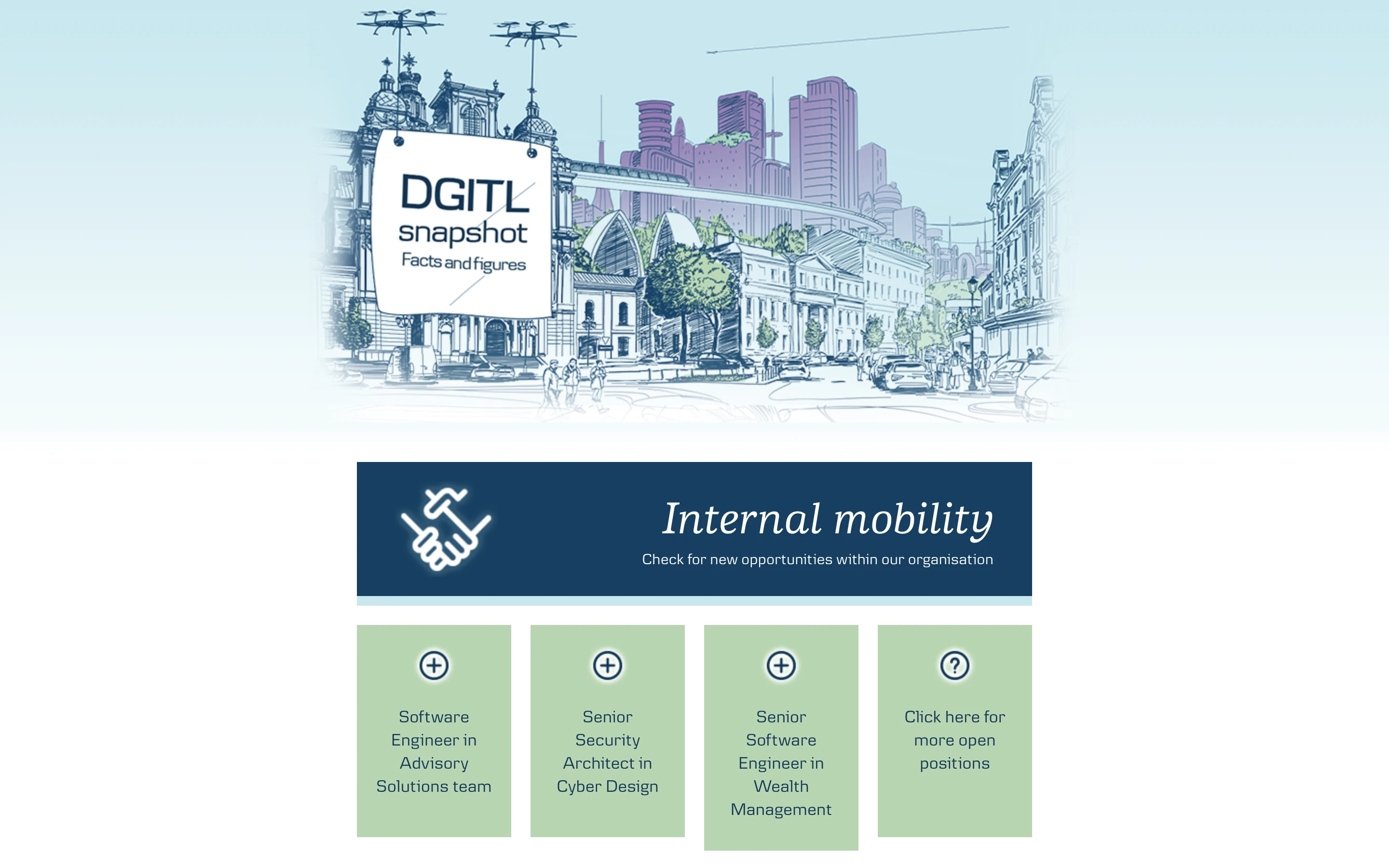
Another MailerLite customer, DGTIL Communications, uses a softer gradient for their newsletter background. The color they chose blends well with the rest of the newsletter content, tying it all together and giving it a well-rounded finish.
Look 8: Texture
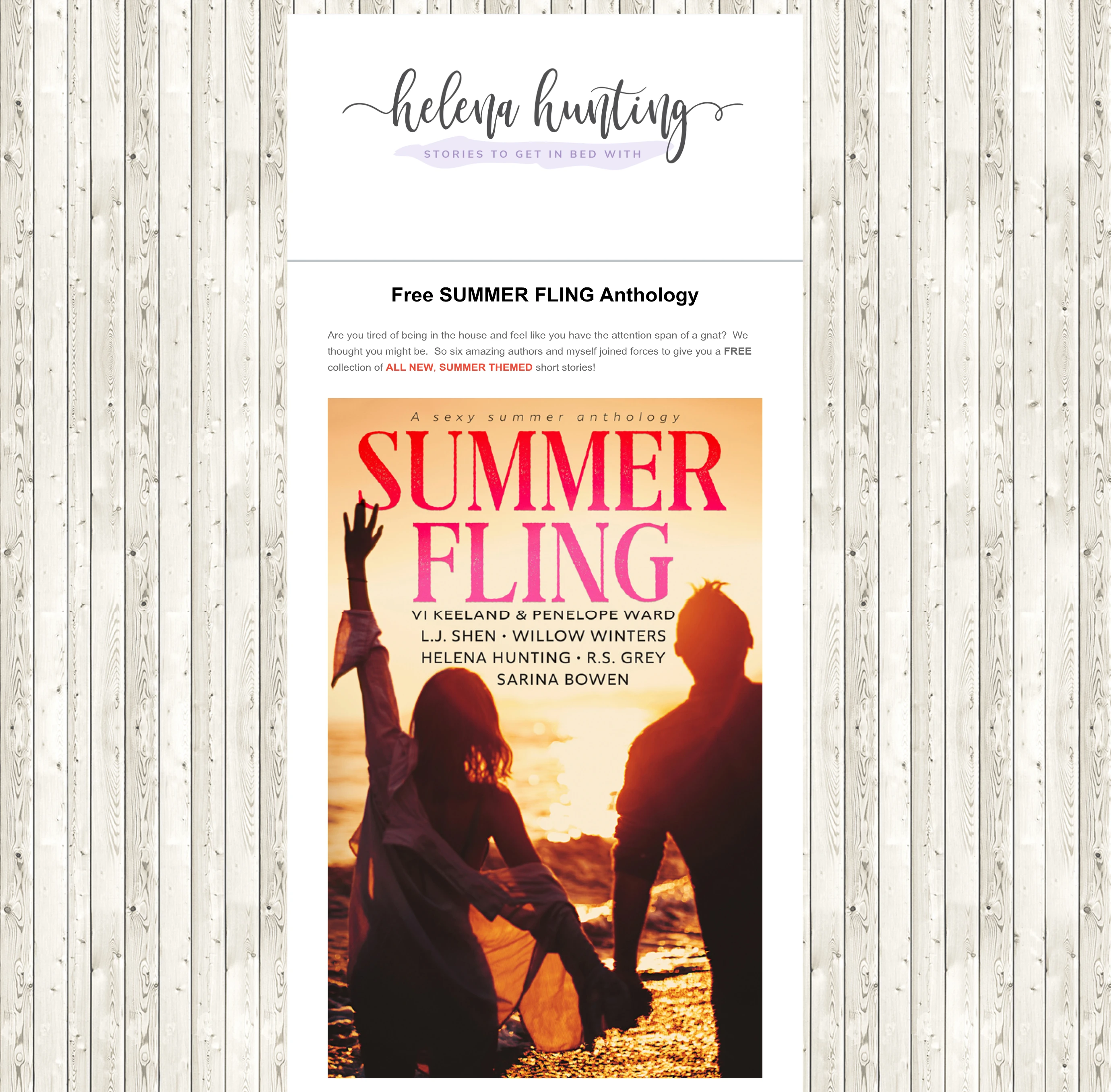
This email by author Helena Hunting instantly envokes a warm, summery feeling with her choice of background image. The light floorboards wrap the newsletter content up in cozy beach house vibes. Perfect for a summer romance.
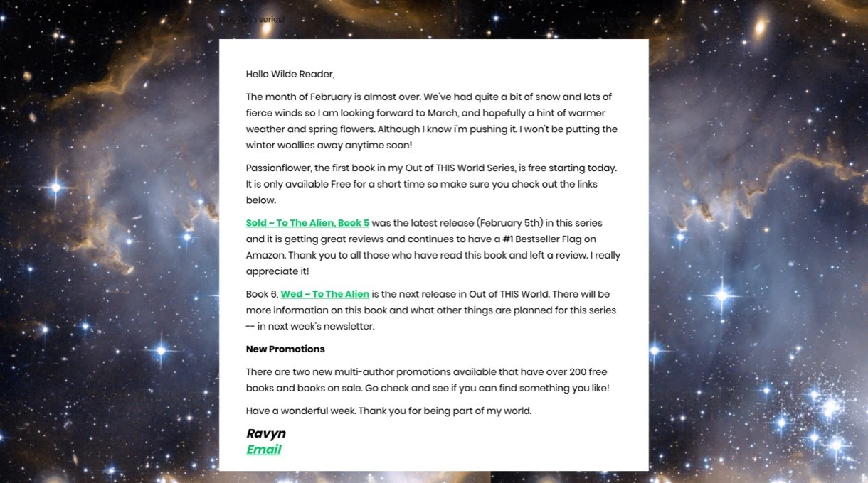
Look 9: Spacey
If your newsletter promotes alien books, you want to get a little spacey with the background design.
Author Ravyn Wilde, takes her readers to another dimension by using the background image below. What would normally be a plain email is now a lot more unique.
Adding background images to your email newsletter in MailerLite
The easiest way to add a background to your email is to use the drag & drop editor. Tech-savvy designers may prefer to use HTML to design a newsletter background.
Adding an email background using the Drag & drop editor
In the right sidebar, select the Template tab and choose the Body option in the Background settings.
Then click Background image in the pop-up menu, and either upload an image or choose an existing one from your file manager.
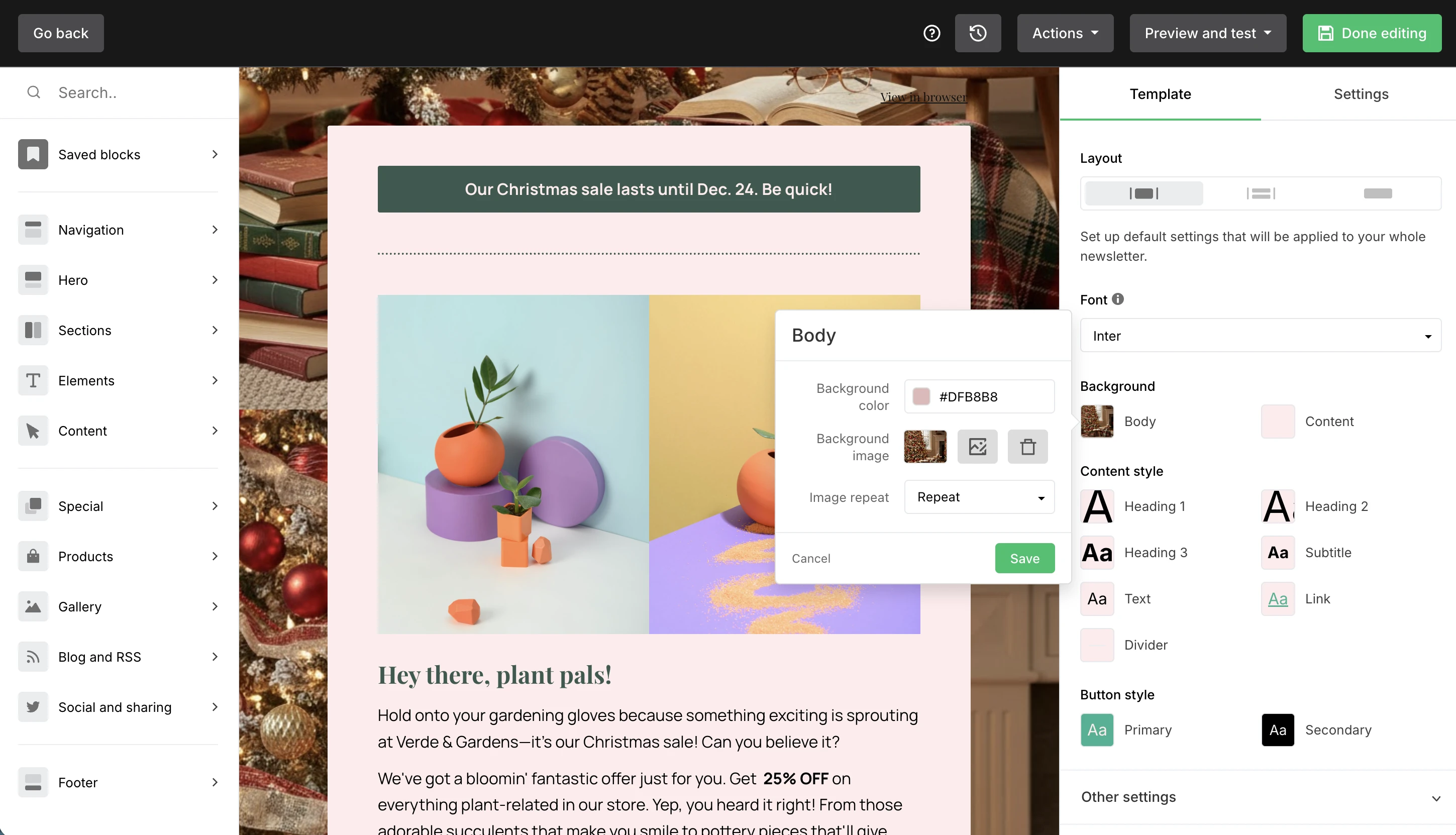
You can then choose whether to fit the image to the background or to repeat it horizontally or vertically. Experiment with the options until you're happy with the result.
Adding a background for email with HTML
If you’re using an HTML email template upload, you’re responsible for coding the background image. There are different ways to do so, for example by using table background attributes, inline CSS styles or embedded CSS.
When you’re a MailerLite customer, you can send custom HTML emails by uploading a zip file, importing via URL or directly pasting the code. With the automatic CSS inline editor, you can improve the code. The newsletter background can be previewed on desktop and mobile.
Since the majority of MailerLite customers use our drag & drop editor to add background images, we won’t go into detail about the HTML part itself. However, this HTML email guide to background images will, if you’re curious.
Free image resources for your email backgrounds
Unless you’re a graphic designer, you might not have a catalog of email-ready newsletter background images, and using images found online can get you into hot water if you don’t have the correct licenses.
Luckily, there are tons of free email background resources, with their own licenses, that allow you to use their images for both personal and commercial use, like:
Pexels (also has royalty-free videos)
Kaboompics (allows you to search by color)
Let's recap!
Email templates with a background image can make your email marketing campaign more engaging, unique and instantly give it a different look.
Make sure the email background complements, not replaces the other newsletter elements. A great background emphasizes the email content and CTA, and doesn’t take away from its attention.
Does the background image complement the other design elements of my newsletter?
Will it emphasize the text and the CTA?
Will subscribers' email platforms support background images?
Is the file image size optimized?
Is the background image responsive?
Have I added ALT text as a backup?
Is the font large and contrasting with the image?
Keep these questions in mind when you're adding a background image to your email, and you'll create a newsletter that pops!
Have you tried using a newsletter background? Paste the preview URL in the comments, we're curious to see.
Editor's note: This article was originally published in June 2020, and has been updated with fresh ideas and examples to keep your email backgrounds popping!