Guide to creating landing pages that convert (with examples)
 MailerLite team member, Radvilė
A landing page is different from other web pages because it targets a specific audience with one clear purpose. When done right, landing pages can be a super effective way to drive leads and conversions.
That single focus is what makes landing pages convert so well. Why? Because they are conscientiously designed to drive a specific action. Every component—from the heading and hero image to the signup form and footer—supports the single, main goal.
So get your notebook out because we’re about to learn all about the different types of landing pages, plus we'll analyze 6 that we think are great. Afterward, you’ll know exactly how to build a great landing page yourself.
What are landing pages?
Landing pages are the pages that site visitors “land on” when they click on a call-to-action (CTA) or ad.
The most effective landing pages are designed with one single focus in mind. Each element—from the copy to the CTA buttons and images—helps convince the reader to take that desired action.
Because the landing page has one specific goal and call-to-action, it often has no website navigation menu (or at least not as extensive as your website’s menu). They’re focused and compact!
What are landing pages used for?
Marketers use landing pages to achieve specific business objectives by focusing on a single, clear CTA. The page and content are designed to guide visitors toward a particular action or goal without the distraction of other irrelevant website content, converting them into customers, leads, users, or attendees.
For example, let’s say you’re a photographer running a paid advertising campaign on Facebook that encourages pregnant women to book a family portrait session.
Would it make more sense to redirect people to your photography homepage or to a landing page that’s focused on your maternity photoshoot services?
If you voted for the latter, you’re completely right!
These standalone pages can be used for ads (like Google text or display ads) or sponsored messages (like a podcast host saying “For 10% off, go to company.com/podcastoffer”).
Check out these tips for boosting landing page conversions!

The difference between a landing page and a website
There are numerous differences between a landing page and a website, starting with the basics of their purposes and structures.
Here are some of the other main things to know about landing pages and websites:
Traffic to your website or homepage is more general and comes from all kinds of sources, including search engines, social media, paid ads, emails and people entering your address into their browser
Homepages usually communicate several things and give visitors multiple options for where to go next. Visitors can choose what they are most interested in. Landing pages have already acquired their intended target audience, so the job is to convert the visitor
The ad or CTA leading to the landing page prompts the visitor to go to the landing page to complete a specific action. The content and CTA on the landing page will support this without distracting the visitor
You can have a website and landing pages, or standalone landing pages without a website. You don’t necessarily need landing pages if you already have a website, but if you’re running any kind of online campaign or ads, it’s a best practice to have a dedicated landing page optimized for the campaign’s specific goals
Even your homepage can be a landing page if it’s appropriate for your campaign. For example, if you’re running Google Ads campaigns using your brand as the keyword, the homepage may be the best destination for visitors who click
Why landing pages are great marketing tools: The benefits
Because of their single focus, strong CTAs, and deliberate design choices, well-designed landing pages significantly increase the chance of conversion compared to regular web pages.
Some other benefits include:
Highly targeted messaging allows you to tailor landing page content for specific campaigns, goals, products, and audiences. In doing so, you can address the exact needs and pain points of visitors and provide precise solutions
Improved ad relevance for Google Ads with tailored landing pages can result in higher quality scores which in turn lowers CPC (Cost Per Click)
The ability to capture more leads with additional information you can use for building your subscriber list, segmentation and personalization, and nurturing leads
Get in-depth, focused analytics data for performance metrics such as conversion rate, time on page, and bounce rate that will help you optimize your landing pages and marketing strategy
A/B test landing pages to learn what types of landing page content, such as CTAs, headlines, and images perform best with your audience and get the most conversions
Learn more about A/B testing for landing pages in our guide:
Overall, landing pages are a powerful and cost-effective tool for collecting leads, driving conversions, and making your messaging specific for people who are actually seeking out your product or service.
Types of landing pages
1. Squeeze landing page
The goal of a squeeze page is to capture a visitor’s email address. Squeeze pages are usually most effective at the top of the marketing funnel. Many offer a freebie (such as some type of gated content or a free trial) in exchange for the email address.
Main characteristics:
Short-form copy; simple and straight to the point
A few images to support the offer and message
An eye-catching form and CTA
Drift keeps it simple with no distracting menu for the visitor to navigate away from the page, a short but compelling description, and a bright CTA.
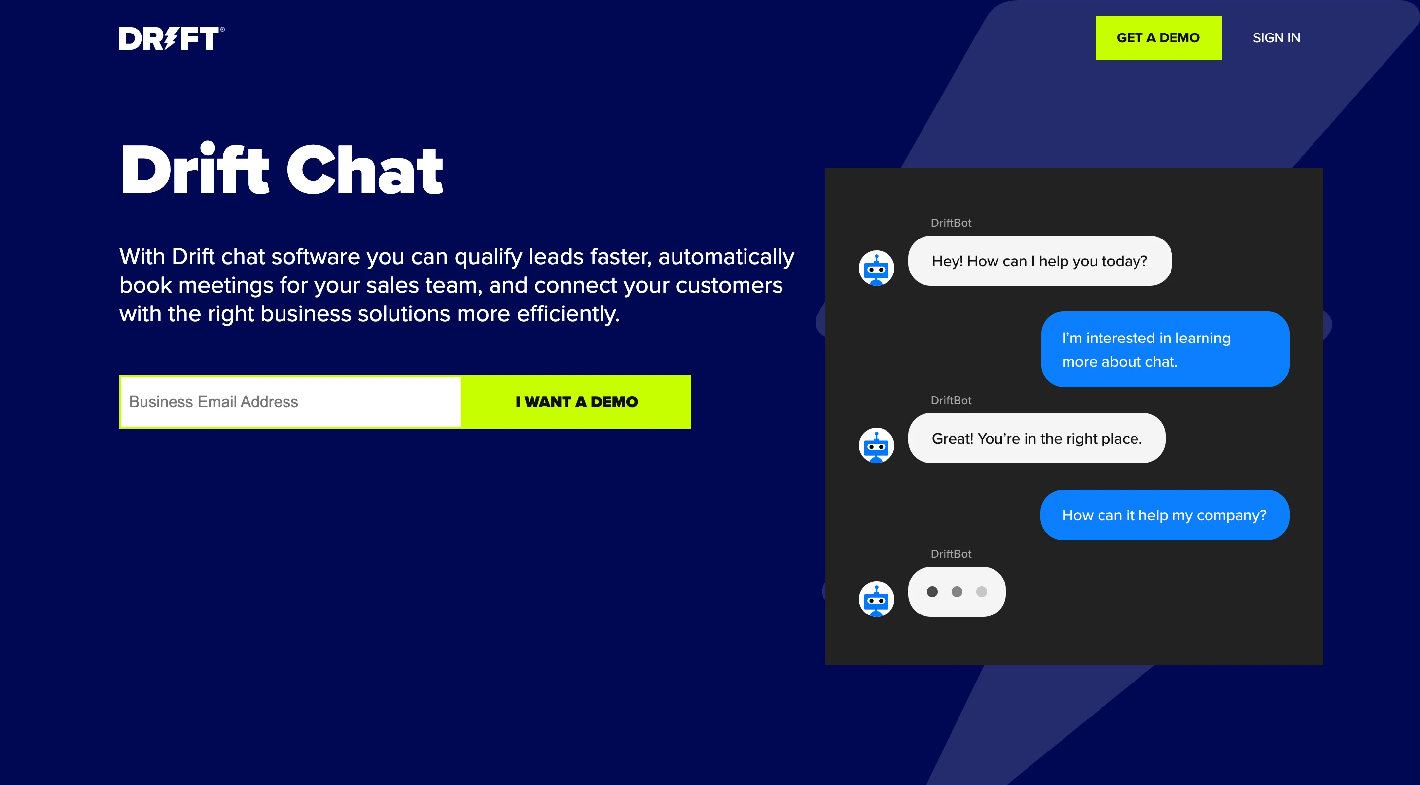
Squeeze landing pages are great for building your email list. If the freebie is valuable and relevant to your product or service, it’s a good indication that the people who sign up will be interested in what you have to say in the future.
E-commerce landing page: Offer a discount or free shipping
Coming soon landing page: Visitors can sign up to be notified when the product is launched
Ebook landing page: Give visitors a free ebook download
2. Lead capture landing page
Squeeze pages and lead capture pages are pretty similar. They both offer something in return for personal details.
Main characteristics:
Similar to squeeze pages but with more in-depth forms to collect additional data so that leads can be qualified
Forms may request information such as phone number, company name, company size, company role, etc.
Telesign uses bullet points to clearly inform the visitor what they’re signing up for. They’ve even included social proof for the extra encouragement.
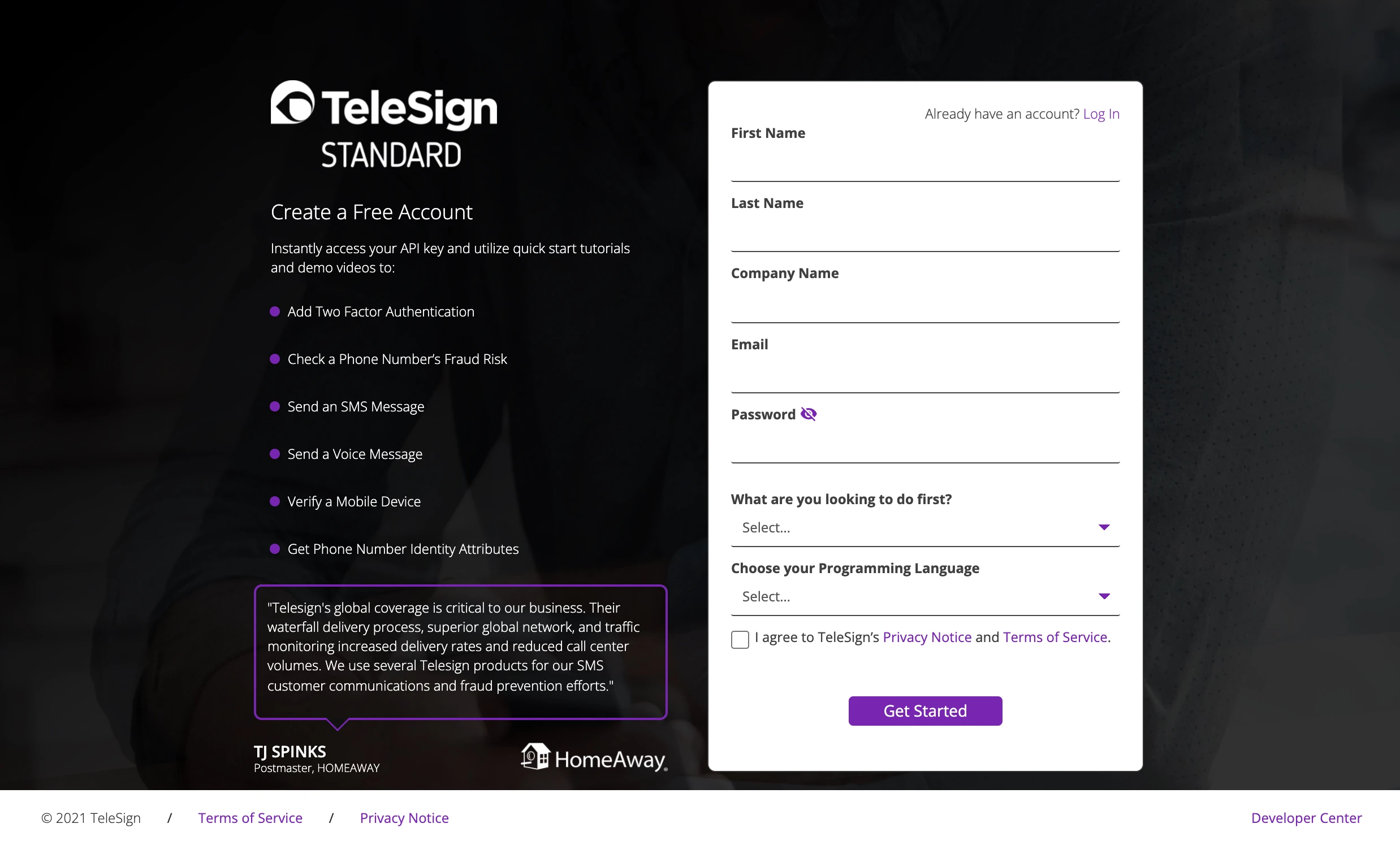
Lead capture pages work all the way through the marketing funnel, and especially at converting visitors who have already shown an interest in your offering, for example, if they’ve downloaded your case studies.
SaaS landing page: Offer a discount
Real estate landing page: Provide a free consultation or exclusive listings
Lawyer landing page: Offer a free resource on a specific topic
3. Click-through landing page
The purpose of this page is to educate the visitor and “sell” the product or service, priming them for the next step—signing up for the free trial and potentially a purchase. For this reason, the copy, layout and design of the pages require a lot more consideration than other types of pages.
Main characteristics:
Design that’s clean and easy to digest
Images that show of your product and support your claims
Start with a pain point or problem and offer a solution by describing the benefits
Social proof, such as customer testimonials
Strong CTA
Freshdesk follows the typical format of a click-through landing page and puts the mind of the customer at ease by reassuring them no credit card is required to get started.
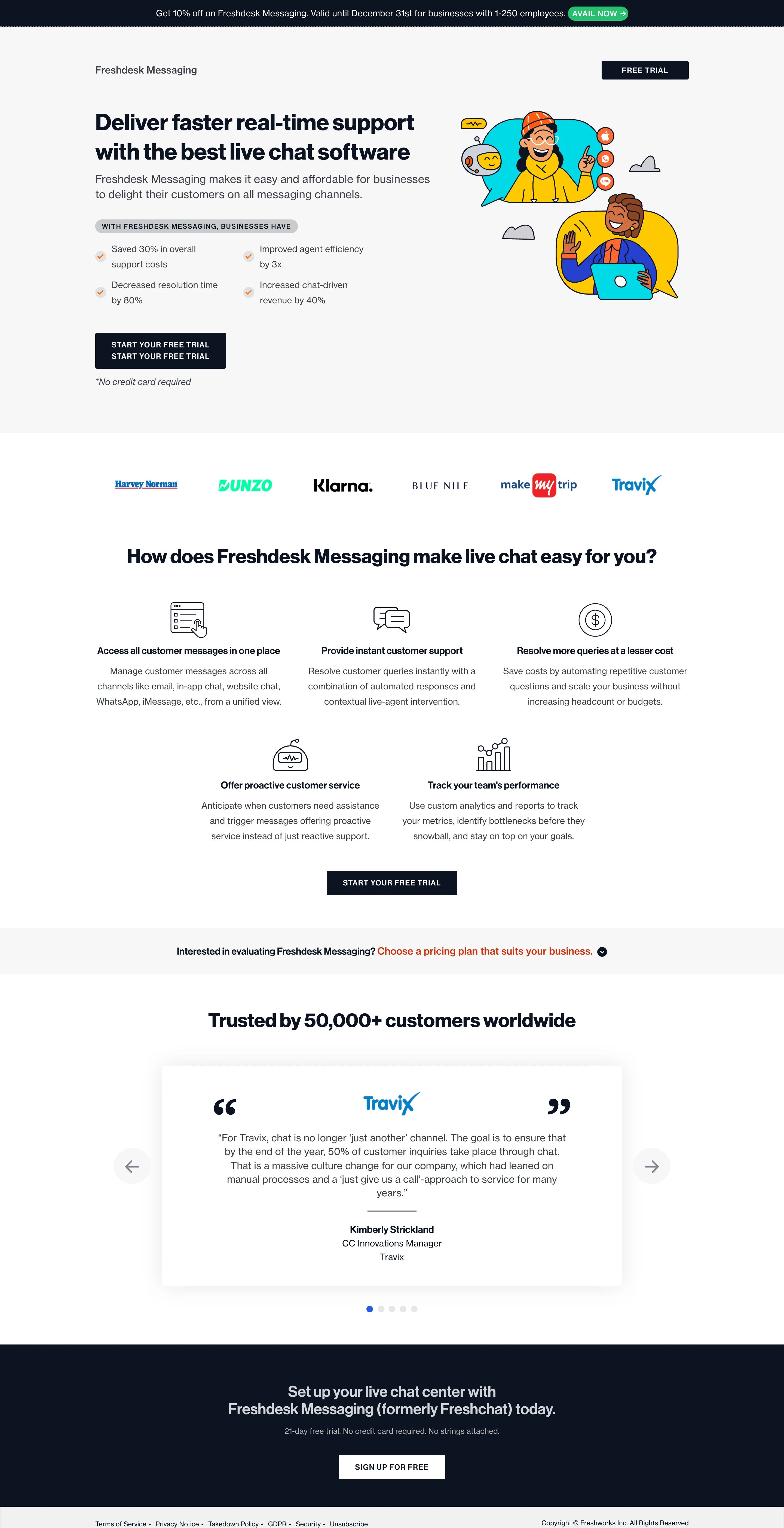
Click-through landing pages work well earlier on in the sales funnel. Potential customers should be able to learn about the product without too much “salesy” language. It lessens the pressure to buy and allows them to take the next step fully informed.
Product landing page: Prime visitors to sign up for a free trial
Event landing page: Tell visitors why they need to attend your event and include a CTA to register
Black Friday landing page: Grab visitors’ attention with special offers and encourage them to partake in the Black Friday sales
4. Long-form landing page
Think of the long-form landing page as your sales pitch. Not only does it list all the benefits of your product/service and provide social proof, but it also considers any questions the visitor might have and answers them.
To be effective, the best long-form landing pages should include:
A strong headline and subheadings that describe a problem and how the product will solve them
Engaging copy that informs the visitor of the benefits of the product/service and addresses any pain points
Compelling imagery and/or video that supports your claims and strengthens your brand image
CTAs strategically placed throughout the content
Social proof to build trust in your company and product
FAQs so that you can answer questions and remove any barriers to purchase
Tier11 gets straight to the point with its strong messaging and clean layout. The content is easy to digest and the designated FAQ section is an added bonus.
Long-form landing pages work best on prospects who are at the bottom of your sales funnel. This is where people can get any last doubts or questions addressed and compare your product or service with competitors—so every detail counts!
High-value product landing page: Include more information to encourage customers to commit to the high cost of your product
New product/service landing page: Help visitors to understand your offering
Training/course landing page: Show visitors why your course offers something they can’t find anywhere else
5. Video landing page
On a video landing page, the video is the main focus. In this type of page, the video content is usually located above the fold with some complimentary text and also a signup form. The goal is to educate the visitor on your product or service, explain the benefits and value, and then encourage them to sign up, start a free trial, or make a purchase.
The sample landing page from LivePerson delivers their message using minimal text and an engaging 2-minute video that describes all the benefits of their product. Want to learn more? Visitors can simply scroll down below the fold to get more details.
Video works well on landing pages because it’s more engaging and can provide all the necessary information to the visitor, without them needing to read through walls of text. It’s also a great way to show your product in action so that people can get a better idea of what you’re offering.
Product landing page: Show your product in use, hacks, or any tips and tricks
SaaS landing page: Demo your product and showcase its interface
Elements to include in your landing page
Landing pages are built on various core elements that are proven to drive results. If you use these as a basis to create your landing pages, you can test, develop, and tweak additional elements. This will help you to find the perfect recipe that works for your audience, while always having the essential components down.
1. Unique Selling Proposition (USP): That special X factor that makes your product or service stand out against all others; what makes your offer better than the rest? You can include your USP in your headline and supporting copy.
2. Hero image/video: This is the first visual aspect visitors to your landing page will see, so it really needs to demonstrate the benefit of your product or how it’s used.
3. Main heading and sub-headings: Your main heading should be short, sweet, and clearly communicate the benefit of your offering. Your sub-headings should also be kept concise, building on the main heading and enticing the visitor to read the content.
4. Copy: Your supporting copy should reinforce your USP and supplement the messaging by expanding on the benefits and explaining why the visitor needs your product. Want to take your copywriting game to the next level for your landing pages? Check out our guide on how to write high-converting copy.
5. CTA: Your landing page should have one clear CTA, usually a button that stands out on the page. The button text should be short and clear yet descriptive, such as “Start my free trial”. Avoid using bland, non-descriptive text.
Depending on the length of your landing page, the CTA can be placed multiple times but each one should result in the same action.
6. Form: You’ll need a signup form to collect leads or registrations. Keep the form as short as possible and only collect the information you absolutely need. Reserve longer forms customers further down in your funnel.
7. Social proof: Humans are social creatures and that’s why taking recommendations from peers and hearing about their experiences so greatly influences our own purchasing decisions. Include quotes, testimonials, case studies and anything else that demonstrates your customers’ satisfaction with your brand. Check out these social proof examples for inspiration.
8. Privacy notice: As with any website, you need to include a privacy notice to ensure you comply with data protection regulations, set clear expectations for customers, and protect your business.
9. Thank you page: Use your thank you pages as an opportunity to upsell or encourage people to engage with you across your various marketing channels. Think of it as the IKEA checkout area of your website (if you know, you know).
This is an excellent place to recommend further content subscribers might be interested in, direct them to your social channels, or give a gentle nudge towards a free trial of your product.
Best practices for landing page optimization
1. Start out by defining your goal
Decide on the specific goal to build your landing page around. Having a clear objective will enable you to design your page so that it remains focused and every element works toward driving conversions.
Some goals you might want to consider include:
Driving sales
Encouraging signups for a newsletter/service/free trial
Capturing leads
Event registration
App downloads
Survey completions
2. Get a headstart with a template or AI generator
Creating landing pages from scratch can be tricky! Save time and benefit from professionally designed landing page templates that include all of the main elements a good landing page should.
Many marketers now rely on a no-code Al website builder to quickly create landing pages that are easy to customize, test, and optimize without relying on developers.
MailerLite includes a library of beautifully designed templates—all you need to do is select which one catches your eye and then customize it with your colors, branding, and content.
And don’t be afraid to enlist the help of AI! There are some great tools you can use to create images, copy, and more for your landing pages. In fact, MailerLite has a feature for that too. You can generate text, images, and even whole landing pages with just a few prompts.
3. Pay attention to load speed
A study by Portent found that a site that loads in 1 second results in three times more conversions than a site that takes 5 seconds or more. That’s astonishing!
Slow load times can be frustrating to visitors and lead to higher bounce rates. Ensure your landing page loads quickly by optimizing images, minimizing scripts, and using a reliable hosting service. You can use Google’s PageSpeed Insights tool to check your page and, if there are any issues, identify what is causing them.
4. Ensure your landing page is responsive
Your audience is likely to be using a wide range of devices and screen sizes, so you need to ensure that your page will display and function correctly on all of them. Making your landing page fully responsive means that it adapts seamlessly, whether the visitor is viewing it on their mobile device, laptop, or large monitor.
Making your landing page responsive will not only improve the user experience, but it will also maximize conversions across all types of devices.
With MailerLite’s landing page builder, landing pages are automatically made responsive, so you never have to worry about whether they’ll display correctly on different devices.
Tip: Want an easy way to check if your landing page is responsive? You can do it from your browser without downloading a thing! Check out this guide on how to simulate a mobile environment in your browser for Chrome, Firefox, and Safari.
5. Make your landing page accessible
Speaking of improving the user experience, accessibility is another factor that should be taken into account to ensure your landing page is usable by everyone, including those with any impairments or disabilities.
Making your landing page accessible involves using alt text, clear fonts, good color contrast, ensuring screen reader compatibility, and more. This will help you to reach a wider audience while ensuring your brand is inclusive and provides a great user experience for everyone.
6. Discover what works best with A/B testing
Your landing page journey is a never-ending marathon, not a sprint. As with any marketing initiative, it’s important to consistently test your efforts and optimize your strategy.
A/B testing is a key approach to discovering what types of landing pages and landing page elements work best with your target audience. You can test out different headlines, images, CTAs, specific design elements, page layouts, and more.
MailerLite has a split testing feature that allows you to test up to 5 variations of a landing page.
7. Utilize heat maps and user recordings to gain behavioral insights
Have you ever wondered how a visitor interacts with your landing page? With heat maps and user recording tools, such as Hotjar, you can gain insights into just that!
These types of tools allow you to see where visitors are clicking on your landing page, how far they are scrolling, and anything that may be causing friction to the user experience. It gives you real data from your audience that you can use to make adjustments to your landing pages for a more optimized experience and higher conversion rates.
8. Align your landing page with your overall marketing strategy
It’s important to create a cohesive brand experience for visitors to your page. Doing so will help to build trust and increase the likelihood of conversions.
To do this, your landing page messaging, design, and offers should be focused on your campaign objective while remaining true to your brand design, voice, and values. It should be an extension of your existing assets and strategy and recognizable as belonging to your brand.
9. Track performance
Continuously monitoring the performance of your landing pages will allow you to understand how successful they are at reaching your campaign goals and will allow you to identify areas for improvement.
Use analytics tools such as Google Analytics to track key performance metrics such as:
Conversion rate: The percentage of visitors who completed the desired action. For example, making a purchase or signing up for a newsletter
Bounce rate: The percentage of visitors who leave your landing page without taking any action or clicking a link
Engagement time: How long visitors spend on your landing page
Form completion rate: The percentage of visitors to your landing page who complete and submit a form
1. Including too much information: Get straight to the point and only include information that supports your goal. Too much information can be overwhelming and distracting, so cut out anything that is crucial.
2. Lack of social proof: A lack of reviews or testimonials could suggest that you don’t have a significant customer base, your product hasn’t received any positive feedback, or could even make your brand seem less trustworthy.
3. Poor design: Poorly designed landing pages tend to come across as suspicious or scammy. Ensure yours instills trust with a professional design.
4. Inconsistent tone of voice/messaging: Not having a cohesive brand identity throughout your landing pages can create confusion and a lack of trust among your audience. Not only can it make visitors doubt the legitimacy of your landing page, but it can also make them see your brand as unreliable or unprofessional.
5. Weak CTA: A CTA that is non-descriptive, hard to see, poorly positioned, or uninspiring won’t guide visitors toward completing whatever action it is you want them to take.
6. Including a navigation menu: Providing opportunities for visitors to navigate away from your landing page can distract them from the primary goal of completing the desired action. Removing the menu makes the page more focused and increases the likelihood of conversions.
How to bring traffic to your landing page
Landing pages are generally used for digital marketing campaigns that drive traffic directly to the page for a specific goal—and you’ll be glad to hear that not all of them are paid methods.
1. Paid traffic
Paid search or Pay-per-click (PPC), such as Google Ads, requires you to create ads based on your campaign goal and keywords, and then bid on those keywords to be placed at the top of the search results page. Because paid search ads have specific goals, landing pages are ideal for this.
2. Social media
This could include the free posts that you share on your social profiles, as well as paid social including boosted posts and social media ads.
3. Email marketing campaigns
Link to your landing page from your newsletter or create a separate campaign all about your offer. Your email list is your best and most engaged audience, so why not make use of it?
4. Link to it on your website
While landing pages are not traditionally linked to through a website’s main navigation, that doesn’t mean you can’t link to it from within your content!
Add CTAs to relevant blog posts and pages to direct traffic to your landing page and increase conversions through already engaged website visitors.
4. Share your link in online communities
Join in discussions on forums and communities such as Reddit and Quora, and jump in on the comments sections of online publications and social media (LinkedIn is great for this). The key to this is to not be spammy or salesy at all. Instead, look for opportunities to engage in conversations and provide real value with your link.
5. Collaborate with other content creators
This is a great way to gain access to audiences that are similar to your own. Find other content creators with similar interests and do a collaboration in which they share your landing page link with their audience.
Don’t forget to include tracking code in your URLs to view where the traffic comes from in Google Analytics. This way, you’ll be able to measure which channels are the most successful.
6. SEO
SEO (Search Engine Optimization) involves optimizing your landing pages for specific keywords so that they can rank higher in SERPs (Search Engine Result Pages) and bring in more organic traffic. This is a great way to reach people who are searching for terms related to your offering and it doesn’t cost a thing!
6 great landing page examples analyzed
The easiest way to learn how to build the best landing page is by seeing how others created theirs. Analyze landing pages from a customer point of view.
Ask:
Is it clear what I’m supposed to do (e.g. purchase, register)?
Would I take the desired action after seeing this landing page?
What information is not convincing or missing?
Does the design match the message? Are the colors, fonts, images, videos, etc. convincing me or making me have doubts about taking action?
To show you how to analyze landing pages, we’ll kick start it with 6 examples.
Remember that our opinions are subjective and the landing page conversion rate all depends on the target audience. Some designs we might tweak, while their audience loves the version as is.
1. Webinar - UK VetMove
UK VetMove is an incredible program aiming to make Veterinarians' transition to UK practices as seamless and pain-free as possible. They offer coaching and mentoring for overseas vets to help them feel confident and knowledgeable in their profession.
👍 Awesome!
The structure of the page, the colors and copy are all nicely designed and very fitting to the target group. The content above the fold is clear and concise and includes a CTA, with additional information below.
🔧 Could be tweaked
The heading and copy are straightforward and descriptive, but visually they could make more of an impact if they had a slightly transparent white background to contrast with the image. The font used for the copy could also benefit from being Sans serif and larger in size.
👉 Tip: To make the content and CTAs on the landing page more impactful, more play with color could. be used. The heading of the second CTA gets a bit lost, and the additional information could benefit from being sectioned off using the brand colors.
2. Podcast - She Leads Africa
She Leads Africa is the #1 destination for smart and ambitious African women. They host coaching programs, the SLAY festival, and other events. Plus they run a large community. They designed a great landing page with the purpose of collecting signups by offering a podcast episode on social media secrets.

👍 Awesome!
This background! It’s branded, eye-catching, original and fits the message. The action is clear, as there is only one thing they ask: to fill in the form fields and click “I want it!”.
🔧 Could be tweaked
This depends on the context. If you’d only see this page, you might want to know more about what’s being discussed in the podcast. A quick list of bullet points could make readers more intrigued.
A link to the homepage can be added to the logo upper-left (in MailerLite, click the image block and add a link). The field titles in the form can be enlarged for better UX (web font sizes often run from 14-16px and up, so it’s readable on all devices).
👉 Tip: Make the headline as eye-catching as possible. Clearly state the value proposition. Numbers and words like “free” or “exclusive access” can help. In this example, an alternative headline could be: “Get access to our exclusive podcast episode where we reveal the 7 secrets to building customer’s trust on social media!”
3. Lead generation - Kellie Lynn Media
Kellie Lynn Media is a creative design studio specializing in branding and web design for businesses in a wide variety of industries. Kellie’s lead generation landing page has the goal of collecting signups by offering a free eBook on how to grow your Instagram.
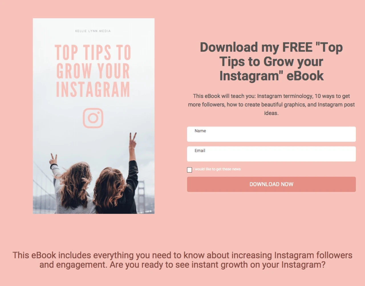
👍 Awesome!
The straightforward approach of this landing page is great. The picture fits the message and is very inline with the Instagram aesthetic, and the description clearly describes what the reader can expect.
🔧 Could be tweaked
While the headline stands out and is supported by the image, the font of the description is quite small. Since this is where the important details about what the eBook contains are, we would enlarge the font size and place the eBook topics into bullet points to be more eye-catching and easy to read.
The image is great so we would make it full width and place the subscribe form on it, emphasizing it by adding a white background to that element. This would make the form and CTA really pop while elevating the overall design.
👉 Tip: If you want images to take up the entire width of the page, use the background image option in the Settings tab of the page itself or an individual element.
4. Free stock images - Michelle Buchanan
Michelle Buchanan is a photographer and designer who specializes in stock imagery. The purpose of her landing page is to collect signups by offering a lead magnet in the form of a pack. offree stock images.
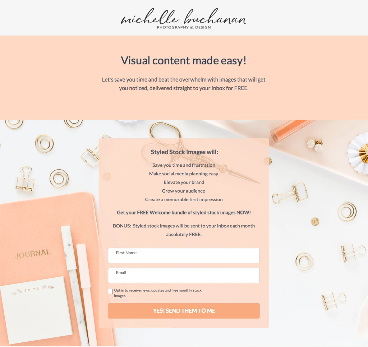
👍 Awesome!
This landing page makes excellent use of color, tying in hues from the background image and applying color blocking to highlight sections. All the elements are there on this page. The signup form takes center stage, catching the eye of the visitor. The reader also sees what they’ll get and the benefits.
🔧 Could be tweaked
The heading at the top of the page should be a call to action, for example, "Download these free stock images and enhance your visual content!".
👉 Tip: The best landing pages are short and sweet. They contain all the necessary information that’s interesting for the audience.
5. Book a call - OBM agency
OBM agency created a beautiful landing page with the aim to persuade visitors to book a free strategy call to discuss their small business marketing strategy. This is a great tactic to collect leads and establish the first contact of your hopefully long-term relationship.
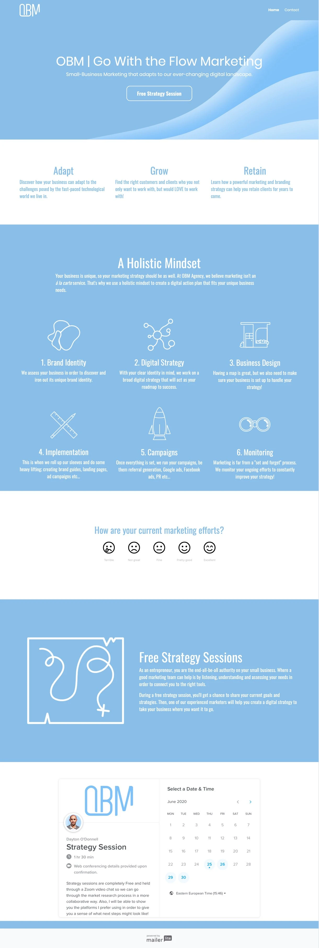
👍 Awesome!
The design of this page is on point! The different icons help to quickly spot what this agency can offer you. The interactive quiz midway keeps the reader engaged.
🔧 Could be tweaked
The agency could look at their conversion rate, create a split test and slightly tweak a part of the copy of the second version. The upper part of the page takes up a lot of space without telling the reader much. Though the CTA is clear, it can be interesting to see if different wording influences the CTR.
👉 Tip: At the very end of the landing page, this agency integrated the Calendly app that’s used to book the free strategy session. This is done by using the HTML block for landing pages.
6. Unlimited access - Mathletics
Mathletics is a UK-based online learning platform with interactive maths games and activities. Their target audiences are schools and teachers, and this landing page was created to promote their 30-day free trial.
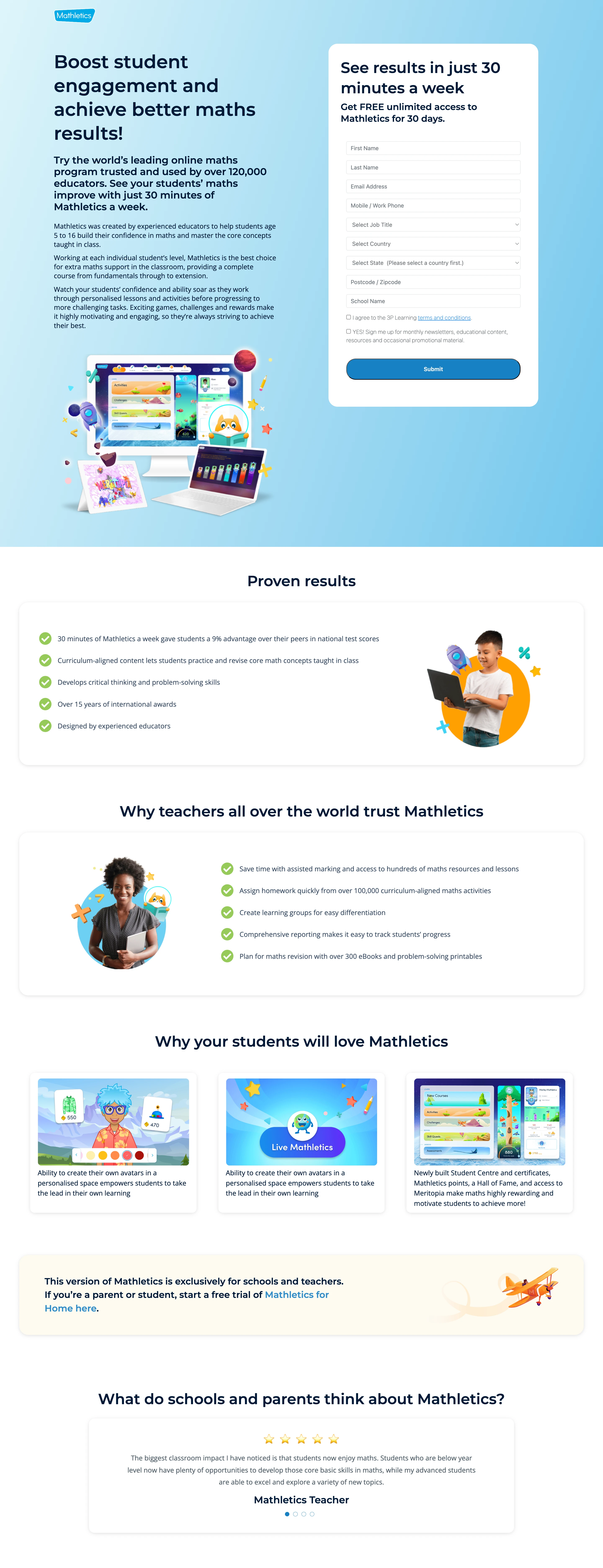
👍 Awesome!
These complementing color blocks are a big YES from us! The blue, yellow, gray and white tones are easy on the eyes, without being boring, and the font is clear and readable. We also love the award logos and testimonials, which add credibility and social proof for their platform. The email copy is personal and it lists benefits over features. Great job, Mathletics!
🔧 Could be tweaked
Mathletics could add a short video to their landing page, showing their solution in action.
👉 Tip: Faces are powerful marketing tools. Whether you use them in photos and/or videos, they will build human connections, set the right tone, and establish trust with your brand.
Your ultimate landing page checklist
We know this is a lot to take in! But get the basis for your landing pages just right and you’ll be on your way to success. Here’s a checklist of other things to keep in mind when creating your landing pages.
✅ Analyze your landing page from a customer perspective
✅ Use the right backgrounds and structure to make your landing page pop
✅ Testimonials with pictures can make your page seem more trustworthy
✅ Make the headline loud and attention-grabbing
✅ Be clear about your value proposition
✅ Make the copy personal to the reader, using the word ‘you’
✅ Use 16 px for your body copy text font size
✅ Keep it short, concise and to the point
✅ Countdown timers are a great way to add urgency to your landing page
✅ Make sure your subscribe forms are GDPR-compliant
Landing pages are also a work in progress. No first draft will be the winner, there are always small things to tweak. With landing page A/B tests, you can continue optimizing your landing page until you find the version that drives the desired conversions.
Your turn! Create your own great landing page
I hope all of this additional knowledge gave you the motivational boost to start building your own beautiful landing page. If you’re not a MailerLite customer yet, click below to create your free account.
Create your first landing page!
Sign up for our Free plan and get access to all premium features for the next 14 days.
Have you ever created a landing page with MailerLite? Share it with us in the comments!
Editor's note: This article was originally published in June 2020. It has now been updated with new tips and examples to help you make your landing page the best it can be!