
Collecting leads and nurturing healthy, long-lasting relationships is a never-ending process for marketers. Follow these landing page tips that will help you achieve this.
The more landing page conversions you acquire and retain, the higher the returns and number of customers it will translate to.
One of the best ways to generate leads is to direct them to a landing page that contains a signup form. Unlike your website’s homepage, which sets the stage for your entire business, a landing page focuses your potential customers' attention on one clear-cut objective and encourages them to act on the spot.
To get started with effective landing page best practices, here are 13 effective landing page examples that you can apply to your lead generation initiatives to increase conversion rates.
13 landing page tips for optimization
1. Include the 4 key landing page elements above the fold
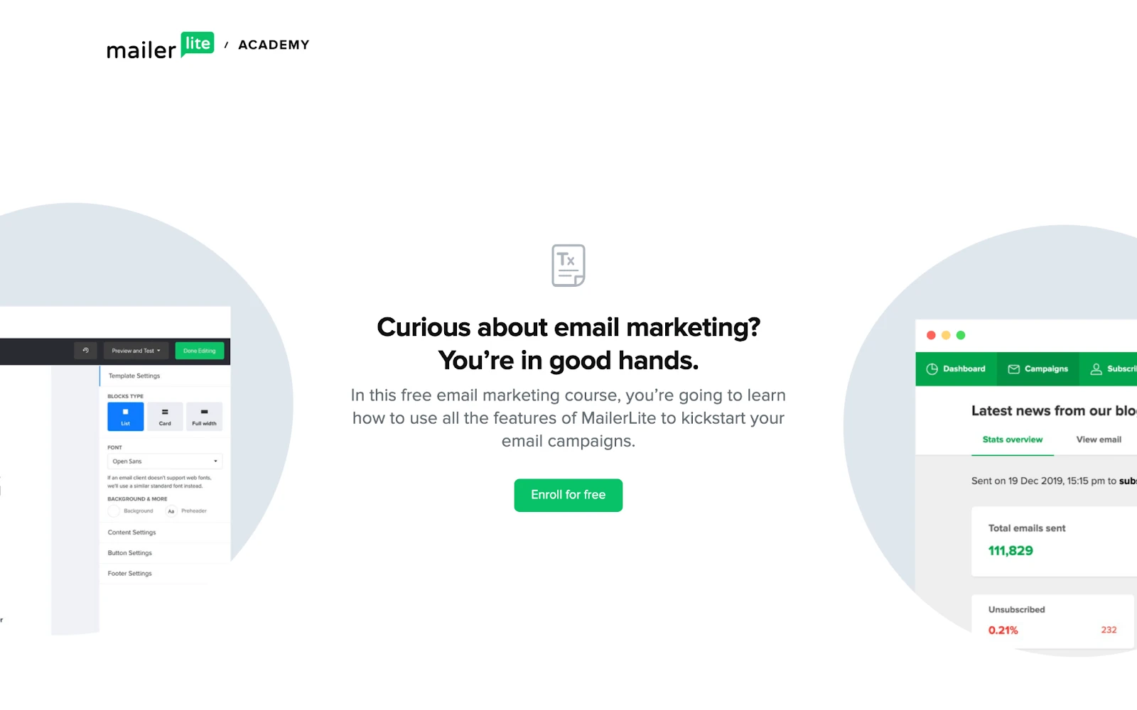
Why we love this landing page: “All the critical elements of a good landing page are visible without scrolling. You know all the basic information, and the exact action you need to take, within the first glance!”
A good landing page only needs 4 important elements:
Headline
A description of your offer and its value/benefits
A supporting image or video
Subscription form or call-to-action (CTA) button
These elements should all be displayed above the fold, before the page visitor has to scroll.
So when it came to designing a landing page for the MailerLite Academy, we wanted to ensure that these 4 important elements are visible as soon as the landing page visitor opens the webpage—and you should do the same.
You don’t need all the bells and whistles for a high landing page conversion rate. All supporting information such as testimonials, additional product/service information, contact information, social media links etc. should be included below the 4 key elements of your landing page.
2. Be goal-oriented by removing distractions
Why we dig this landing page: “It’s bright, straight to the point and the CTA button is the first thing you’ll notice. Simplicity at its best!”
When your visitors make it to your landing page, you don’t want them to leave. You want to keep them there till they complete your desired action.
This means you need to remove all distractive links or articles that might divert visitors from your goal. Remember, your website is where all your shiny offers are advertised. Your landing page just focuses on that 1 can't-miss offer.
3. Write a headline that drives action
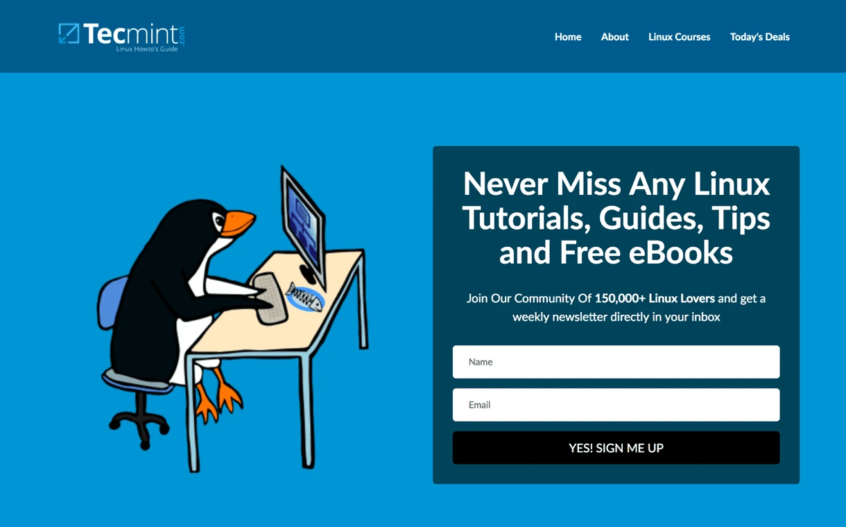
Why this landing page rocks: “Tecmint tells the reader exactly what their newsletter is about and how often to expect it. The social proof (150,000+ Linux Lovers are already reading it!) gives their offer more weight.”
You have visitors looking at your landing page. Well done!
Next, you want them to read your headline. Based on this, your visitors are going to make a split-second decision whether they want to see more, so it’s worth spending a lot of time crafting the headline to perfection. People tend to read it 5 times more than the rest of your landing page copy. So it’s quite important!
You want the headline to be clear, relevant and informative about what your site or product does. Or even better—how a visitor can benefit from it.
Ask yourself: If someone glances at my headline, do they know exactly what to expect?
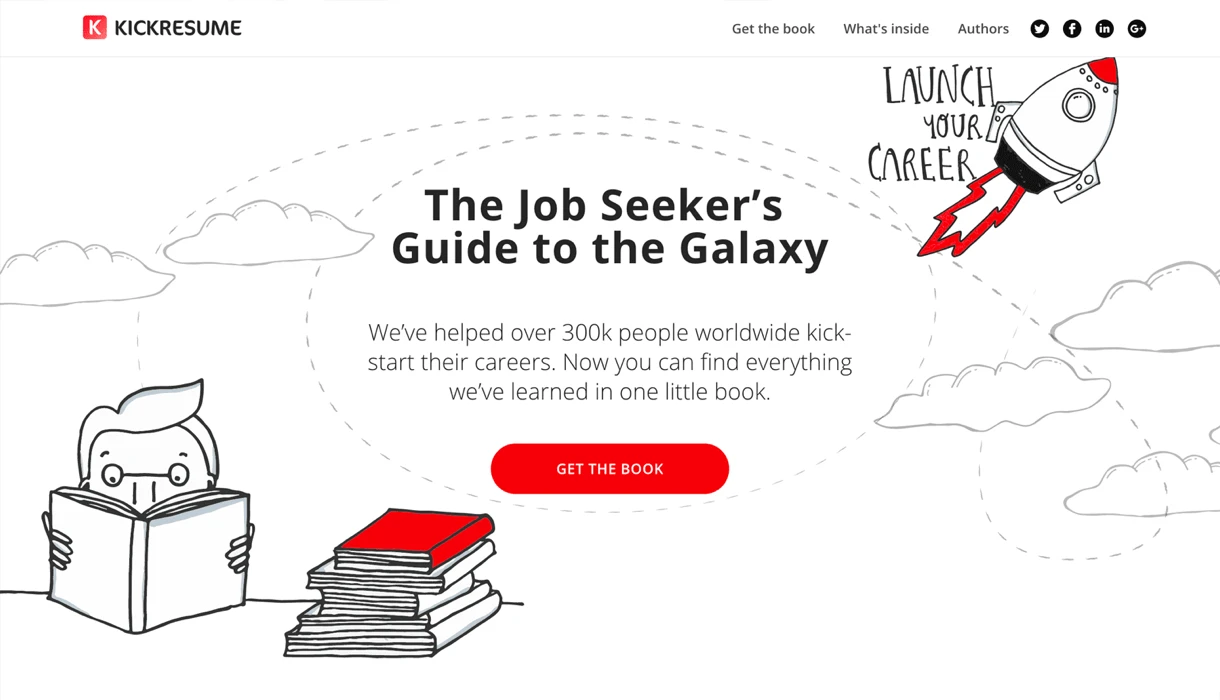
4. A clear yet informative call-to-action (CTA)
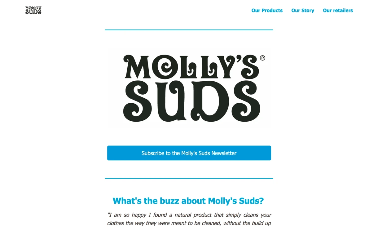
Why this landing page rocks: "Molly's Suds uses a very clear CTA asking visitors to 'Subscribe'. Nothing fancy. The button length and color fit the design as well."
A call-to-action is what you want your visitors to do. It sounds very simple, yet a good CTA requires some extra thought and creativity.
You want it to be clearly visible, enticing and button-shaped. Make your CTA button as easy to spot as a billboard in the desert.
Consider the color of it as well. Does it match the rest of your color scheme, yet still stand out? Psychologists agree that colors are a big part of marketing and should be used with consideration. Here are some examples:
Yellow is associated with optimism, clarity and warmth
Orange is friendly and cheerful
Red is exciting and bold
Blue is associated with trust and strength
Green means peaceful and healthy
The use of white space promotes balance and calmness
When it comes to CTA buttons, there are 2 popular choices: Red or green. In fact, there are multiple case studies on whether red or green leads to the most landing page conversions.
The other important aspect is the wording. You clearly want the CTA to be something more interesting than a plain “Submit”. Who would want to submit to anything? I know I wouldn’t!
Instead, use phrases like “Get the book”, “Subscribe to my newsletter'', “Yes, send it NOW!” This makes the reader more excited and tells them exactly what to expect when hitting the button.
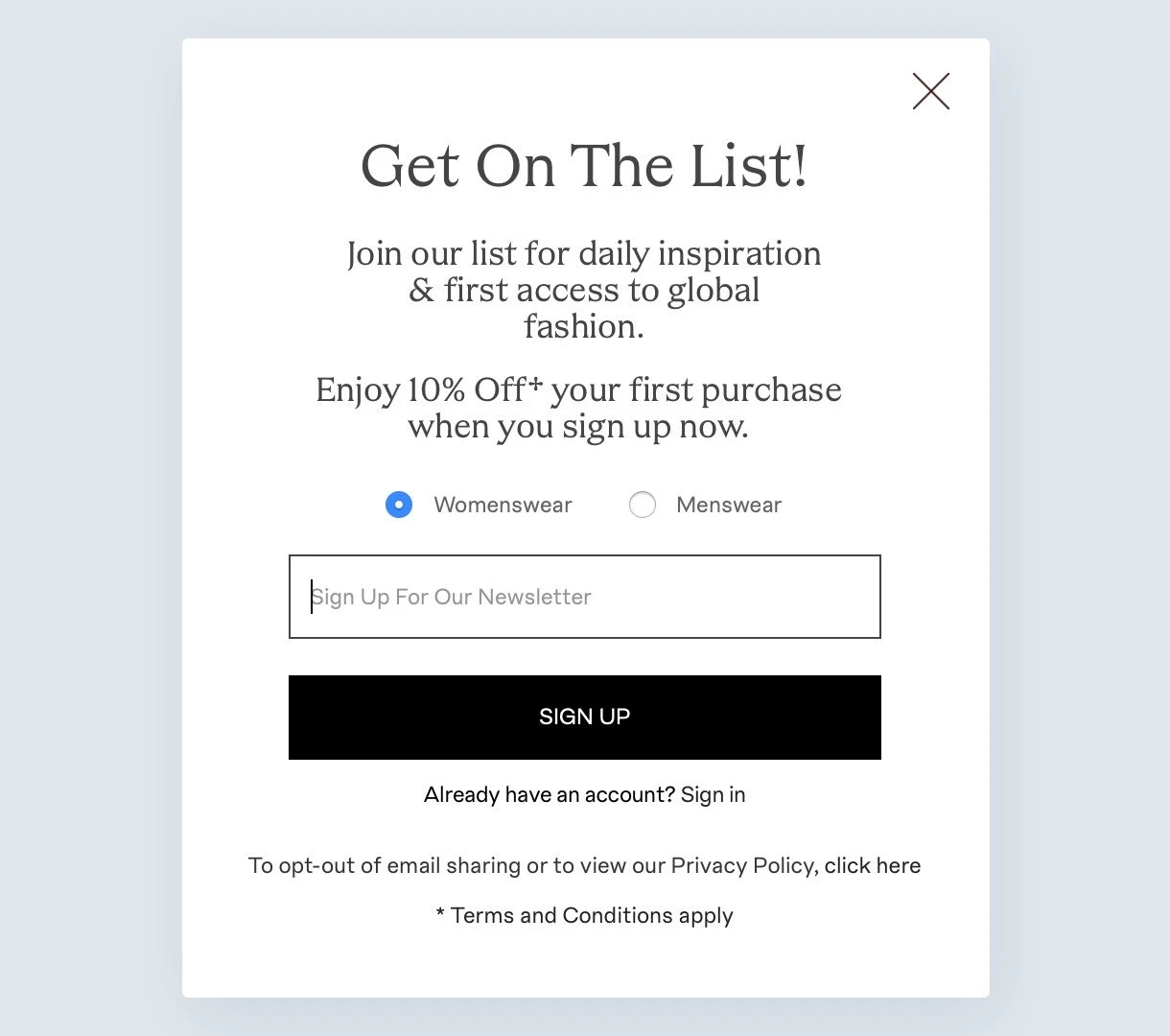
5. Highlight the value for your target audience
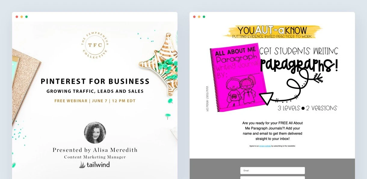
Why these landing pages rock: "They offer FREE lead magnets immediately in a clear way. You know exactly what you will receive when you share your email."
In addition to writing a clear headline and CTA, you’ll want to quickly communicate the value you’re offering to your reader. Are you giving them a free download or introducing a newsletter that they’ll love?
Whatever you’re offering in exchange for their email, make it clear and worth their while.
Lead magnets are always a good strategy to convert visitors into leads. A lead magnet is a free item that you offer in exchange for their email address. For example, you could include a free PDF download, like an ebook or guide, and deliver it using an automated lead magnet sequence. Be creative, but relevant. The lead magnet should always relate to your business and help your audience.
6. Give them a taste with a newsletter archive
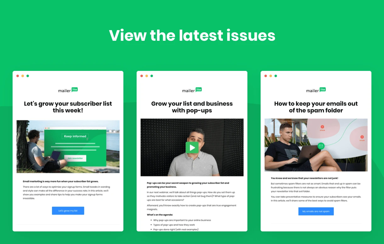
Why newsletter archives rock: “Everyone loves to try before they buy. Visitors can preview older newsletters before they dive in.”
If you’re building your subscriber list, why not give them a look-see at what’s in store to encourage sign-ups?
The newsletter archive block in MailerLite lets you display your previous newsletters on your landing page. When you give people a taste of what they will receive, they’ll know exactly what they’re getting themselves into when they subscribe.
This approach attracts your target audience and encourages long-term subscribers. Just like ordering a product online, you’ve already had a look at the product images and details, so there are no surprises when you receive it.
7. Go for neat and tidy landing page design
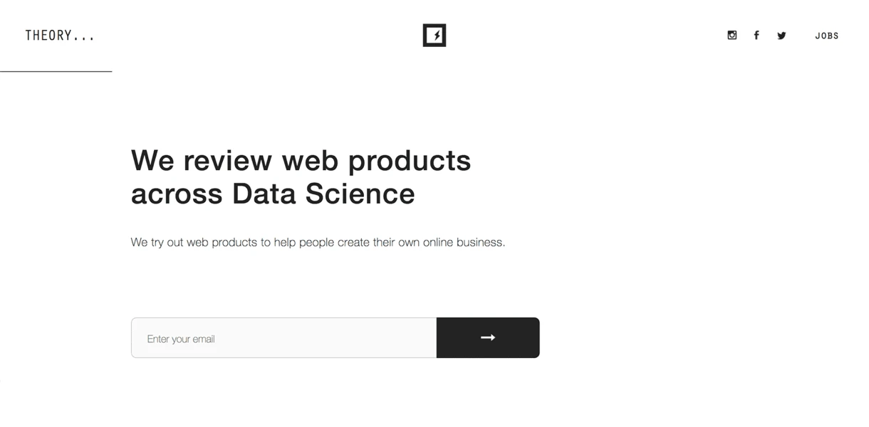
Why this landing page rocks: "Theory strips away all unnecessary design and words to focus the reader on 1 objective."
Smart design is probably as important as the content. Visuals done right can increase your conversions significantly.
Clean design keeps website visitors focused on your call to action, while bigger fonts make it easy to read and quickly grasp what your site or product is about. What’s more, you should consider using bullet points so your visitors can quickly skim through rather than having a big chunk of text to read.
Lastly, try removing the main navigation links that are usually present on your website. If your audience wants to engage further, they can click your logo to go through to the homepage.
8. Use directional cues to guide the reader

A directional cue is a graphic that points the reader to where you want them to look. Whether it’s the main message or the clickable call-to-action button, a directional cue is an effective way to subtly call the attention of your target audience to the element you want.
You can use graphics like arrows, lines, or even a photo of a person pointing to lead the visitor’s eye towards the end goal.
9. Prove your value with social proof
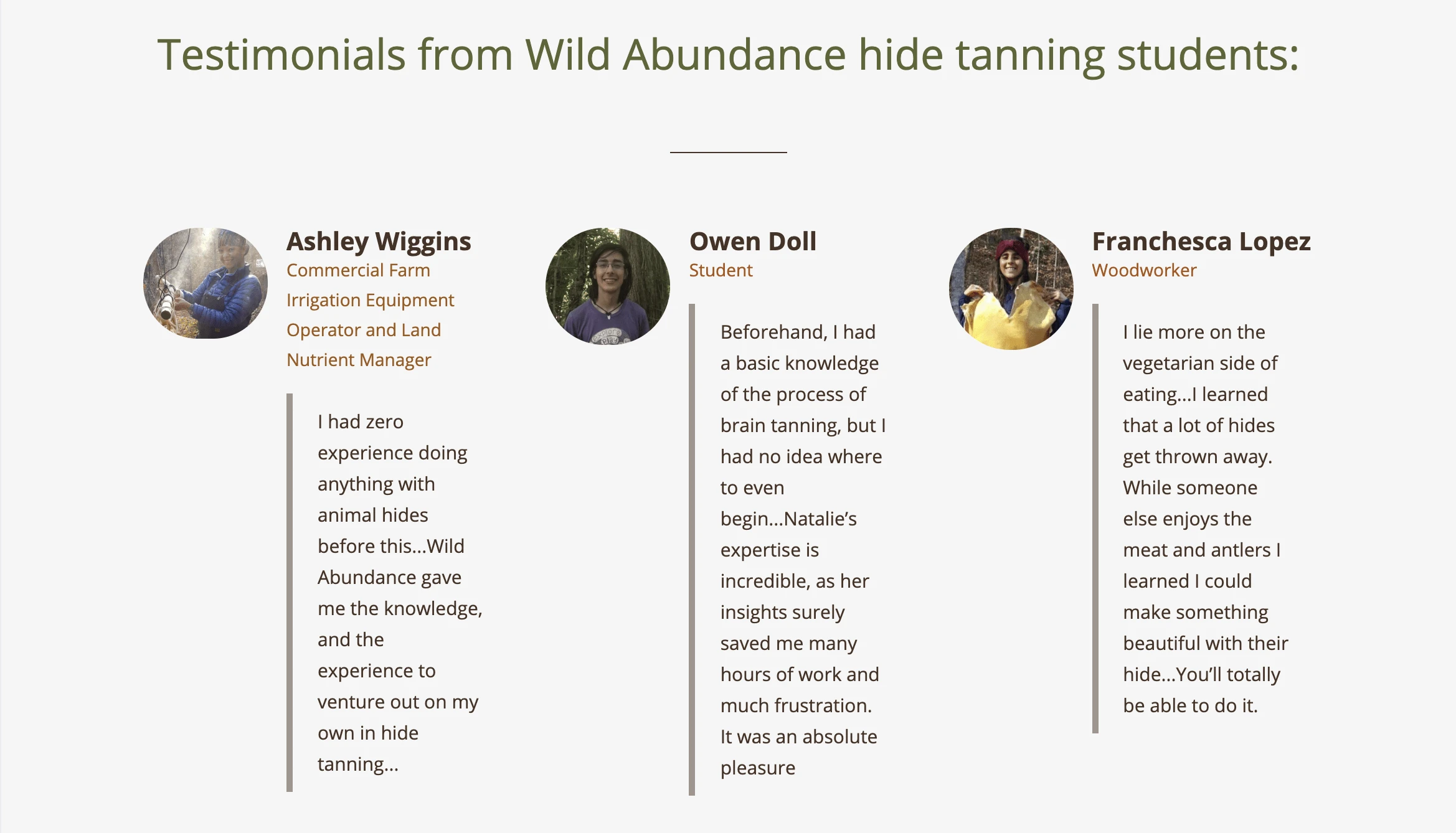
Why social proof is awesome: “Seeing glowing testimonials from real customers builds trust and relieves the anxiety some new customers feel about purchasing a product or service from an unfamiliar brand or organization”.
Wild Abundance does a great job of utilizing testimonials for social proof. The 3 testimonials they display on their landing page are from first time customers with little to no knowledge of the product. By including these reviews on their landing page, new visitors get extra confirmation of their value proposition.
10. Test different variations for landing page optimization
Sometimes you don’t know exactly what will make your landing pages yield the best conversion rates. There have been several times that we built a page liked by everyone internally, but it didn’t convert well with our visitors.
The good news is that you no longer need to guess; you can use A/B testing for conversion rate optimization. Landing page A/B testing (or split testing) is when you create 2 or more versions of the same landing page but change a few variables such as landing page copy, tone, images, and CTAs.
With MailerLite you can A/B test up to 5 different versions for 1 landing page. Learn more about split testing in this tutorial video.
11. Make it very easy to convert
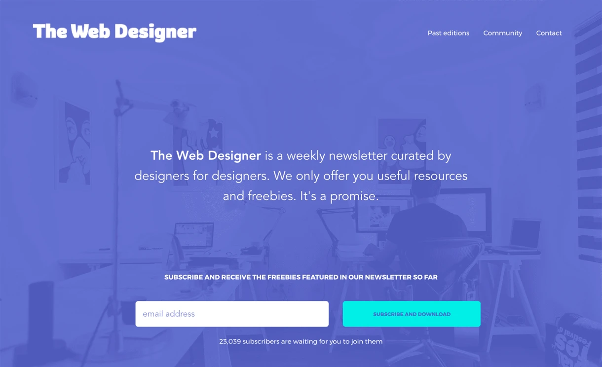
Why this landing page rocks: "The Web Designer's page has it all—a clean design, lead magnets and clear way to sign up."
Let's be honest—life is hectic! Your visitors might not have much time for filling in forms.
If you make the subscription process too complicated and long, your potential subscribers’ interest will quickly fade away. Heck, they might not even bother to read the form at all if they see an intimidating amount of text and form fields!
The fewer fields your form has, the higher the rate of conversion. It's as simple as that.
You might need to collect more information like dates or phone numbers, and that’s fine! However, in general, you should only ask for the information that you really need. You can always ask them for additional information later on in the relationship.
Want to learn more about creating signup forms? Here’s how to optimize your signup form (and turn it into a lead capture machine).
12. Think about GDPR-compliance
Why this landing page rocks: "Well, it follows GDPR but at the same time offers value and a clear path to sign up."
As a general best practice, it’s important to keep your landing pages GDPR compliant. You can create GDPR-friendly landing pages in MailerLite by adding pre-written permissions, checkboxes and EU-subscriber segmentation. There are also GDPR-ready templates available to help you get started.
13. Retain subscribers by asking them for feedback
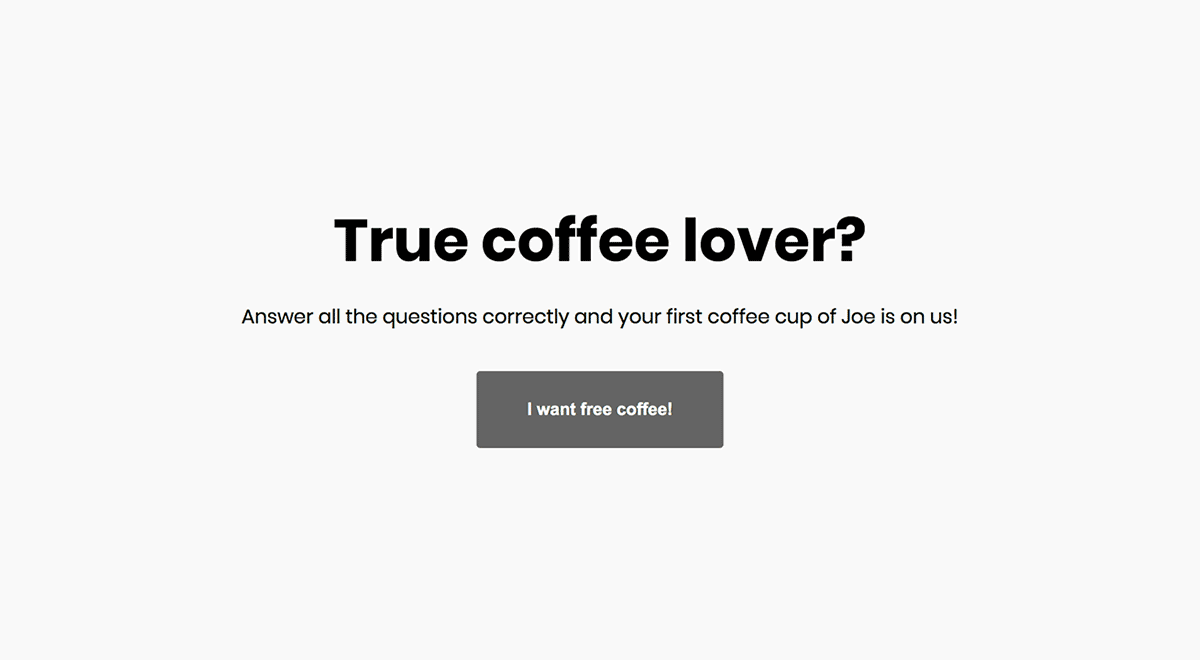
Why this landing page rocks: "It's a quiz about coffee—'nuff said."
While landing pages are great for acquiring new subscribers, they work just as well to keep your audience engaged and retain customers. One way to keep your subscribers connected to your brand is to occasionally ask them for feedback.
Instead of sending your visitors away to a third-party survey site, you can embed survey blocks on your landing page to control the experience.
In addition to surveys, you can have some fun and turn your landing page into a quiz. People love quizzes, especially if they are specific to your brand.
Get inspired by best landing page examples
Use landing page templates with best practices built-in
Encourage social sharing (Add social icons)
Optimize it for mobile devices (Automatic with MailerLite)
Create beautiful, effective landing pages on your own
Our intuitive landing page builder helps transform people of all skill levels into professional designers. With drag and drop functionality, you can build all types of landing pages quickly and easily. Check out this landing page demonstration video.
Editor's note: This post was originally published in 2017 and has been updated with new landing page tips and examples.
What's your best-converting landing page? Add your URL in the comments below!
