How to design a winning email newsletter header (with examples)
 Rūta, Marketing team
First impressions are powerful. In his book, Blink, Malcolm Gladwell famously wrote: “Buyers make most decisions by relying on their two-second first impressions."
Email headers, often referred to as email banners, can be your two-second secret weapon for making a great first impression with your email newsletter. A strong header helps optimize your message, telling readers instantly who you are, what this email is about, and whether it's worth their attention.
Designing an eye-catching newsletter header doesn't require pro-level skills or a big budget, making it an accessible win for your email marketing strategy.
It takes a clear purpose, a few reliable principles, and the willingness to test what works for your audience. This guide walks you through all of it.
What’s an email newsletter header?
Your email newsletter header is the visual block at the very top of your email. At its simplest, it's just your logo like this one below:
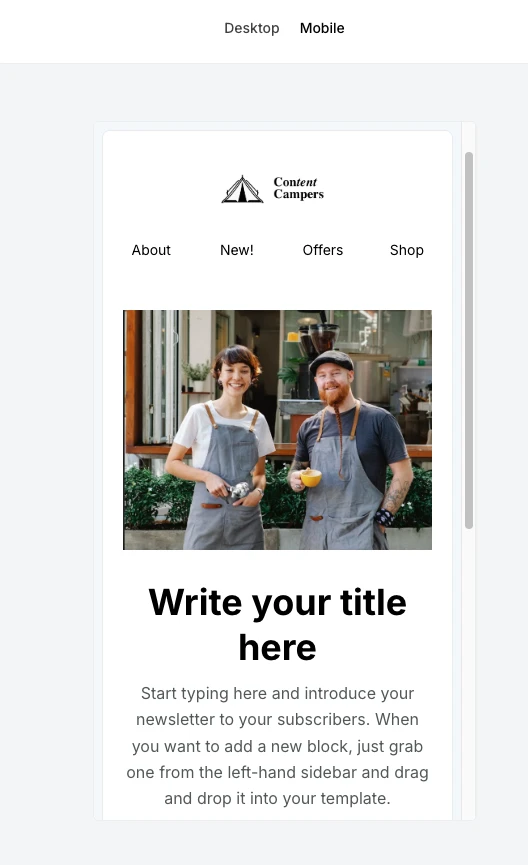
At its most developed, it combines your logo with imagery, a tagline, navigation links, and sometimes a headline or call to action. Here’s an example:
Think of this space as prime real estate. It's the one part of your email every subscriber will see, even if they never scroll.
Used well, it helps:
Reinforce your brand personality
Set the tone
Pull readers into the content
The term email header gets used two different ways: there's the technical email header (the sender name, subject line, preheader text, and routing metadata) and the visual header (the designed block at the top of the email body). This article is about the visual email header design, the one your subscribers see and judge you on.
Why your newsletter header matters more than you think
The inbox is crowded. The average person receives over a hundred emails a day, and most decisions about what to open, skim, or delete happen in seconds. Your header has the following jobs in that moment:
Build instant brand recognition. When subscribers see a consistent header across every send, they know it's you before they read a word. Over time, your header becomes a visual shortcut that says "this is worth reading", or, at least, "this isn't spam"
Establish trust and credibility. A polished, branded header signals that there's a real organization behind the email. A header that looks cobbled together in 5 minutes signals the opposite, regardless of how good the content below it is
Set the tone. A playfully illustrated header tells readers to expect a different experience than a minimalist typographic one. Before a single sentence is read, your header is making promises about what's coming
Drive action. Headers don't have to be passive branding. A well-placed tagline, CTA, or offer in the header reaches every reader who opens the email, including the ones who never scroll
The anatomy of a great newsletter header
The most effective headers contain some combination of the elements below. Depending on your brand values and offers, select the ones you’d like to include:
Logo: The anchor of almost every header, your brand logo helps significantly with brand recognition. Place it where subscribers expect it (usually top-left or centered) and keep it consistent from send to send
MailerLite's drag-and-drop editor gives you multiple ways to display your logo, as a standalone element, merged into a navigation bar, or placed alongside a tagline, all without touching code.
Newsletter name or headline: If your newsletter has a name distinct from your brand (like a "Weekly Digest" or a branded newsletter title), the header is where it lives
Tagline or sub-headline: One short line that explains what the newsletter is or what this specific issue covers
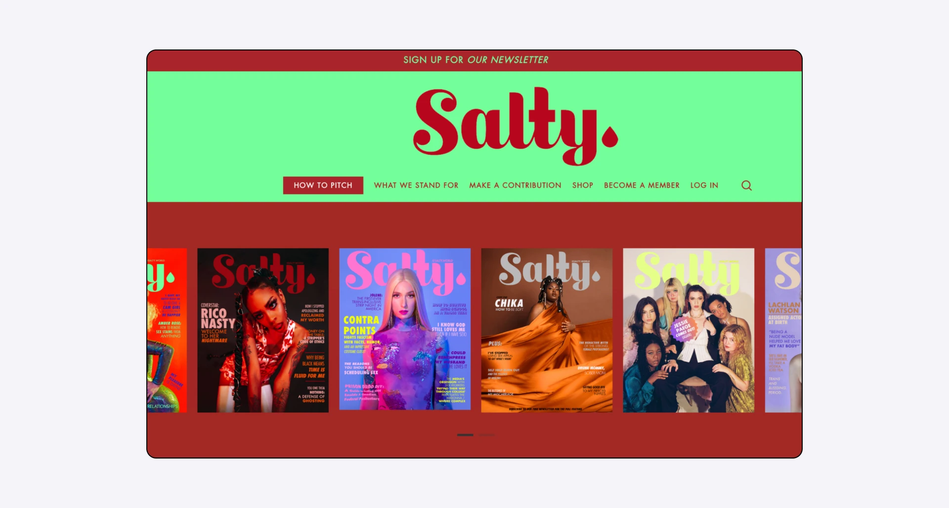
Imagery: A photo, illustration, pattern, or band of color. Imagery is where most of the visual brand personality lives. Check out our customer, media company Salty’s personality-filled header here:
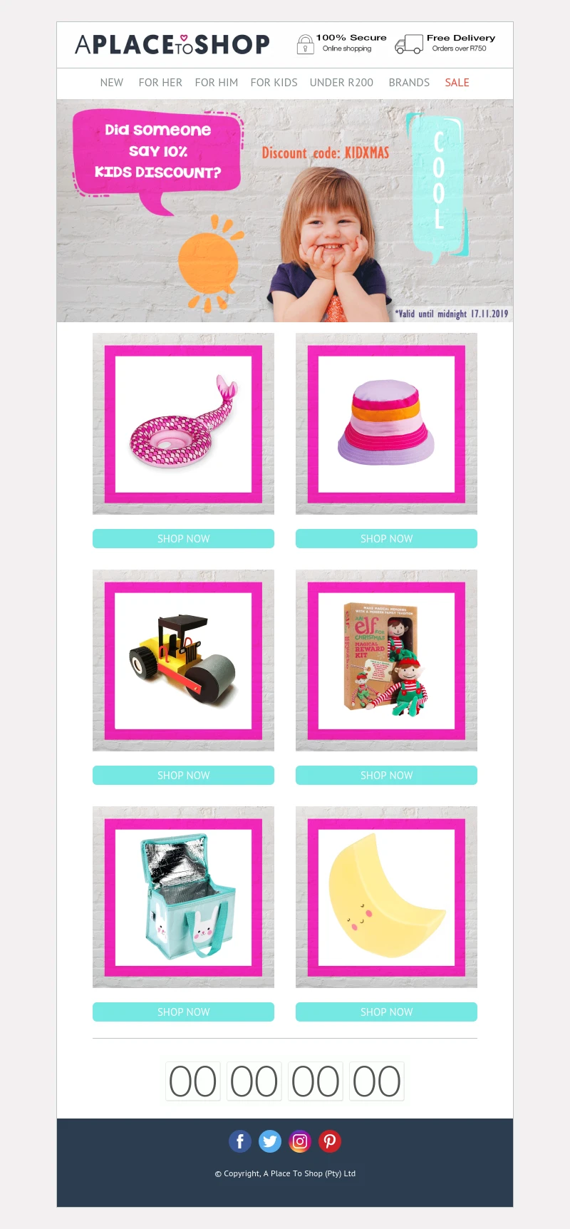
Navigation: Links to sections of your website or categories within the newsletter. Links are useful for e-commerce, pricing pages, and content-heavy sends, but easy to overdo. If you include nav, cap it at 3 to 5 items
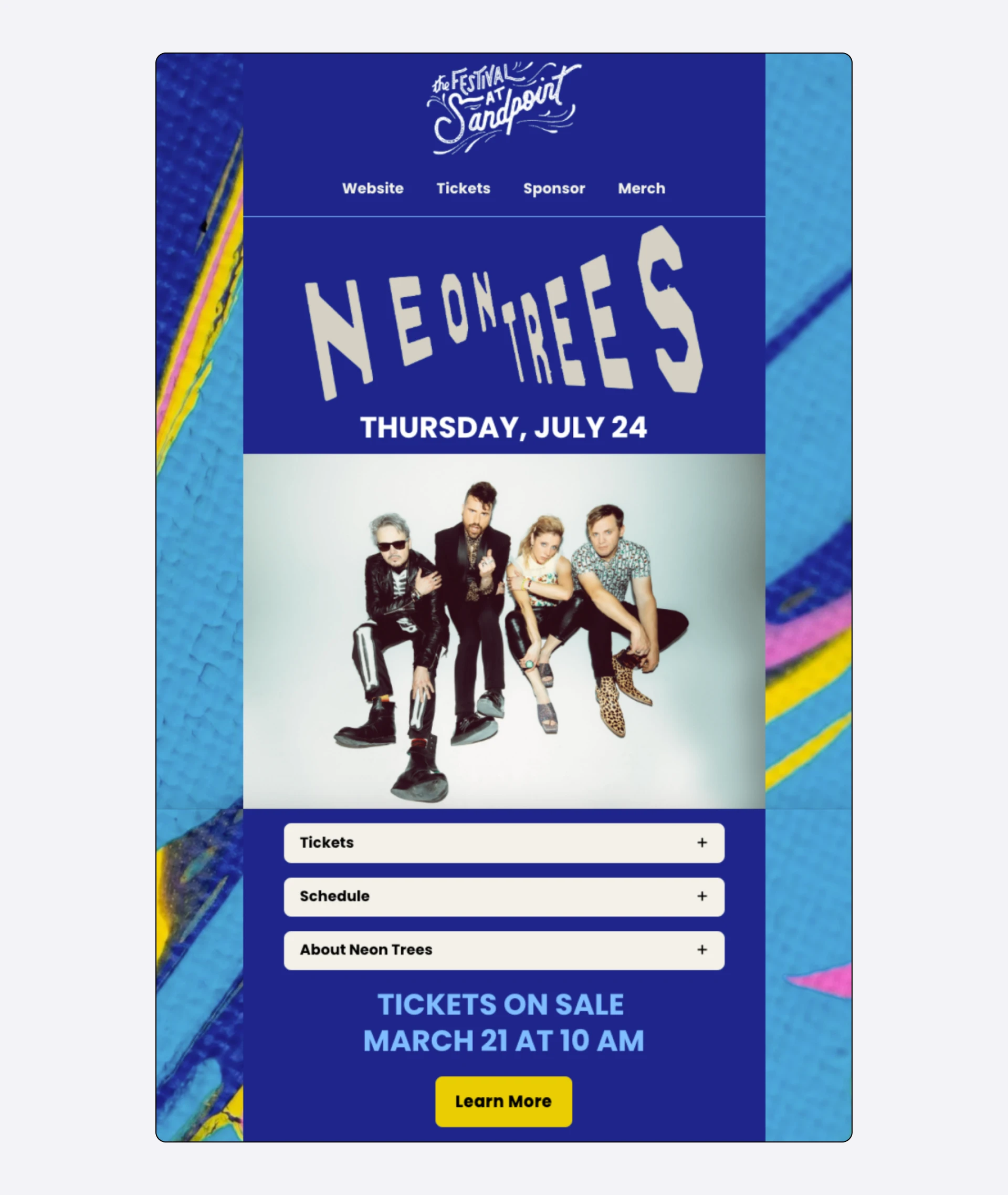
Check out the clean navigation links for our customer Festival at Sandpoint. Since they sell tickets to local concerts, you have the option to buy tickets or merchandise, sponsor their events, or visit their website to find out more about them.
Optional extras: Issue number or date, social media icons, a CTA button, a "view in browser" link. Add these only when they earn their place. Remember, every element you add is one more thing competing for the reader's attention
Technical specs that you need to remember
Before we get into design principles, let's cover the dimensions and file specs that sometimes get overlooked:
Width: 600 pixels is the standard email width for compatibility across major email service providers. Design your header around this width, and it will render correctly across Gmail, Outlook, Apple Mail, and other major clients
Height: Keep headers compact. A header without navigation should be around 70–150 pixels tall. A header with navigation can go up to about 200 pixels. Anything taller and you're pushing your actual content below the fold on mobile
Pro-Tip: If your header is just a logo, aim for the 70px – 100px range.
File size: Aim for header images between 40KB and 100KB, and do not go beyond 200KB. Larger files slow load times, and slow emails get closed. Use JPEG for photos, PNG for logos and graphics with transparency, and compress before uploading
Retina displays: Export your header image at 2x the display size (so 1200px wide for a 600px header) so it stays sharp on high-resolution screens. The file will be larger, but still manageable if you compress it
Alt text: Always add descriptive alt text to header images. Many email clients block images by default, and subscribers using screen readers rely on alt text entirely. "Logo" isn't useful; "MailerLite logo with a green bubble icon" is a better description
The shortcut: MailerLite's drag & drop editor handles most of these technical details for you—sizing, responsive rendering, and image optimization all happen behind the scenes.
12 principles for designing effective newsletter headers
Here are some of the most important points you must keep in mind when designing your newsletter header. Remember, every newsletter is different. So, use whatever works for you, tweak wherever you need to, and ignore the rest.
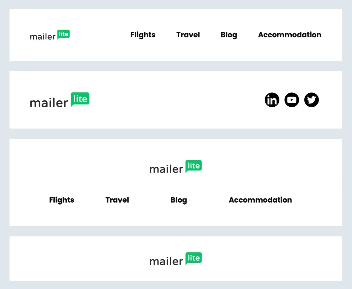
1. Lead with your logo
Subscribers should know who sent the email at a glance. Placing your logo at the top of the header—top-left or centered—is the most reliable way to make that happen. If your logo has color variants, pick the one that works on your header background and brand colors, then stick with it.
Here are the two newsletter headers sent from the Content Marketing and Product Marketing teams at MailerLite. Notice how the logo is either at the center or at the top-left:
2. Design mobile-first
Up to 81% of emails get opened on mobile now. A header that looks stunning on desktop but crops awkwardly or becomes illegible on a phone is a header that fails most of its audience.
Design for a 320–375 pixel mobile viewport first, then scale up. Keep text large enough to read without zooming (16px minimum for body copy, larger for headlines). If your header includes navigation, make sure tap targets are at least 44 pixels tall on mobile.
Headers built with MailerLite's drag & drop editor are automatically optimized for mobile, and the preview mode lets you see exactly how your header renders on desktop and mobile side by side before you hit send—a quick sanity check that catches cropping issues, illegible text, and broken layouts.
3. Use imagery with intent
Images are the fastest way to add personality, but only when they serve the message. A stock photo of a handshake on a B2B newsletter says nothing. A photo of your team, product, or something genuinely relevant to the issue is what you need.
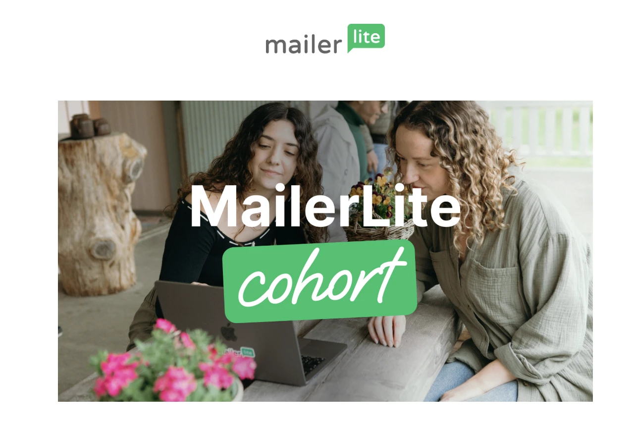
At MailerLite, we are always taking photos of our team during our annual work together events, which gives us a library of images that we can later use for our email headers.
Here’s an example of a MailerLite cohort email from our Community team with an image of MailerLiters at work.
If you don't have original photography, free libraries like Pexels and Unsplash offer high-quality options. For paid options, iStockPhoto is still reliable.
Whatever you use, run it through a quick edit, a filter, or a color overlay, so it doesn't look like the same stock image every other brand is using.
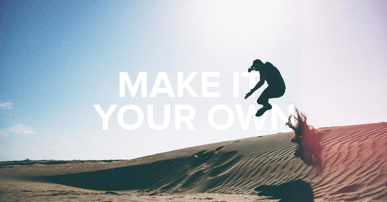
Here’s an example of a stock photo before customization:

Now, check out how the same stock photo looks after customization:
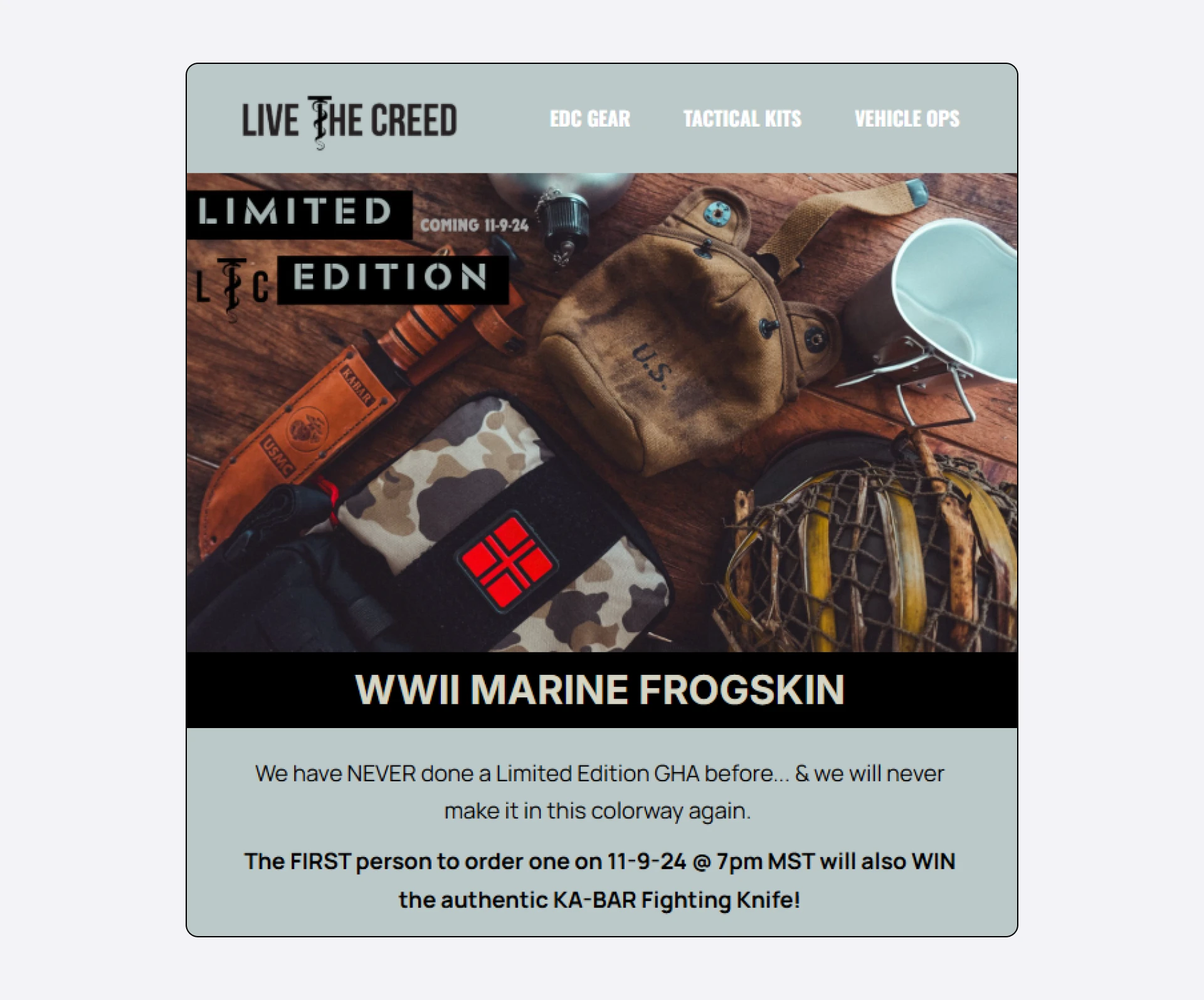
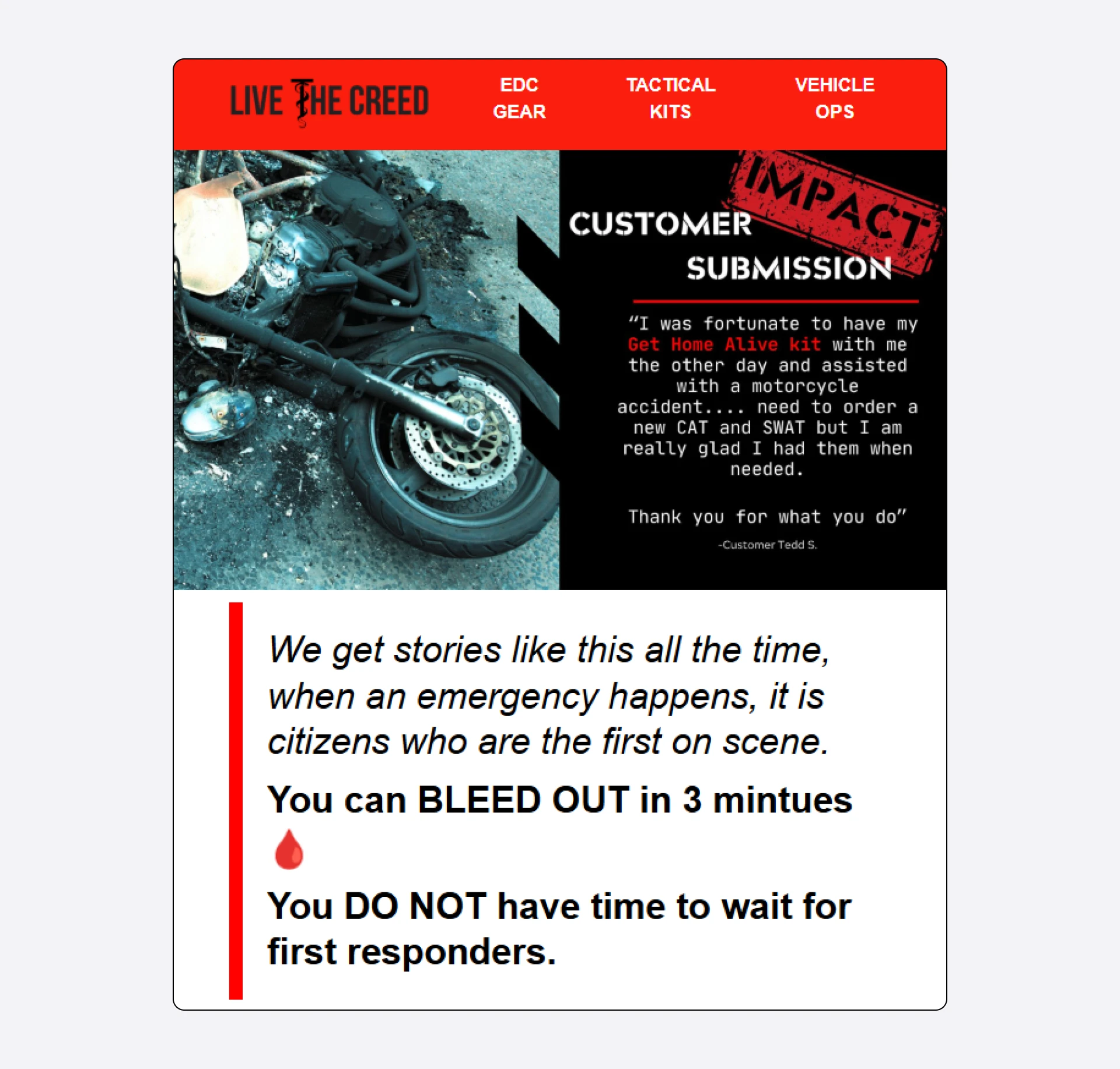
4. Make the header unique to your brand
Your header should be instantly recognizable as coming from you, not a generic template. That comes from consistent use of your brand elements: color palette, typography, logo placement, and image treatment.
The trick is balancing consistency with freshness. Keep your core header structure locked and vary the background color or imagery per campaign, if needed. This gives you visual freshness without sacrificing recognition.
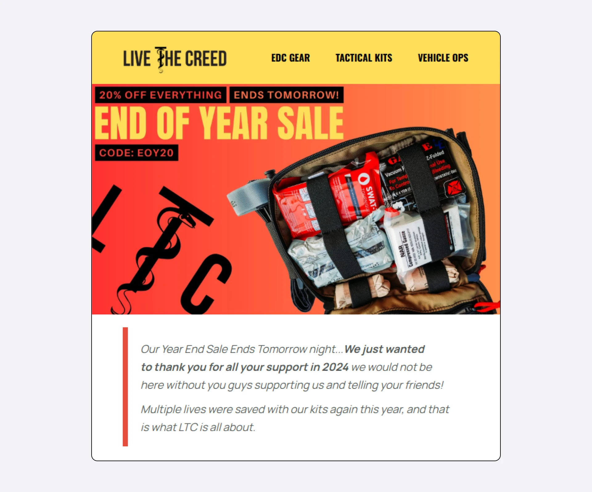
Check out how MailerLite customer Live The Creed achieves this in their newsletters:
Canva has prebuilt email templates that you can customize to fit your brand and then export to MailerLite in seconds with our Canva integration.
5. Avoid clutter
The temptation to cram everything into the header—logo, name, tagline, nav, CTA, social icons, issue number—is real. Resist it. Every element you add dilutes the others. Here’s an example of a cluttered newsletter header, followed by an equally crowded body.
Ask yourself: if a reader only looks at this header for one second, what do I want them to take away? Design around that single answer and cut anything that doesn't support it.
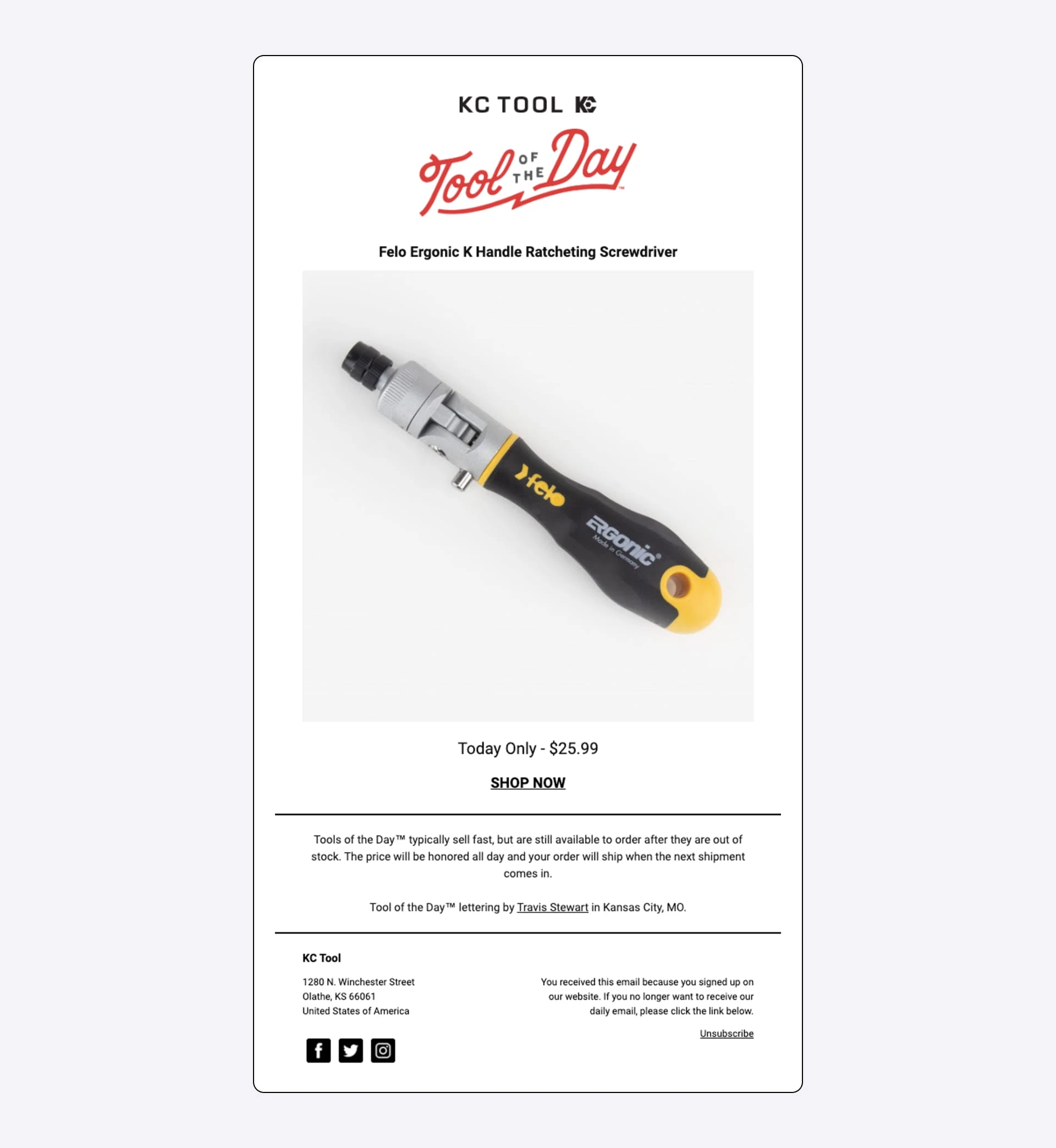
Here’s an example of a clean email header by MailerLite customer KC Tool. The header verifies the brand in a split second and immediately gets out of the way. By stripping out everything else, it ensures the "Tool of the Day" remains the undisputed star of the screen.
6. Use white space intentionally
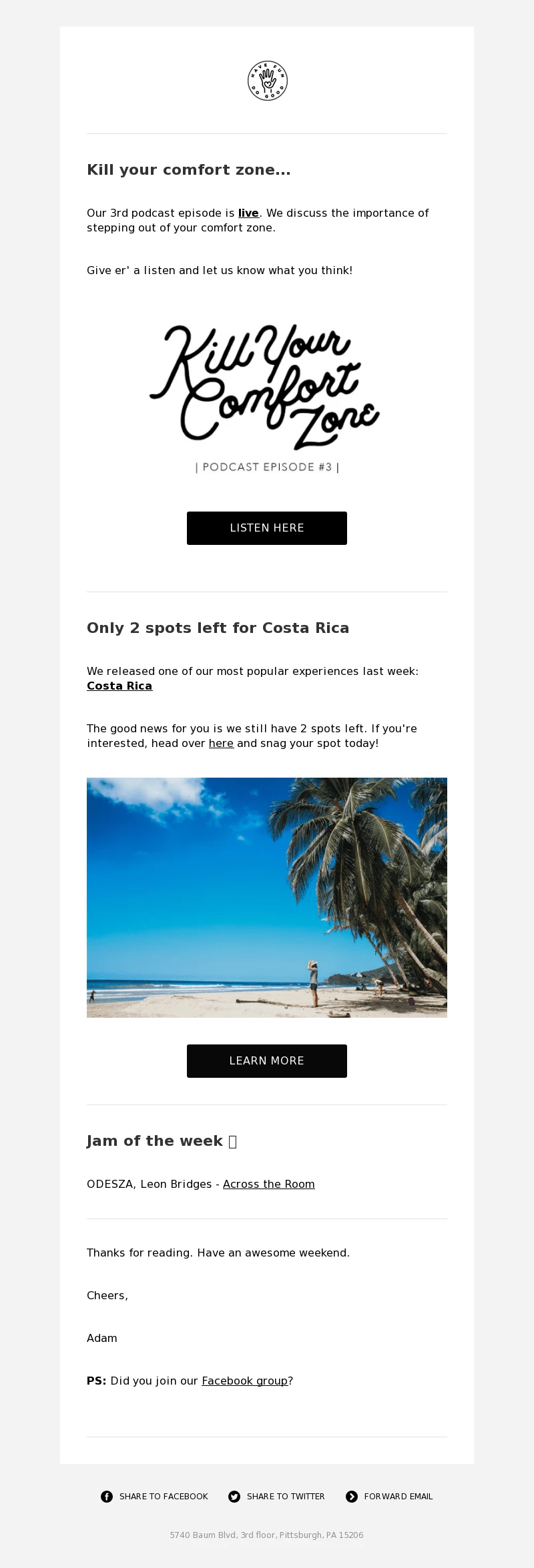
White space (or "negative space") is the breathing room around your elements. It's what makes a header feel intentional rather than crammed. When in doubt, add more space between elements and trim the copy shorter than you think it needs to be. Take inspiration from our very own minimalistic newsletter header. :)
7. Choose typography deliberately
If your email header includes text beyond the logo, use no more than two fonts, one for headlines and one for supporting text.
Pair a distinctive display font with a readable body font. Try to avoid script fonts for anything longer than a few words; they tank readability, especially on mobile. Stick to web-safe fonts or fonts explicitly supported by email clients.
MailerLite's drag & drop editor comes with a curated library of email-safe fonts and styling options, so you can pair and customize without worrying about whether your choice will render in Gmail or Outlook.
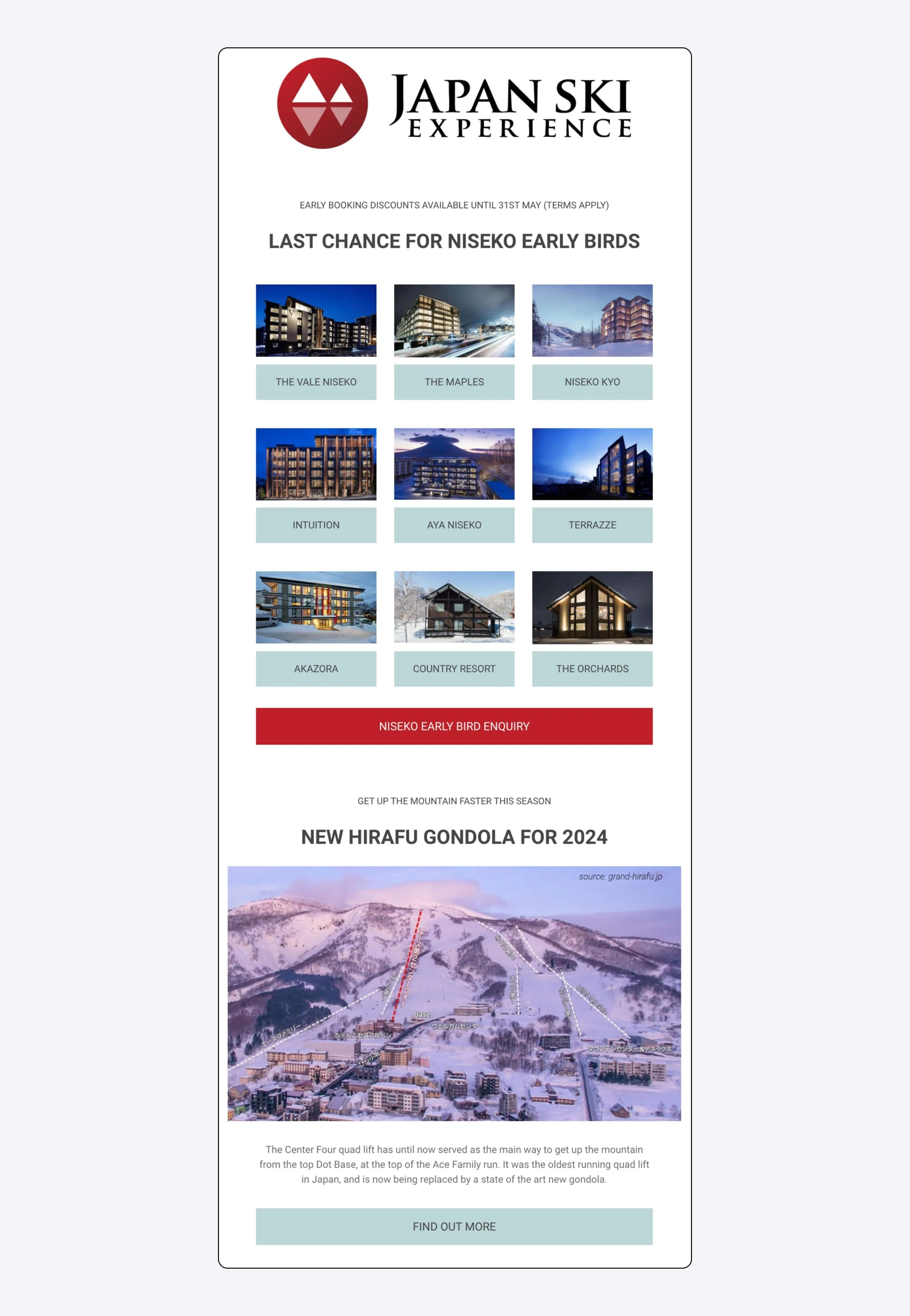
For example, check out the clean email header by our customer, Japan Ski Experience. Nothing competes for attention here. Just a simple mountain slope logo paired with the bolded brand name:
8. Get your contrast right
Text on your header needs to be readable. WCAG accessibility guidelines recommend a contrast ratio of at least 4.5:1 between text and background for normal-sized text. Free tools like WebAIM's contrast checker will tell you whether your header passes.
This matters for accessibility, but it also matters for everyone. Think about it: light grey text on a busy photo background is hard to read in bright sunlight, in dark mode, or on a low-quality screen.
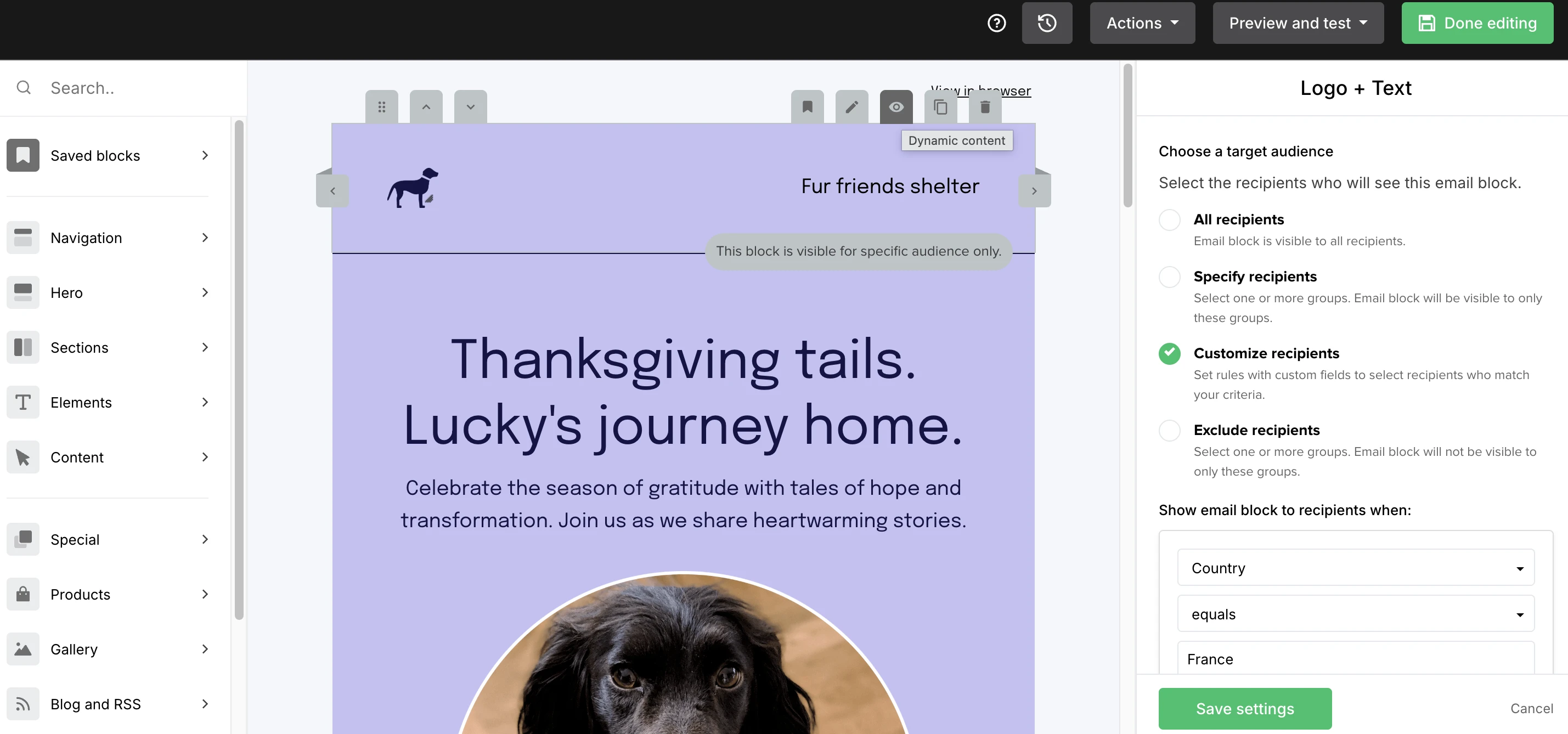
9. Personalize with dynamic content
You could experiment with dynamic content on the header. MailerLite's dynamic content feature lets you show different header blocks to different subscriber groups from a single campaign.
For example, your new subscribers could see a welcome header, or subscribers in different regions could view imagery relevant to their location.
10. Use animated GIFs (sparingly)
A subtle animation, such as a product rotating, a counter ticking, or a hand scrolling, draws the eye without being obnoxious. When adding animations to your emails, keep the file under 1 MB, make sure the first frame looks good on its own (it's what shows when GIFs don't load), and don't use animation just because you can!

11. Use AI as an accelerator, not autopilot
AI tools can speed up header creation, generating imagery, suggesting copy variants, or resizing for mobile. Use them as aids, but don't let them work on autopilot. AI-generated imagery, in particular, has a recognizable aesthetic that can make your brand feel generic if overused.
12. Test, then test again
An email newsletter header that should work on paper may underperform for reasons you can't predict, and a header you're not sure about may convert beautifully. 🤷🏽♀️
A/B testing is how you find out. Keep everything else, like subject line, content, and send time the same, and change only the header. MailerLite's A/B testing tools make this straightforward to achieve: split your list, send both versions, and let the data decide.
Read all about A/B testing here:

So, there you have it. Everything you need to build a powerful email newsletter header. We know this is a lot to follow, but there are easier ways to get a head start or improve on your existing header.
Just head over to MailerLite’s newsletter template gallery and choose one that suits your brand, customize it as per your requirements, and voila, you’re done!
Common pitfalls to avoid
So far, we've discussed how you can create a compelling email newsletter header. But let’s also explore the common pitfalls we should avoid:
Overloading with information: If your header is trying to say 5 things, it's saying none of them. Pick one primary message
Ignoring mobile: Designing only at desktop size and hoping mobile looks fine is how you end up with cropped logos, unreadable text, and navigation menus that are impossible to tap
Inconsistent branding across sends: Changing your header's structure every week undermines the recognition you're trying to build. Change imagery freely if you need to, but keep logo placement, color palette, and type treatment consistent
Text trapped inside images: If your headline is baked into an image file, it disappears when images are blocked. Use live HTML text for anything critical
Images that are too heavy: A beautiful 2MB header that loads in five seconds is a header most subscribers will never see. Compress aggressively
No clear purpose: "What is this header for?" should have a one-sentence answer. If it doesn't, redesign it until it does
Skipping A/B tests: Even experienced designers guess wrong about what resonates with a specific audience. Test before you commit
Build a header that works hard while looking effortless
A great newsletter header isn't a one-time project. It's a living part of your brand that evolves as your audience grows, your product changes, and your understanding of what works sharpens. The principles in this guide are a starting point.
The best headers come from applying them, measuring the results, and refining from there. Ready to put it into practice? Check out our email templates design gallery.
Frequently asked questions
Q: What's the ideal size for an email newsletter header?
A: 600 pixels wide is standard. For height, aim for 70–150 pixels without navigation, up to 200 pixels with navigation. Anything taller risks pushing your content below the fold on mobile.
Q: Should my header be an image or built with HTML?
A: HTML headers (live text on a colored background, with separate logo and image elements) are generally better. They load faster, stay readable when images are blocked, and adapt better to different screen sizes. Pure-image headers are simpler to design but more fragile. When in doubt, go HTML.
Q: Do I need navigation in my header?
A: Only if you have somewhere specific for readers to go. E-commerce brands often benefit from a short nav bar linking to product categories. Content newsletters usually don't need one. If you include navigation, try capping it at 3-5 links.
Q: How do I make sure my header works on mobile?
A: Design at mobile width first (320–375 pixels), use large enough text (16px minimum for body), and preview your email on an actual phone before sending. MailerLite's preview mode lets you check both desktop and mobile renders side by side.
Q: How often should I change my header design?
A: Change imagery freely, but keep the structural elements (logo placement, color palette, typography) consistent. A major newsletter header design overhaul should happen rarely, and when it does, it's worth announcing to subscribers so they don't mistake you for a different sender.