How to design a winning email newsletter header
First impressions are powerful. In his book, Blink, Malcolm Gladwell famously wrote: “Buyers make most decisions by relying on their two-second first impressions."
Email headers can be your two-second secret weapon for making a great first impression with your email newsletter. The header is the first thing that most people see when they preview or open your email.
A compelling email header design can be the difference-maker if a reader stays or goes. But how exactly do you design an eye-catching newsletter header? Let’s get into the details.
What’s an email newsletter header?
Essentially, your email newsletter header is the image at the top of your newsletter. It can be just your company logo or company name, or a combination of the logo and a picture.
Though this header element is often perceived as an image that doesn’t have that much importance, it’s actually a great opportunity to strengthen your newsletter. The email header can be used for branding, marketing or to get across your call to action (CTA). Use this free space wisely, after all, it’s the first thing that your newsletter readers will see.
How to create effective email headers
It’s essential that your email header design captures and holds your reader's attention. It’s your opportunity to make a visual statement about your brand.
There is no secret formula for designing a great email header. You need to start by asking yourself:
'If I get 2 seconds of their attention, what do I want people to think and remember?'
While some header designs work well with just a logo, we believe the best approach is to add some type of imagery along with your branding. Images can tell a story or leave an impression within seconds.
In addition to imagery, it’s important to design email newsletter headers that are consistent, clear and include some form of branding that sets you apart.
Six guiding principles for designing effective newsletter headers
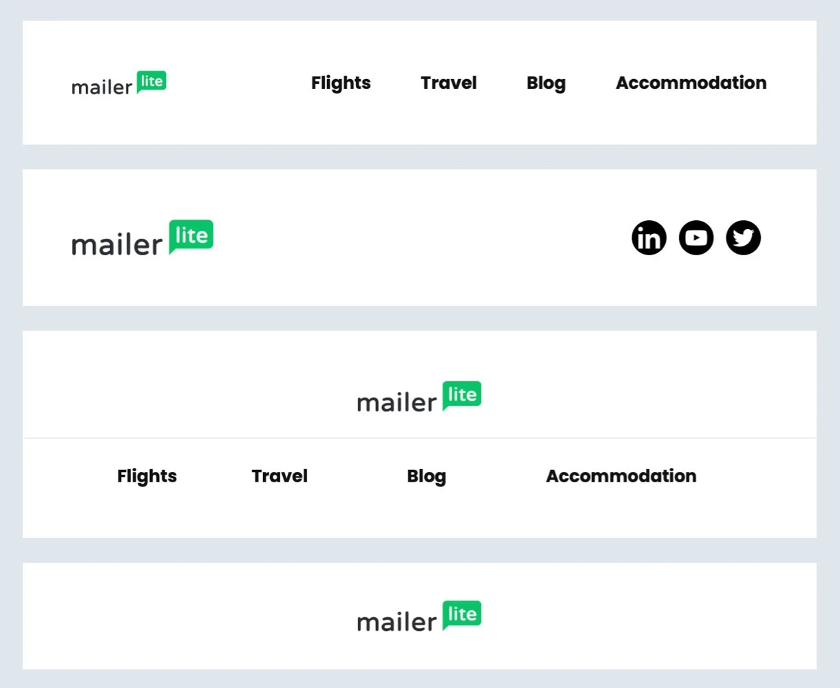
1. Insert your logo
People read so many marketing emails during the day, they’ll thank you when you make it easy for them to recognize what brand the newsletter is from. For brand recognition purposes, make sure to insert your logo in the newsletter.
Most businesses add their logo at the very top of the email newsletter header design. You can make it an element on its own, or merge it with the navigation. In MailerLite, you have different options to display your logo.
2. Use imagery
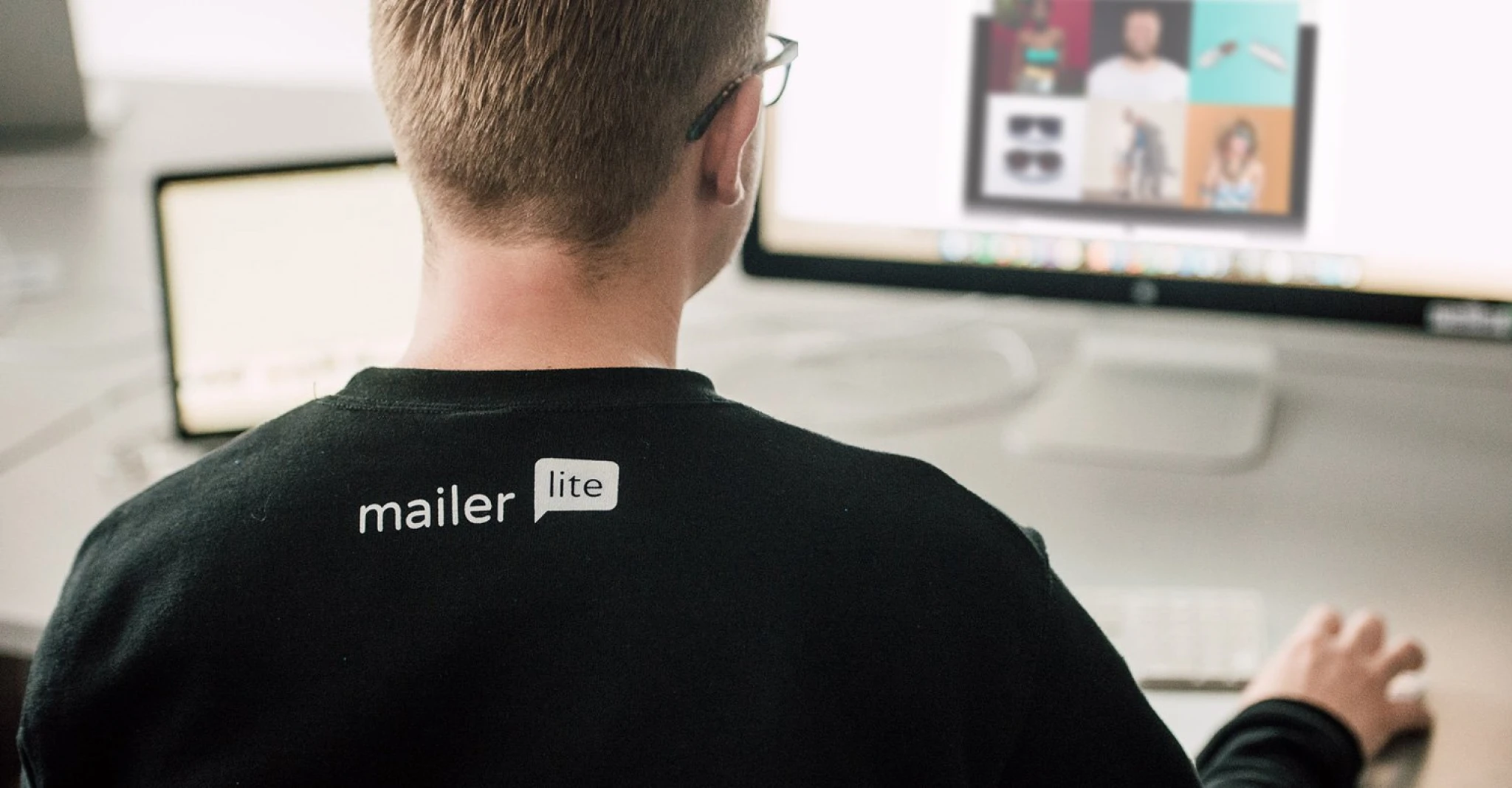
At MailerLite, we are always taking photos of the team and our experiences, which gives us a library of images that we can later use for our email headers.
If you don’t have original images, you can find free photos at sites like Pexels, Freerange Stock, and Morguefile. Or, for a few dollars, iStockPhoto is a fantastic resource.
During our bi-yearly workations, we always have a photographer travel with us (the amazing Ronya Galka). During COVID, when we couldn’t travel to meet, we arranged photoshoots with smaller groups of remote workers who live in the same country and a local photographer (of course, with the restrictions in mind). This is how we made sure we still had fresh imagery throughout 2020.
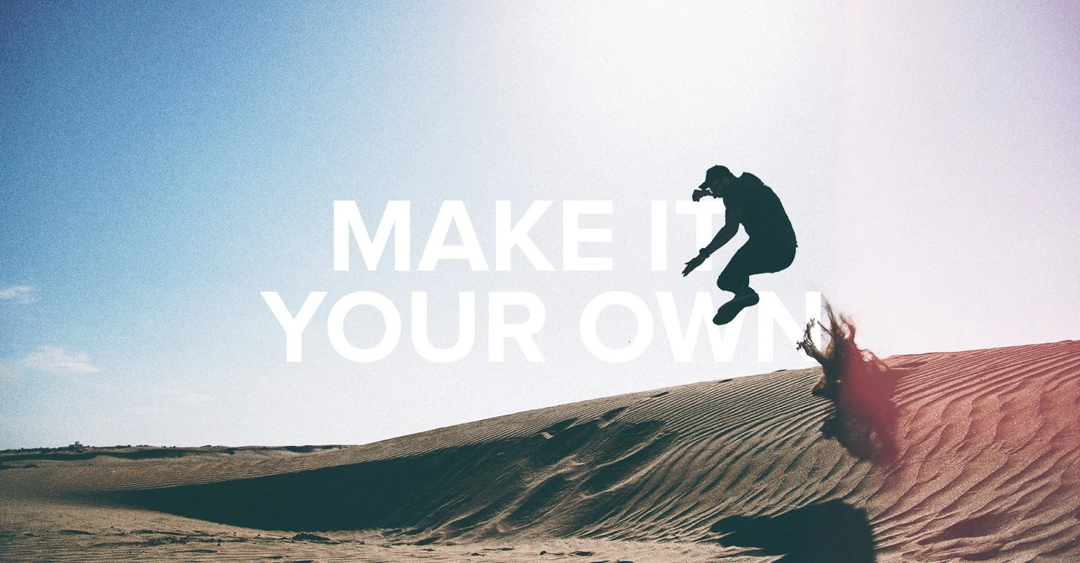
3. Make it your own
Once you’ve found the perfect photo, make it your own!
You can edit with simple tools like Canva or Aviary. For example, your image might look pretty cool if you run it through a filter or add some text on top.
Of course, you’ll want to add your unique brand design cues (logo, color, icons, fonts) to ensure your readers instantly recognize that the newsletter is from you.
Stock photo example:

Stock photo customized:
Canva even has prebuilt email templates that you can customize to fit your brand and then export to MailerLite in seconds with our Canva integration.
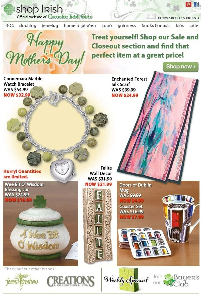
4. Avoid clutter
It might be tempting to include a lot of information in the header. Don’t do it! Less is more. The whole purpose is to grab the reader’s attention with your email header design.
When you add too many images or too many words, the reader can get turned off. Keep it simple and clean.
Cluttered example:
Simple and clean example:
5. Experiment and test
Let’s face it, no one really knows if a design will work until they test it out. If you are unsure why different headers are working or want to experiment with a few designs, set up an A/B test.
Just remember to keep your newsletters exactly the same except for the email header design. This way, when you get the results to see which design is more effective, you will know that the newsletter header design is the difference-maker.
Have fun and take some chances. If your crazy email newsletter design ideas don’t test well, at least you pushed the envelope to get the best design possible.
Want to see how easy it is to set up an A/B test?

6. Be consistent
Once you settle on an email header design direction, the trick is to keep it consistent while also keeping it fresh.
Try to use the same structure and branding elements (such as the same email color and fonts) in your email newsletter design, but change the images to relate to the topics within the newsletter.
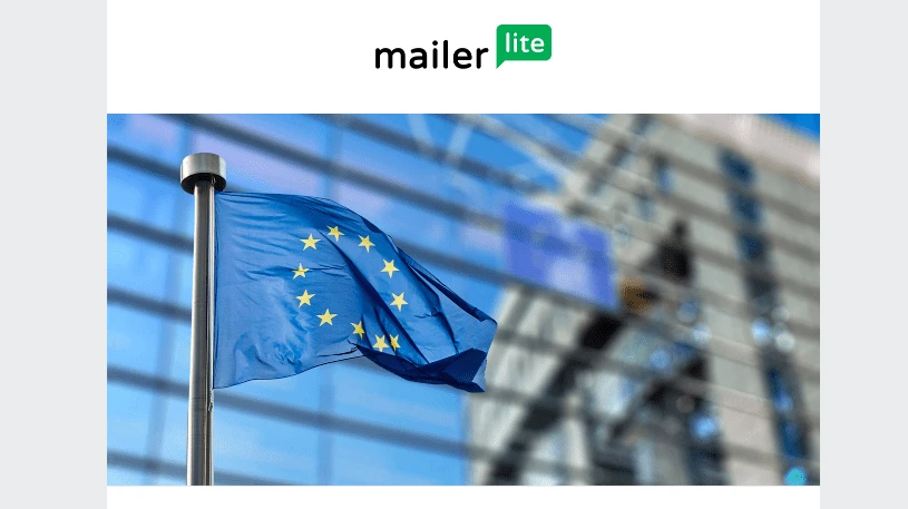
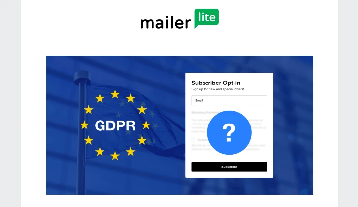
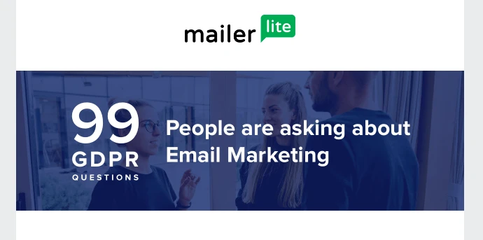
Our GDPR newsletter series is a good example of keeping a consistent design while using different imagery. Here are three different headers under the same brand look and feel.
Email header design examples
Now that you have the fundamentals down, it's time to get inspired. Spend time looking at other email campaigns to get ideas and best practices.
Check out these newsletter header examples below from our own customers.
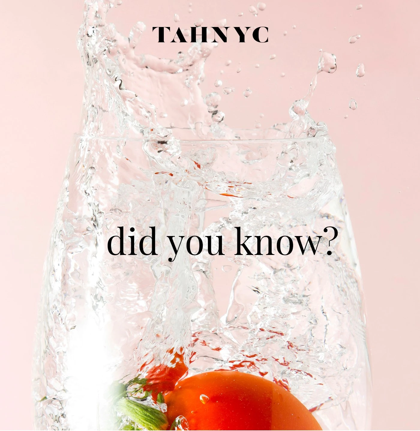
Pros
Compelling image
Includes branding
Clean design and clear
Cons
Lacks a descriptive headline to draw the reader in.
Image size is large. Header size should be about 600px wide and 200px high
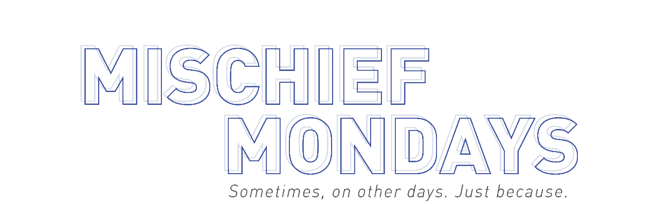
Pros
Clean design
Clear messaging
Slight movement makes up for no image
A GIF can be eye-catching and a fun twist to an otherwise plain logo
Cons
Lacks personality and uniqueness
Might not draw people in (that’s why we test)
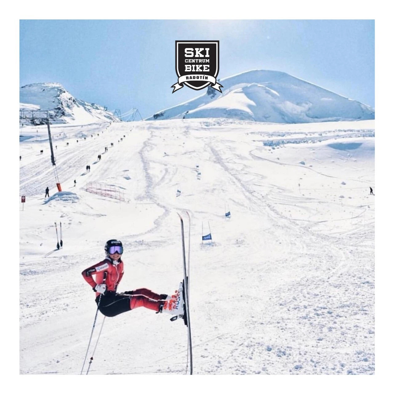
Pros
The image describes exactly what the newsletter is about
The text is clear and doesn’t clutter the image
Includes branding logo and colors
Cons
The image is quite large in height, so email readers will only see the image upon opening the email
An additional header text or CTA would have been more compelling
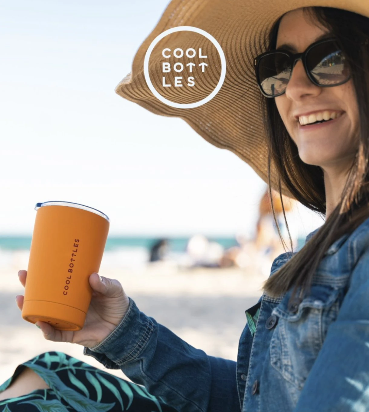
Pros
It immediately becomes clear what the newsletter is about
The bright colors are eye-catching
Cons
The email header design is quite vibrant, so it’s better to keep the rest of the email design simple to avoid the newsletter becoming chaotic
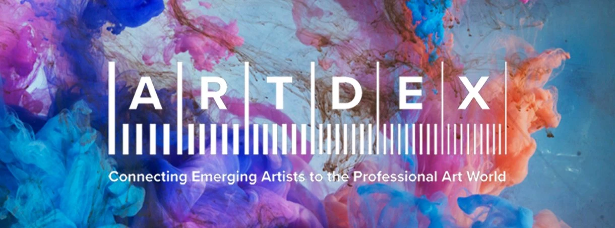
Pros
The artsy background shows that this newsletter is indeed about, art
Cons
The white font on a multicolored background makes the text hard to read
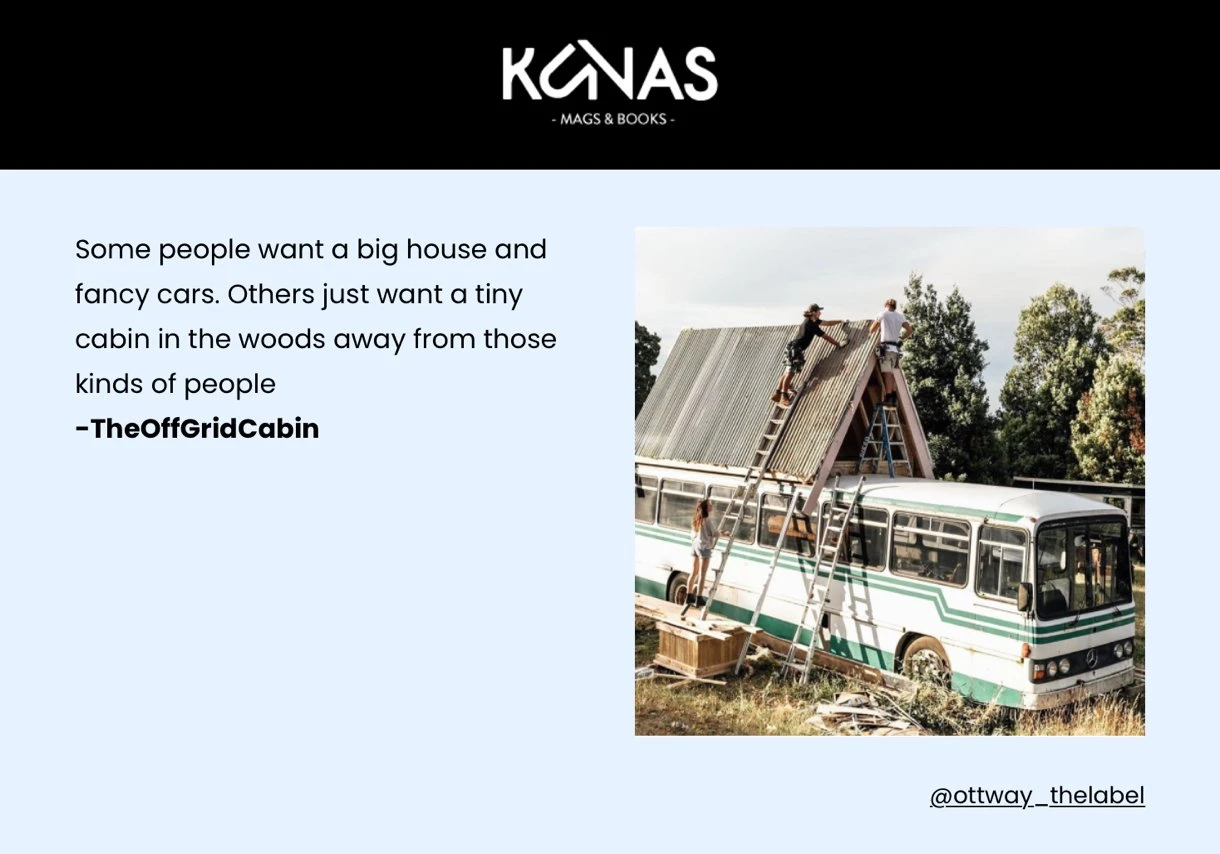
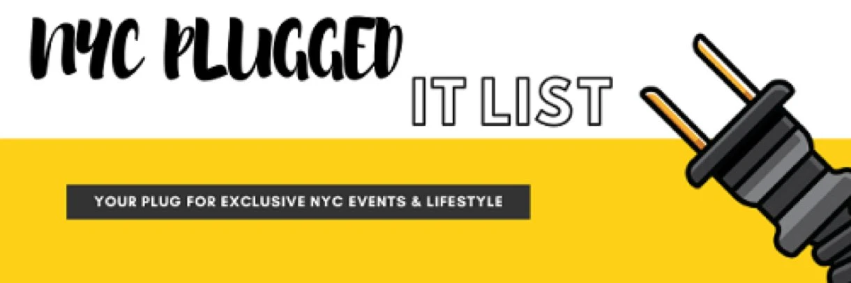
Pros
The way they designed the email newsletter header element is unique and unconventional
Cons
The Instagram handle at the bottom right is a little confusing, as you can’t really tell whether it belongs to the brand or refers to the picture or text used
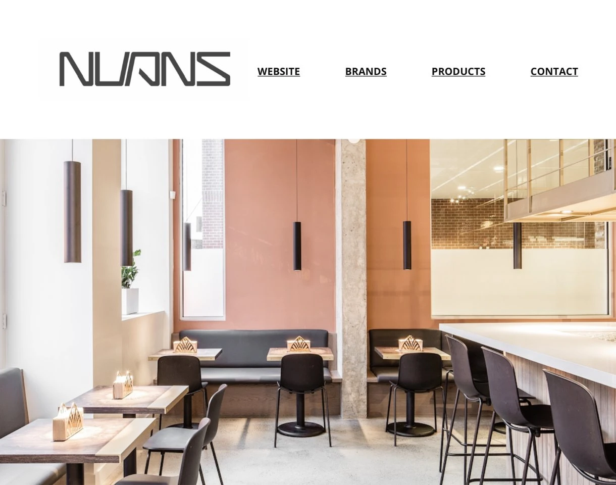
Pros
Below this email header, the chairs pictured are promoted. The image thus helps the reader to visualize what the product will look like in a room
Cons
The navigation items are quite small. By enlarging them and making the logo a little smaller, they become more easily clickable (especially on mobile devices with smaller screens)
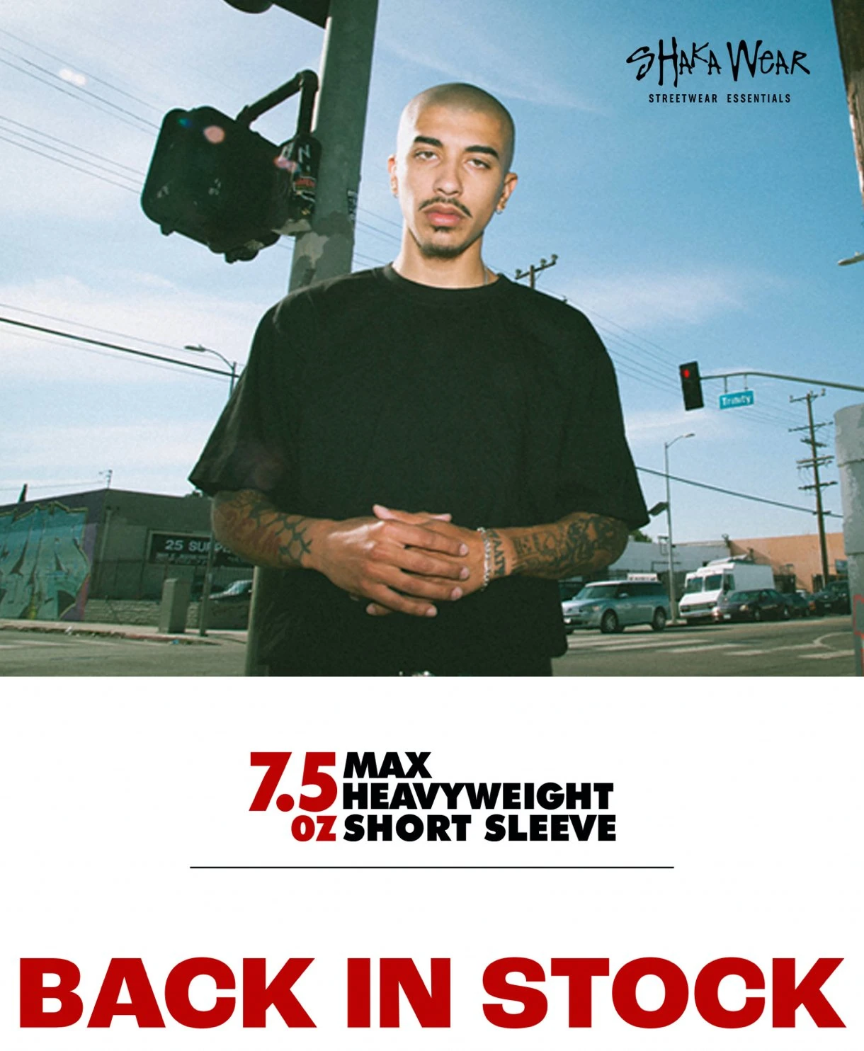
Pros
The email header image is showing the shirt and conveying the brand’s overall image (Cali vibes)
Cons
To save space and convey the message upon first glance, the “Back in stock” text could have been placed as an overlay on the email header image
More newsletter header examples can be found in our email templates design gallery.
Do you have any email header design questions? Leave your message in the comments section and I’ll personally reply to your question!
And if you want to continue reading about design in email marketing, we’ve got just the right guide for you:

Editor's note: This article was originally published in July 2018, but has been updated with new insights and examples.