13 newsletter signup form best practices to skyrocket conversions
 Marta, Legal Team Lead (left) and Ernesta Senior Legal Counsel (right)
Email signup form rule #1: Get right to the point! So let’s skip a fancy intro and start optimizing your signup forms today.
This article will introduce 13 newsletter signup form best practices you can use to turn your website into a lead capture machine.
First: The two types of email signup forms
Let’s start with the two main types of email signup forms: embedded forms and pop-ups.
Embedded forms are those you place in a static position on your site. People see them when they scroll to this point on your page. You can use multiple embedded forms on a single page to increase your chances of converting visitors into subscribers.
Pop-ups are forms that appear in the visitor’s browser window while they are reading your content. These forms are more intrusive as they stop the reader from interacting with your page. The benefit is that they are also more visible, which can lead to more signups.
You can create high-converting forms
MailerLite’s drag-and-drop form builder makes it easy to create beautiful forms and add them to your website. You’ll boost conversions and grow your list.
Signup form best practices: 13 tips to become a lead capture machine
The best email newsletter signup forms have 3 elements.
Persuasive content: They convince people to sign up for your newsletter.
Prominent location: People can only sign up if they see the form.
Compliant: The form needs to be compliant with regulations like GDPR.
Our 13 newsletter best practices cover these 3 three points. Once you’ve finished you’ll know all you need to create newsletter signup forms that convert website visitors into subscribers.
1. Make your value proposition clear
The best newsletters have a clear value proposition. Make this promise as straightforward as possible in your signup form.
Your value proposition needs to appeal to potential subscribers.
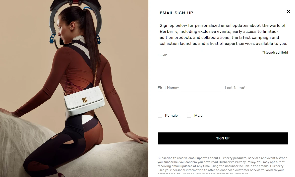
Burberry says newsletter signups get access to exclusive events, limited edition products, new collaborations, and expert services. This works because their audience is interested in being in the know.
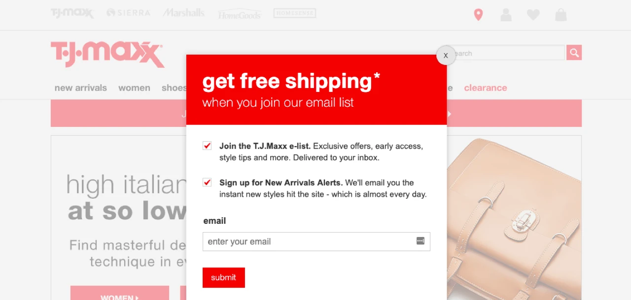
However, T.J. Maxx advertises free shipping as its unique selling point (USP). Their customers are more focused on saving money and snatching a good deal.
When creating your signup form, think about what your audience wants and how your newsletter provides this value. Once you know the USP you want to use, make it clear and focus on how it benefits the reader.
Writing copy that converts isn’t easy if it’s your first time. But this article on landing page copy has plenty of tips that are also relevant to creating forms.
2. Minimize the number of fields you use
Using fewer form fields simplifies the signup process. It makes signing up fast and means visitors don’t need to hand over non-essential data. Reducing these barriers may result in more signups.
The highest-converting signup forms usually only request the user’s email address as this is all you need to contact your list. You can add other fields if they are essential to your business, but consider using as few as possible or making additional fields optional.
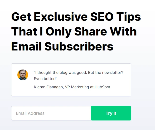
This example from Backlinko is a great example of a simple signup form with a single field.
Remember that your signup form isn’t the only place you can learn about newsletter subscribers. Use email surveys and your preference center to find out more as you build your relationship.
3. Optimize your call-to-action
Your CTA button is where you ask customers to sign up for your list. It’s a small part of your form, but it has a big influence on your conversion rate.
Here are three strategies you can use to improve the impact of your CTA.
Make it pop. Choose a color that stands out from the rest of your page, so the button is clear.
Start with an imperative. Words like sign up, get, or start encourage conversions by literally telling the reader to act.
Be clear. Let the reader know exactly what to expect. “Sign up for daily styling advice” is better than “Sign up for our newsletter.”
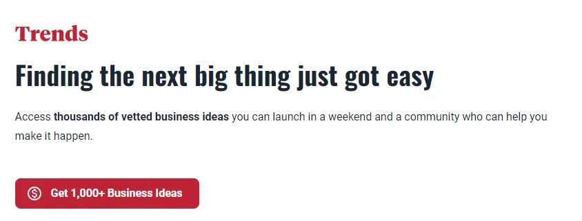
The Trends newsletter signup form contains a CTA with all the above points. The red button stands out from the white background, the text begins with the word “Get,” and it explains exactly what the user is signing up for.
4. Make your form visible
Where you place your signup form is one of the most influential factors when it comes to your signup success.
People won’t convert if they don’t see your form, so make sure it is in a prominent position on your page. You can increase your chances of conversion further by embedding your signup form in multiple locations.
Some common places to integrate a signup form on your website are:
Header
About page
Sidebar
Underneath or weaved into a blog post
Footer
On a signup page
As a floating bar
Pop-ups help to increase the visibility of your signup forms. They make your forms impossible to miss by showing them in front of the content the reader is viewing. The reader has to either sign up or click off the form to continue viewing the content.
You can use automated triggers to define when the pop-up shows on the user’s screen. The options available in MailerLite are:
Time: Show the pop-up after the visitor spends a predefined amount of time on your page.
Scroll depth: Show the pop-up when the visitor reaches a certain point in your page.
Exit intent: Show the pop-up when the visitor goes to leave your page.
Pop-ups can be quite intrusive as they interrupt the visitor’s viewing. Configure yours to show at a point when the visitor has already gained value from your page and is, therefore, more likely to sign up.
5. Show social proof
Humans are pack animals. Just as we’re more likely to sit down at a restaurant with a courtyard packed full of other customers, we’re more likely to sign up for newsletters that other people already subscribe to.
Take advantage of this instinct by adding social proof to your signup form.
One way of doing this is to include reviews or testimonials to show how subscribers have benefited from the newsletter.

The downside of the above method is that testimonials take up a lot of space, which is problematic if your form is small. A more subtle way to add social proof is to highlight how many people have already signed up for your newsletter, just like The Hustle does in the image below.

6. Let people choose their interests
If you run multiple newsletters, add an option to your signup form that lets people choose which ones to subscribe to. People will be able to sign up for more than one newsletter at the same time, maximizing the subscriber count for each one.
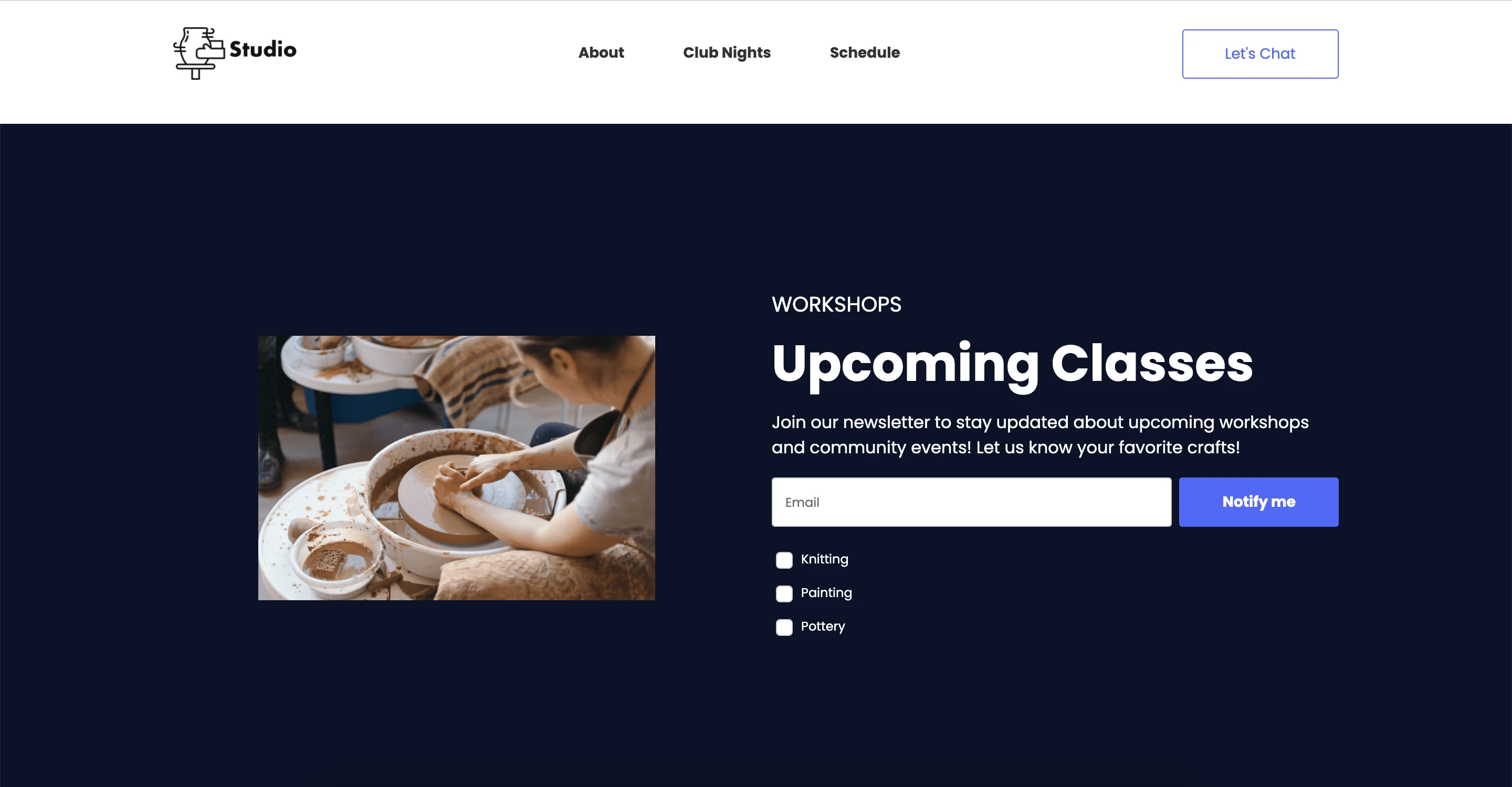
You can easily add this component to your form in MailerLite. In your settings, choose “Add interest groups” and the options will appear on your form.
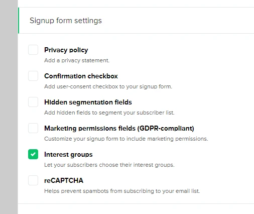
Once your form is live, new subscribers will automatically be tagged and placed into the right interest group after they’ve self-selected their topics. Learn how to set up and use interest groups in your signup forms for audience segmentation here.
7. Incentives sweeten the deal
Incentives are an easy way to offer extra value that can convince people to sign up for your email list.
An incentive is a virtual gift you offer in exchange for people giving you their email addresses. This can be a discount, downloadable content or anything your audience might enjoy. Discount popups are a simple way to present that offer at the right moment and capture signup.
At MailerLite, we offer downloadable resources to encourage people to sign up for our list. For example, this email marketing content calendar helps people plan their email content for the entire year.
8. Use responsive forms
Make sure your signup form looks good on all display types.
A common problem is pop-ups that are too big for mobile screens. These are more likely to annoy users than convince people to subscribe to your list.
Before publishing your form, check how it looks on mobile and desktop devices. MailerLite automatically resizes your forms, so they look good on both device types. And you can easily switch between mobile and desktop views in the preview mode.
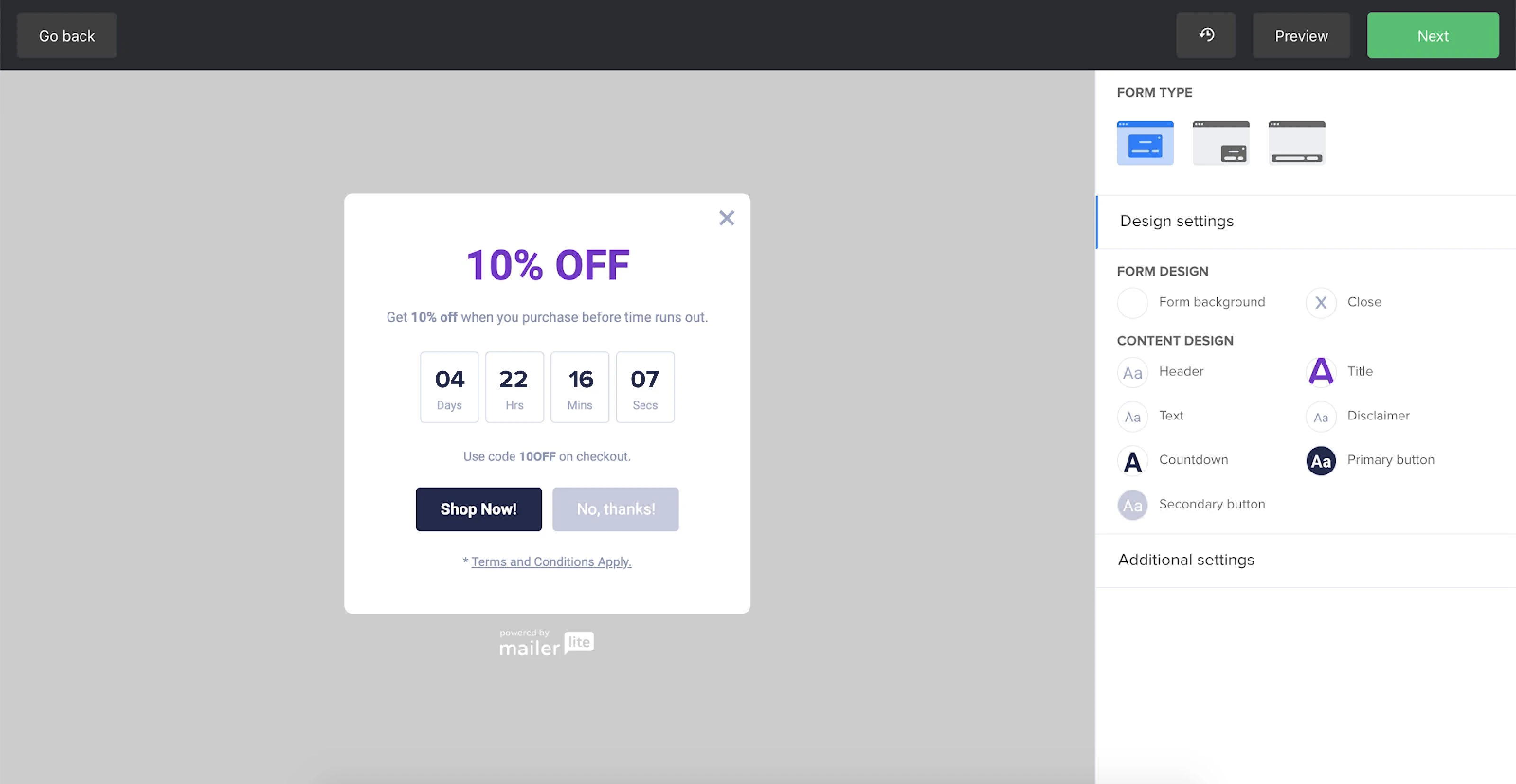
9. Use a countdown timer
If your signup offer is time sensitive, use a countdown timer to encourage action by highlighting that visitors have a limited time to signup. Use your headline, description, and call-to-action to make your offer clear, and then add a timer to show how long the viewer has left.
You can easily add a timer to your pop-ups in the MailerLite form builder. Just choose the countdown block from the menu and select when your offer will end.
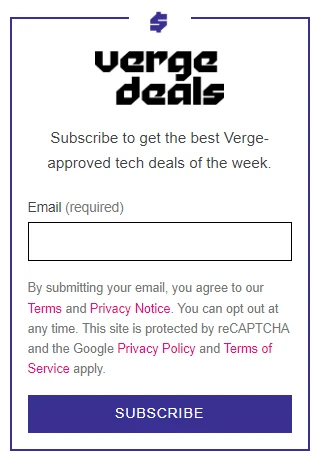
10. Reassure subscribers
Use your form text to address any concerns visitors may have about subscribing to your list. Highlighting that people can quickly opt-out of your email campaigns minimizes the commitment they make when they hand over their email address.
The Verge does this by letting website visitors know they can unsubscribe at any time. They also link to the terms and privacy policy so interested subscribers can find out how the company will use their details.
11. Use double opt-in
Double opt-in adds an extra step to the signup process. It requires any user that subscribes to your newsletter to click on a link that you automatically send to their email address before they are added to your list.
The downside of double opt-in is that you’ll end up with fewer emails on your list. But that’s only because you’ll weed out spam email addresses, addresses with typos, or people with low engagement.
This has three main benefits:
You’ll improve your sender reputation by not sending emails to known spam accounts. This increases the likelihood of your newsletter reaching the inboxes of real email subscribers.
You’ll increase email metrics like open rate and click-through rate by not sending messages to people who aren’t engaged.
You’ll save on your email marketing software costs as poor-quality email addresses won’t inflate your list size.
If your open rate is already low, it may be because you have a high percentage of low-quality email addresses. You can easily find out if this is the case by using MailerCheck to analyze your email list and identify problems.
All you have to do is upload your email list and the software will scan the addresses and give each one a rating of “send to,” “risky,” or “do not send to.” You can then take action such as removing the bad emails from your list.
Find out more about how MailerCheck keeps your email list clean. Or sign up to use the tool and check up to 10 email addresses for free.
Clean your email list today
Sign up for MailerCheck today to remove low-quality email addresses and boost your sender reputation.
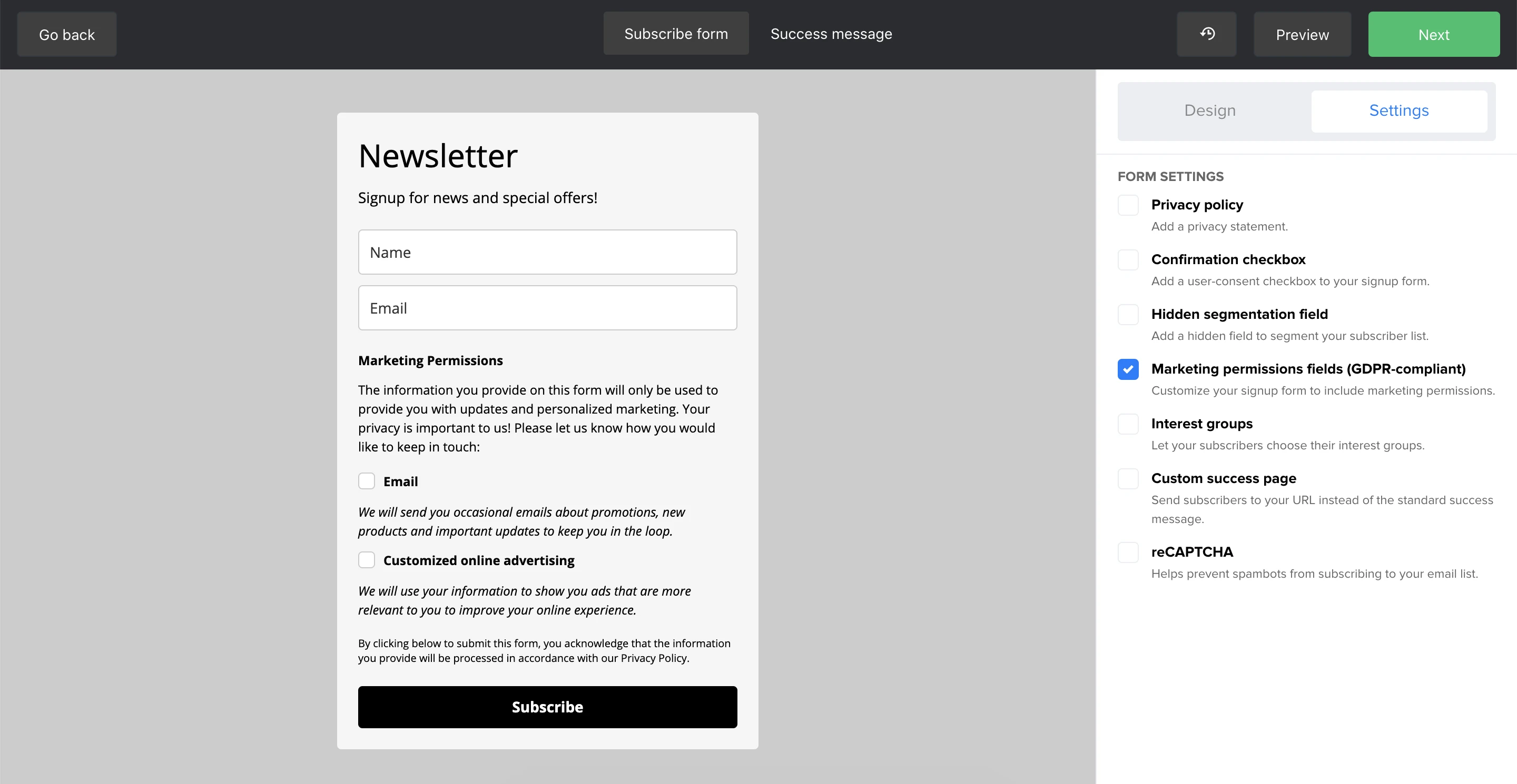
12. Make your form GDPR compliant
If you have subscribers in the European Union, your subscription form must be GDPR compliant.
A form for one type of email—e.g. your newsletter—is GDPR compliant as long as it is clear that the user is signing up for a newsletter.
If your form is for two types of email—e.g. your newsletter and advertising emails—you can use a checkbox to collect consent for each type of contact. You can easily add these checkboxes to your form by heading to the settings within the MailerLite form builder and then selecting Marketing permissions fields.
Read this article to find out more about creating GDPR-compliant forms and see plenty of great examples.
13. Create a welcome series
A welcome series is an automation sequence you send to new subscribers. While a welcome email won’t impact form conversions, it can make a big difference to how people engage with your emails post signup.
Send an automated welcome email as soon as someone subscribes. Use this message to explain the most important things people need to know. The exact information you include will depend on the goal of your newsletter, but useful content to send at this point includes:
An introduction to your newsletter including the type of content you send and when you send it
A link to the lead magnet you used to encourage signups
Instructions the recipient can use to add your address to their priority inbox
Links to your social media or other communication channels
Questions or surveys to discover more about your subscribers
A link to your preference center so users can choose which type of content to receive
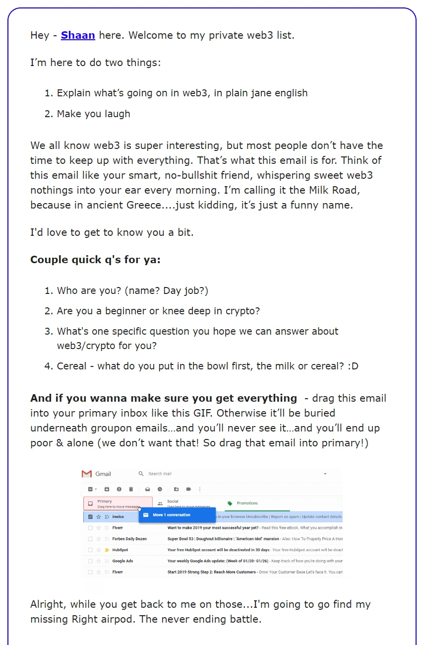
This welcome email from The Milk Road works because it lets subscribers know exactly what to expect, asks them to provide more information, and has a GIF that clearly shows how to prioritize the newsletter.
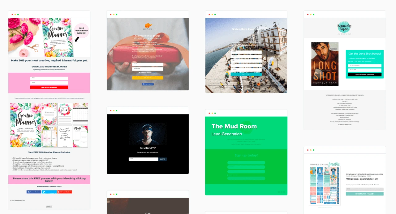
Creative newsletter signup examples
Still feeling uninspired when it comes to your own signup form? These examples will show you how other brands promote their newsletter subscription. Get inspired by some of the best signup forms!
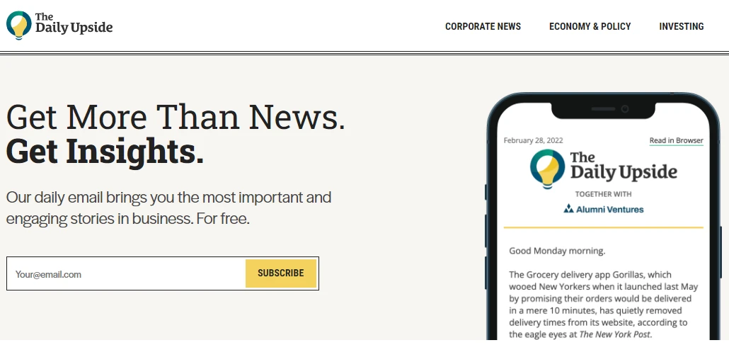
The Daily Upside
The Daily Upside’s main product is its newsletter, and the signup form is prominent on the website.
We like this newsletter signup form because the headline clearly displays the benefits, the description explains exactly what subscribers get, and you only need to provide your email address to sign up.
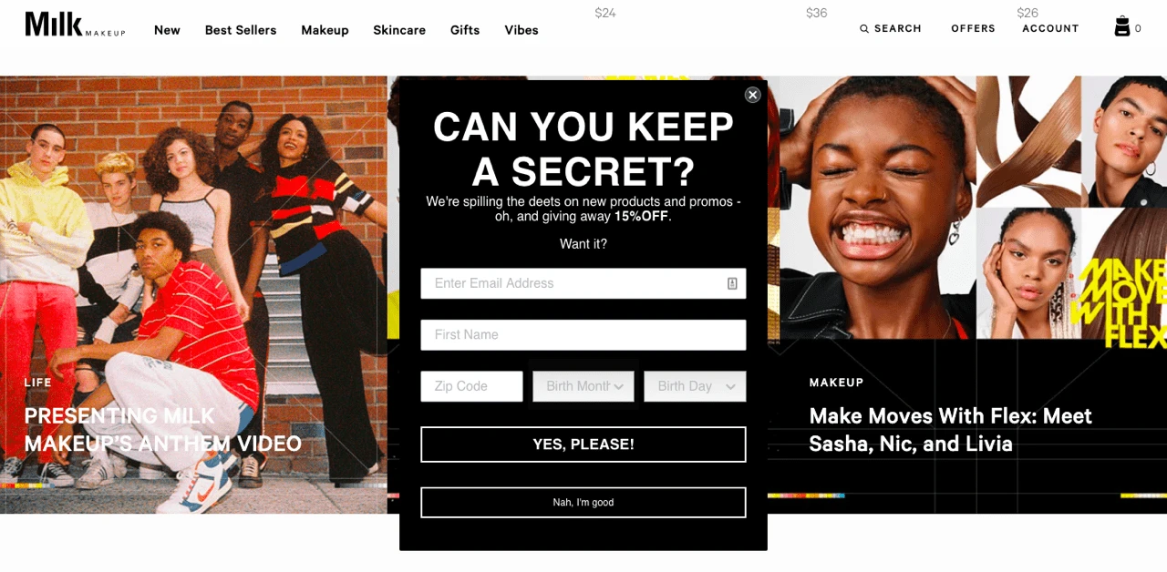
Milk Makeup
Cosmetics brand Milk’s pop-up form appears a few seconds after you land on their homepage. The all-black form stands apart from the colorful homepage. The copy promises beauty lovers that they’ll be the first to know about new promos and products if they sign up. It also offers a 15% discount to sweeten the deal.
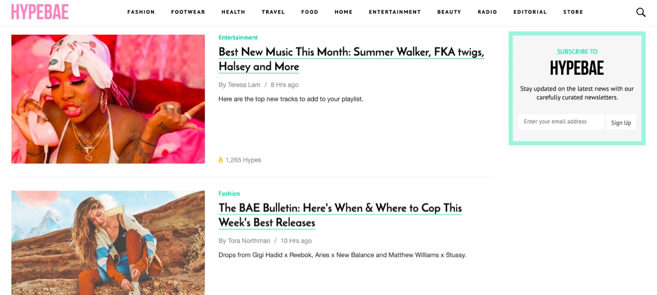
HYPEBAE
HYPEBAE promotes its newsletter with a pop-up and a signup form that moves along while you scroll down. The brand styled the form in the same colors as the website, making it visible enough to catch your attention but blended in enough to not bother you while scanning the article headlines.

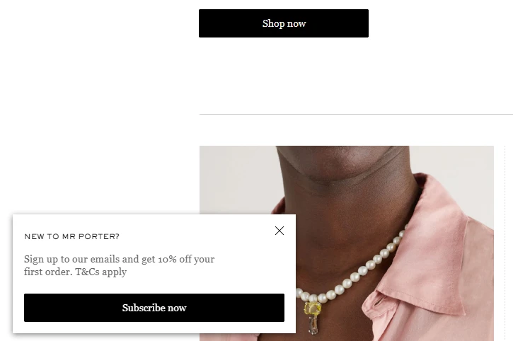
Mr Porter
E-commerce site Mr Porter uses a floating pop-up to promote its email. It’s situated in the bottom right of the browser window so it isn’t as distracting as a fullscreen pop-up would be. But it is still prominent as it stays on the user’s screen until they either subscribe or close the box. Signups also get a tempting 10% discount coupon.
Want to see more customer form examples? Visit our lead generation landing page gallery to view many more beautifully designed form templates.
How to embed a signup form using MailerLite
Use our embedded form builder to design your signup form to suit your brand and webpage. It’s easy to use, especially if you are already familiar with the MailerLite email or website designer. If you need more help, this article explains the process of creating embedded forms in detail.
Once you have designed your mailing list signup form, you can embed it onto your chosen webpage by following these simple steps:
1. Navigate to the Forms page.
2. Click the title of your form.
3. Scroll down to where it says Embed form into your website. Here you will see two snippets of javascript.
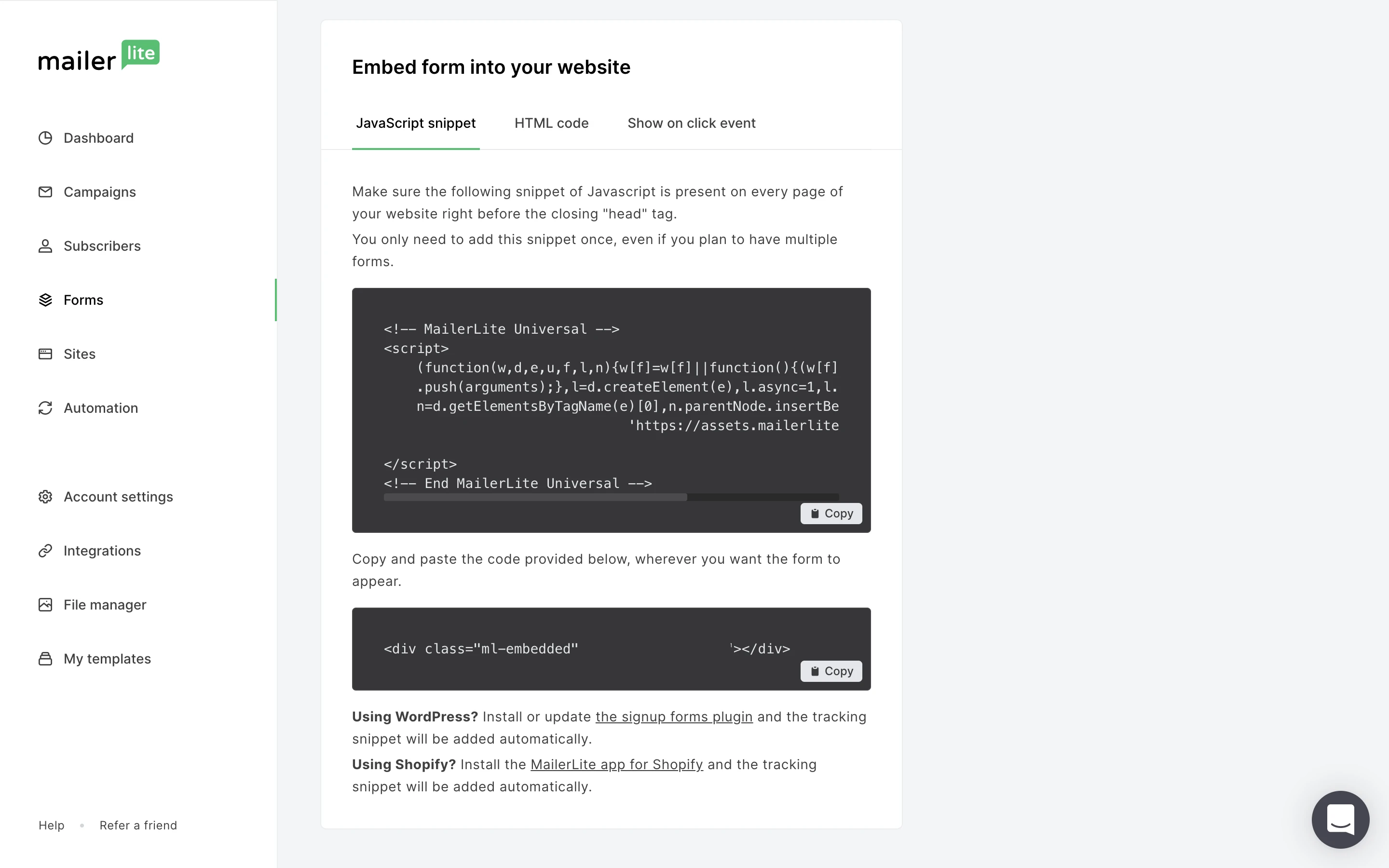
The first snippet (the larger piece of code) is the MailerLite universal tracking snippet; the second snippet (the small piece of code) is your individual form’s code.
4. Copy and paste the universal tracking snippet into your website’s HTML just before the closing </head> tag.
5. Paste the second snippet into the location on your page where you want the form to appear.
Using WordPress? Install MailerLite’s WordPress widget to embed email opt-in forms on your WordPress site or sidebar.
Signing off
Take the time to test different form elements. Small details can make all the difference and A/B testing will show you which changes work and which don’t.
Every form you publish will teach you something new about what works best for you and your brand. This means with every update you’re getting one step closer to creating the ultimate signup form that’s a super-magnet for new subscribers.
Editor's note: This article was originally published in October 2019. It has now been updated with new examples and optimization tips.
Start today by optimizing one of the elements above and report back about your results in the comments. We’re excited to hear about your findings!