We’re explaining every web page your website should contain
 Nenad, Marta, and Maksim, development team.
You know your website is a great way to showcase your brand, make sales, generate leads, and grow your email list. You also know the information on your site impacts whether you achieve these goals.
The big question then is, what pages does your website actually need to be successful? And what content should you include on each one?
In this guide, we’ll break down exactly which website pages to add to your site—covering everything from essential brand-building content like your about page, to pages that are required, like your privacy policy.
Plus, you’ll find plenty of tips on how you can create these pages quickly using MailerLite’s website builder.
How many pages should my website have?
We hate to do this to you, but... there's no single answer. The number of pages your website has depends on your industry, goals, and the information you want to share with website visitors.
For example, an e-commerce website or online store will need pages for each of its products. This could mean hundreds or thousands of pages!
Meanwhile, a small local business with just 1 or 2 services will often be fine with fewer than 10 pages.
Start out with some of the essential website pages that you must have, and then build out depending on what makes sense for your brand.
OK, so what pages should my website have?
Your website should be shaped by your target audience. Consider what you want them to learn, and the action you want them to take.
Do you want them to read an article?
Learn about a new feature?
Sign up for a newsletter?
Buy a product?
If you’re unsure how to answer these questions, look at competitor websites to get an idea of what site visitors are hoping to find.
You can see all the pages on a website that Google has listed by searching on Google for “site:https://:examplesite.com,” changing “examplesite.com” to the URL of the website you want to research. The results will show all the pages listed on Google.
You can also see all the pages on a domain and how they are organized by looking at a website’s sitemap (discover how here).
Once you’re clear on what relevant website content to add, you can jot down the web pages and landing pages your website needs.
How to build a website with MailerLite
Did you know that MailerLite has an awesome drag & drop website builder?
The website builder is perfect for small businesses and creators. It has all the features you need to collect email addresses, generate leads, sell products and services, and manage your presence on search engines.
It’s super easy to use, and you can start with a template to get up and running in no time. Sign up for a trial today to build and publish your site!
Check out the carousel below to see examples of professionally-designed website templates and the pages they include. With MailerLite, you can customize any of these designs to quickly create a website for your business.
18 website pages every business should consider
Here is a list of pages your website can benefit from. We’ve started with pages that every business needs, such as a homepage and an about us page, and then moved on to some nice-to-haves that you may want to include depending on your business type.
Homepage
Your homepage is the grand entree. Though not every visitor will enter via the main entrance, people who want to learn more about your brand will often head to the homepage.
Here’s what to put on your website homepage:
A headline and subheading
Explanation of the product or service
Links to important pages like product categories
CTA
Social proof, such as reviews and testimonials
Any other content that sparks curiosity and strengthens your message
Visitors decide in seconds whether a webpage is relevant or not. Make sure to catch the visitor’s attention immediately by telling a compelling story and focusing on their needs. A clear call to action lets the reader know what action to take.
The MailerLite website builder has a selection of website blocks you can use to create powerful first impressions that drive action.
The Signup form block lets you display your offer with a prominent headline and description and then collect email addresses.
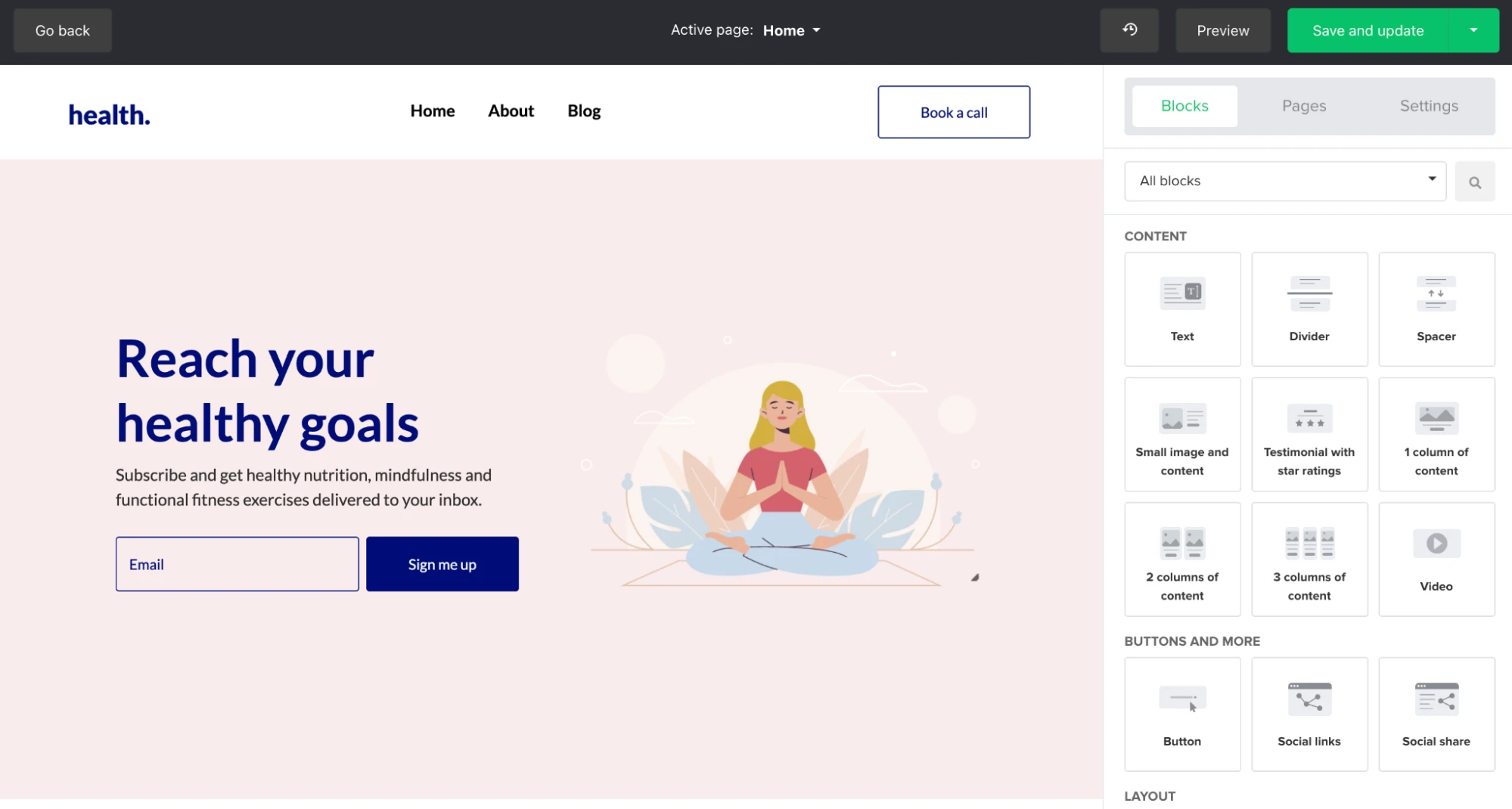
The Small image and content block lets you add your offer and includes a button you can use to either direct people to another website page or, using an anchor link, another section of your home page.
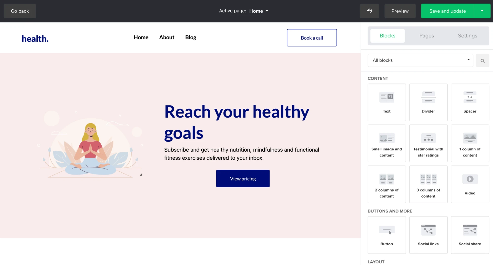
You can also use our custom content and column blocks to create a bespoke header that suits your needs.
A great way to measure page relevance is with a Five Second Test. Five Second Tests are a form of user research used to evaluate the effectiveness of your webpage. Participants are asked to view a design for 5 seconds and then answer some questions to gauge how well the page’s messaging comes through.
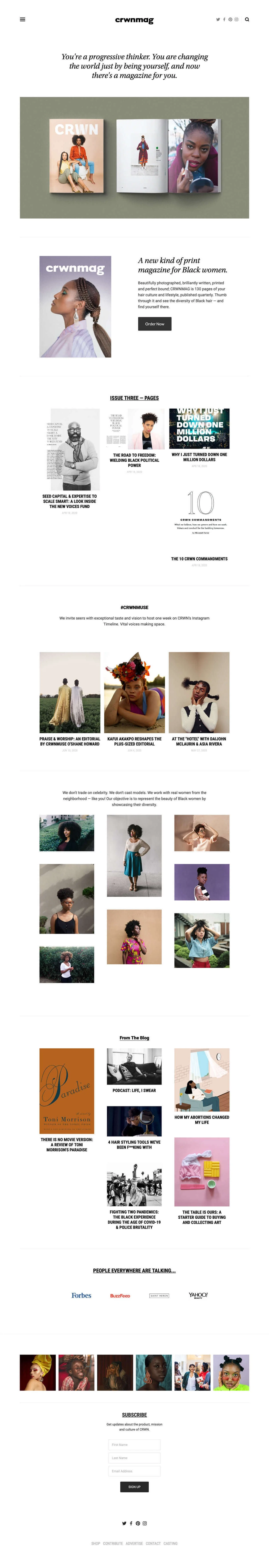
This example from crwnmag talks directly to their target audience, clearly tells what the magazine is about, has a distinctive “Order now” CTA, shows examples, and inspires.
If you want to learn more about the specific elements that enhance your website’s success, read our blog “The key elements of a well-structured website”.
About page
Your website’s about page is key to introducing your company or brand and building trust with your audience and potential customers.
It helps to humanize your brand and connect with readers by presenting the people and story behind the business. Plus, showcasing your experience and expertise on your about page can help your website and blog posts rank on Google.
Showcase your brand’s personal side by adding visual content. With the MailerLite website builder’s image, gallery and video blocks, adding media is as simple as dragging and dropping the relevant content into place.
You can also add in fun facts, milestones, company values or USPs. Whatever makes you stand out from competitors and resonates with readers.
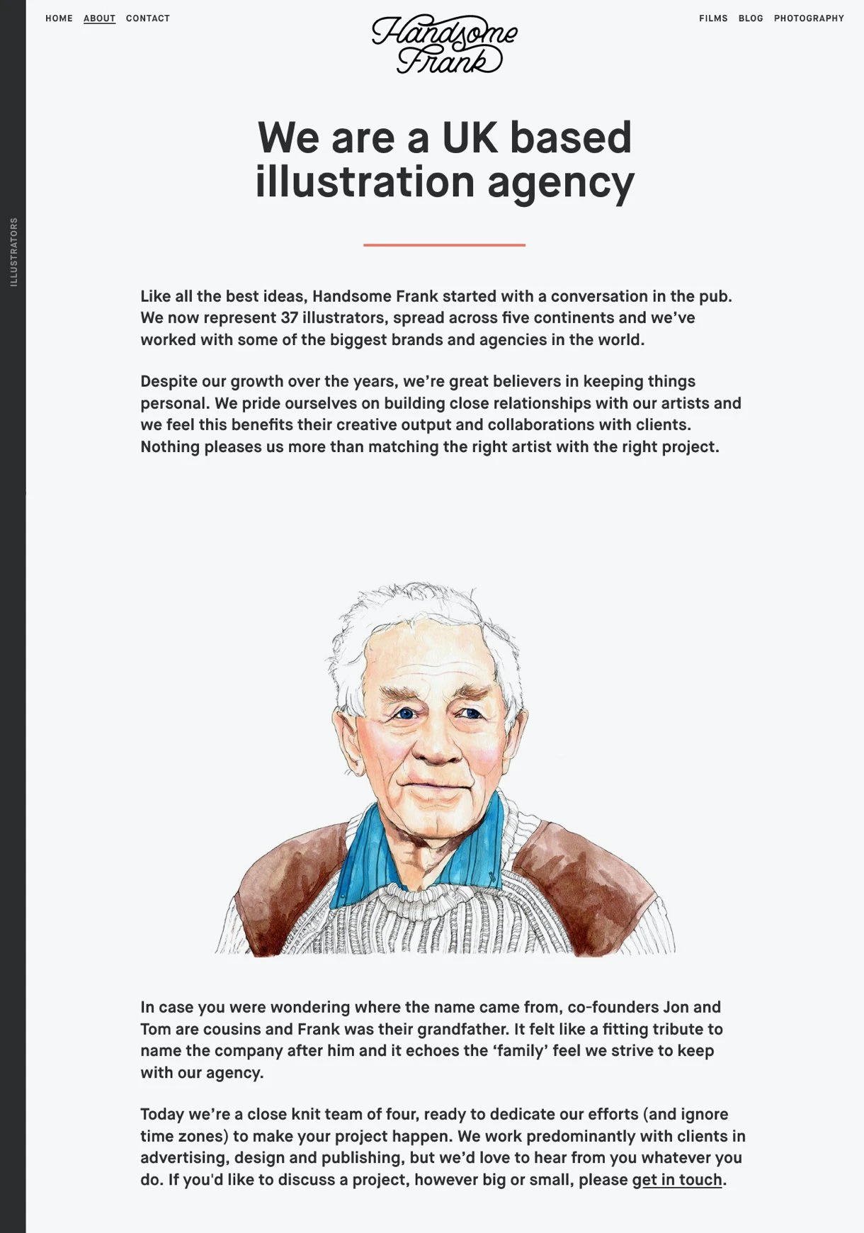
Take an example of illustration agency Handsome Frank—their story is funny, informative and personal.
MailerLite is a people-first company, and to emphasize this, our About page is full of beautiful photos of our lovely staff members. We also include information about our founding story and our remote way of working.
Contact page
Your contact information page is where website visitors can get in touch with you. You could list your email address and phone number on this page. But, if you do, there’s a good chance that your contact information will be scraped and added to spam lists.
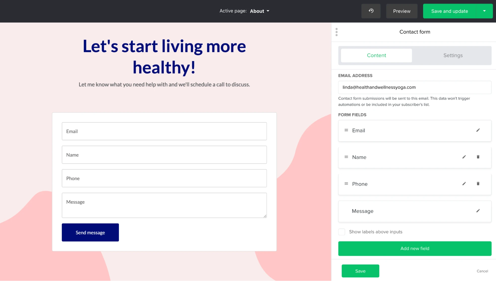
A better option is to add a contact form to the page that automatically sends entries to your email address. The MailerLite website builder’s contact form is an easy and free way to do this.
Just choose the fields you want people to add, such as their name, contact email address and message, and then add the form to your contact page. You can even add a reCAPTCHA to stop bots from using the form to spam your email address.
You can also include links to your knowledge base or FAQ section to help people get answers independently. This will help to keep people on your website, create a better user experience, and lighten the load on your inbox or support team.
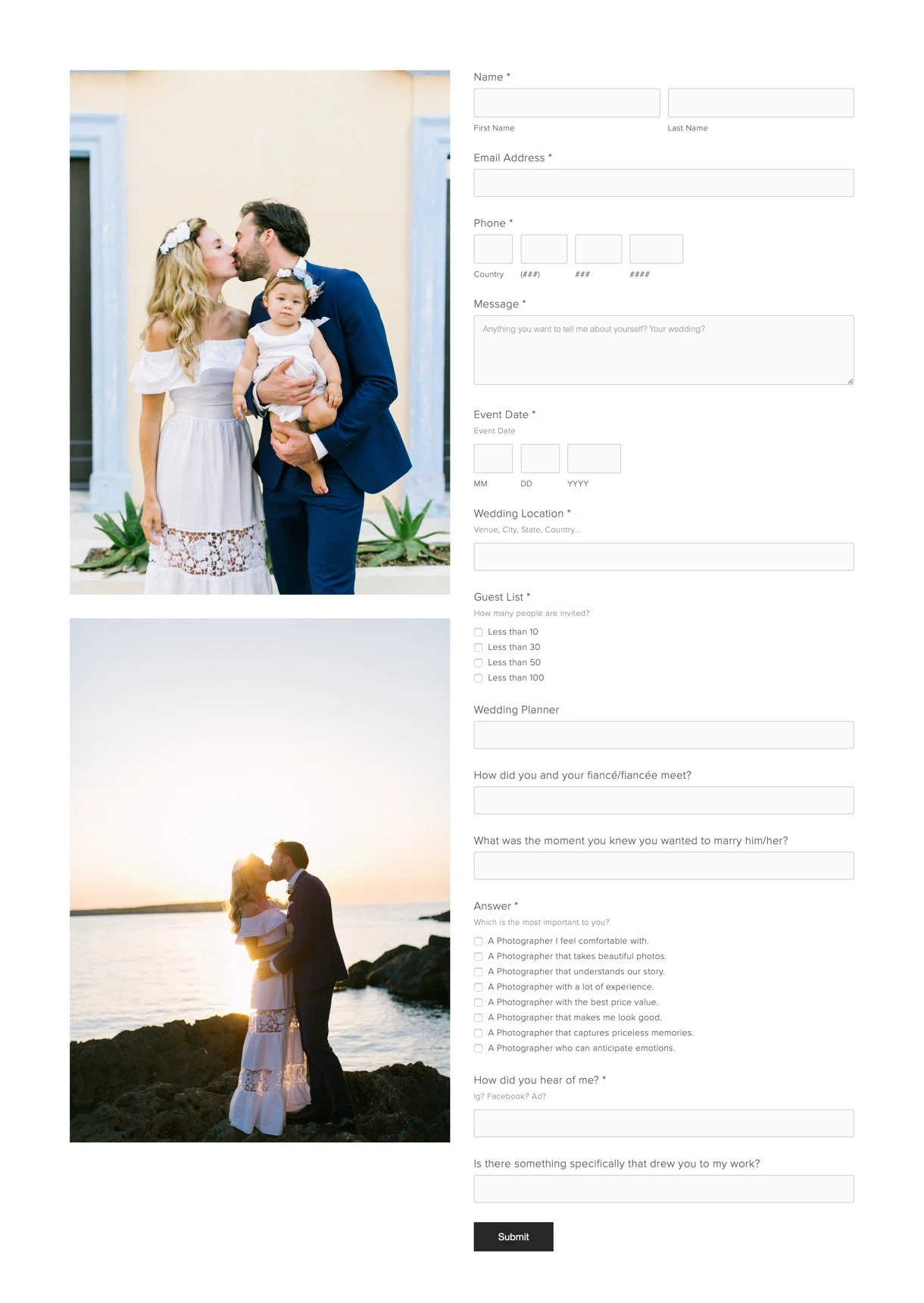
Wedding photographer Alea Lovely shows what options your contact form can have to gather necessary information upfront. By asking for the number of guests, budget and expectations, she can better filter the right clients and decide on the service fee to ask for.
Only ask for necessary information to make it as easy as possible for people to fill in the form. For example, if you don’t need a phone number, don’t ask for it. Keep your contact form as simple as possible.
Product page (if you offer products)
E-commerce stores and digital product sellers should create pages for each of their products. A typical product page includes:
Product images
Product descriptions
Price
Customer reviews or testimonials
Practical details like weight, dimensions or materials
The easiest way to create product pages for digital products is with MailerLite’s new digital products feature. Use it to create digital downloads, one-off services, or coaching calls within MailerLite and then start collecting payments in minutes.
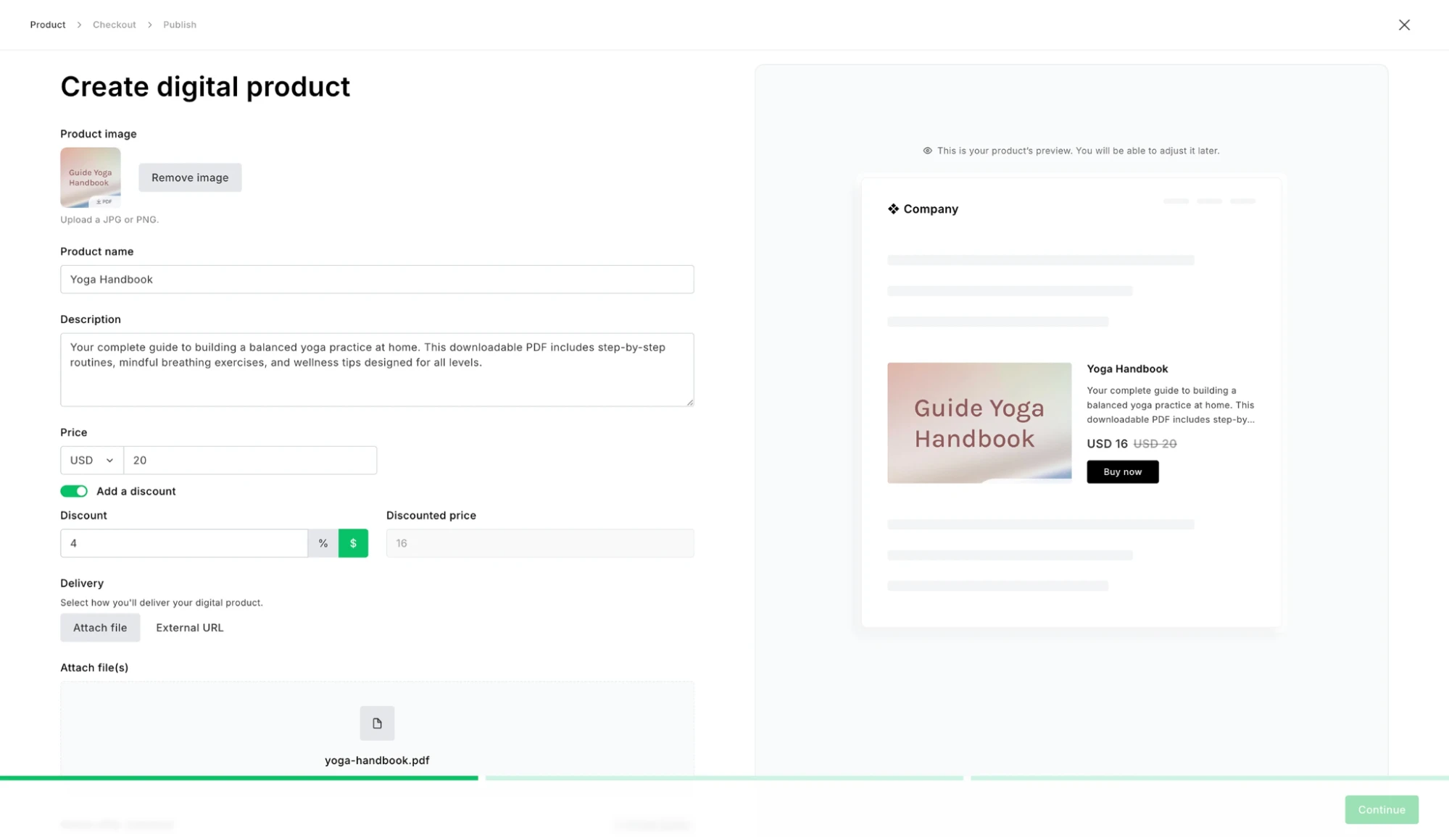
You can easily add the product to your website product page (or email or landing page) using our Products box. This will automatically bring in information such as the product name, image, price and description, so you can create these pages faster.
We’ve also created a complete checkout experience, so people can enter their payment details and make the purchase without ever leaving your website. And since MailerLite doesn’t take any commission on sales, selling with us is one of the most profitable ways to sell your products.
The page below, from illustrator Alja Horvat, shows a print product page with the relevant information.
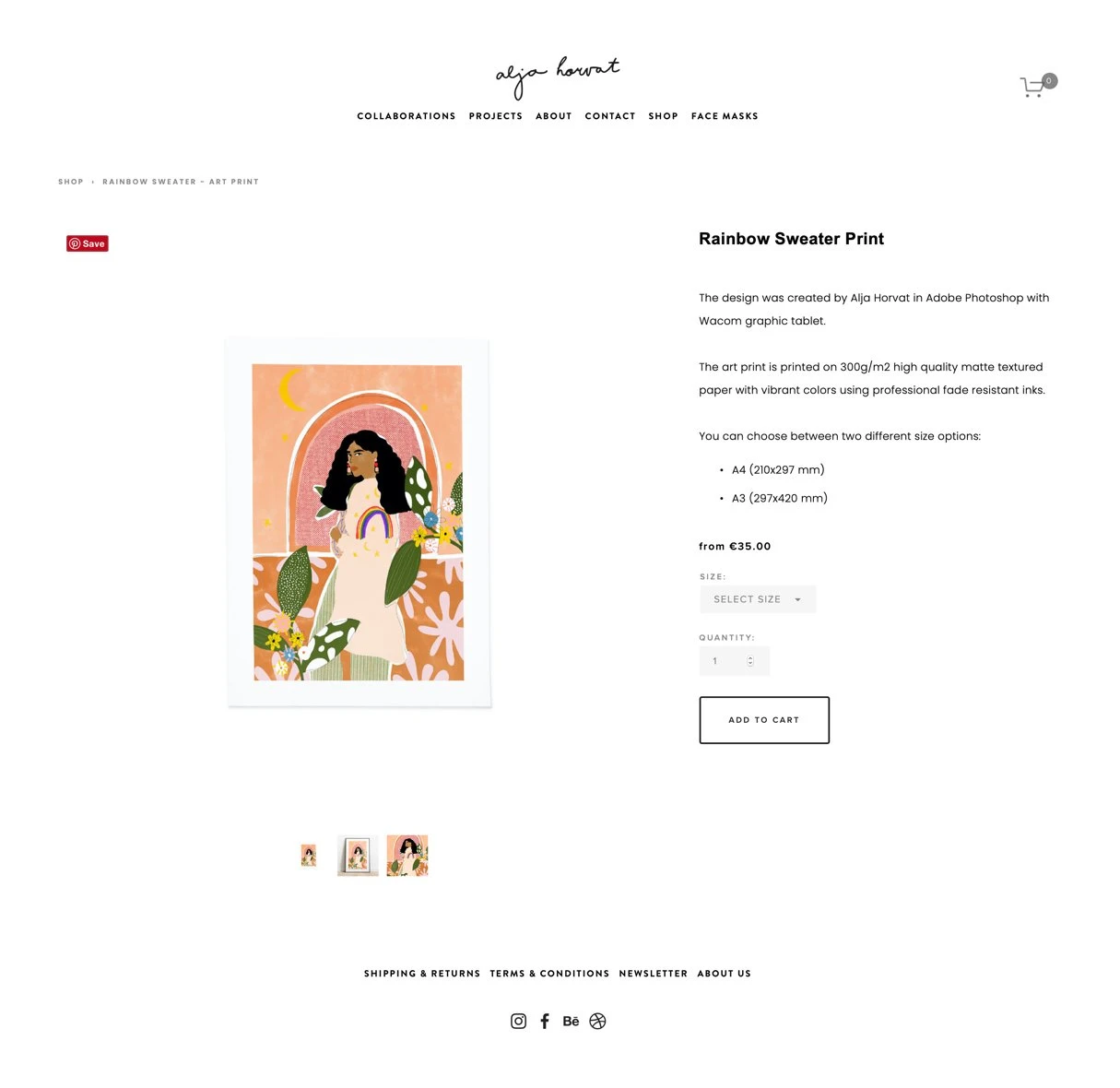
Focus on the benefits, not just the features. If your product is better shown with a video, add it! You can also link to a size guide or recommend similar or “Shop the look” products. Whatever information helps customers make a better decision is worth adding to the product page.
Avoid the temptation of simply copying and pasting cookie-cutter product descriptions. Aim to write unique and informative descriptions with a touch of personality.
Service page (if you offer services)
The service page describes all your services. Though that sounds easy, the trick is to organize it in a way that’s clear, compact and easy to digest for potential clients. If you offer a lot of services, think about how to structure the page. You might need one main page that contains links to specific services.
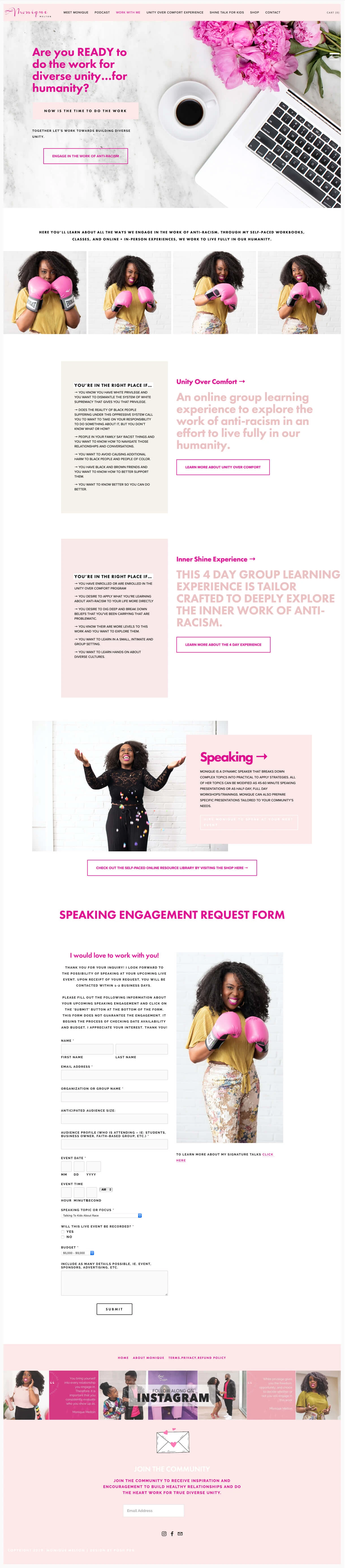
This services page by educator, author and speaker Monique Melton is a great example of how you can structure your page and aesthetically present your services.
It helps to know a thing or two about web design when deciding how to present all your content. Read our 9 website design best practices article to learn more.
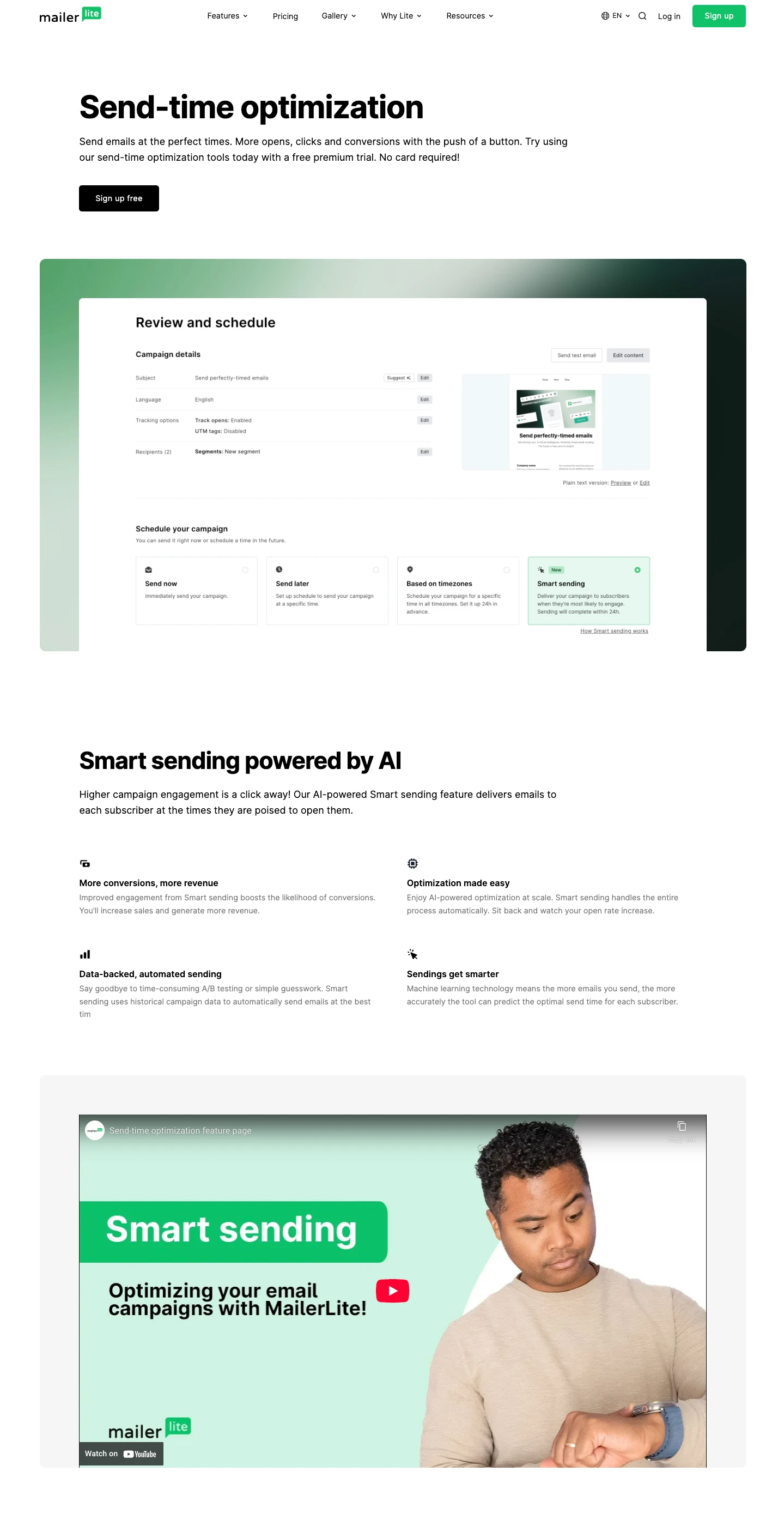
Feature page (for software tools)
Create a feature page for all the main tools your software platform offers. Go into detail about what each feature is and how it can benefit the user. The aim is to provide the essential information buyers need when deciding whether to use your tool.
As well as helping with sales, having dedicated pages for each feature means you’re more likely to show up in search engines or AI tools when people search for specific tools.
At MailerLite, we have over 50 pages to showcase all our features. If you have a similarly large number of tools, consider creating pages for only the most important ones, and then building the rest later.
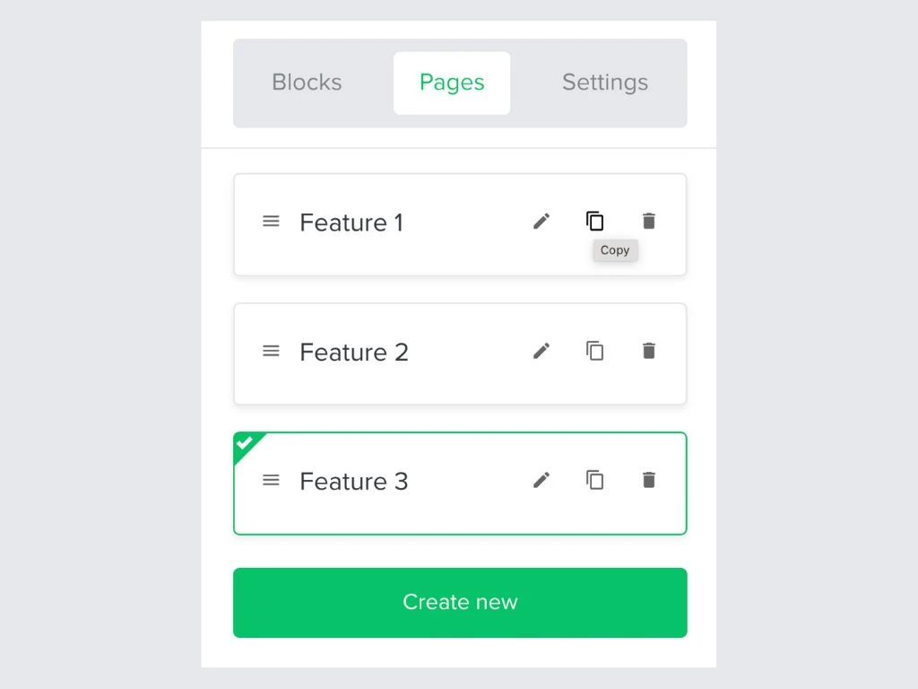
Speed up the page creation process by creating a template page and reusing it for every feature. You can easily do this in the MailerLite website builder by hitting the Copy button in your page.
Blog page
A blog page is an overview where all your blog articles are collected. Though this section isn’t mandatory, we do highly recommend having a blog page—both for creative and marketing purposes.
MailerLite users can easily add a blog to their website by clicking the Create new button in the pages tab and then choosing the option to add a blog.
You can then use our visual builder to design the page as you would with any other page. Finally, add blog posts via the Blog section in your website’s dashboard.
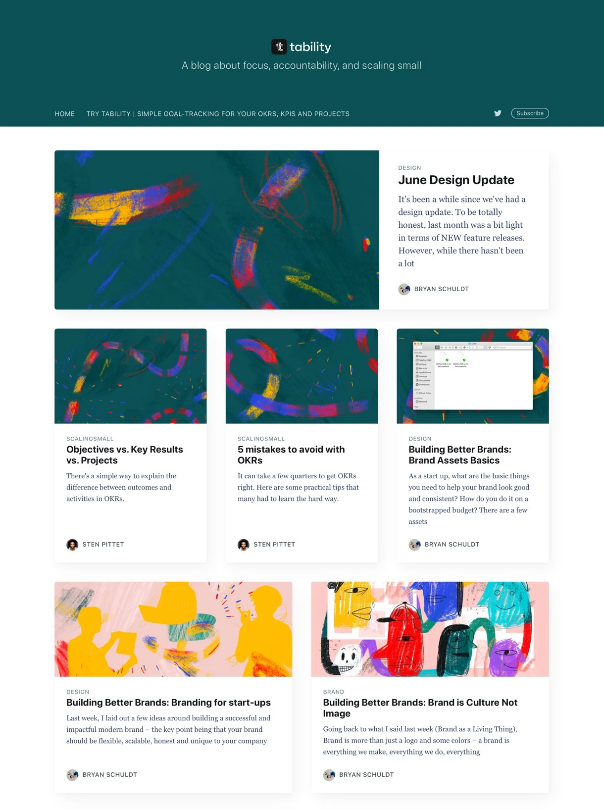
We love this blog overview from plan-tracking tool Tability. Apart from the interesting blogs, the artsy headers are unique and differentiate them from their competitors.
Watch our video tutorial to learn how to set up your blog in MailerLite.
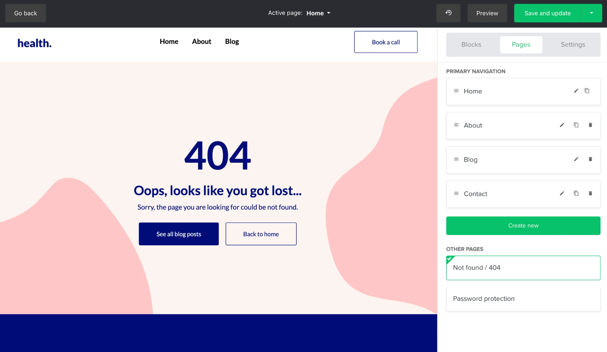
Page not found page
Your 404 page tells readers that the URL they inserted doesn’t exist. It means visitors aren’t left with a blank screen and lets you direct them to another part of your website.
MailerLite automatically creates a 404 error page that you can edit within our website builder. You can be witty with your copy or add a GIF to make the 404 page more engaging. Consider linking to your home page or most popular pages to help visitors find the information they were looking for.
Privacy Policy page
With the GDPR in full force, you definitely need a Privacy Policy page (see our Privacy policy and read why you need this page to be GDPR compliant).
This page lets visitors know how you handle their personal information and data. It includes information on cookies, emails, advertising and more.
You can also add an additional Security Statement. See here what that looks like. Finally, with AI being so prominent nowadays, consider adding an AI policy that outlines all the ways you use AI in your business. However, using AI to generate legal documents is not advised.
"When it comes to creating legal documents, we urge businesses to avoid using AI tools like ChatGPT, unless they have legal expertise. Privacy policy generators use carefully worded templates that have been carefully reviewed by lawyers to ensure a consistent and compliant output - something AI simply cannot achieve."
If you're not sure what to include in your privacy policy, use a tool like GetTerms to automatically generate a customized page that you can add to your website.
Accessibility statement
An accessibility statement is a page on your website that outlines the steps you’ve taken to make your page more accessible for everyone. It also mentions areas for improvement, steps you’re taking to fix the issues, and how people can contact you with suggestions.
Writing an accessibility statement shows the effort you're taking to make your website open to everyone, and it can build trust among all audiences.
Plus, some types of organizations, such as public sector organizations in the EU and US, are required to have this statement on their website.
Simple steps you can take to make your website more accessible include:
Using high contrast colors
Letting people navigate with a keyboard
Adding alt text to your images
Choosing fonts that are easy to read
Find out more about how to make your website and marketing more accessible in this article.
Terms of Service page
Your Terms and Conditions page is kind of like the Privacy Policy, except on this page, you tell users what conditions to agree to when using your website. Check out the ToS page from MailerLite and the Terms of Use from our email verification partner, MailerCheck, for inspiration.
Create your Terms and Conditions with Shopify’s generator.
Testimonials or reviews page
Testimonials, reviews and case studies are great for building credibility. You can praise your product all you want, but it’s much more trustworthy when customers give their honest feedback.
Reviews can come in the form of written text, videos, star ratings, links to reviews, magazine articles and interviews.
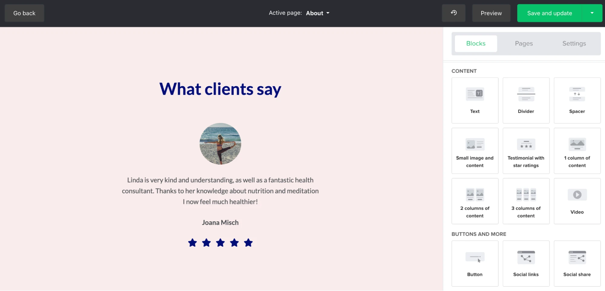
The MailerLite website builder’s Testimonial with a star rating block is an easy way to add customer feedback to your testimonial page.
Just drag the block in and then add an image, name, message and star rating to showcase the love. You could even use the contact form to ask people to share their thoughts.
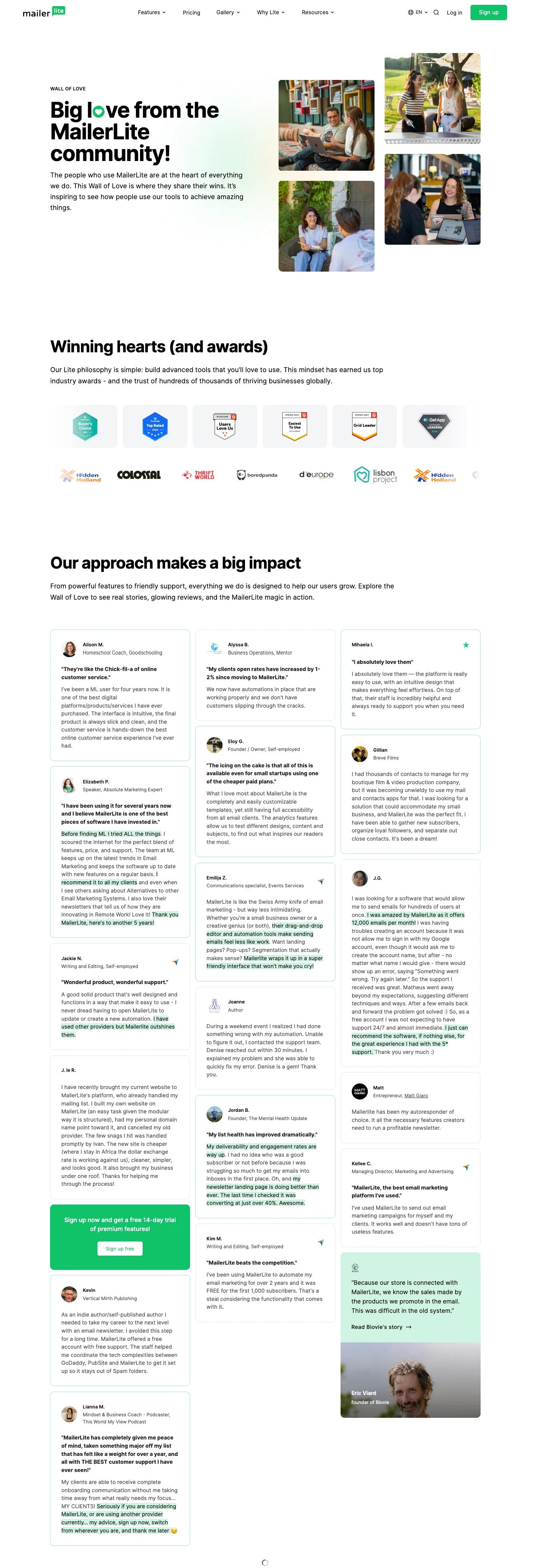
At MailerLite, we showcase our reviews, alongside our rewards and top customers, on our Wall of Love page.
Does collecting customer feedback feel like drawing blood from a stone? Check out how we use NPS surveys to find out what our customers think.
FAQ page
Do you notice that customers keep asking similar questions? A Q&A page with Frequently Asked Questions can provide answers before people contact you, resulting in you receiving fewer support requests.
Here’s an example of an FAQ page from Organic Olivia.
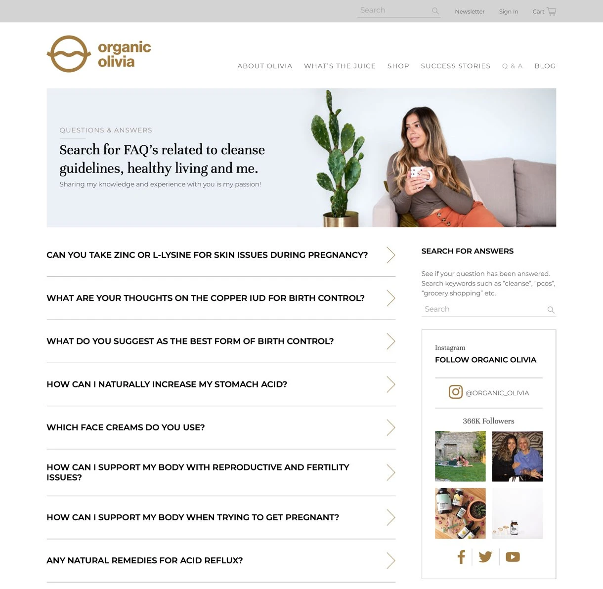
Use an accordion menu like the one above to keep your page neatly structured. This will hide the answers until visitors toggle it to show.
You can easily add an accordion to any MailerLite website page with our FAQ block functionality. Customize the design and add questions via the sidebar options.
Press kit page
A press kit (or brand assets) page includes a package of promotional materials that provides journalists with all the essential information and assets they need to write about your business.
Press kits typically include information about your company, product details, high-resolution images, logos, and press releases.
Gather all these resources, add them to your MailerLite file manager, and then link to them in the website page. Or add them to a public folder in a tool like Google Drive.
At MailerLite, our brand assets page includes links to our logos, screenshot images and intellectual property guidelines.
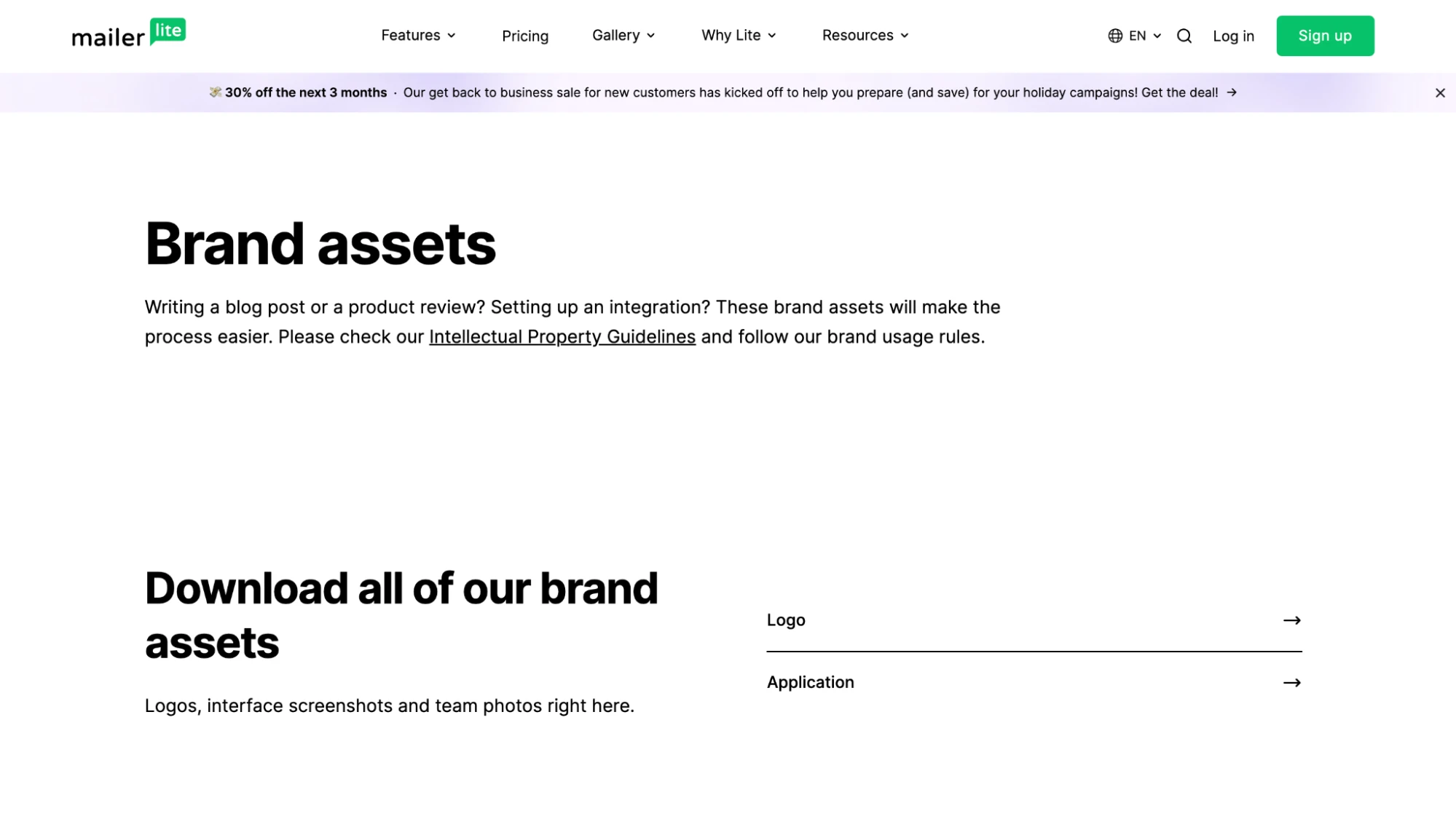
You should also add a way for members of the press to contact you. Adding a contact form to your website is a simple way to enable this.
Sitemap page
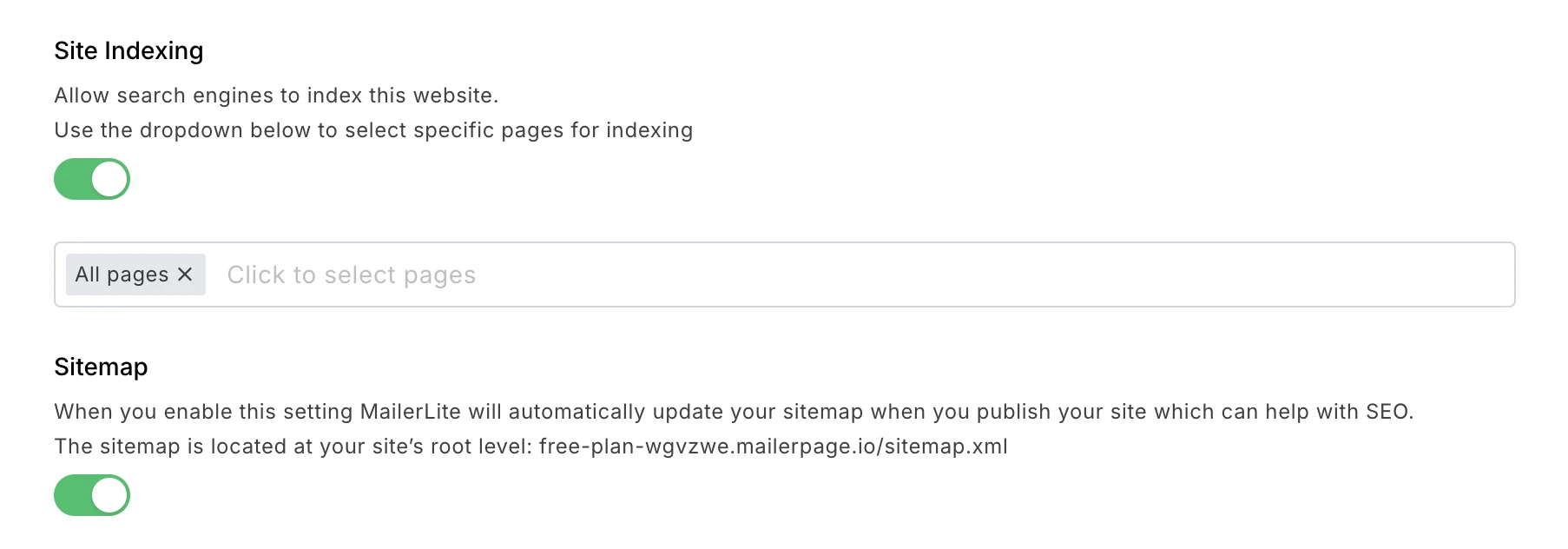
Sitemaps are website pages that list all the URLs published to your website. They are essential for your website's search engine optimization (SEO) as they help search engine bots better discover your content, understand your website structure, and find newly added pages more quickly.
When you create a website with MailerLite, we will automatically generate a sitemap for you and publish it at https://yourwebsite.com/sitemap.xml if you toggle the sitemap setting to on.
If you use another website-building platform, see the official Google documentation to learn how to create a sitemap.
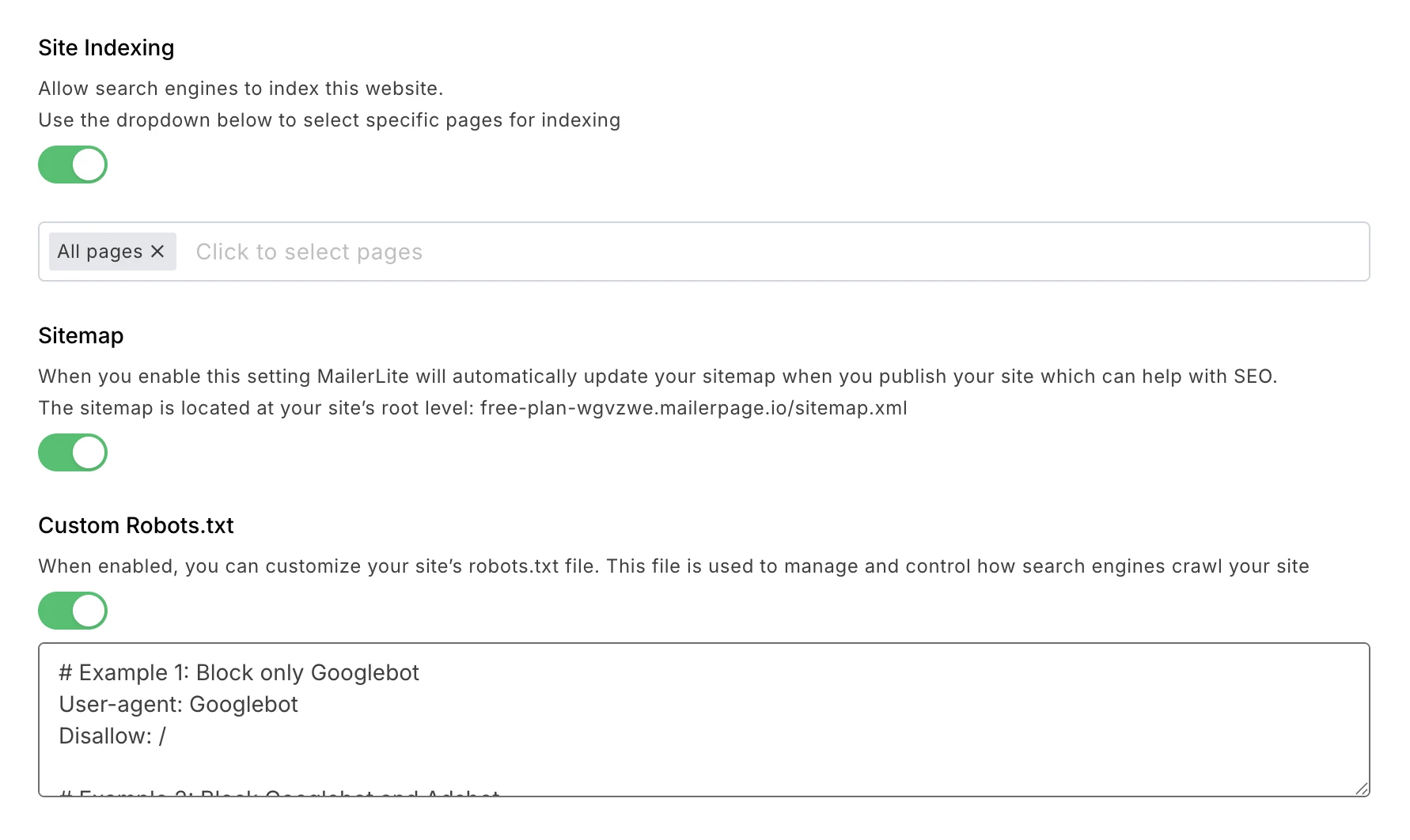
Robots.txt file
A robots.txt file tells bots, such as those used by search engines and AI tools, which parts of your website they can and can’t crawl. The file is published as a plain text file, usually at the URL https://yourdomain.com/robots.txt
The benefit of a robots.txt file is that you can use it to control which information and pages show up on Google searches or in AI tool answers.
MailerLite has a feature that lets you specify which pages search engines can crawl. We will automatically add these instructions to a robots.txt file.
You can also use our Custom robots.txt settings menu to customize the page, for example, to create custom instructions for different search engines. Check out Google’s robot.txt instructions for a good guide on how to do this.
Return and refunds page
There are 2 types of website visitors who might want to see a return or refunds information page.
Potential customers who want to know that they can easily return the purchase and get their money back.
Converted customers who want to return a product.
Either way, you want to make the user and customer experience as seamless as possible. What’s more, you’ll build credibility by reassuring customers that you’re a legitimate business, and free up space in your inbox or support channels by providing the information on-screen.
Society6’s returns policy leads to their help center, where you can easily find information on the policy, how to start a return, and how long it takes to receive the refund.

Keep things simple but informative. Make it easy for customers to get the main point of the returns policy without overwhelming them with a wall of text.
Shipping information page
Save your customers time and frustration by offering shipping details up front. Include shipping locations, estimated delivery times, available delivery options and costs, as well as any other important information. This way, you’ll set expectations and avoid unhappy experiences.
There are often many questions around shipping. Axel Arigato keeps things clear by presenting their shipping information as an FAQ so that customers can easily find what they are looking for.
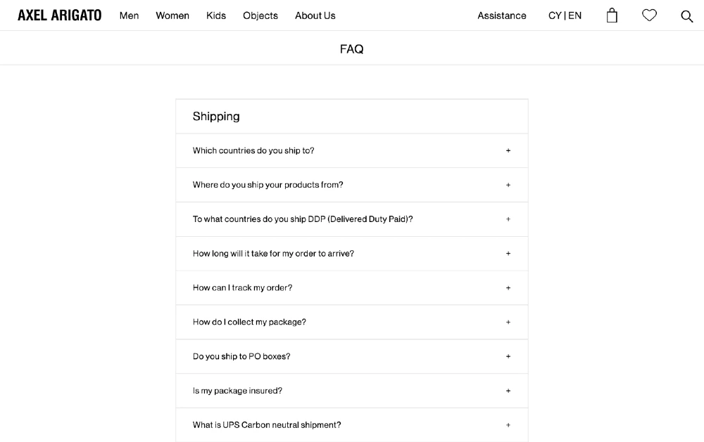
Keep the content of this page up to date! Inform customers of real-time service interruptions and keep track of any common questions or issues that come through in support, updating the page as needed.
Bonus: Website pages checklist
To recap, these are the 18 pages that every website should or could contain—some are a must, others are great to have, and a handful of website pages are optional. Think about your business, product and customers, and then build a website with the pages you need!
Must have
Homepage
About page
Contact page
Product page (if you offer products)
Service page (if you offer services)
Features page (for SaaS tool)
Blog
Page not found (404)
Privacy Policy
Terms of Service
Great-to-have
Accessibility statement
Testimonials or reviews
FAQ
Press kit
Sitemap
Robots.txt
Returns and Refunds
Shipping Policy
Build your dream business website
MailerLite has all the website-building tools that small businesses and creators need to sell products, collect email addresses, and showcase their brand. Start with a template and use easy, visual tools to publish your site in just hours!
Editor's note: This article was originally published in July 2020, but has been updated with fresh ideas and examples.