The key elements of a well-structured website (with checklist)
 Fernando, Developer.
A job well-done is when visitors come to your website and find exactly what they’re looking for while you keep them engaged and guide them towards the desired goal.
You can accomplish this by strategically picking each element of your website. Before you jump into building a website, think about what actions you want a visitor to do and structure each element on the page accordingly.
In this article, we’ll talk about which website elements help you deliver a top-notch experience for each visitor. Get excited to learn how to build a good website that reaches your objectives!
Prepare: Define the page goal
Do you know how much time on average people spend on a web page?
Under a minute. More precisely, 54 seconds. So you want to catch people’s attention as soon as they arrive and use effective website elements to keep them engaged.
Deciding which elements a page needs depends on the goal. Each page has its own objective. To give you an idea, here are examples of common web page goals:
Generate leads (e.g. “book a demo” or contact pages)
Boost conversions (e.g. sales, product or feature pages)
Increase awareness (e.g. informative pages or product launch pages)
Attract visitors (e.g. optimized blog pages)
Collect email subscribers (e.g. blog overview or lead magnet pages)
Higher customer satisfaction (e.g. contact or FAQ page)
Before structuring a page, be clear about the goal first. Then draft the content.
Write: Draft copy that speaks to people
Google “How to write effective web copy” and you’ll find 333,000,000 results. 😱
Though there are many strategies you can implement, the most important question to ask yourself is: “What’s the most compelling thing I can tell the reader to achieve my goal?”
If your goal is to boost sign-ups, you want to focus the content on how your product or service benefits the reader. This can be done by clearly explaining features and their value, and actively talking to the reader directly by using “you”, for example.
Write up a first draft, take a break and then edit the copy with a fresh pair of eyes—do this as many times as needed. Spellcheck tools like Grammarly help you write perfect English, and online editors like Readable or Hemmingway check your text’s readability and give suggestions for improvement.
Tip: Remember, it’s a good thing to publish version: copyfinalfinalfinalreallyfinal.docx. Writing good marketing copy takes time!
Build: Website elements to structure pages
Great website functionality goes beyond modern web design best practices. While aesthetics matter, things like strategic CTAs, images that tell a story and carefully-curated navbars are just as important.
Let’s look at 11 key website elements to consider when building a new website.
1. Curated navigation menu
Let’s start at the top! The navigation bar is a crucial element that guides people through your website and helps them find things with ease. Therefore, it should be curated with care.
How to create an effective navbar:
Use straightforward titles
Less is more: 5-10 menu items is an optimal range
Decide on a vertical or horizontal menu bar
Keep the navigation menu consistent throughout the website
Make items clear to see (use a solid background if the menu is fixed and scrolls along)
Add shadow to create depth and make the navbar stand out more
Highlight the page someone’s currently on (underline, bold, colored text or background)
Emphasize important links, like the signup button
Optional: Use icons
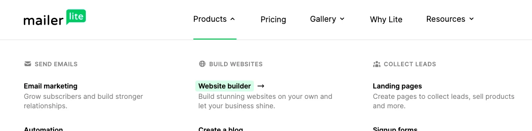
When you feel lost in menu items, it helps to draw a tree-like structure. Jot down all your pages, then see how they relate and can be best categorized.
We did this when redesigning the MailerLite website menu (coming soon, below is a small sneak peek). We grouped features to make it easier for people to navigate and find what they need.
For example, the Products menu is divided into goals our software helps you achieve. Visitors can easily pick their objective (build websites) and learn about features (MailerLite's website builder).
2. Clear call to action
Each landing page design should have one clear call to action (CTA).
Where and how many CTA elements you add to a page depends on the goal. A contact form has one action: submit the contact request. A sales page might have a few signup or purchase buttons to make it easier for people to take action as they scroll down the page.
Learn how to write, design and place CTAs on your website in the guide below.

Apart from simple CTA buttons or forms, pop-ups are also a great way to encourage people to take action. They can generate leads, collect subscribers and drive conversions—all of the good stuff.
You just need to know how to use pop-ups correctly. Read our blog to learn about best practices and see inspiring pop-up examples.
3. Scannable typography
When creating new pages for the web, look at the amount of text you’ve written and decide how to best present everything. Some people are interested in reading everything, while others want to quickly scan the content: It’s your job to give both audiences a great user experience.
How to make web copy a pleasure to read:
Write short paragraphs and sentences
Use easy-to-read typography and font sizes
Add highlights, or mark words in bold, italic or underline them
Structure text with headers
Distinguish between paragraphs with different font sizes
Work with lists and tables for diverse content formats
See which text could also be communicated through images
Add white space to give text room to breathe
4. Purposeful visuals
Images should be functional, have a purpose and tell their own story. Just by looking at the imagery, a reader should be able to tell what the page is about. It’s all about the first impression!
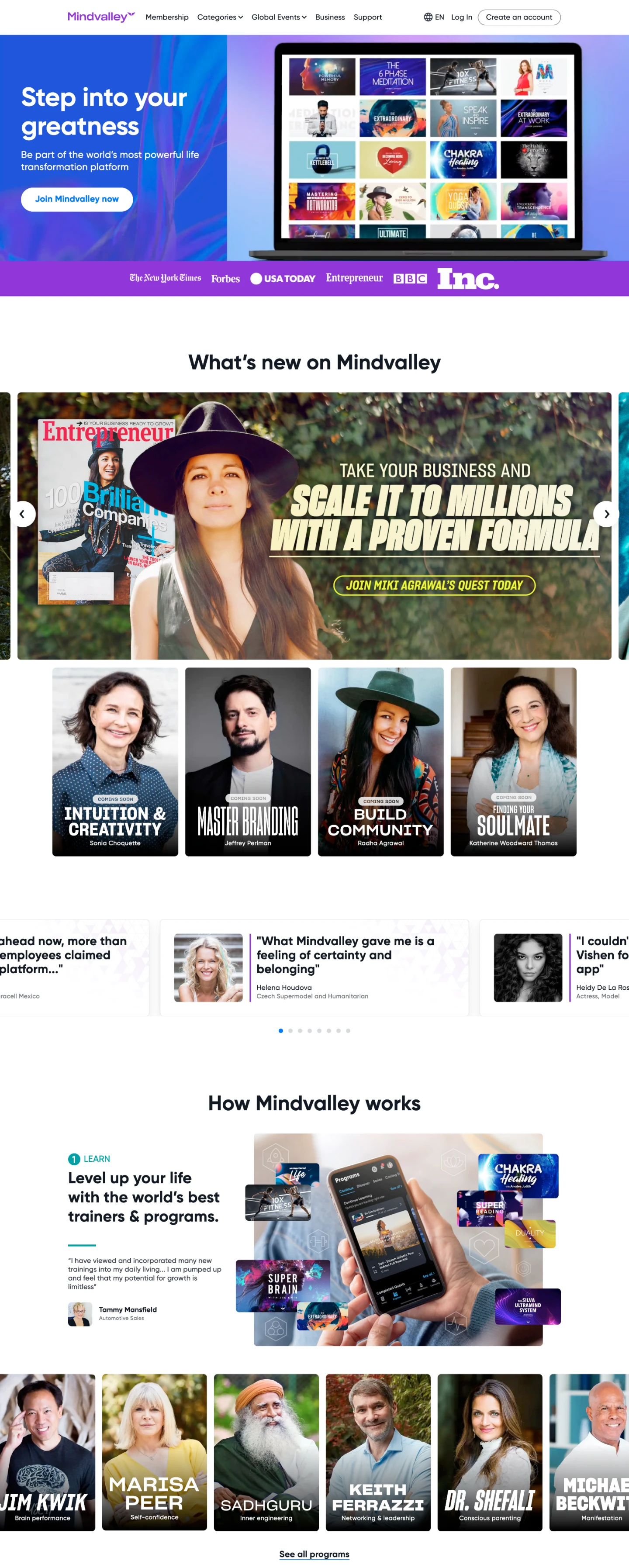
Mindvalley is a great example. For their hero image, they use a video—a great choice since their product is video courses. Large images are mixed with smaller high-quality photos to create a web design that feels lively and interactive, like their brand.
If you wouldn’t read any of the homepage text and only look at the images, you’d still understand that their product is about people, videos, courses, mentors and growth.
When picking images, you can use your own (like we do at MailerLite) or stock photography. Make sure your target audience can resonate with the models you show and make everyone feel included, for example by browsing galleries like ColorJoy Stock, TONL and The Gender Spectrum Collection.
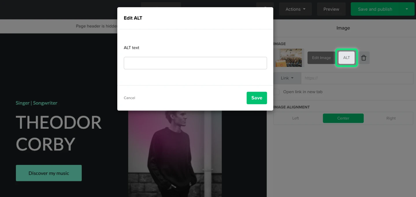
Don’t forget to add ALT text for each image. This helps people with visual impairments that use screen readers and visitors with unstable or poor internet connections. Plus, it can help you rank better on search engines. Describe what can be seen on the image in the alternative text. Start with a capital and end with a period.
Tip: In MailerLite’s website builder, you can easily add ALT texts. Select any image, click the ALT button and start writing.
As for image placement, let’s hand the mic to our graphic design talent Cody:
“When adding an image, the textual content determines everything. I focus on whether the image adds value to the content and place it only where it makes the most sense. I also use images to break up text or at the start to draw the reader in.”
5. Strategic color scheme
While often overlooked, color theory is a real thing and can help your marketing message. Using the right color scheme on your website matters.
Most successful websites stick to a monochromatic color palette using 2-3 versions of one color. This can be combined with a contrasting color.
When using minimal colors, you can design the CTA buttons in a color that pops and catches the reader’s eye immediately.
Tip: Want to learn more about color schemes? Our Video and Motion Graphics Editor Ash recommends this 13-minute video: “How to apply a color palette to your design”.
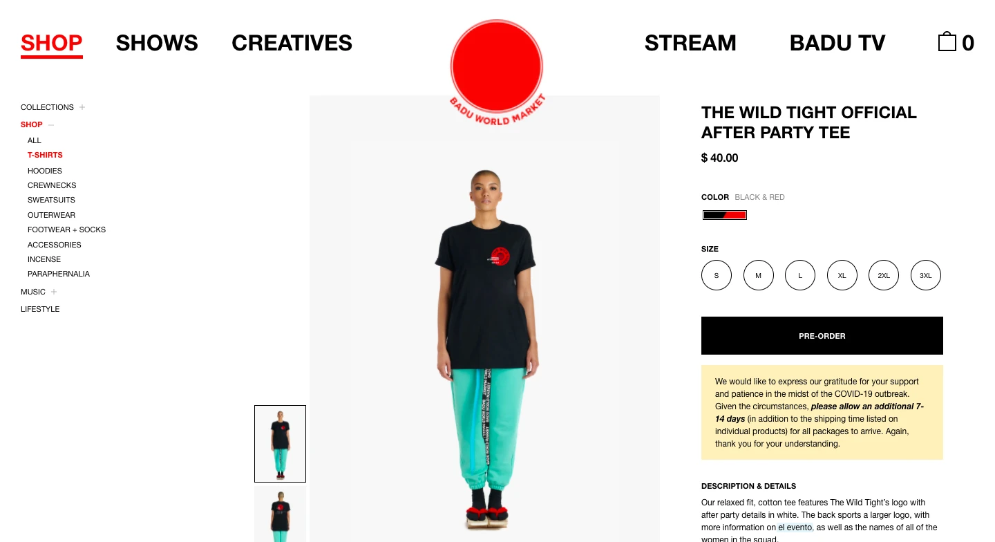
Erykah Badu’s website is an example of minimalism paired with contrasting colors. The abundance of white is calming for the eye and the high-contrast red/black colors highlight important website elements. The result is great usability.
6. Responsive web design
In responsive website design, parts of the website stack on top of each other once a screen gets smaller. This ensures that people can digest the website correctly on every device.
Before publishing a page, see what the website layout looks like on different screens. Make sure that text and images go well together, even when their order is different. On a laptop, the text element might be positioned next to the image, while on mobile the text is shown below the image.
Below you can see how the website components of gratitude journal app Happyfeed change depending on the device. On mobile devices, the three columns of images and text are automatically stacked below each other.
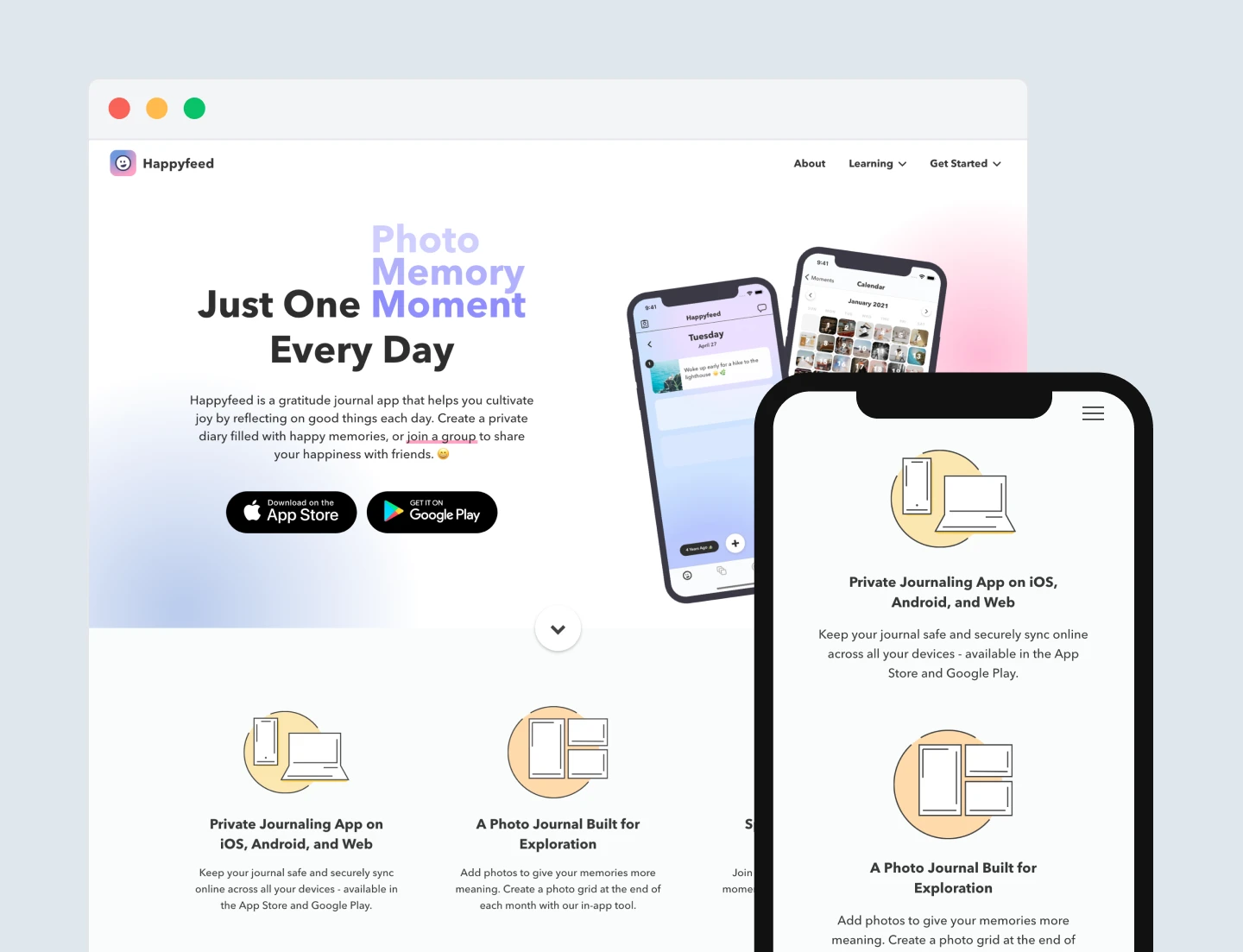
Tip: When using MailerLite’s website builder, your design is automatically responsive. You don’t need to do a thing (making it especially easy to use for beginners)! In the website editor, click Preview and see what your website layout looks like on desktop and mobile.
Build a free website using drag & drop
Use MailerLite’s website builder to add and style all components of a website. You can launch the same day—web hosting is on us! Sign up for a free account to start building.
View the website templates in the carousel below to see the types of designs you can create with MailerLite. You can also quickly build a site by choosing a template and customizing it to meet your needs.
7. Interactive elements
What do pub quizzes, board games and Q&A sessions have in common?
Engagement! When people can participate, they’re more engaged.
Interactive website elements can turn passive readers into active visitors. Try implementing a survey or quiz (fun fact: You can do this with MailerLite’s website builder!). When you ask people to sign up to get the results in their inbox, you’re simultaneously collecting new leads.
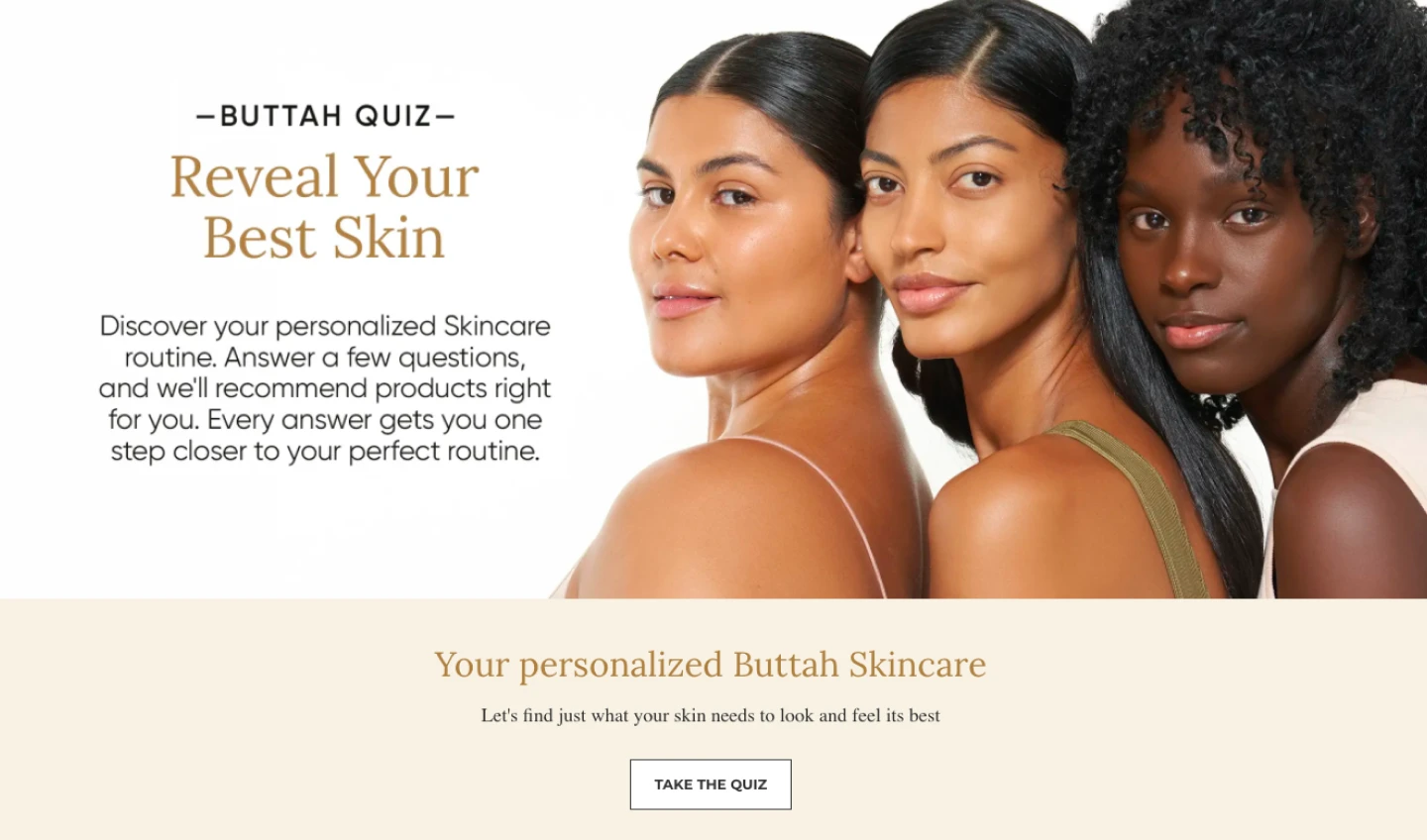
A good example is Buttah’s skincare quiz. With such a variety of products, people might not know what’s best for their skin. A quiz is both valuable and interactive.
8. Authentic about page
Your homepage, features, pricing and signup pages will probably attract far more visitors than the about page, but that doesn’t mean this part of the website isn’t important.
Your about us page shows readers who you are. It’s where you establish trust and authenticity. Tell readers how your business came about, share real pictures of the team and add testimonials from happy customers.
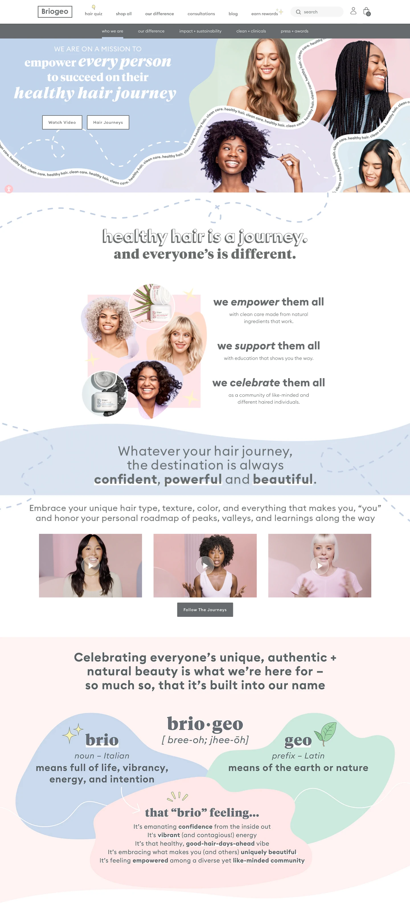
We love the Our Story page from haircare e-commerce company Briogeo. Matching their brand, the About page is fun and interactive. You can watch video interviews, listen to podcasts and learn about the brand’s name origins and founder story. They strategically intertwined products, but in a way that feels organic.
9. Accessible contact page
Like the about page, your contact page is an essential website component as well. Make it easy for people to contact you, whether that’s through a contact information form, email, phone number or on social media.
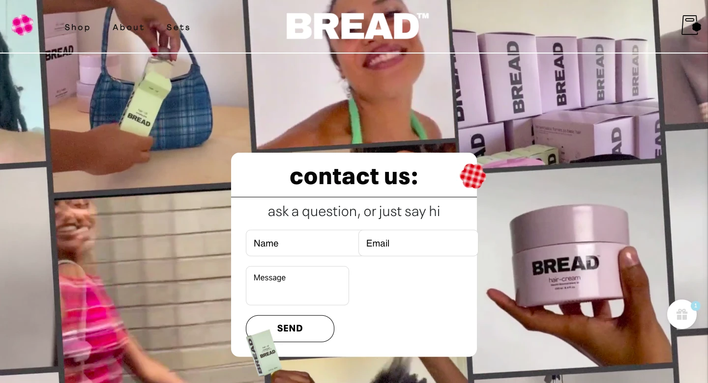
If your brand allows it, you can easily spice up this otherwise simple page by adding a vibrant background animation. We love this creative take from Bread Beauty Supply (click the link to see the video background in action).
If there’s no dedicated support team to answer all inquiries, it’s good practice to share your contact details nevertheless. The lack of an email or phone number can cause suspicion, which hurts your credibility.
Take example of “Range” author David Epstein. He notifies readers upfront that his inbox is overflowing and offers instructions on how to get time-sensitive requests through.
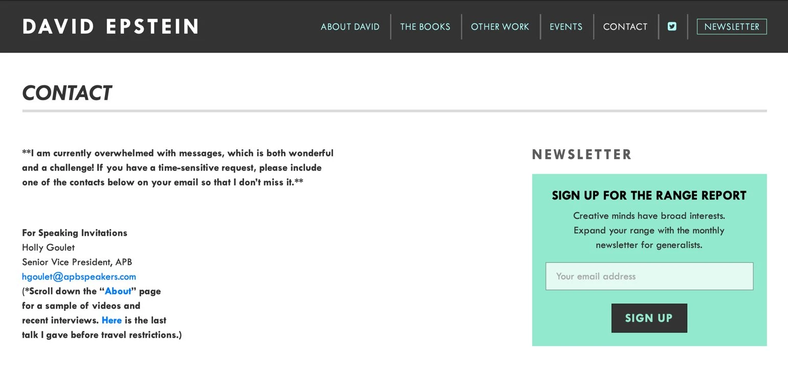
Alternatively, you can create an email automation workflow that sends an auto-reply message explaining the longer response time.
A FAQ page with the most common questions answered can also lower the number of incoming customer requests. This expandable web element helps to keep this information neatly organized.
And guess what? This web element can also be found in MailerLite’s drag & drop website builder!
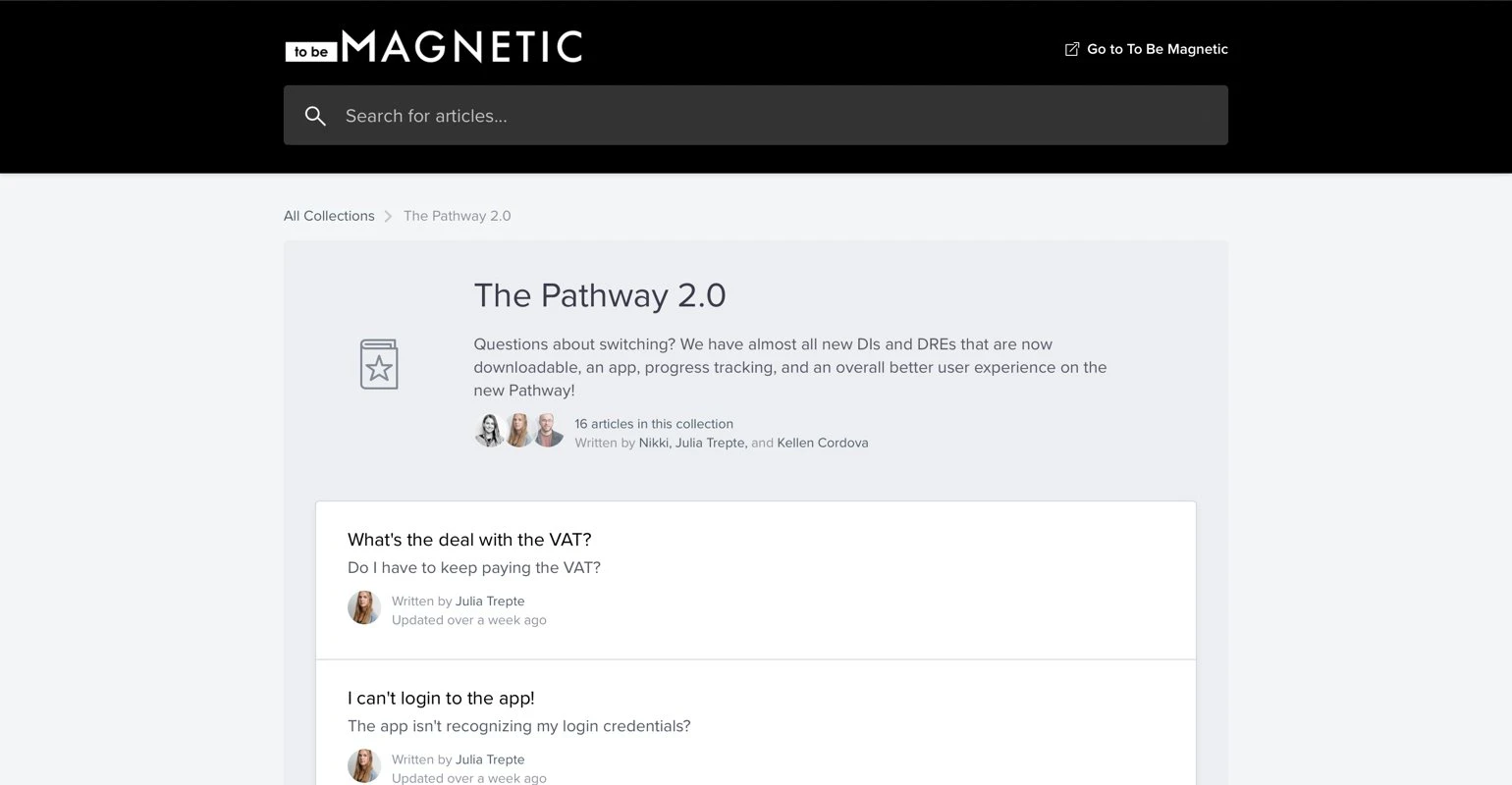
If you have a large community, you can even start a separate support center where topics are explained and people can browse through questions. Below you see how manifestation expert Lacy Phillips does this on her community FAQ page.
10. SEO elements
Now that you’ve put all your efforts into creating a website using the essential web design elements, we need to talk Search Engine Optimization. This is the practice of organically ranking your website on search engines, like Google. It’s how people will find your website.
In short, research keywords that describe what your website is about. Then write texts around these topics that add value for potential customers.
For a longer explanation, head over to our basic SEO to grow your website guide, where we’ll go in-depth and explain SEO and action steps in clear language that everyone can understand.
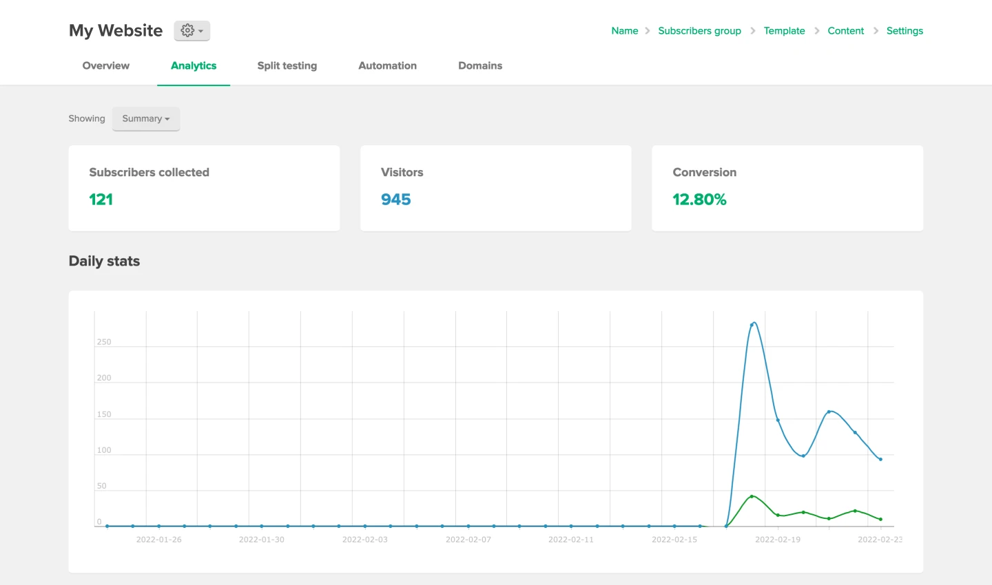
11. Website analytics
Once your website starts gaining traction, it’s good to check your analytics and see how each website page performs. This gives you insights into what engages people and which website elements can be improved.
We find Google Analytics to be the most accessible and comprehensive analytics platform. With simple instructions, you can set it up for any website. Then you can track a wide array of performance indicators like (new) website visitors, clicks, impressions, average time on site and conversion rates.
In MailerLite’s user-friendly website builder, you’ll find all key analytics directly in your dashboard. Additionally, you can connect to Google Analytics and Facebook to see how people behave on your website after clicking on a paid Facebook ad.
11 must-have website elements checklist
Carefully select the navigation menu items.
Have a clear actionable goal for each web page.
Make copy nice to read in full and easy to scan.
Pick visuals that complement the pieces of content.
Use colors to show readers what element to focus on.
Adapt pages to different screen sizes using responsive design.
Increase engagement with interactive elements.
Create trust and authenticity on your About page.
Make it easy for people to contact you.
Optimize your website content to attract visitors.
Analyze performance to see what works and can be improved.
What web element do you find challenging to get right on your website? Leave a comment, we’ll personally respond with our advice!