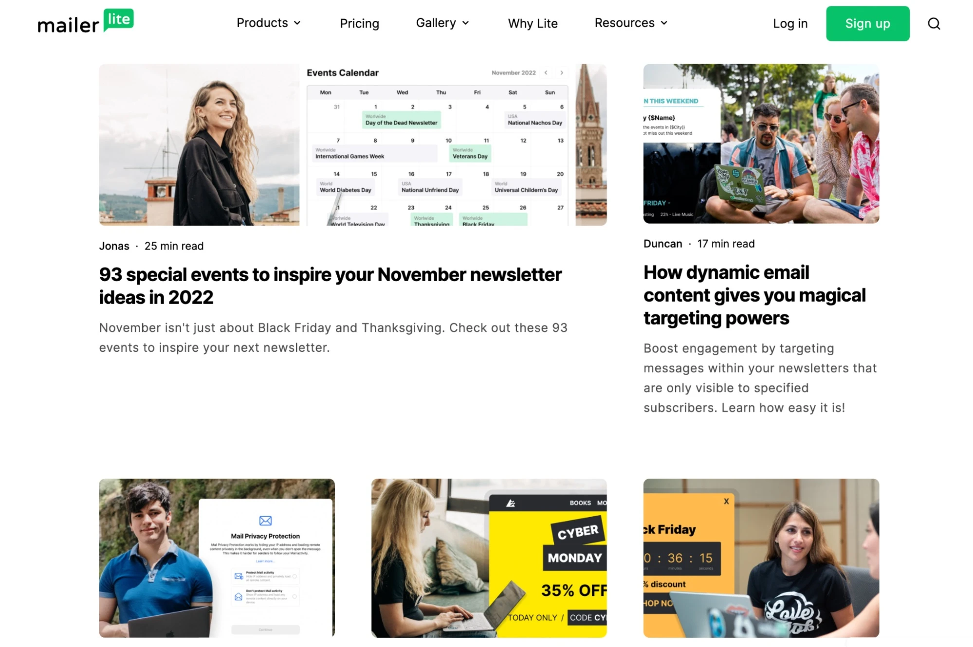
14 essential web design best practices and tips for 2024
 Remis and Renata on a Workation
Do you know how long it takes for people to decide whether to stay on your website?
Probably less time than it took you to read the headline and this sentence.
Are you still here?
It takes 5 to 15 seconds for people to make that decision. Following web design best practices helps you create a first impression that convinces people to stay.
This article will explain how to design a website that hooks your target audience.
We’ll cover:
The importance of consistent design
How to create a visual hierarchy that highlights your most important content
Navigation ideas that make it easy for people to browse your site
Plus plenty more helpful tips. Let’s jump in!
14 web design best practices and standards
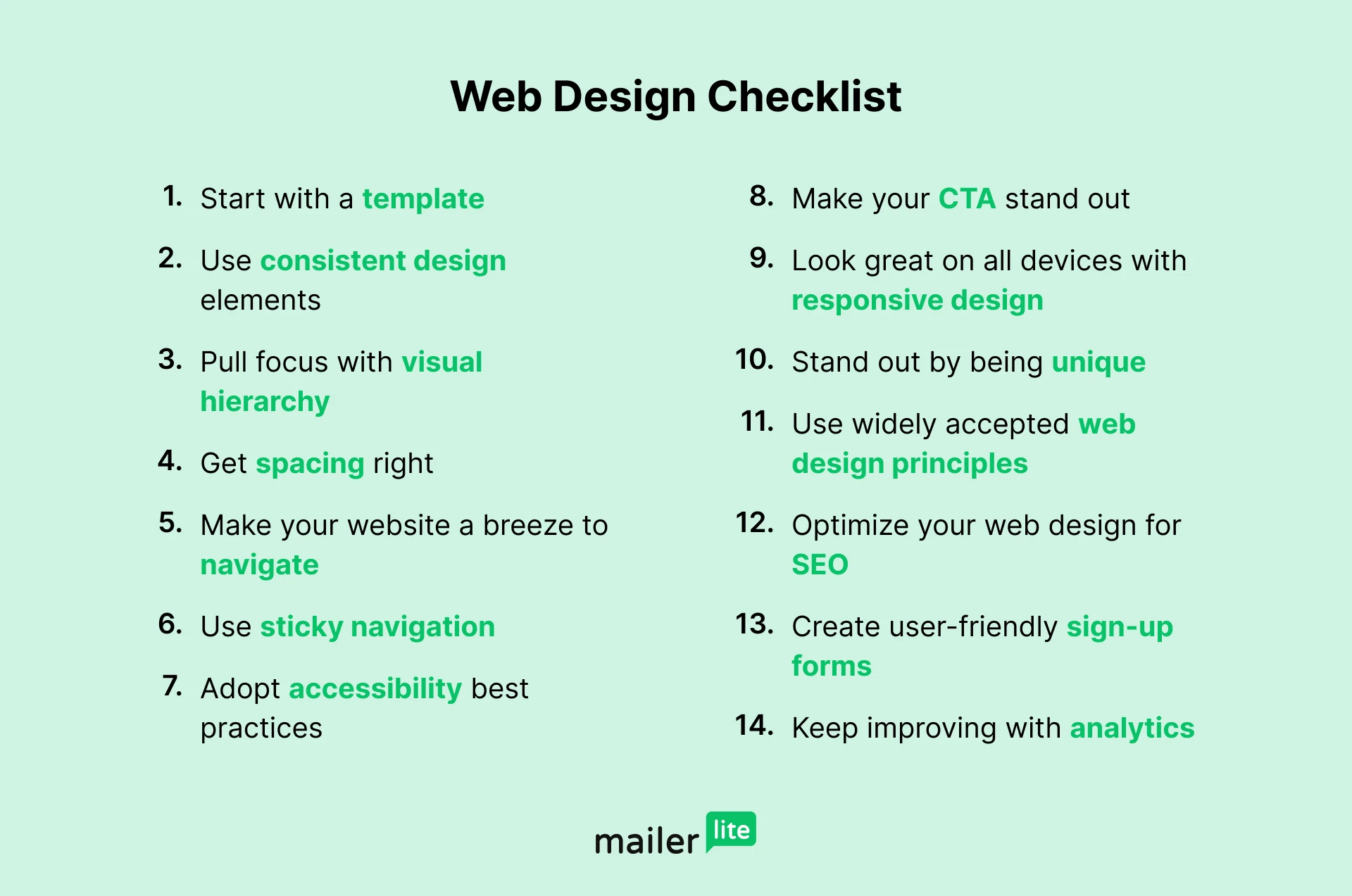
Creating a great-looking website isn’t guesswork. Follow these best practices to build a website that looks professional and helps visitors find the information they need. Read the article for the full rundown of the tips, or check out the graphic below for a TLDR checklist.
1. Start with a template
Web design beginners and pros alike can benefit from a template. These pre-built sites are designed with web design best practices in mind, making them the easiest way to get a beautiful website.
Starting with a template also gives you a massive head start, meaning your site will be up and running far faster than it would be otherwise.
All you have to do is choose a design and then adjust the content, add pages, and customize the styles to reflect your branding.
Most website builders have a large template library to choose from. See some of our favorites from the MailerLite website builder below.
2. Use consistent design elements across your website
Look at any professionally built website; you’ll notice each site uses the same fonts, colors, logos, and styles on every page.
There’s a good reason for this consistency. Using the same visual elements results in a recognizable and coherent brand identity. What’s more, you’ll save time when creating your site as you don’t have to think about how each element looks every time you add one.
Here are 4 factors to consider that will help with design consistency. We’ve also included some free tools to help you set up.
Create a logo
Adding your logo to your site makes it obvious the page belongs to your brand.
If you don’t already have a logo, automated logo generators from Logo Creator, Shopify and Adobe will create one for you instantly. Or use Canva if you want a simple way to put your graphic design skills to the test. You can then export the logo to use in your MailerLite website with our Canva integration.
Define your color palette
Choose colors that complement each other and reflect your brand. Use a tool like Coolors to browse color schemes until you find one you like. Then use them consistently across your website and other assets.
It might not seem significant, but colors play a big part in how people perceive your brand. The right palette can help you stand out, associate you with particular feelings, and even change someone's mood. Check out the graphic below to see what feelings common colors can evoke.

Choose typography
Most brands use two or three fonts across their website. This typically includes a font for your website copy and one for your headings and buttons.
Some font pairings work better than others. Use Fontjoy to browse pairings until you find one you like.
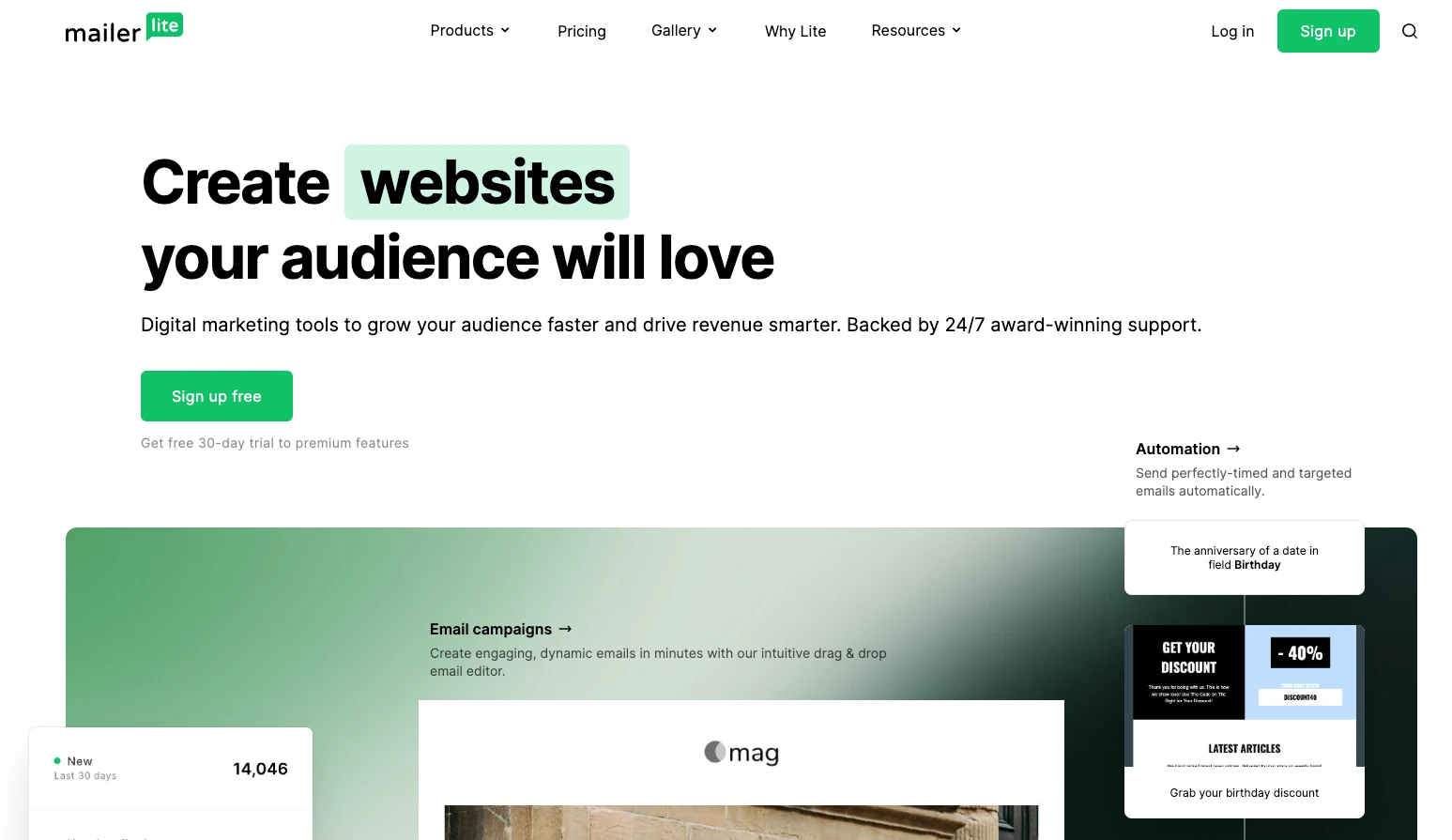
Design consistency example: MailerLite
Check the MailerLite website to see design consistency in action. We use dark green, light green, white, black, and gray across our website. Each page also uses the same fonts for text and headings.
Define your global styles before starting the design process
Once you’ve chosen fonts and colors, decide where you will use them. Do this before designing your website so every element uses the same styles.
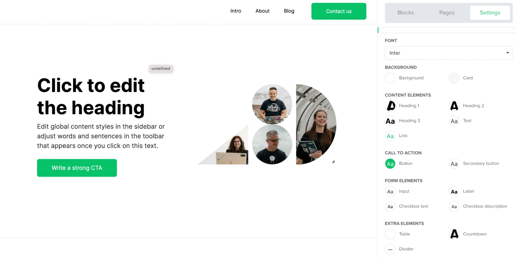
The MailerLite website builder allows you to define global styles like the color and font of headings, titles, body text, and buttons from the settings menu.
The styles you choose are reflected on your website whenever you add one of these blocks.
Use the colors and fonts you choose for your website across all branded materials, including emails, social media content, and videos. People will recognize the content as yours wherever they see it.
3. Pull focus with a visual hierarchy
A visual hierarchy is how you rank and display website content. An effective visual hierarchy organizes your site content so that:
The most important elements are the most prominent.
Content is in a logical sequence that is easy for visitors to navigate.
Creating an optimized visual hierarchy can be complex. Professional designers use an element’s size, color, contrast, and spacing to guide the visitor’s attention across the page.
You can keep things simple by following these three rules:
Make sure the most important elements are large and near the top of your page.
Use contrasting colors to highlight aspects like your CTA buttons.
Make non-essential details smaller and put them further down the page.
Example: MailerSend’s home page
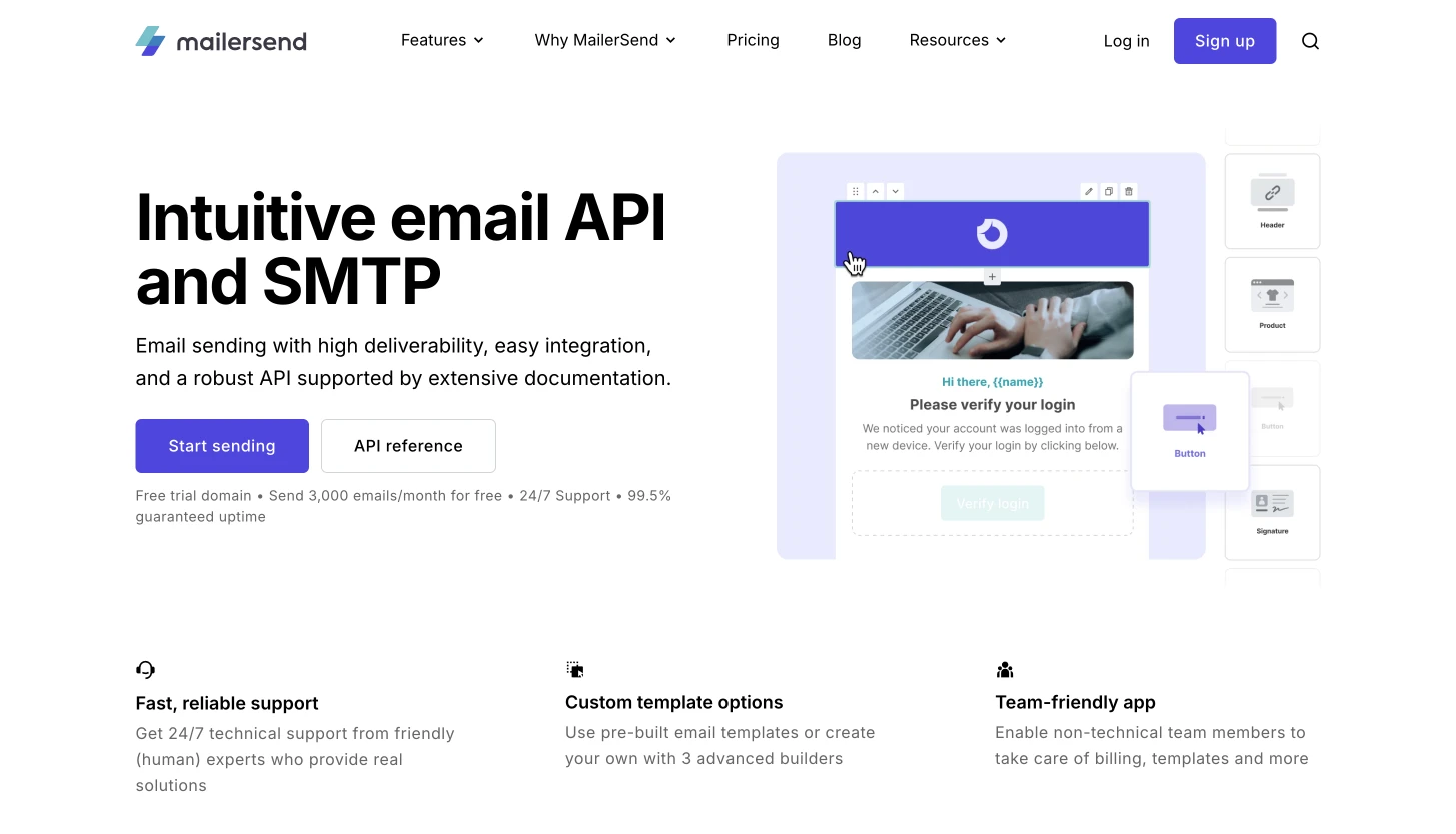
The MailerSend homepage is a clear example of a visual hierarchy that prioritizes important information.
The title text contains the service description. It’s much bigger than all the other elements and is placed in the position people first see when they land on a page.
The subtitle provides further benefits about the service; it’s large but not as large as the title. CTA signup buttons are important for conversions, so they have a color that contrasts with the rest of the page.
As you scroll down, you can see more information about the benefits of individual features. These aren’t as important as the above elements, which is why they are placed lower on the page.
Use F and Z patterns
Your web page layout is another important part of a visual hierarchy. Lay out your page’s elements in a structure that is natural to read, like the F or Z pattern.
F and Z patterns are principles that explain how a reader’s eyes move across a webpage.
The F pattern is when someone starts at the top left of the page and goes horizontally right, before moving to the start of the next line. As the person moves down the page, they are more likely to scan content on the left side and only move across if something really interests them.
This is typically how people read pages with a lot of text, like blog posts. Use this knowledge in your web design by placing the most important information at the top. Further down the page, use headings and images so people who are scanning can see and understand the content.
The Z pattern is similar except instead of moving back to the start of the line below, the reader follows a diagonal line back to the left side of the page. This is typically how people view pages with less information, like landing pages.
The key is to put the most essential information in the top left and add the other elements along the Z pattern.
Build a beautiful website with MailerLite
Access templates and pre-built blocks to make designing a great-looking site easy. Build your site for free, then choose a paid plan when you’re ready to publish.
4. Get spacing right
Website spacing is key to good website design. Getting spacing right ensures your text is clear, content is organized, and visitors can focus on the most important parts of your page.
White space (also known as negative space) is the space between page elements. Use it to ensure it’s easy for visitors to digest the content on your website.
Use white space to improve readability
Here’s an example that shows the impact of white space. The left screenshot shows one of MailerLite's professionally designed templates with the horizontal white space removed from between each element, while the right screenshot shows the original template.
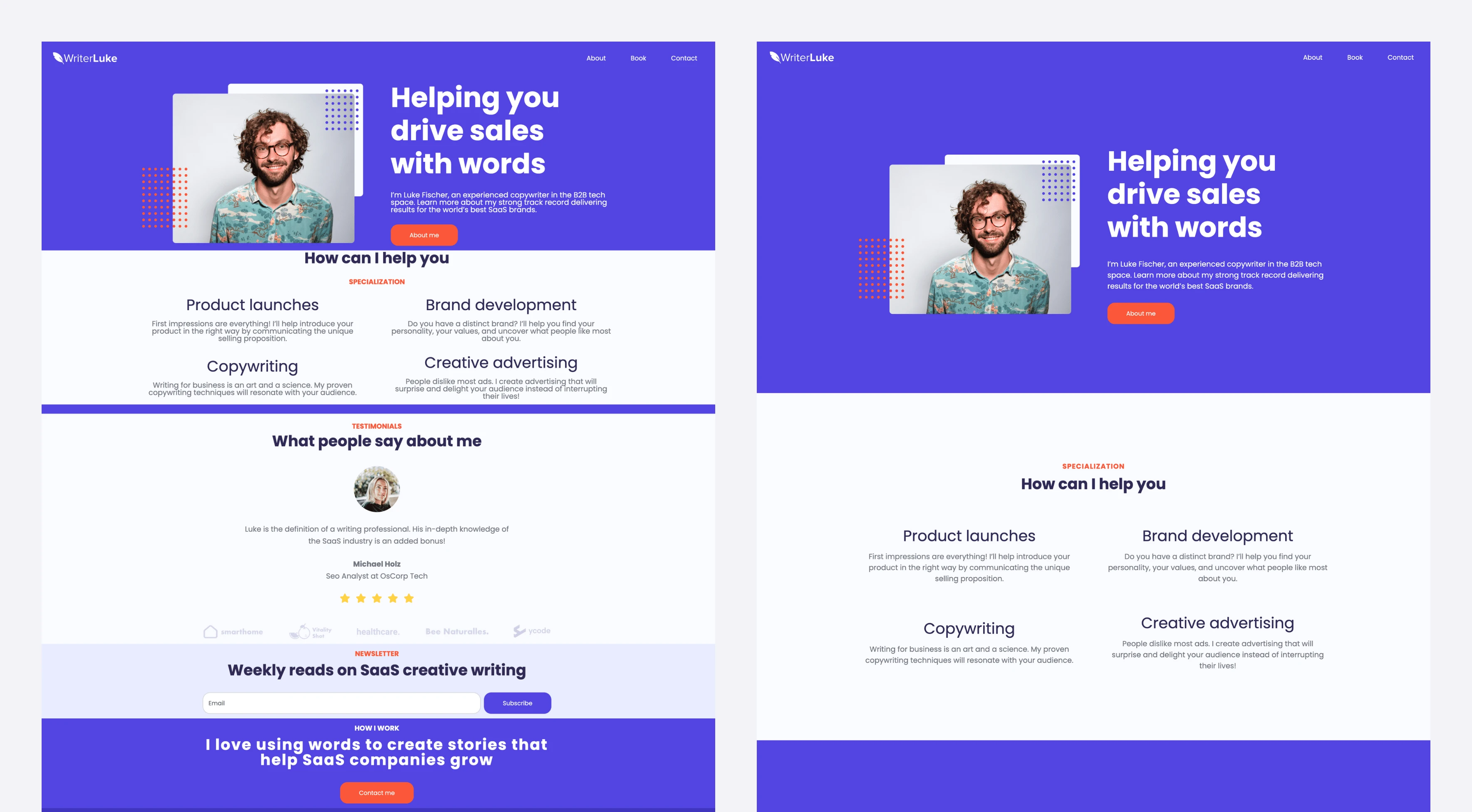
The page with the white space looks far better and is easier to read. This is an extreme example, but it clearly shows the benefits of using white space in your web design.
White space helps you group content
You can also use white space to group elements together. Elements in the same group are closer than elements in different groups.
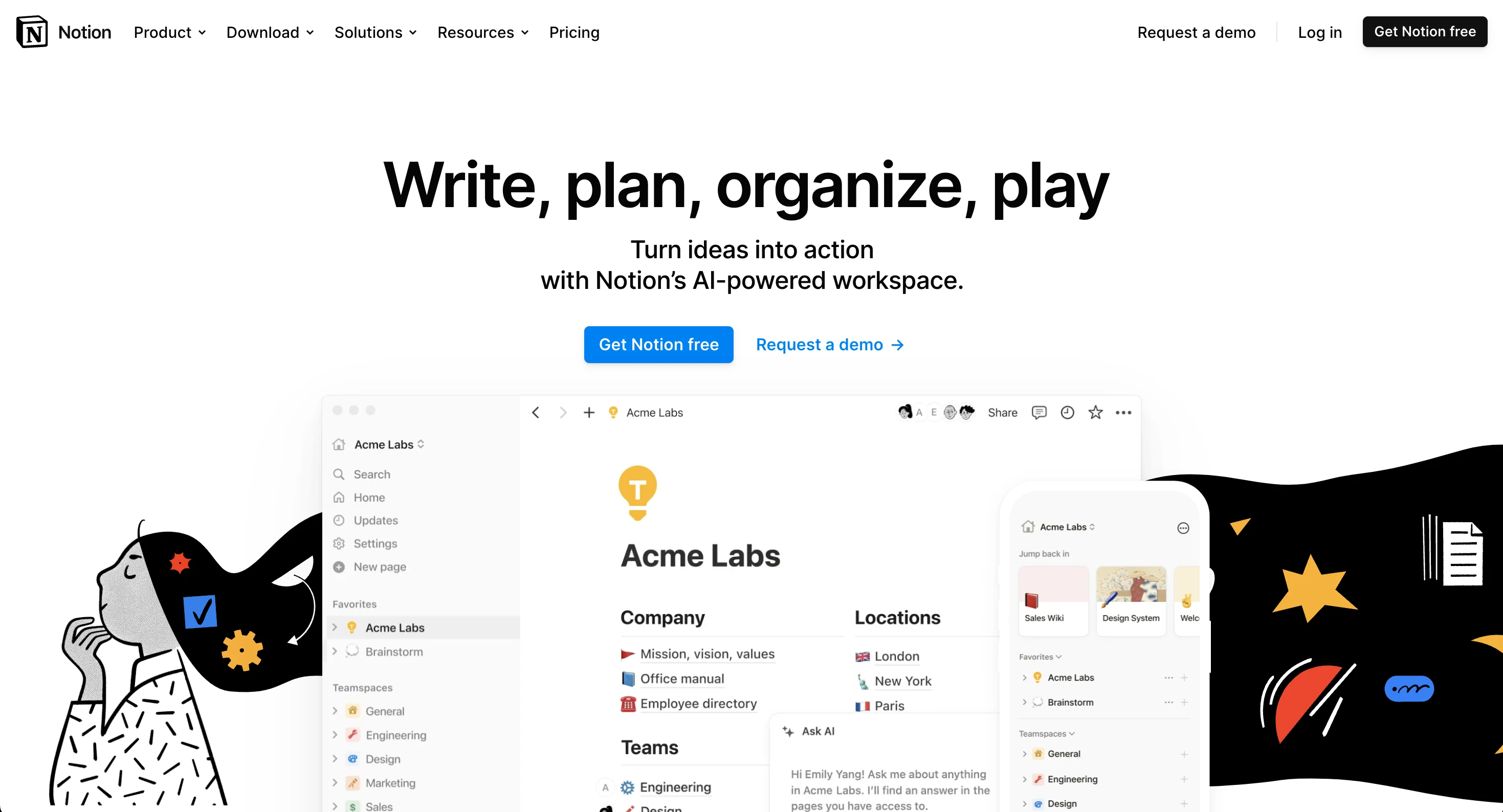
The screenshot of the Notion homepage below shows this theory in action. All the top menu items are grouped and separate from the main hero items, which are separate from the product explanation items further down the page.
The white space makes these groupings obvious, despite no barriers or lines separating each element.
The MailerLite website builder has many options to help you get website spacing right.
You can:
Use pre-built website templates with white space best practices included
Adjust the vertical spacing between different elements and images on your page
Add spacers and dividers to keep elements separate
Use prebuilt content blocks with professional spacing
Change the focus of the content in blocks by changing the ratio of the elements
5. Make your website a breeze to navigate
Your design should make it easy for people to navigate your website and find the information they need. It should push people towards the website KPIs that impact your business goals.
Here are five key web design elements to help people navigate your website.
1. Header menu
Your homepage isn’t always the first page people visit. Your header bar makes it easy for people to find the information they need from any page on your site.
Check out the MailerLite header as an example of the type of content you can include in a header bar.
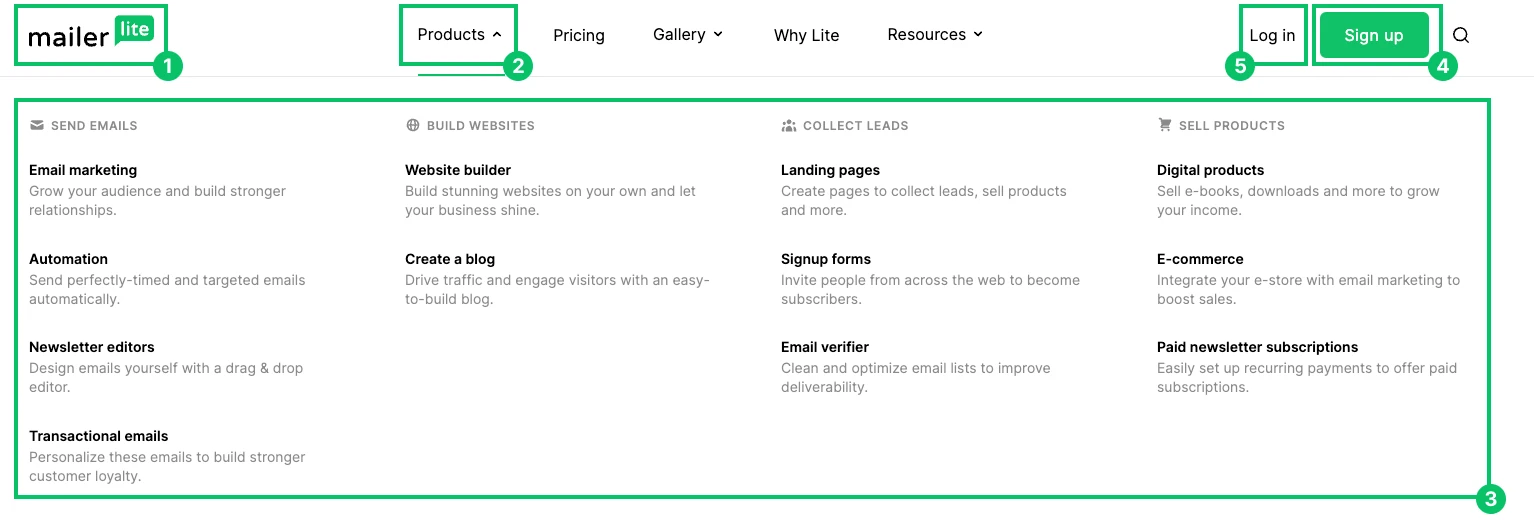
Logo: Lets people know the page belongs to Mailerlite. It also links to the MailerLite home page where people can learn more about our company.
Drop-down navigation menu: Provides access to product pages, content resources, and our example galleries.
Links: Guide people to important pages so they can find out more about the company and product.
Sign-up button: This is the most prominent element due to its contrasting color. We want anyone who lands on our website to sign up for our product.
Login button: Makes it easy for existing customers to access their account from any page.
Your header bar won’t include the same information as ours. Consider what your most important pages are and then add them to your main navigation menu.
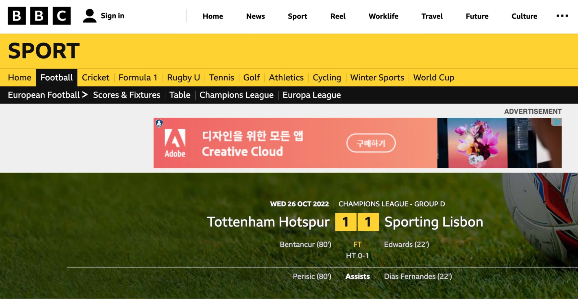
2. Breadcrumbs
Breadcrumbs are navigational elements that reveal where the current page sits in your overall website structure.
Websites typically add breadcrumbs under the header or at the bottom of the article’s body content.
Below, the BBC website makes it obvious that the article you’re reading is in the Sport, Football, and European football categories. The user can find more information about any of these topics by clicking on the link.
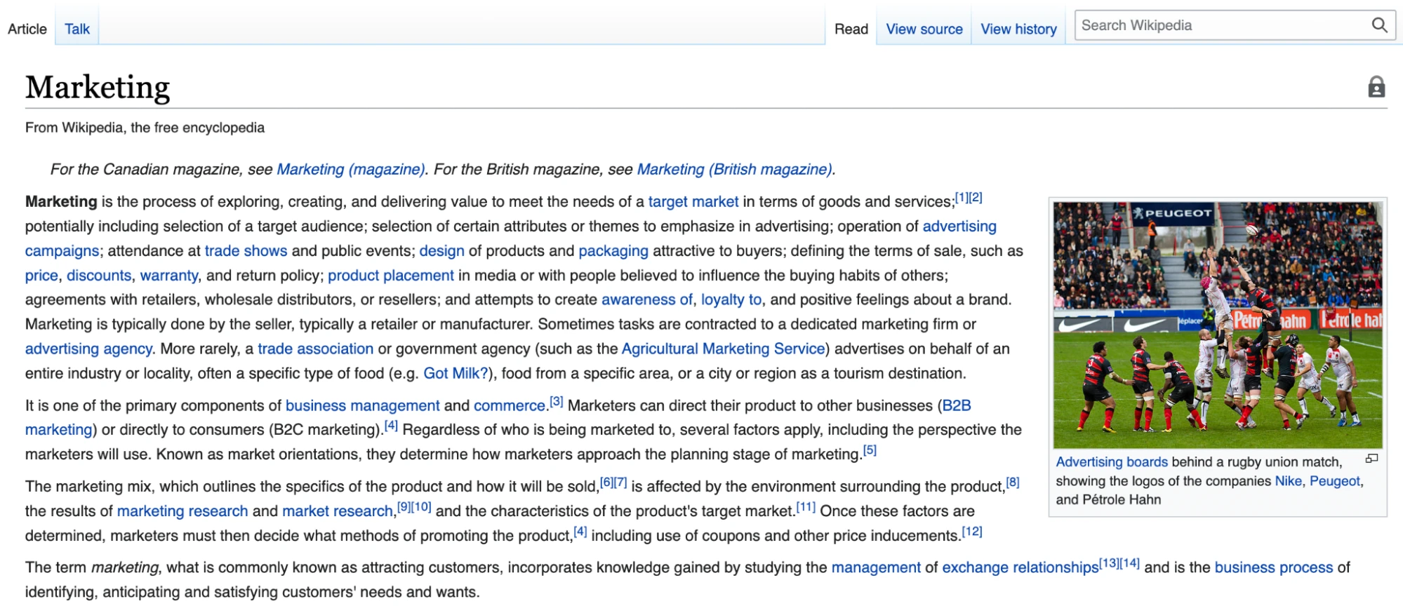
3. Search bar
The search bar makes it easy for people to find specific content on your website. It’s helpful if your site has many pages that aren’t easily accessible through menu clicks.
The Wikipedia search bar is an essential tool for website visitors who want to find information in the encyclopedia.
4. Links in body copy
Body copy links make it easy for people to discover more information about the topics your article discusses.
Here’s an example from the MailerLite blog. The below section on steps to building a website makes it easy for people to discover more about our no-code website builder.
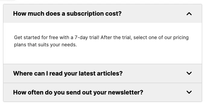
5. Use expandable accordion blocks
It’s sometimes better to answer questions within the page the visitor is on, rather than directing them to a new one. However, adding too much text can complicate the design of your website.
Using accordion FAQ blocks to add expandable content is an easy way around this. They let you include more information without cluttering up your page.
Quickly add an accordion block to your page with the MailerLite page builder. Drag-and-drop the block into the area where you want it to appear and then edit the heading and information in the drop-down box. You can see an example in the screenshot below.
The 3 clicks rule states that people should be able to access any important page on your website within 3 clicks. The more pages you have, the harder this will be, but the overall idea stays the same: you should make pages as accessible as possible.
6. Use sticky navigation
Sticky navigation menus help people browse your site by ensuring they always have access to your main navigation menu. This means they can visit relevant pages without scrolling to the top of the page.
When using sticky navigation, the menu should be as unobtrusive as possible so it doesn’t get in the way of other page elements. Using an icon that expands to reveal the whole menu when someone clicks on it is a good way to balance navigation with usability.
You can enable this on your MailerLite website by clicking Edit on the header block, opening the Settings tab, and then toggling Remain at the top while scrolling to on. When on desktop, the full menu will stay at the top of the page, on mobile it will automatically turn into a menu icon.
7. Consider accessibility best practices
When building a website, think about how the design will impact the way a person with a disability interacts with it.
The Web Content Accessibility Guidelines, produced by the World Wide Web Consortium, are a set of recommendations that web designers can take to maximize the accessibility of their content.
Some of the key guidelines include:
Offer text alternatives for non-text content. Do this by adding captions or alt text to content like images, buttons, or video files
Include text transcript, sign language interpretation, or captions for audio content or videos
Make content distinguishable by increasing contrast via colors and other methods, ensuring no text is lost when people resize text, and ensuring audio volume can be adjusted or paused
Make content operable by people who use a keyboard rather than a mouse to browse websites
Content shouldn’t include flashes at rates that can cause seizures
Pages should be organized and labeled so users can navigate the website effectively
Include an audio version of your page, especially for content-heavy pages that are dense with text
You can consult the entire set of Web Content Accessibility Guidelines when you're building your website.
8. Make your CTA stand out
Each page on your website should have a purpose. Your visual hierarchy and navigation play a big part in pushing people to this goal, but your call-to-action (CTA) is where you convince them to take the next step.
Make your CTA design effective by:
Giving it a prominent position on your page
Using contrasting colors to make it stand out
Using multiple buttons throughout your page
Combining your CTA with other elements to make your offer super clear
Using different CTAs for each page
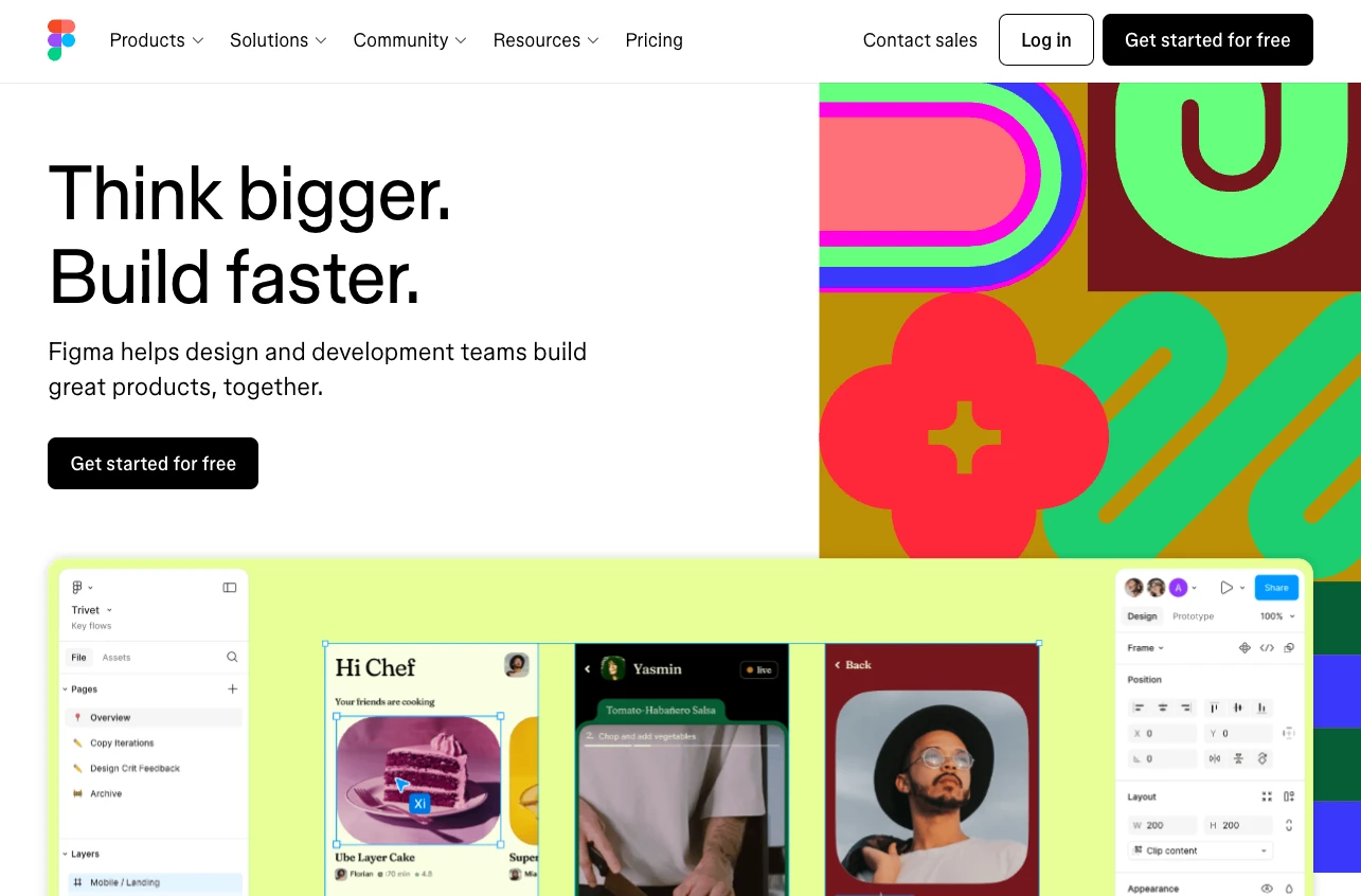
The Figma homepage ticks many of the above boxes. For example:
The page has CTAs in 2 prominent positions and the header CTA stays in position as you scroll down the page
The black CTA button contrasts with the white background
The page has the 2 CTAs you can see in the above screenshot and a signup form at the bottom of the page
The primary CTA combines with the headline and the subheader to create a clear offer
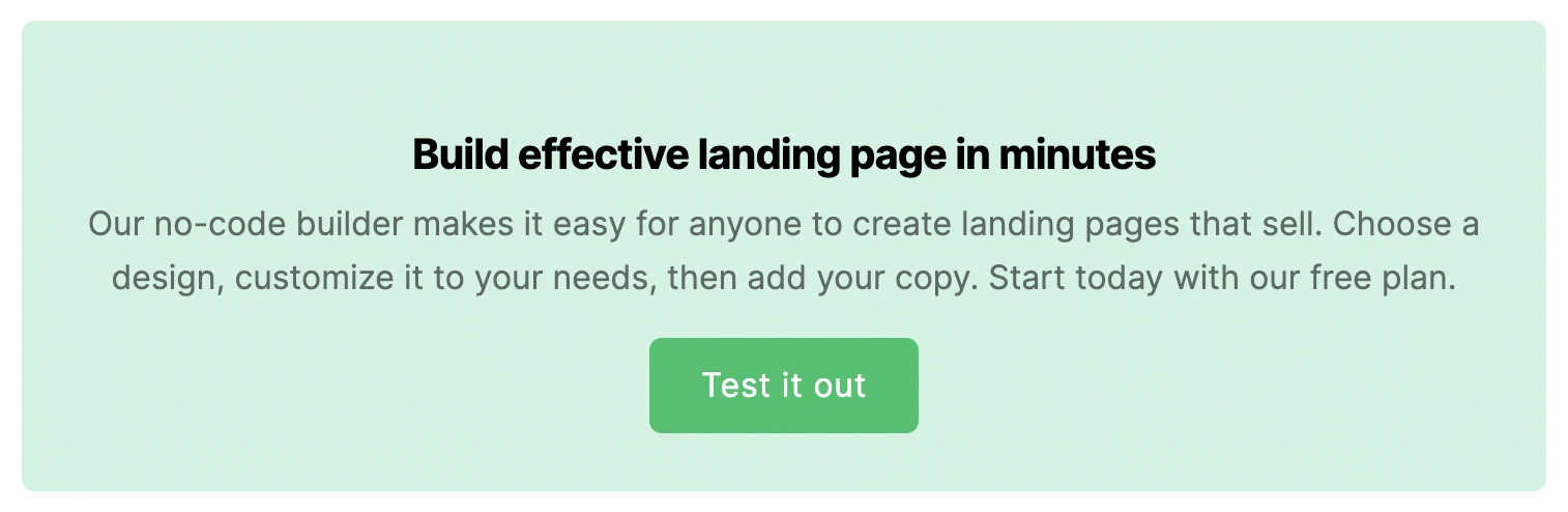
Use content blocks
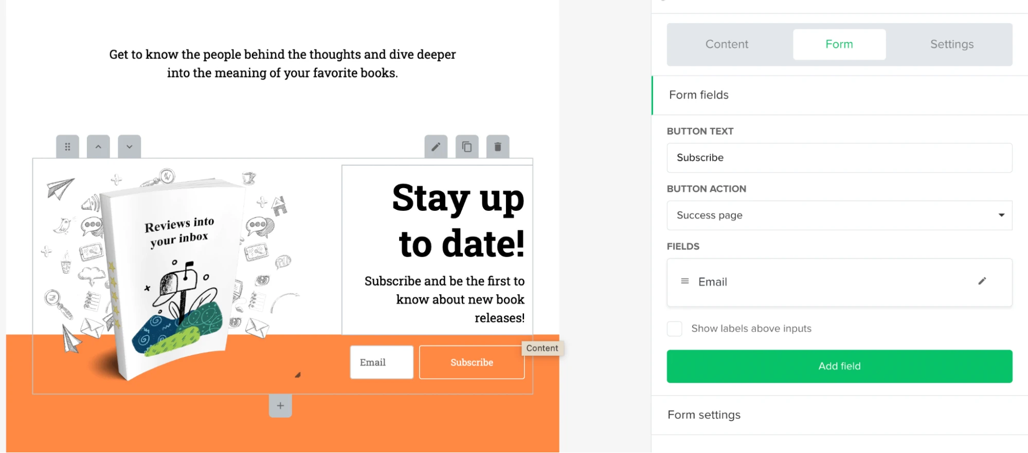
Content blocks help your offer stand out even more. For example, we use a block to embed signup forms on every MailerLite blog post so people can sign up for our product or email list.
This is more effective than a simple subscribe button because it provides detailed information about our offer. See an example in the screenshot below.
The MailerLite website builder makes it easy to embed this type of content on your page. Use our form builder to add forms to any part of your website. You can add an image, customize the colors, and add or remove fields.
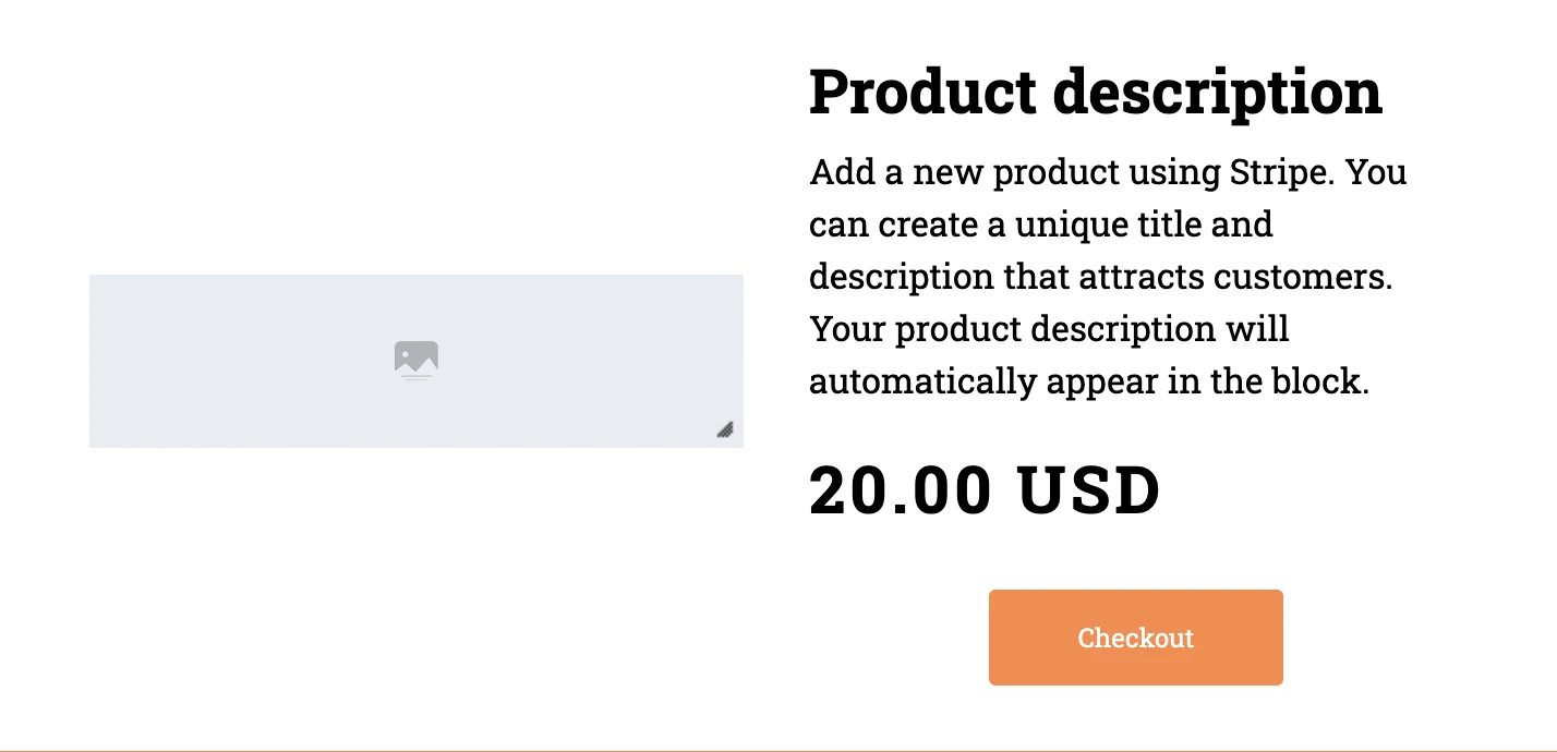
Or use an e-commerce product block to sell your digital product anywhere on your site. Connect the block to your Stripe account to automatically populate it with descriptions and images. When someone hits the buy button, they go straight to the Stripe checkout page.
9. Look great on all devices with responsive design
Optimize your web design for desktop and mobile devices. Achieve this by using a responsive design with a layout that changes depending on the screen size the page is being viewed on.
Most websites use breakpoints to enable responsive design. These are the points when the web page layout changes to make it look better on smaller devices.
For example, the website might organize its content horizontally when a browser has a widescreen 1920x1080 aspect ratio. But it will stack content vertically when it switches to a narrower 1080x1920 aspect ratio like many smartphones.
The website may also start to remove content, move it to the bottom of the screen, or shrink links into dropdown menus when in a narrower aspect ratio.
You can easily see how a website’s design changes responsively by opening a window on your computer and gradually resizing it.
MailerLite’s website builder automatically ensures that your website and landing pages look great on all devices. Before publishing, you can also preview how each page looks on mobile and desktop devices.
10. Stand out by being unique
You're unique, so your website design should be too. There are many ways to make your branding stand out from the crowd.
One of the easiest is to use your website copy to highlight what makes your brand special. Even if you aren’t a design pro, simply writing what makes you unique will help you stand out.
Also, pay attention to your About page. While it’s tempting to deprioritize this page since it’s unlikely to result in conversions directly, it’s a key part of your brand identity. Use the page to explain your values so people can learn more.
Here are 4 brands that have done a great job of creating websites that look great and are instantly recognizable.
The Verge: Stand out with distinctive colors
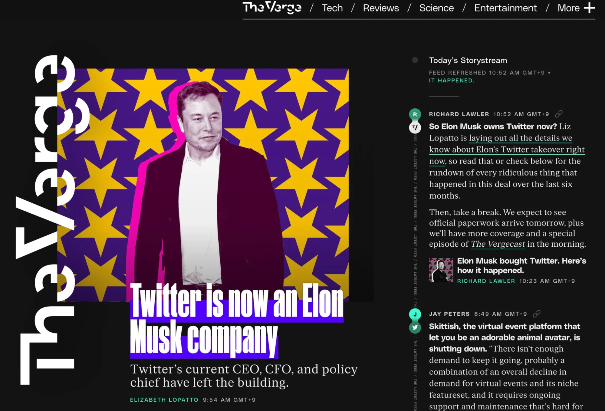
The tech news industry is incredibly competitive. The Verge’s distinctive color palette of bright colors on a black background helps its website stand out. The brand uses these colors across all online assets, including social media, email, and video.
Milk Road: Create a mascot
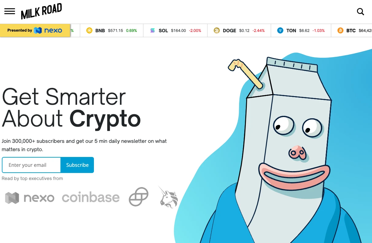
Crypto newsletter The Milk Road created a milk carton character that it uses throughout its website, social channels, and newsletters. The character ensures that any of the brand’s content is instantly recognizable as no other brand can use this design.
MailerLite: Add a human touch
At MailerLite, we use images of our team across our website and blog. The people who work at our company are unique to us, so using these images helps our website stand out.
Ogilvy: Use animation
Ogilvy is a leading advertising agency, so it’s important the company website catches the eye of visitors. One way the company does this is via animations that come into effect as visitors scroll down the home page.
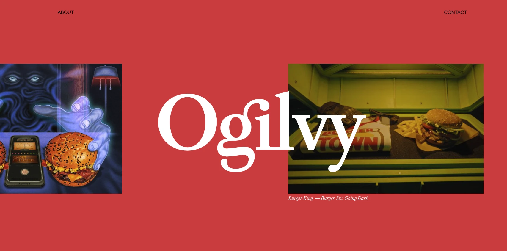
MailerLite customers can use our animations feature to add a similar effect to their websites. Choose either fade, flip up, or zoom effects to easily add animation to your pages. Below you can see an example of a page with the flip-up effect.
11. Use widely accepted web design principles
When people visit a website, they have expectations about how different design elements should work. While you want your website to be unique, you should always keep widely accepted website design principles in mind when designing your website.
Some examples of these design principles include:
Your header logo should take people to your home page
Underlined or highlighted body text should signify links to other pages
Use the hamburger button to let people expand a menu
Use the gear symbol to let people open the settings
Include a menu in your header
Use social icons to link to your social media profiles
Use app store buttons to link to your app store listing
Using these best practices in your site ensures that when people land on your website, they will instantly have a good idea about how to navigate it.
For example, you can:
Add social icons
Create a header with a menu and a logo
Add app store buttons
Use the hamburger icon to expand your menu on mobile
Highlight internal links in your content
12. Optimize your web design for SEO
Search Engine Optimization (SEO) is all about optimizing your website to increase the likelihood that it shows up on Google. This is important because Google can be an immense source of free, highly targeted website traffic.
Your website’s design plays a big part in how well your website ranks, so it’s essential that you consider SEO best practices when designing your site.
Find out more about SEO in our beginner guide.
Here are 4 factors that influence SEO that you should consider when designing a website.
Site loading speed
Loading speed is a key ranking factor—your site must load fast if you want to rank on Google.
It's better to switch out large elements that take a long time to load for smaller elements that take up fewer server resources. This is the case even if you think the larger element looks better.
Use Google’s Page Speed Insights tool to see which design elements are slowing your website down and then remove or optimize them.
This tool breaks load time down into the following factors:
First contentful paint: How quickly the first element loads onto the user’s screen
Interaction to next paint: How quickly a page reacts to user interaction
First input delay: How quickly a page reacts after a user clicks on an interactive element
Largest contentful paint: How long the most prominent element visible on a page takes to load
Cumulative layout shift: How much elements move on a page move while loading
Time to first byte: The time it takes for the first byte of a response to arrive after a resource request
Try to get each of these elements into the green when building your website. Remember that optimizing for speed won’t only improve your site’s SEO; it also improves the user experience.
A common mistake that can cause you to fail the above tests is adding slow-loading content at the top of the page. This not only increases load times but also has a big impact on the largest contentful paint metric.
With this in mind, keep the top of your page as light as possible. Add a single image to the website header and avoid web design elements like sliders that cycle through different images in a single box.
Images
Image files can be large, causing your website to load slowly. Get around this by using modern file types built for the web like WebP and AVIF. Images served in these formats load faster than images served as JPGs or PNG images.
Ensure that all your images have descriptive names and alt tags. This tells Google what your images are about, so the search engine can surface them in search results.
Keywords
Add search keywords to your website’s titles, headings, and body copy. When you add keywords, your website will likely rank for the relevant terms.
Mobile-friendliness
Creating a responsive website isn’t only important from a user standpoint; it’s also a key part of ranking on Google.
Google switched to a mobile-first model for ranking websites in 2019, which means the mobile version of your site is more important when ranking on the search engine.
Our sites are quick and responsive. Adding SEO-optimized titles, meta titles, image alt text, and URLs to your website is also easy.
13. Create user-friendly sign-up forms
Many businesses use sign-up forms to collect leads or newsletter subscribers. The importance of these forms to business goals means they are a key part of website design.
When designing your forms, ensure they complement the rest of your site and use the same fonts and colors.
Also make your forms super clear: Use a headline to clarify the main benefit and the description to provide further information. Then define the steps the visitor should take with a call-to-action.
What about pop-ups?
Adding pop-ups can increase conversions further. But, they come at a user experience cost since they disrupt what the visitor is doing.
The key to an effective pop-up is to minimize disruption while keeping the chance of conversions high.
These pop-up design best practices will help:
Include a clear button to close the pop-up
Ensure the pop-up doesn’t cover essential website elements
Show the pop-up once the visitor has spent some time on the page
Include a clear offer, signup form, and call-to-action
Add consent boxes or make it clear what the user is signing up for in the pop-up copy
Build pop-ups that follow these design best practices with MailerLite’s pop-up and form builder. Simply select a template, edit the content, and choose from easy site embed options.
14. Keep improving with analytics
Website design doesn’t stop when you publish your site. Keep testing it to ensure your website pushes users toward your goals.
Monitor engagement
Website analytics platforms provide a ton of essential insights you can use to measure and improve site performance.
You can discover:
Your most visited pages
How people land on your site
The content people interact with
How long they stay on a page
How they navigate your website
Most website builders have a built-in analytics dashboard that provides data about your website. For example, MailerLite shows the number of unique visitors, views, subscribers collected, and conversions.
If you want more information, you can easily add Google Analytics, or another analytics platform, to your website.
Just sign up for the tool you want to use and then paste the provided snippet into the Google Analytics code box or the header code injection box. Find this in the settings section of your MailerLite website dashboard.
A/B testing
A/B testing is an easy way to see the impact of changes to your pages. It’s vital for conversion-focused pages like landing or sales pages where a slight increase in effectiveness can lead to significant revenue increases.
Here’s how to A/B test website design:
Pick a page to optimize and choose which conversion indicator to improve.
Change one design element, like the button color or CTA position.
Run both versions of the page simultaneously for an adequate time (here’s a calculator).
Check your website analytics to see which page version performs best.
Repeat with different design elements. Each A/B test can improve conversion slightly, which builds up into big gains.
MailerLite makes landing page A/B split testing easy. Just create two versions of your page and use landing pages to test web design variations.
Website design best practices help you build better sites
Keep these guidelines in mind when browsing the web. You’ll likely notice that almost all professionally built sites use these best practices.
The reason for this is that they work. Using them on your own site will increase your chances of ending up with a website that looks high-quality and is a joy to browse.
Build your website with MailerLite
MailerLite’s website builder simplifies beautiful website creation. Design your page from scratch or use one of our templates. Only pay when you publish the page to a custom domain.
Editor's note: This post was published in September 2020, but has now been updated with new insights from our team.