All of the newsletters built in our Drag & drop editor and Simple editor are automatically responsive. This means that your newsletter will automatically resize for all devices, including desktop and mobile.
You can also create your own template and upload your HTML code using our custom HTML editor. Please note that your HTML code should include responsive coding to make your newsletter responsive.
It is essential to have a responsive email design so that the reader has the best experience reading your newsletter.
Responsive design support across email applications
Responsive email design is built using media queries. There are different mail applications, and not all of them support media queries on mobile. Here's the list of popular mail applications and an evaluation of their responsive design support.
| Email client | IOS | Android |
| Native client | ||
| Gmail app | ||
| Inbox by Gmail app | ||
| Yahoo Mail app | ||
| Outlook app | ||
| Mail.Ru app | ||
| Yandex.Mail app |
Mobile version preview
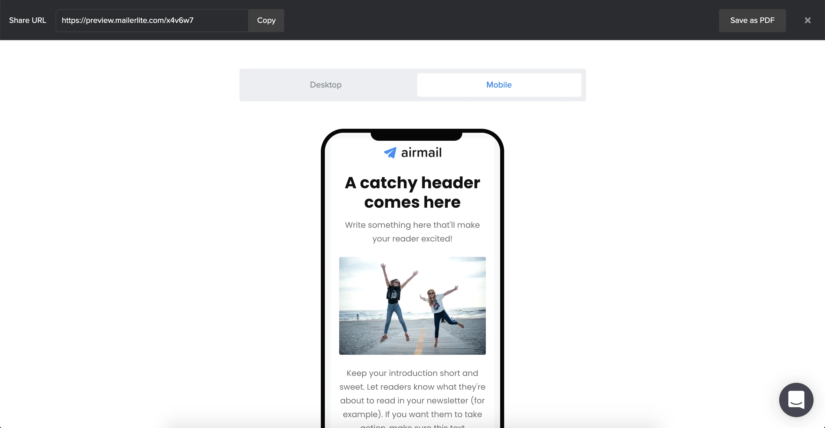
It is possible to preview the mobile view of your newsletter in both our Drag & drop editor and Simple editor.
To check how your newsletter will be displayed on mobile devices, click on the Preview and Test button on the top header of the drag & drop editor, and then click Preview mode.
Dark mode
Dark mode is a display setting that inverts traditional color palettes, presenting light-colored text and other design elements against a dark background.
Since some subscribers prefer this display style, dark mode optimization is essential to prevent broken visuals, invisible text, and lower subscriber engagement.
Support across different email clients
These clients and apps currently offer Dark mode, either through a manual setting or by automatically detecting the user's preferred color scheme:
Desktop clients: Apple Mail, Outlook 2021 (Mac OS and Windows), Office365 (Mac OS and Windows), Windows Mail
Mobile apps: iPhone Mail, iPad Mail, Gmail App (Android and iOS), Outlook App (Android)
Web clients: Outlook.com
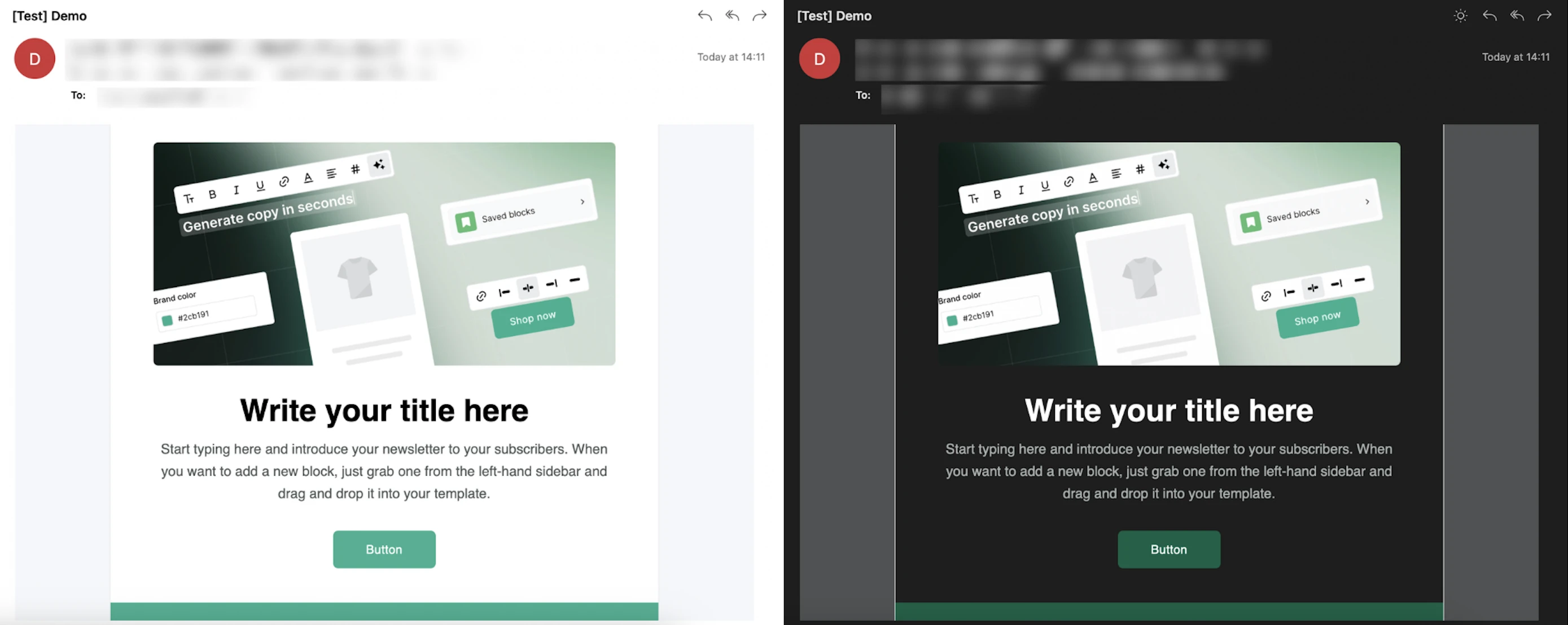
Note: Even though these email clients support Dark mode, the way they handle changes is different. For example, some invert pure white and black, others automatically lighten or darken text. It’s important to test your campaigns to ensure readability.
Best practices for designing emails in Dark mode
Ensure high contrast. Make sure your text stands out against the background in both light and dark modes.
Design with midtones. Stick to a mostly midtone palette so your content stays visible against both light and dark backgrounds.
Avoid thin fonts. Light text on dark backgrounds can impact readability, and by using a thin font, you can make it harder for subscribers to read your email.
Optimize your logos and other images. For transparent PNGs with dark text, add a translucent outline to keep them legible.
Adjust style via code. For more control, developers can use the @media (prefers-color-scheme: dark) CSS query to create specific styles for dark mode.
Test your emails across different environments. Preview your emails in multiple settings before sending. You can use Litmus to see how your email renders across 100+ clients and devices.
💡 Find more tips on our blog: How to create a responsive email template from scratch