10 best practices for designing email graphics that impress
 Jen, Milda and Izabella (People and Culture)
We unveiled our brand new Canva integration earlier this year. To celebrate its release, we asked the Canva team to share some best practices that will help you create eye-catching graphics for your emails.
Use these tips to create campaigns that stand out and your subscribers love. You can then import the graphics straight to MailerLite from the Canva editor using our integration and add them to your messages with our brand-new drag-and-drop email builder.
Read on to discover Canva’s top 10 tips for designing email graphics. 👇
1. Design graphics with email layout in mind
When designing graphics optimized for email, it’s best to have the overall layout and accessibility of your message in mind. One key factor is to get a good balance between text and graphics. The most commonly recommended text-to-graphics ratio is 60:40 in favor of text.
You can also look at our email template gallery to see example newsletters with optimized layouts. We've added some of our favorite designs below.
There are several reasons why you shouldn’t go beyond this ratio. For one, not all mailbox providers will display your graphics the way you intended. Some may even block them from loading. Such misfires can discourage subscribers from reading your email and may even prevent them from opening your future messages.
Focusing too heavily on email graphics can also make your images inaccessible to people with disabilities who use screen readers to read emails. This is why it’s important to add alt text to your images as screen readers see this text and can provide context to the recipient. Read more about how to create accessible emails here.
2. Choose the right size and file format for your image
Large images can be slow to load when the recipient opens them. This results in a poor reader experience that can lead people to stop interacting with your messages.
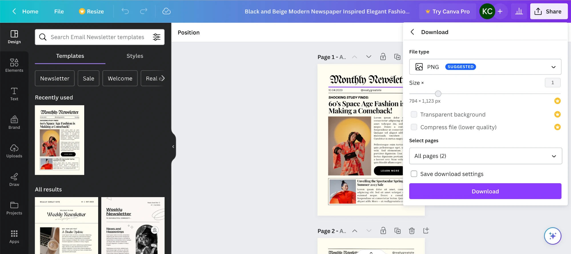
To prevent this from happening to your email graphics, design high-resolution images in a compressed file format like PNG or JPG. Keep your file size under 1MB so email providers can load your graphics properly.
If you’re designing your email graphics with Canva, you can download your design as a PNG or JPG and even compress the file should it exceed 1MB.
3. Design graphics that fit your branding
Your email graphics should represent your company and be consistent with the overall visual identity of your brand including your colors, font choices, and imagery.
Consistency across all platforms, including email, helps generate better brand awareness and recall among customers and subscribers. It also helps streamline your design process, as it limits your aesthetic options.
Canva’s brand kit is an easy way to keep track of your brand assets such as its color palette, logos, icons and imagery. Include brand guidelines on how to use these assets when creating designs, including your email graphics.
You can also use the global design options in the MailerLite editor to ensure all elements in your email have consistent colors, fonts and designs without having to choose the right ones every time. You'll work faster and create better-looking emails!

4. Use typography to make graphics more visually dynamic
Adding text to your images can communicate a message and make your email graphics more interesting. But there are plenty of best practices you should follow when adding text.
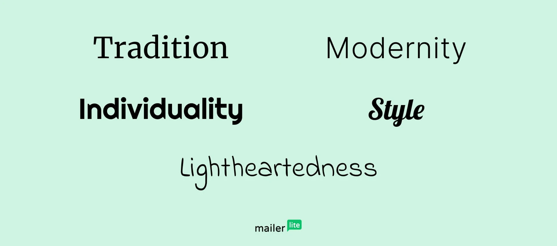
First, be sure to choose typography that represents your brand voice and matches the message of your email. See some examples of how different fonts portray different moods in the image below.
Also, consider using a maximum of three fonts in your graphics to prevent them from looking too cluttered. Choose a display typeface for headings and text fonts for subheadings and body copy. Be sure to choose fonts for your graphics that complement the ones you use for your email text.
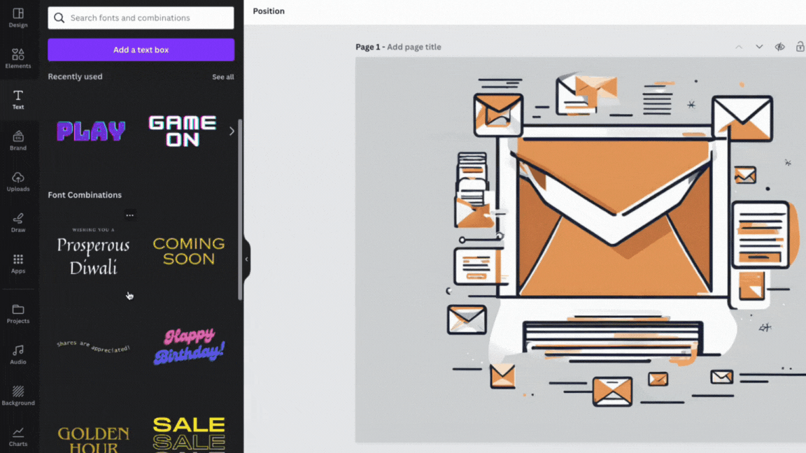
You can use Canva’s pre-existing font combinations to find beautiful pairings. To see these font combinations, refer to the left side of the online editor, click Text, and scroll down to find the selection.
5. Use a clear visual hierarchy
Visual hierarchy is a design principle that arranges elements in order of importance to make information easy to read.
While visual hierarchy can be complex, there are some simple steps you can follow to ensure your images follow best practices.
Ensure important elements are the focus of your graphic by making them large and placing them centrally
Make the most important text larger than the secondary text
Remember that people read from left to right and up to down and place elements accordingly
Use contrasting colors to make specific elements stand out
Use the rule of thirds, which is when you divide your graphic into 9 equal-sized squares and place important elements in the focal points where the lines intersect
Use blank space around elements in your image to make them clear and help important sections stand out
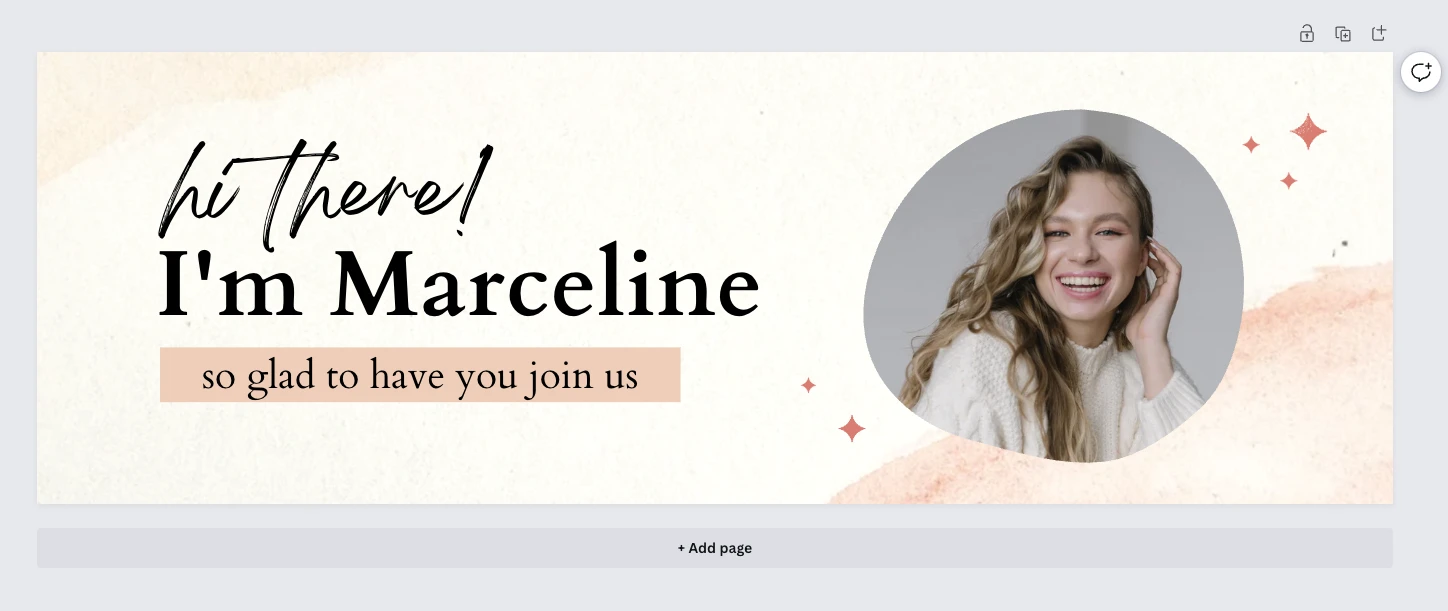
The below Canva email header template is a good example of an email graphic that follows the above principles. The result is a graphic that looks great and is easy to understand.
It’s split into thirds, uses plenty of blank space, has contrasting colors, and the most important images and text are larger than the other graphical elements.
6. Incorporate wit and humor
Wit and humor can help you connect with and provide value to your customers. Visual jokes, memes, and emojis can also add a human touch to your emails, which is a great selling point and a compelling reason for subscribers to check your email regularly.
To craft entertaining graphics, take advantage of Canva’s fully stocked media library, where you’ll find a wide selection of emojis, lighthearted stickers and illustrations. You can also add trending GIFs by accessing GIPHY directly from Canva. You’ll find this on the left side of the online editor, under Apps.
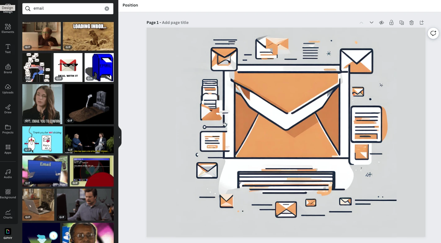
Before incorporating emojis and GIFs into your email graphics, make sure that the style of humor you use is in keeping with the overall voice and tone of your branding. If not aligned with your brand, your humor might confuse or turn off your audience.
7. Insert graphics that serve a purpose
Make sure your graphics serve a purpose in your overall messaging, whether it’s to refresh your branding, emphasize the urgency of your promo, introduce a new product, or generate excitement.
When designing meaningful graphics, it helps to get your team’s input and collaboration, even if they’re not designers themselves. Canva’s online whiteboard allows you and your colleagues to bounce ideas off one another visually.
Designers and non-designers alike can take advantage of the drag-and-drop tools and media library to brainstorm graphic ideas online, even if you’re not in the same room.
8. Avoid overly complicated background images
Adding background images to your emails is an easy way to create an email design that instantly stands out as yours.
When choosing a background image, be sure to pick a design that complements the other elements in your newsletter. This is important as the wrong design can overwhelm your email and make it hard to read. The image below is a good example of a background image that supports the rest of the email.
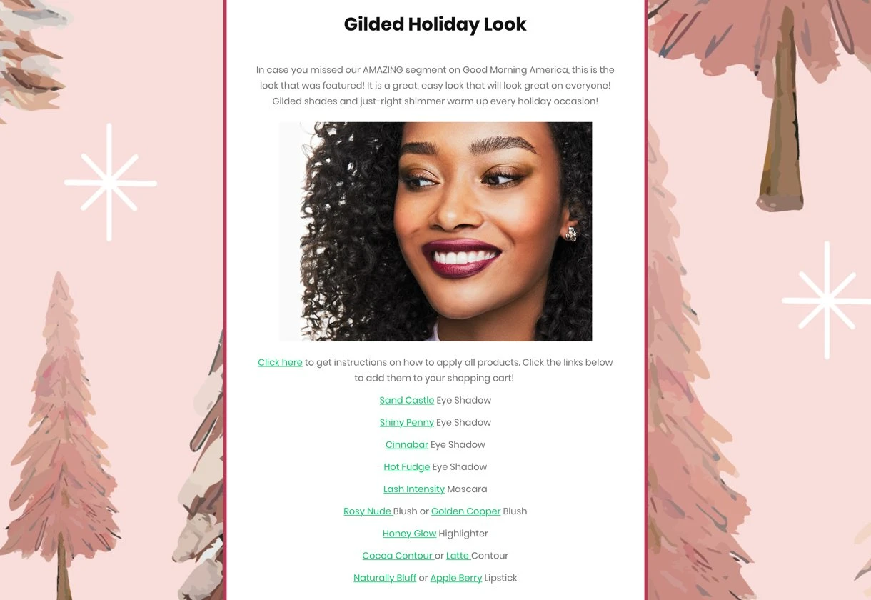
When in doubt, always choose simplicity. Stick to a neutral background image in favor of exciting but distracting textures or background images. You can also choose different background images for each section of your newsletter to ensure each part is clear.

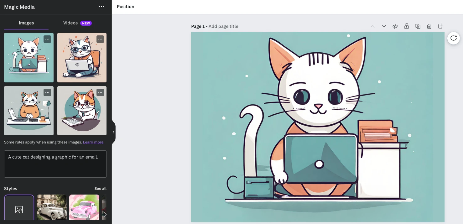
9. Use AI image generation
If you are ever struggling to find an image or graphic that is unique and matches your brand identity, just use AI to generate one for you.
Canva’s Magic Media image generation tool will create images based on any text. Access it via the Apps section of the editor, describe the content you want to produce, choose the style of image from the relevant options, and then hit generate.
The tool will create several options in seconds and you can choose the one you like. See an example in the image below.
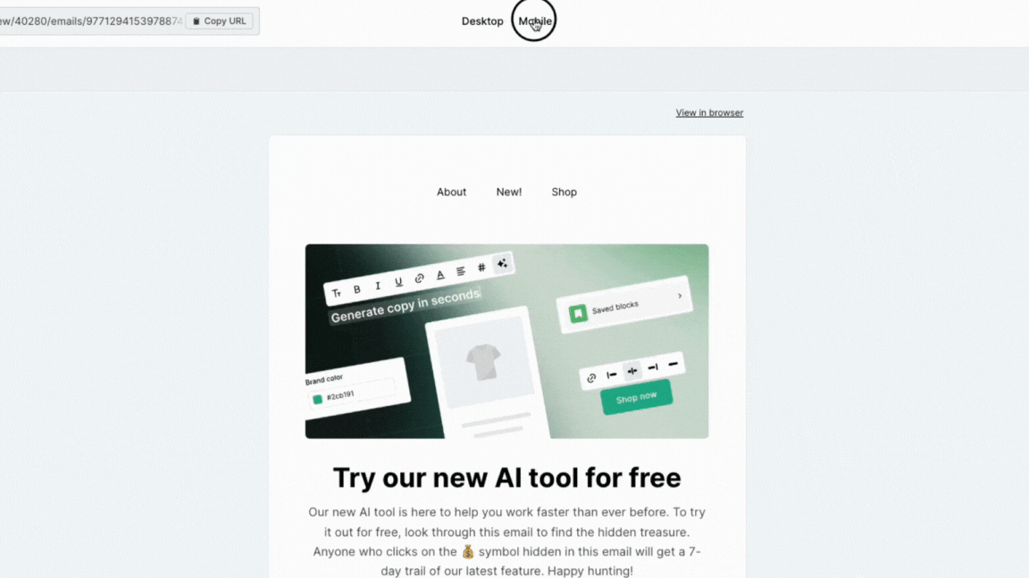
10. Make sure your graphics display well on all devices
Your subscribers likely check your emails on multiple devices. They may even use both light and dark modes to read your emails. Keep this in mind when designing your email graphics and ensure they look good on all devices.
While all emails built with MailerLite’s Drag & Drop editor are mobile responsive, the graphics you use won’t change beyond the size they are displayed in. While this typically isn’t a problem, it can become one in certain situations, such as if the image contains text that is hard to read when the image is resized for mobile.
With this in mind, be sure to preview your messages on both desktop and mobile before hitting send. You can do this via the MailerLite preview button or by sending a test email to your account and opening it on your phone and a computer with a larger display.
Canva plus MailerLite equals beautiful emails
Those were Canva’s 10 top best practices for creating email graphics. Use them to craft email graphics that resonate with your target audience and then add them to your MailerLite campaign in seconds with our new integration.
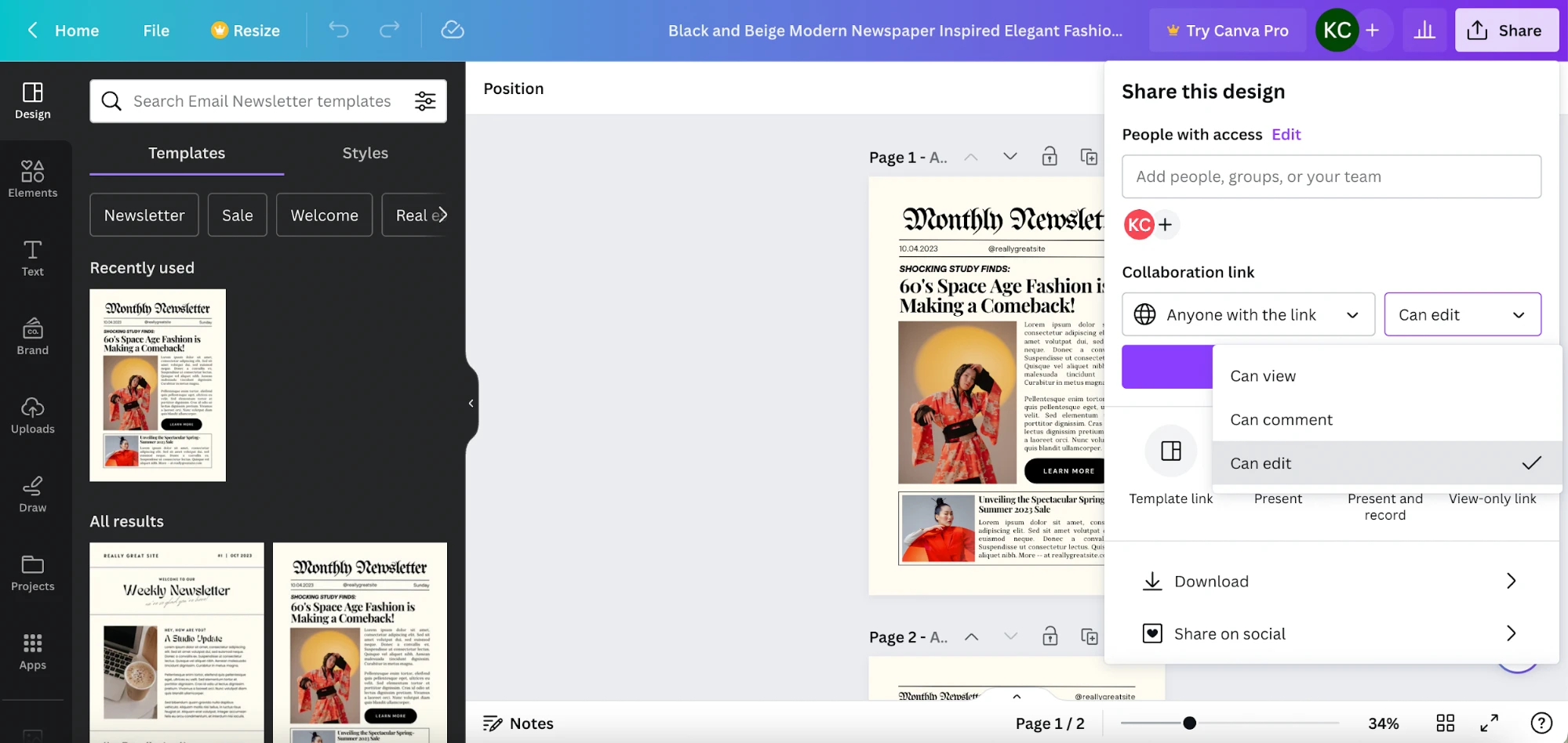
Access our Canva email integration by heading to the sharing menu in Canva’s design editor, hitting more, and then searching for MailerLite. You can then connect your account and begin exporting images straight to your file manager for easy use in your next campaign.
Start sending today
Sign up for a free MailerLite account to connect to Canva and send up to 2,500 emails per month. You’ll also access our drag-and-drop email designer with AI features, and a whole suite of powerful email marketing tools.