New custom reports: Intuitive tools to become a more informed marketer
 Piotr, development team, and Yusuf, SRE team.
Your marketing data is full of stories, but it’s hard to see the plot when you’re looking at one campaign at a time.
That’s why we’re excited to introduce custom reports, an advanced analytics tool designed to turn scattered metrics into clear trend lines.
Whether you’re a solopreneur trying to find your most engaged audience, a marketing manager who wants to see what works, or an agency lead reporting to clients, you can now get the data you need to hit your goals faster.
And thanks to visual controls that will feel familiar the moment you open them, you can create reports in minutes that will provide insights for years.
Your new custom reporting tool at a glance
Create custom reports in MailerLite that highlight your most important metrics
Build quickly with visual filtering tools and drop-down menus
See detailed insights without diving into each campaign
Select 2 metrics to display on a clear, dynamic graph
Focus on what matters by filtering data by campaign type, period or subscriber group
Save multiple reports tailored to different stakeholders or use cases
Export the data to share reports with clients or your boss
The feature is currently in beta and available on all plans
How MailerLite’s custom reports help you stay more informed

Your custom reports tool is packed with features to help you understand your data and make smarter decisions. Here are the highlights!
Spot patterns with dynamic graphs
Spot patterns in an instant with real-time graphs that highlight 2 metrics concurrently. Choose data around engagement, deliverability or orders and see how they are impacted by time or campaign types.
See only what you need with filters
Use filters to see the exact insights you need for the specific report. Narrow the data down by campaign, campaign type, audience or time frame.
Track how emails lead to revenue and sales
Email is one of the most effective ways to generate sales. Pull in data on orders, revenue and average order value to see exactly what impact email marketing has on your sales.
Save and reuse as many reports as you need
Create a report once and then save it to access insights whenever you need them. Your reports dynamically update with time, so you’ll always see the most current data for every use case.
Share and export data with a click
Export reports as CSV files or snapshots for external presentations. Your boss or clients will love the upward trend, and you’ll love how easy the report was to build.
4 reports you can create to get started asap
You can use this tool to create any report that shows what matters to your business. Here are some examples for you to try out.
See which campaigns lead to high engagement
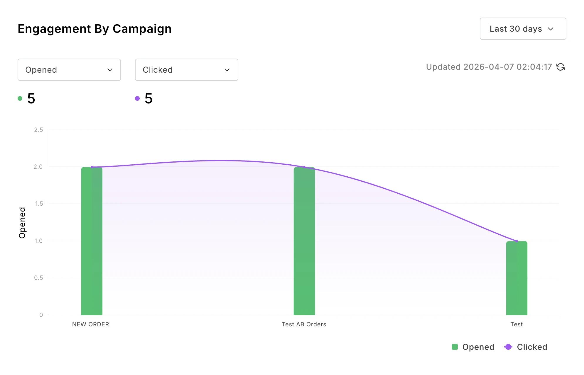
Instantly see which campaigns lead to high engagement by creating a report that plots metrics like clicks or sales against each campaign you send. Quickly identify topics and messaging your audience likes, and then create more content like this.
Name: Engagement by campaign
Metrics: Clicked, Opened
Group by: Campaign
Filter by: Your chosen campaigns or groups
Track how engagement metrics change over time
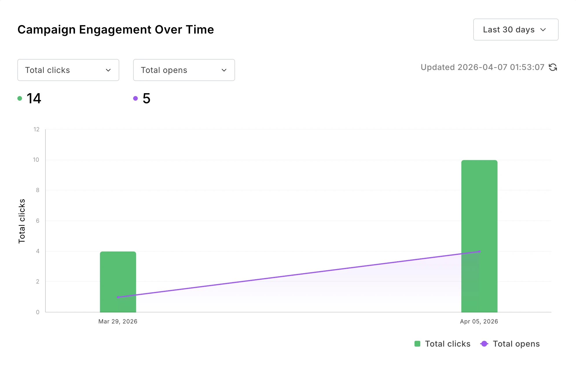
See how your email marketing changes over time. Create a report with your chosen data types and then group the campaign by time period. Notice an increase? Keep going, you're doing great! Notice a decrease? Mix things up or clean your list.
Name: Campaign engagement over time
Metrics: Clicked, Opened, or any other 2 metrics
Group by: Day, Week, or your chosen time period
Filter by: Your chosen campaigns or groups
Identify your most engaged subscriber groups
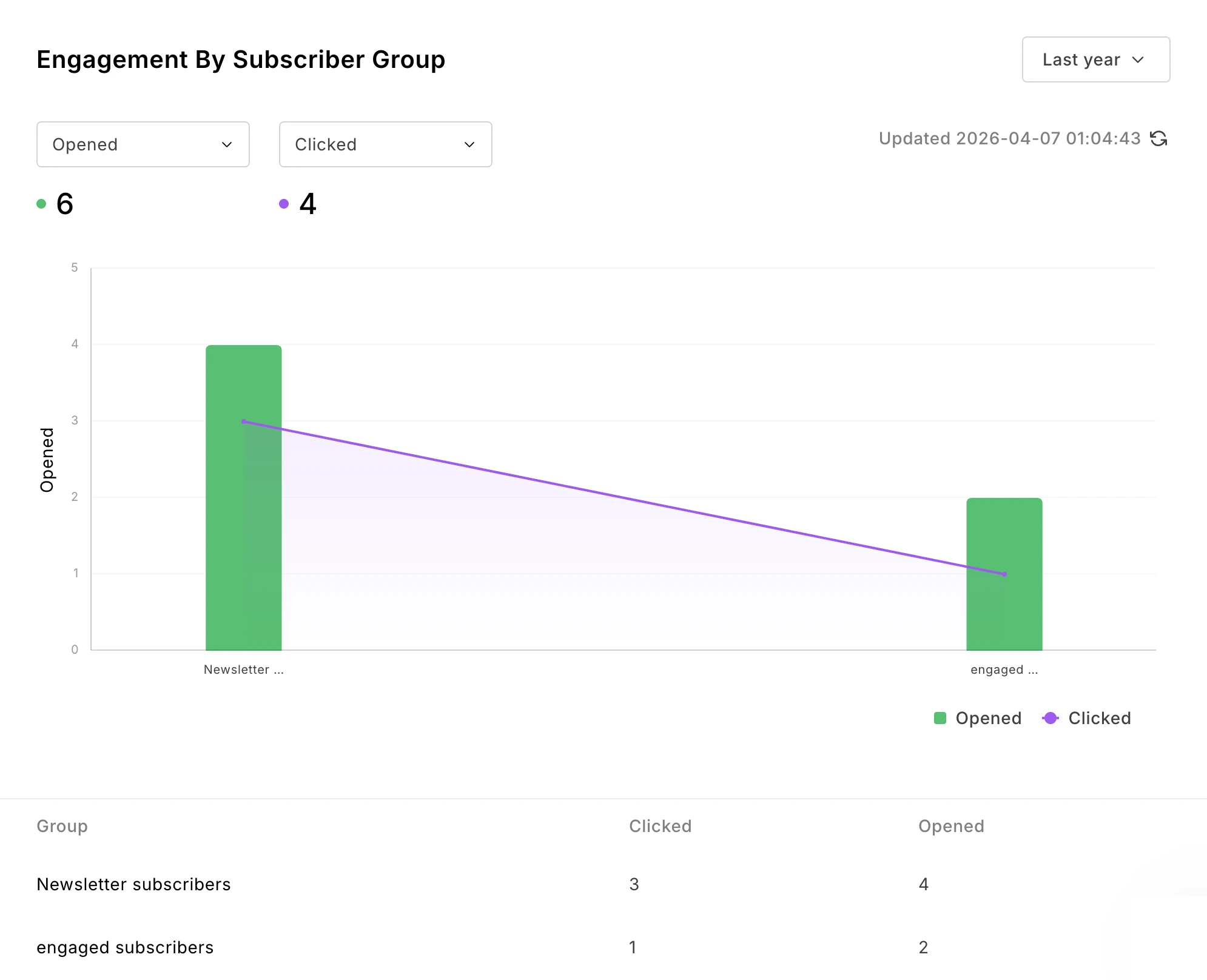
You likely have different subscriber groups based on factors like how they joined your list, their location or their interests. Find out which group is the most valuable by creating a report that shows engagement or sales data filtered by group.
Once you have the data, you can create strategies to get more people like this onto your list. If people who come from your free email course buy more than those who join via your discount offer, you know you should focus more on promoting the course.
Name: Engagement by subscriber group
Metrics: Clicked, Opened, or any other 2 metrics
Group by: Group
Filter by: Your chosen campaigns or groups
Impress your boss with sales over time
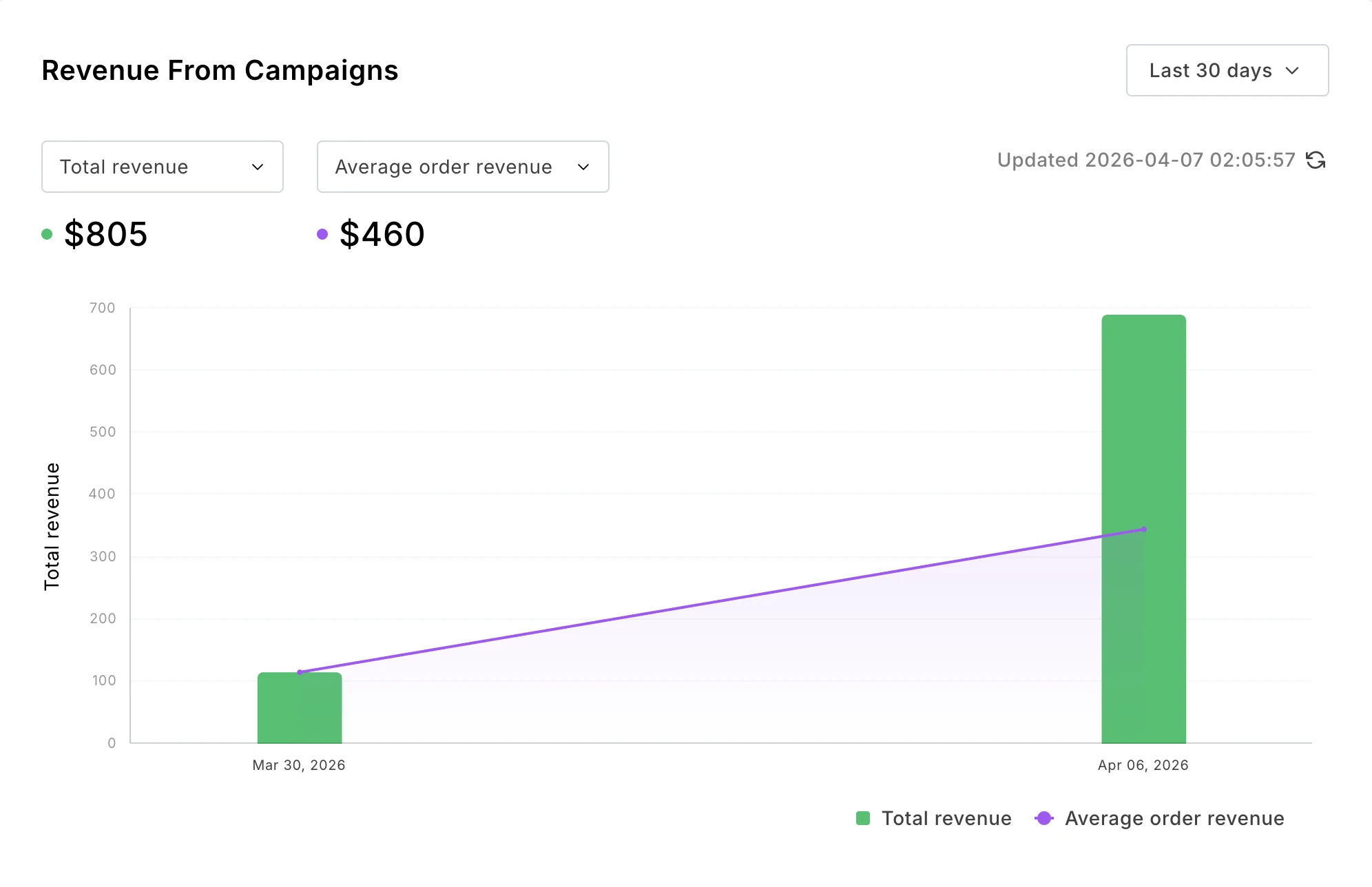
If you sell your product with our built-in digital product features or a connected e-commerce store, you can bring in sales data to see how your campaigns lead to purchases.
Choose to see data on orders, revenue or conversion rate. You can also export these insights as a CSV and email the file directly to your boss or client.
Name: Revenue from campaigns
Metrics: Total revenue, Average order revenue
Shop: Choose which connected shop you want to see metrics for
Group by: Day, Week, or your chosen time period
Filter by: Your chosen campaigns or groups
How to create a custom report in minutes
The above reports are just examples. You can create any report that highlights the data you need.
Here’s how:
1. Open the reports dashboard
Head to Campaigns and then click on Custom reports. If this is your first report, you can create the report from the options in the sidebar. If it’s not your first, you’ll see a list of reports and the option to create a new one.
2. Choose the metrics you want to track
Give your report a name and then choose the metrics that you want to track. This is what you’ll see on the y-axis. Choose from engagement data like clicks or opens; deliverability data like spam complaints and bounces; or e-commerce data like orders and revenue.
Display up to 2 metrics at a time; if you select more, pick which ones to display from within the report using the drop-down menu.
As you create the report, your choices will immediately be reflected in the preview. It’s easy to keep customizing the report until you have the exact data you need.
3. Choose how to group the data
This is what you’ll see on the x-axis. Options include campaign, campaign type, subscriber groups, or time period.
4. Select data filters
Choose whether to filter the data by campaign, campaign type, or groups. The report will only show relevant data.
At this point, you can also use the time period drop-down menu to decide how long you want to see data for. Choose from the last 7 days, 30 days, 90 days, 6 months, year, or simply select the exact dates you want to include.
5. Save the report
Once you're happy, hit save to access the report at any time. When you enter the dashboard, you’ll see all your saved reports.
You can also export the data from each one as a CSV file or snapshot to view it in other tools.Dive deeper into analytics with our pro reporting tools
Dive deeper into analytics with our pro reporting tools
We’ve recently put a lot of work into our analytics and reporting features. MailerLite users can now access some of the industry’s most advanced reporting features, such as:
Email marketing MCP server: Connect your email marketing data with AI tools like ChatGPT and Claude to get AI-powered analysis and suggestions. We recently added an interactive UI to make the tool even easier to manage
Comparative reporting: Choose which dates to see data for and then compare it to a previous period. Easily available from your main dashboard
Automation visibility: Instantly identify your best-performing content by open rate and CTOR, or pinpoint friction with unsubscribe data
Unsubscribe reasons: See a helpful pie chart that clearly shows all the reasons given when someone leaves your list
We have plenty more planned, too. Keep an eye on our newsletter, social channels and in-app notifications to hear about the changes as soon as we make them.
Create your first report today
This tool is so easy to use that you can genuinely have your first report set up in minutes. Just head to the Campaigns section of your dashboard and then hit Custom reports to get started. This feature is currently in beta and is available on all plans.
Start with a free trial
Not yet a MailerLite customer? Get a free trial to access all our features, including customer reports and other exciting new features like bookings, digital products, and our revamped automation builder. Sign up at the link below!