23 e-commerce conversion rate optimization ideas to turn clicks into customers
 Renata, compliance officer.
Same traffic. More sales. An effective e-commerce conversion rate optimization strategy can help you earn more from visitors to your store by increasing the percentage of people who buy.
Start by making small tweaks to your site and seeing how they impact your conversion rate. After running a few tests and stacking up some successes, you’ll see a big difference in how your page performs.
The tricky part is knowing what you should be experimenting with. In this article, we’ll share 23 elements you can test to increase conversions on your page.
What is conversion rate optimization?
Conversion rate optimization (CRO) is the process of improving a website, landing page, or digital marketing campaign to increase the percentage of visitors who take a desired action. This could be making a purchase, signing up for a newsletter, filling out a form, or any other goal.
A good CRO strategy changes a single element in a page and analyzes how this impacts user behavior. If the change is positive, leave it in place and move on to the next one.
Do this several times at each stage of the funnel and you can make a big difference to overall performance. You’ll get more sales from the same traffic, making your e-commerce funnel more effective and increasing revenue without spending extra on ads.
What is a conversion in e-commerce?
A conversion in e-commerce can be a variety of things. The main goal of an e-commerce website is often a sale, so many people consider a sale to be a conversion. But you can also break the sales process down into a series of individual goals that are specific to the website page you’re focusing on.
For example, a conversion could be when an online store visitor:
Signs up for an email newsletter
Clicks a link to a product page
Adds a product to the basket
Clicks through to the checkout page
Completes a purchase
Each page you test will have a different conversion goal that you need to track. The key is to identify the goal of each page.
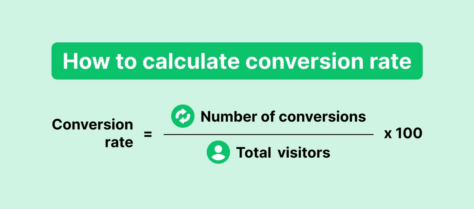
How to calculate conversion rate
E-commerce conversion rate is the percentage of visitors to your e-commerce site who complete the desired action.
You can calculate this by dividing the number of people who take the desired action by the number of visitors to a page and then multiplying the result by 100 to get a percentage.
For example, if 100 people visit your page and 2 convert, your conversion rate is 2%. This is because 2 divided by 100 is 0.02, which, when multiplied by 100, equals 2, or 2% when converted into a percentage.
23 ways to increase e-commerce conversion rates
Here's a list of 23 conversion rate optimization strategies. What’s more, we’ve divided the tips into 6 sections so you can focus on the particular parts that you’re looking to improve
Make buying easy
The easier it is for people to buy, the more likely they are to do so. Here are 3 factors that you can test to streamline the buying process.
1. Simplify the checkout flow
Ensure there are as few obstacles as possible between someone landing on your site and hitting buy.
Don't ask for unnecessary information during the buying process
Declutter your checkout page so it only includes vital information
Provide a clear path to purchase by indicating how many steps are left—like billing, shipping, and payment
The fewer steps people have to go through, the fewer chances they’ll have to quit the process.
2. Offer more payment methods
Catering to everyone’s payment preferences ensures that the maximum number of visitors can buy from you.
Most shops include popular payment options like credit card, Apple Pay and PayPal. Platforms like Shopify and WooCommerce make adding these options easy. However, there could be a country-specific method you’ve overlooked.
For example, in South Korea, many people use the e-commerce payment system Naver Pay or Kakao Pay for online shopping transactions. You need to offer this option if you want to sell to people located there.
You can also test adding buy it now pay later solutions like Klarna to your checkout page. These reduce the amount that customers have to pay upfront, which could make buying more attractive.
3. Allow for guest checkouts
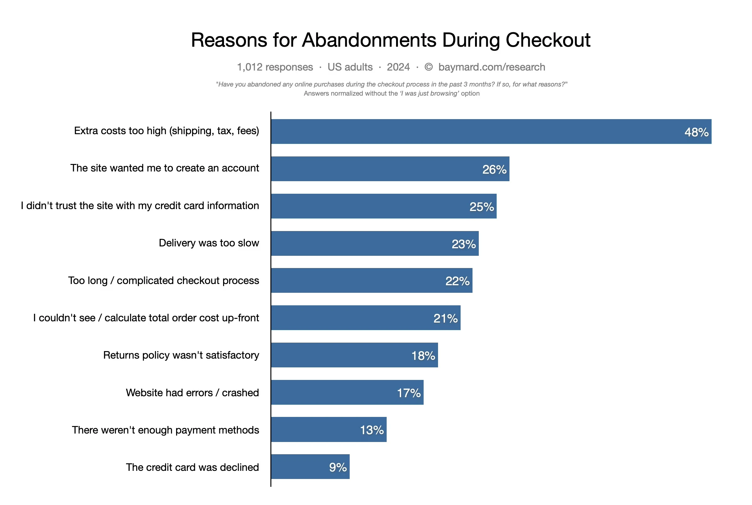
A 2024 study by the Baymard Institute found that needing to create an account was one of the top reasons people abandon a shopping cart.
With this in mind, ensure that people can buy from you without signing up. It might seem like a missed opportunity to create a longer-term relationship, but you can always send post-purchase emails explaining the benefits of joining up.
If you use MailerLite landing pages to sell your products, people can buy without creating an account using our e-commerce integrations. Additionally, e-commerce platforms like Shopify, WooCommerce and Prestashop allow you to offer guest checkouts.
Build trust and credibility with potential customers
People only buy from brands they trust. This can be a problem for new companies without an existing reputation. Follow these easy-to-implement strategies to boost conversions by showing website visitors that you can be trusted.
4. Add genuine social proof
A study by Spiegel Research found that displaying reviews increased the likelihood of someone buying your product by 270%. The impact was even bigger for higher-priced items. In these cases, conversions increased by 380%.
With that in mind, build trust and credibility by adding product reviews, social media posts, testimonials, and other forms of social proof to your pages.
If you don’t yet have any reviews, contact your existing customers to ask for some. Send an email with a link to a survey or a review platform where people can share their experiences.
You can also set up a review request email automation that automatically goes out after someone buys a product in your online store. Read this article to find out how to request reviews and access templates to get set up right away.
5. Share balanced reviews
It can be tempting to only show good reviews. But this might not result in the highest conversion rate: A study in the International Journal of Advertising found that higher star ratings don’t always result in more sales.
The probability of purchase increased until a product had a rating of 4.2 to 4.5 stars. After that, the chances of someone buying actually decreased.
The study suggests 4 reasons why this might be the case:
Two-sided messages can build credibility among consumers.
Very positive reviews may be viewed as unreliable.
The existence of neutral or negative reviews proves the company isn’t hiding anything.
Extremely positive or negative reviews are less useful than balanced ones.
Don’t artificially lower your rating if you have a higher rating than the optimum suggested by this study.
But don’t go out of your way to hide neutral or negative ratings if you do get them, you may find that they boost conversions!
6. Show people that you’re trustworthy
25% of people who abandon a cart do so because they don’t trust the site with their credit card. Building trust can, therefore, increase your chances of getting conversions.
There are plenty of ways to build trust among potential buyers. Consider adding some of the following trust signals to your product or checkout pages:
Product guarantees
Badges and seals from trusted platforms
Detailed product, shipping and return policy information
Banking or payment service badges
Support links
Contact information
Links to an about us page
Number of customers you’ve sold to
SSL certificates for payment pages
Security system badges
These tips are especially useful for new e-commerce brands that lack a reputation. But they can impact established brands too.
Incentivise people to purchase
Having a winning product is the best thing you can do to get people to buy. But adding an extra incentive can make hitting that checkout button extra appealing.
7. Make the need to buy more urgent
Adding urgency to your offer gives the visitor a reason to make the purchase quickly, rather than waiting. It’s an established method of generating sales, you should experiment with it if you haven’t already.
Common ways to build urgency include:
Adding limited-time offers: Offering a discount if the customer buys in the next 24 hours
Highlighting stock limits: Highlighting when a product is almost sold out
Releasing limited editions: Telling people that you manufactured a limited run and won’t be making any more of a particular item.
MailerLite customer KC Tool does the first example above to great effect. The brand offers a 24-hour discount on a different tool every day. The offer frequently sells out! Read more about KC Tool’s e-commerce strategy here.
8. Offer coupons or discounts
There’s nothing like offering a discount to persuade people to convert. Whether it’s an early bird offer or a flash sale, savings can influence people’s purchasing decisions.
Try giving people a limited time frame to use your discount or coupon code to increase the sense of urgency they feel when buying. Also, be sure to test which types of discounts work best for your target audience.
Notion template brand Pathpages often sends a discount to customers. Founder Modest Mitkus said, “When it comes to generating sales, nothing beats a discount or promotion.” See how he uses them to boost sales in this case study.
9. Give people free shipping
According to a study by Power Reviews, 94% of shoppers say free shipping is an important consideration factor when shopping online.
If you currently charge to ship orders, experiment with offering the service at no cost to see if it boosts conversions. You may find that the revenue from the extra sales makes up for the slight decrease in profitability.
10. Use a pop-up
Pop-ups can increase conversions by drawing the visitor’s attention to a particular offer.
Common ways to use a pop-up to increase conversions include:
Giving a discount to people who sign up for your newsletter
Using spin-the-wheel pop-ups to let people win a discount
Highlighting the limited nature of an offer with a countdown timer
Using exit intent pop-ups when site visitors go to click off the page
You can easily add a pop-up to your e-commerce store using a pop-up building tool like MailerLite.
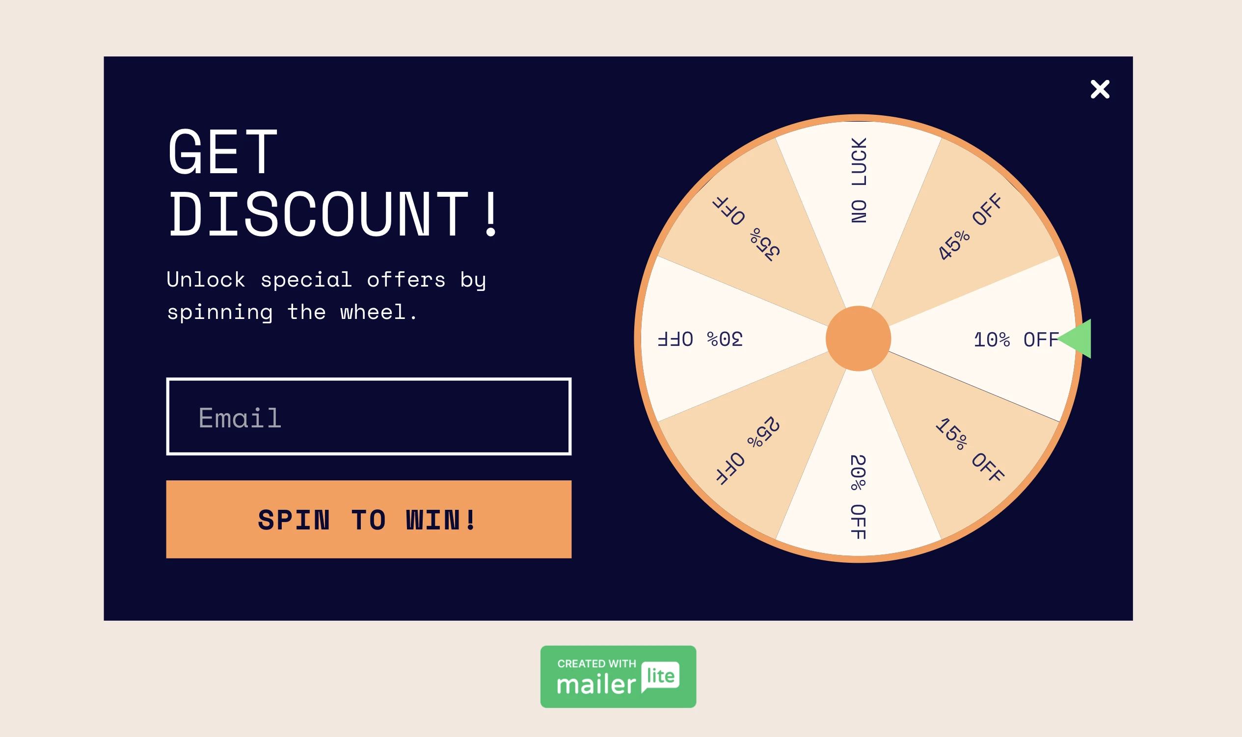
Just design the pop-up in our pop-up builder, choose when and where to show it, and follow the instructions to set it live.
Optimize the page content for conversions
Focusing on design and messaging can make a big impact on a page’s performance. Here are some elements to consider testing.
11. Design CTAs that stand out
Your calls to action (CTA) signpost your visitors toward making a purchase. An effective CTA button has 3 main elements:
Design: CTAs can’t be inconspicuous. Choose a color that pops against the background of your website.
Placement: Position CTAs where they’ll naturally catch the eye without disrupting the user experience.
Wording: Ensure the text is compelling, clear and concise.
CTAs are the perfect element to test with A/B testing. Just create 2 or more different versions to see which one works best.
12. Use clear language
When writing product descriptions, use clear language that consumers understand.
This article in the Journal of Consumer Psychology found that when a product description included a word that the consumer didn’t understand, they assumed the product would be less typical of its category.
This resulted in them perceiving the product price to be higher and the quality to be lower. Both factors negatively impacted purchase desire and intention, meaning people were less likely to convert.
Types of descriptions that may be hard for consumers to understand include:
Real descriptors that aren’t widely understood: People may not know that the term “citra” in your “citra-hopped pale ale” refers to a type of fruity hop
Jargon and technical terms: People are unlikely to know that a biopolymer compound is a more eco-friendly type of plastic
Made-up terms: The term “Vortex gaming keyboard” sounds cool, but the word “vortex” doesn’t mean anything in relation to a keyboard
If your descriptions include these kinds of words, try removing them to see if conversions increase.
13. Simplify the main navigation
Make sure your navigation menu is clear and straightforward so people can easily find what they are looking for.
You may benefit from removing the navigation altogether on specific product landing pages. That’s what YuppieChef did, and they increased conversions by 100%, from 3% to 6%.
We wouldn’t recommend this for most e-commerce stores as navigation can improve the user experience, and removing it can lead to bounces. But you can always run a test to see if it works with your audience.
14. Encourage a which to buy mindset
If you have young kids, you know that a good way to get them to do something is to give 2 options to choose from, rather than a single option. The idea is that the kids focus on choosing from the options available rather than choosing whether or not they like the single option.
It turns out that this can be an effective way to generate conversions, too.
This report points to several studies that discovered that framing an offer as a choice between 2 items, rather than a choice of whether or not to buy a product, resulted in people who see the offer being more willing to buy the product.
A simple way you could experiment with this is by including 2 or more products in your promotional landing pages, ads or emails. You could then use language that encourages people to choose between the options rather than persuades them to buy.
15. Set up an A/B test
When making changes to increase conversions, use A/B testing (also known as split testing) to see the impact of your changes.
The way it works is that you make two versions of the page you want to test. You then split traffic between each version to discover which one performs best. This lets you get results faster than if you test each element independently to discover its impact.

The best thing about A/B testing is that you can continually test different things. After several tests, you’ll end up with a process that is far more effective than before you started testing.
There are several tools that enable you to run A/B tests. MailerLite lets you run A/B tests on any landing page, as well as emails, pop-ups, and automations. Plus, there are plenty of tools that let you A/B test pages of different e-commerce platforms.
16. Increase the font size of comparative prices
Not all CRO experiments have to involve big changes. This study suggests that increasing the font size of either the regular price or the sale price when running a discount can increase people’s likelihood of buying by drawing their attention to the larger price.
When the regular price is presented in a larger font, the study found that the customers focus on the perceived size of the discount, making the savings seem bigger. This can be useful in markets when there isn’t much price variation and the market has a generally accepted price for a product.
On the other hand, when the sale price is presented in a larger font, the intrinsic value of the deal increases. The product seems valuable and affordable, even if people don’t know what the original price is. This is useful when you have a price advantage in competitive marketplaces.
Give people all the information they need to buy
Increasing conversions is sometimes simply a case of better informing your customers about why they need your product. Follow these tips to get this right.
17. Optimize product images and descriptions
Do your product pages show how awesome your products really are? Online shoppers want to know exactly what will be delivered to their doorstep before completing their order.
The key is to make sure that people’s expectations are met. Open a product page and ask yourself these questions:
Do I have high-quality images?
Do I show different angles of the product?
Would a GIF or video help to show the product in action?
Can I add more diverse models (for clothing)?
Can I include more details in the product descriptions?
Do I have customer pictures that show the product in real life? (e.g. Instagram tag feed)
Are there testimonials or customer reviews I can implement?
If your page is lacking any of these elements, consider adding them and then testing to see if doing so boosts conversions.
18. Include videos
Videos are a great way to educate your customers and boost e-commerce sales. 73% of online consumers say they are more likely to make a purchase after watching videos that explain how the product works.
If you have any videos that could help people make a buying decision, add them to your pages. Consider adding videos about product features, tutorials, interviews, reviews, or anything that can make them more likely to convert.
19. Create an FAQ
This 2023 study by Power Reviews found that there was a staggering 177.2% increase in conversions among consumers who interacted with FAQs on product pages.
It’s easy to see why. People often have questions about products they want to buy; if you can answer them, they’re more likely to go through with the purchase.
To create an FAQ, first identify the questions that people have by looking at support tickets, survey responses, keyword reports, or any other reports that offer customer insights. You can then create a list of these questions and answers at the bottom of relevant pages.
It’s also good practice to add support links or contact information, in case someone’s question wasn’t answered in the FAQ.
20. Let people access support
FAQs can be useful, but adding live chat to your pages makes it even easier for people to get the help they need.
Live support is especially useful if your product has a high price tag since people who spend more want to be more sure about the product they are buying. The downside to adding live support is that you’ll need someone available to answer the queries. But if you have enough traffic or a high enough price point, then it could be worth it.
An alternative is to add a chatbot or chat widget built with a tool like Intercom. People can use these tools to easily search for relevant information and leave a message if they can’t find the answer.
Optimize the customer journey
A sale typically requires multiple interactions with your brand. From clicking on an ad to viewing a product and then going through the checkout process. Make sure you optimize each step.
21. Ensure conversion funnel continuity
Think about how your pages look to people who visit from one of your promotional campaigns.
For example, if you run paid ads using a particular product image, ensure that’s the first image people see when they click through to the page. Showing people the product that caused them to click on the ad lets them know they’re in the right place immediately.
Likewise, if your email newsletter highlights a 20% discount, make sure it’s obvious how people can access the offer when they click through the email to visit the page. Since that’s what made them click, they will likely bounce if they can’t see it.
It’s also useful to send people to pages related to the campaign they clicked on. If you’re promoting a product, people should land on the product page rather than your homepage or a category page.
22. Recover abandoned carts
Not everyone who adds products to their basket will end up buying from you. Many people ditch their cart midway through the buying process. This is known as cart abandonment. The good news is that there’s an easy-to-implement fix: abandoned cart emails.
Abandoned cart emails are triggered when a logged-in user or someone who has added their email during the buying process goes on to quit the page after adding items to their carts. The automation waits for a predefined amount of time, usually an hour, before sending an email reminding the person about the product and linking back to the cart.

These emails are proven to be effective at generating sales. Our e-commerce email marketing data shows that 53% of people who receive these emails open them, and 12% click through to the store.
What’s more, it’s easy to add follow-up emails that go out in the days after the abandonment event, reminding people about the purchase.
Note: MailerLite also offers an abandoned checkout template that you can use when a logged-in shopper proceeds to the checkout but doesn't finish the purchase.
Want to send better e-commerce email campaigns?
Integrate MailerLite with platforms like Shopify, WooCommerce, PrestaShop and BigCommerce and use customer data to send more personalized, tailored e-commerce email campaigns that drive conversions.
23. Optimize website speed
Increasing page speed can be a total game-changer if you’re currently suffering with a slow site! A site that loads in 1 second has an e-commerce conversion rate 2.5x higher than a site that loads in 5 seconds.
With that in mind, ensure that your page loads as fast as possible. You can typically do this by limiting resource-heavy content and using a fast hosting platform for your e-commerce website.
4 CRO tools to boost performance
Tracking performance is an essential part of CRO. If you don’t do it, you won’t know the impact of your optimization efforts.
Here are 4 tools that show how the changes you make impact your conversion rate.
Google Analytics 4
Google Analytics is the most popular website analytics tool since it’s free for most users and relatively easy to get set up. It offers tons of metrics about how people engage with your website.
You can also set up custom events to track any kind of conversion, whether that’s link clicks, purchases, or other metrics.
Hotjar
Hotjar is a super useful tool for CRO since it creates click maps that show exactly which parts of your page people interact with. You can see the elements that push people toward and away from conversions.
The tool also has a useful session recording feature. This automatically makes a video of important user sessions so you can see the exact steps people take on your website.
CrazyEgg
CrazyEgg is similar to Hotjar in that it creates heat maps and user session recordings. It also allows you to set up A/B tests on WordPress, Wix, Squarespace, Shopify, and other website-building platforms.
Optimizely
Optimizely offers several tools you can use to increase conversions. As well as A/B testing, it has multivariate testing, which lets you test multiple changes to your pages at once, allowing for faster optimization.
The tool also has website personalization features so you can create more targeted experiences that lead to conversions.
Which e-commerce CRO metrics should you track?
All CRO tests require a primary metric. But, secondary and engagement metrics can also give essential extra insight.
Primary metrics
When running tests for CRO you will always have a primary metric that you are trying to improve. These are closely tied to the e-commerce business value, and they are the main conversion goal of your page.
Some common examples include when someone:
Adds to a cart
Clicks buy
Completes a form
Clicks to the product or checkout page
Clicks on a specific link
Cart abandonment rates
Decide on your primary metric by thinking about what the page’s main goal is. This is what you should focus on in each test.
Secondary metrics
Secondary metrics can highlight unintended consequences of your testing. Track a few of these to gain extra context into how your testing impacts conversions.
For example, you may find that a discount coupon successfully increases the number of people who add a product to a cart. But if secondary metrics show more buyers dropped off later in the process or that the changes resulted in a lower overall average order value (AOV), you may not want to implement the discount more widely.
UX and engagement metrics
Website usability and engagement metrics show how your tests impact a page’s engagement. Engagement metrics can often be leading indicators that point the way to more conversions.
For example, you may find that while a change didn’t increase conversions, it did increase the amount of time people spend on a page and decrease the number of people who bounce.
In this case, you could assume that your changes positively impacted the customer experience. It may just take a couple of tweaks to get the result you want.
Here are some engagement metrics to track.
Bounce rate: The percentage of people who leave a page without taking any further action
Average session duration: How long people spend on a page
Average pages per session: The number of pages people view when they visit your website
Scroll depth: How far down your page people view before exiting
The exact definition of each metric will vary depending on the analytics tool you use.
Which action will you take today to increase conversions?
Now that you’ve gathered many hacks to improve your e-commerce conversion rate, it’s time to put them into action!
Not every tactic will instantly give your metrics a boost, but trust us when we say that everything adds up and you’ll reap the benefits of a streamlined and high-converting e-commerce store over time.