Note: If you're a Legacy (Classic) user, please log in to your account to access the dedicated Legacy (Classic) Help Center.
Accessible content is content that everyone can navigate and understand, including those with visual, auditory, physical, or cognitive disabilities. Creating such content ensures your message reaches every reader while meeting key global compliance standards.
In MailerLite, you can build accessible campaigns, websites, and forms by adjusting how you present your text, images, links, and structure your content.
Write clear, scannable text
Clear writing helps every reader and is essential for subscribers with cognitive disabilities and those using a screen reader.
Write short sentences and paragraphs.
Avoid jargon, idioms, and uncommon abbreviations.
Avoid writing entire words or sentences in ALL CAPS. Some screen readers announce capitalized words letter by letter, so "STOP" can be read aloud as "S-T-O-P."
Break up information with bullet points.
Keep your layout and language consistent across campaigns.
💡 Use the AI writing assistant in the Drag & drop editor to help tighten up text that’s too long or technical.
Structure content with headings
Headings let subscribers using screen readers jump straight to the section they care about, instead of listening to the whole email read in order.
Use one H1 title per email and create a clear hierarchy by using H2, H3, and subtitles.
Don't rely on bold text or a larger font size alone to signal a heading. Screen readers only recognize actual heading elements, not visual styling.
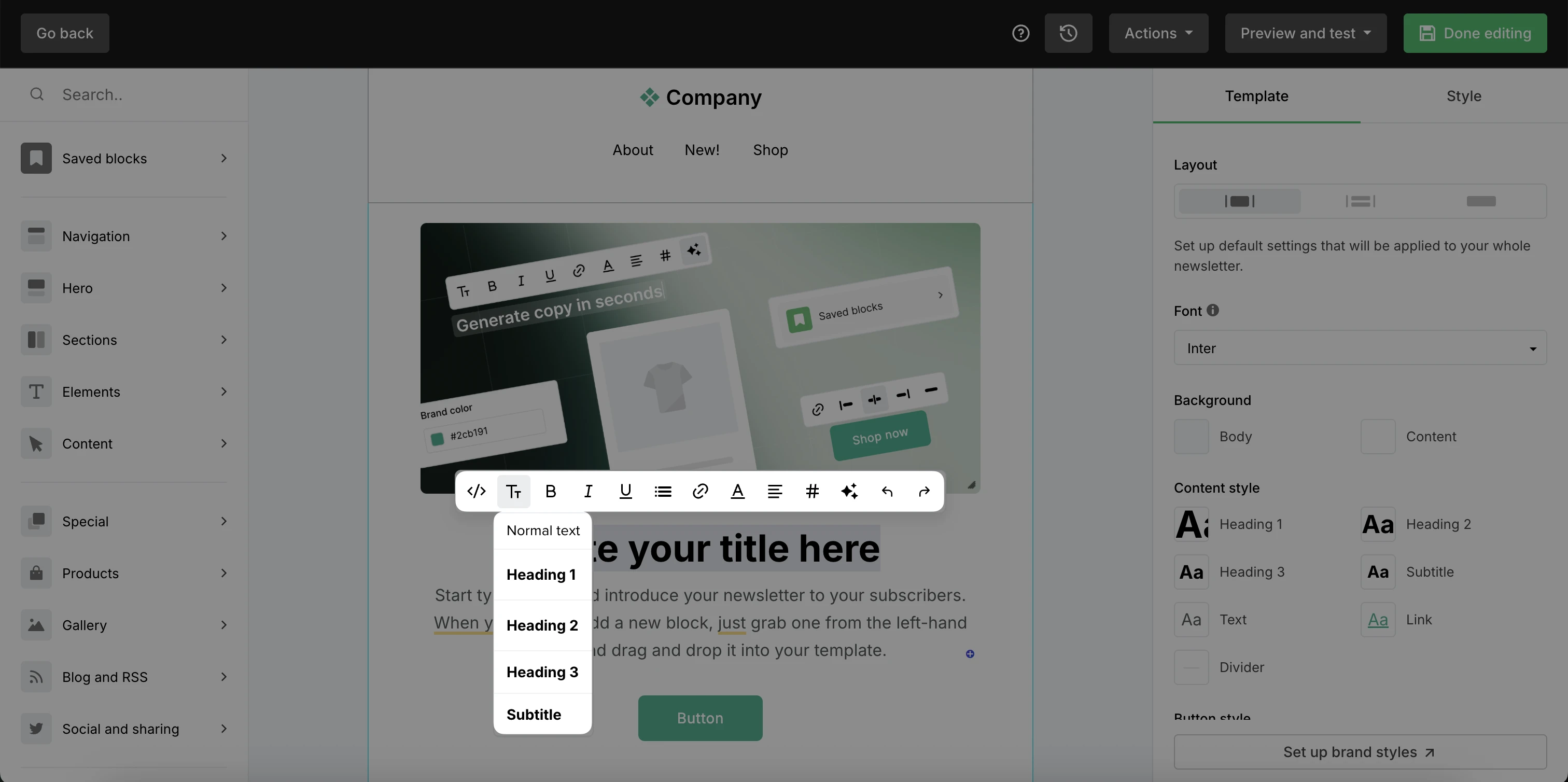
To manage formatting:
Highlight the text you’d like to edit.
In the floating toolbar, select Format.
Select the heading or other format type.
Use descriptive links and button text
Screen readers can generate a list of every link in an email. Links need to be descriptive for them to be easily accessible.
Write link and button text that describes exactly what happens when it's clicked, such as "Download the guide" or "Complete a survey" instead of "Click here".
Give links a visual cue beyond color, like an underline, so they're recognizable to subscribers who are color blind.
Keep buttons and links at least 24x24 pixels, so they're easy to tap for subscribers with limited fine motor control.
Choose accessible colors and contrast
Good color contrast helps subscribers with low vision or color blindness read your content. Additionally, it makes your emails easier to read on a phone in bright light.
Aim for a contrast ratio of at least 4.5:1 between your text color and its background. Check the contrast ratio using WebAIM Contrast Checker.
Stick to one text color and one contrasting background color per section.
Don’t use color as the only way to convey meaning. Instead of "Click the red button," say "Click the Continue button," so the instruction still makes sense to someone who's color blind.
💡 Add contrasting text and background colors to your Brand styles settings to always have them available.
Add ALT text to images
ALT text describes your images for screen readers and acts as a placeholder if they fail to load. It ensures readers who can't see your content still know exactly what your photos convey.
Use a short, specific description of what the image shows. For example, use "Woman hiking on a mountain trail" instead of just "photo" or "image1.jpg".
For purely decorative images that don't add any information, leave ALT text empty so screen readers skip over it.
Never put important information, like a discount code or a date, only inside an image. If images are blocked or don't load, that information disappears completely for the reader.
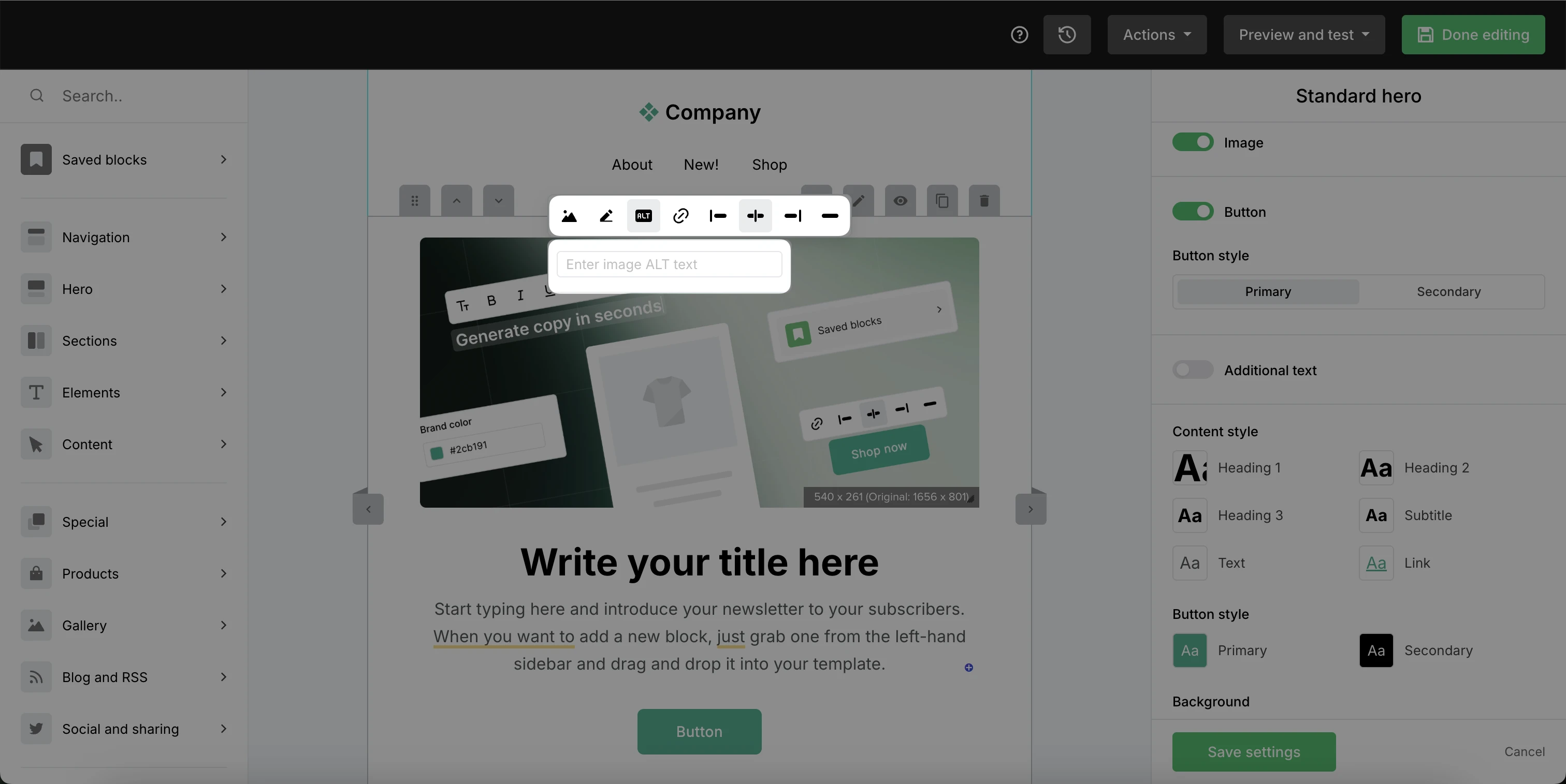
To add ALT text:
Hover over the image.
Select ALT text from the floating toolbar.
Enter the text.
Label your signup form fields
People using screen readers rely on form labels to know what information to enter in each field. Make sure to include them for a clear signup process.
When you add a field to a signup form, give it a clear, visible label like "Email address" or "First name."
Avoid using placeholder text as your only label. Placeholder text disappears once someone starts typing, so a screen reader user may lose track of what the field is for.
If a field is required, say so in the label itself, such as "Email address (required)," rather than relying only on a color or asterisk.
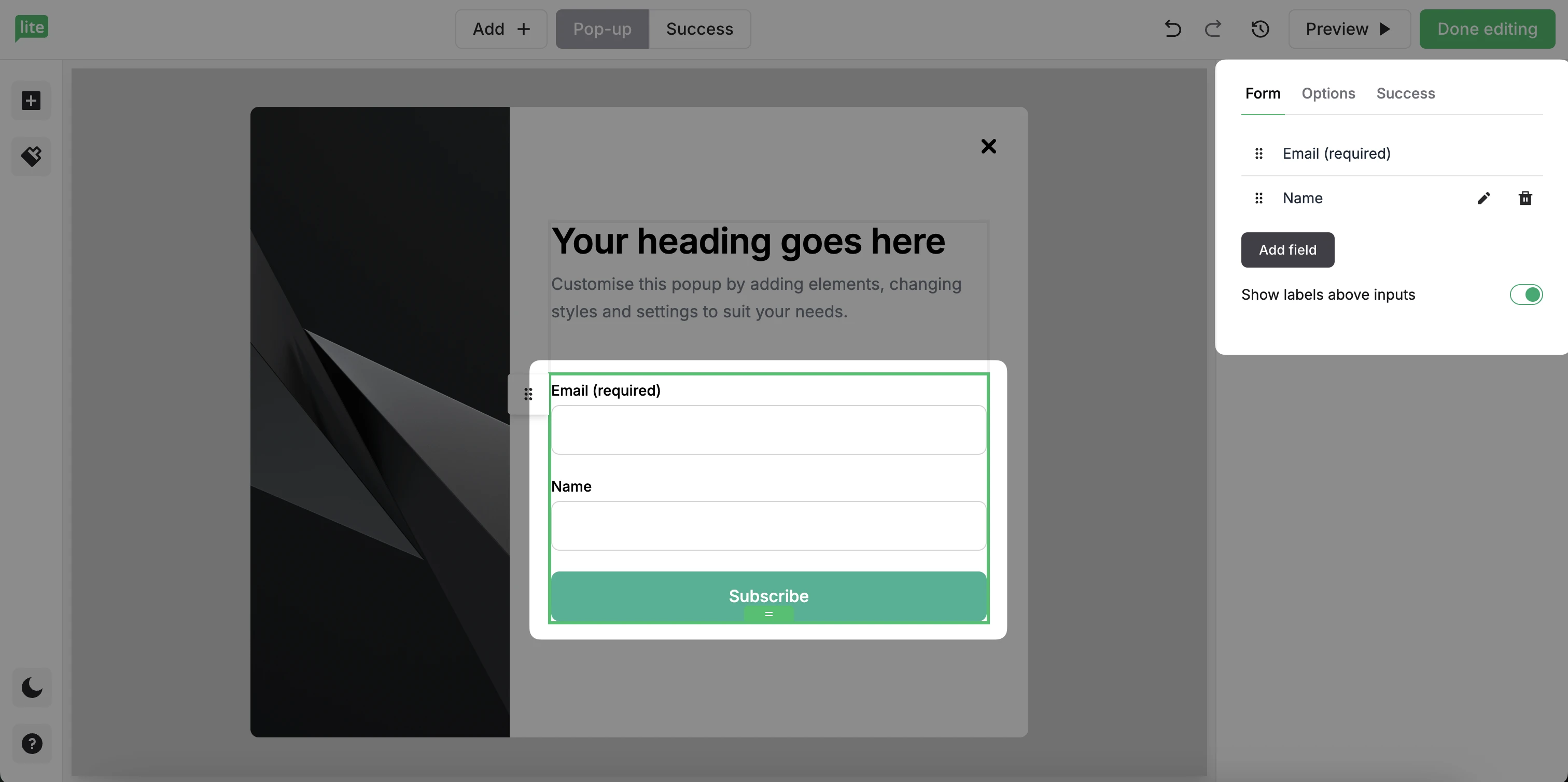
To label form fields:
Click on the block that includes your form fields.
Enable the Show labels above inputs option.
Provide a plain text version
A plain text version strips out images, links, and formatting, leaving just the core message. It's a fallback for subscribers who use assistive technology or mailboxes that don’t support HTML.
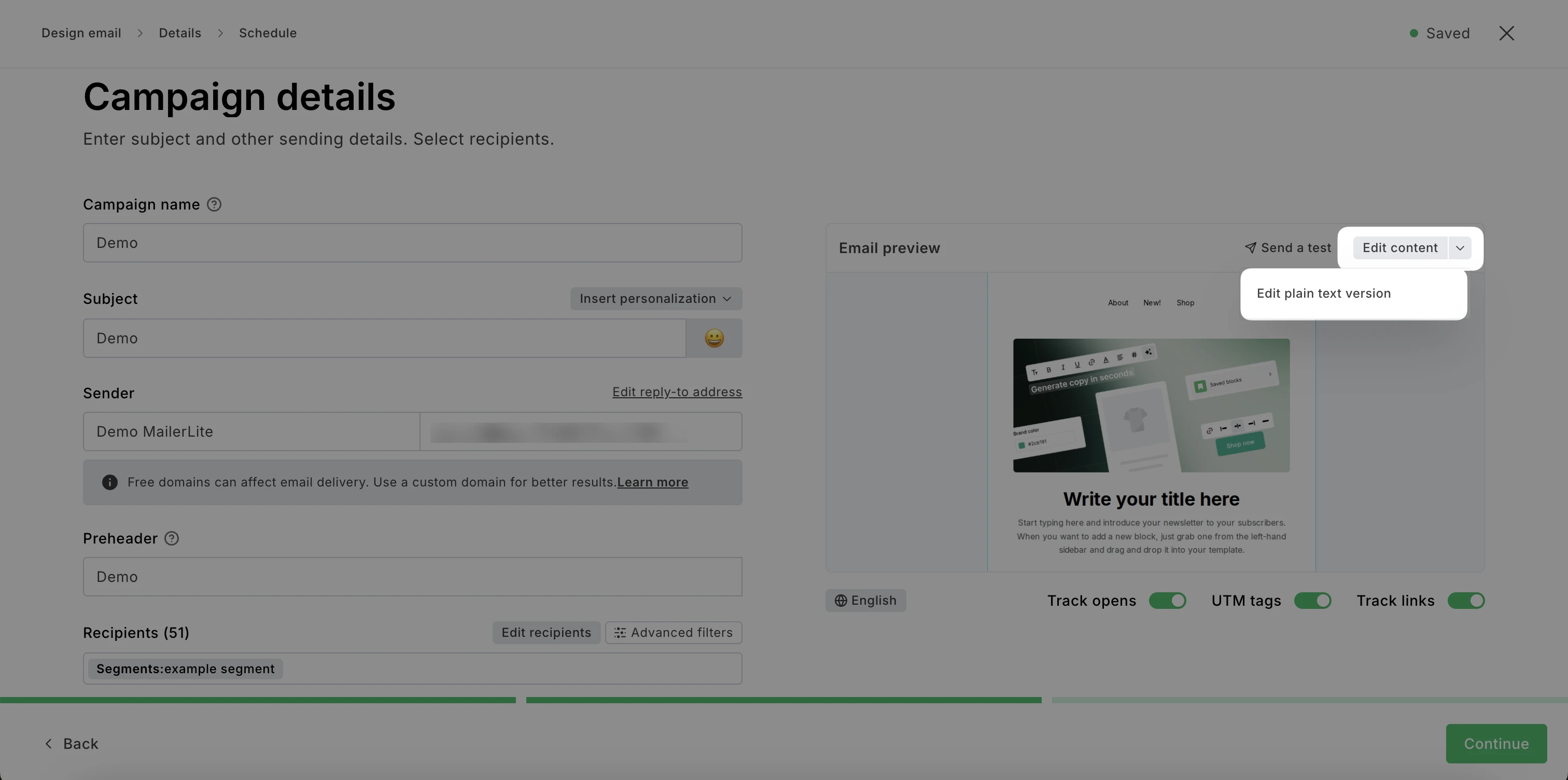
MailerLite automatically generates a plain text version of every campaign you create. To review or customize it:
On the Campaign details step, click the down arrow next to Edit content.
Select Edit plain text version.
Edit the text and click Save.
How to test your content for accessibility
You can test your content for accessibility issues to make sure it will be readable for everyone. To do so:
Send yourself a test email and open it using a screen reader, such as VoiceOver (Mac/iOS), NVDA or Narrator (Windows), or TalkBack (Android).
Run your campaign or landing page through a free automated checker, like the WAVE Web Accessibility Tool browser extension, to catch missing ALT text or heading issues.
Check your color choices with a contrast checker and a color blindness simulator like Color Oracle.
Review your plain text version to confirm it makes sense on its own.
Learn more about accessible design in our blog post, Making your emails accessible: A guide to inclusive communication.